
The Market That’s About to Get Crowded
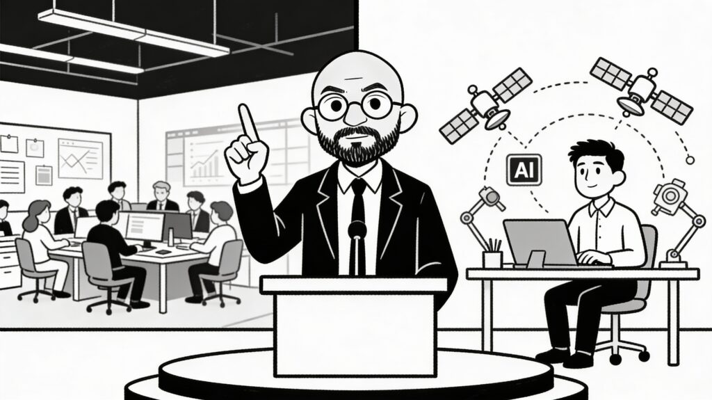
Anupam Mittal started Shaadi.com in 1997 when the internet in India barely existed.
Most people know him as a matrimony platform founder. What fewer people know is that in 2022, Mittal started investing in SaaS companies through his venture fund.
He made an observation that changed how he thought about the Indian tech landscape: “Most Indian SaaS companies are solving real problems. But they’re losing to international competitors because their products feel cheap.”
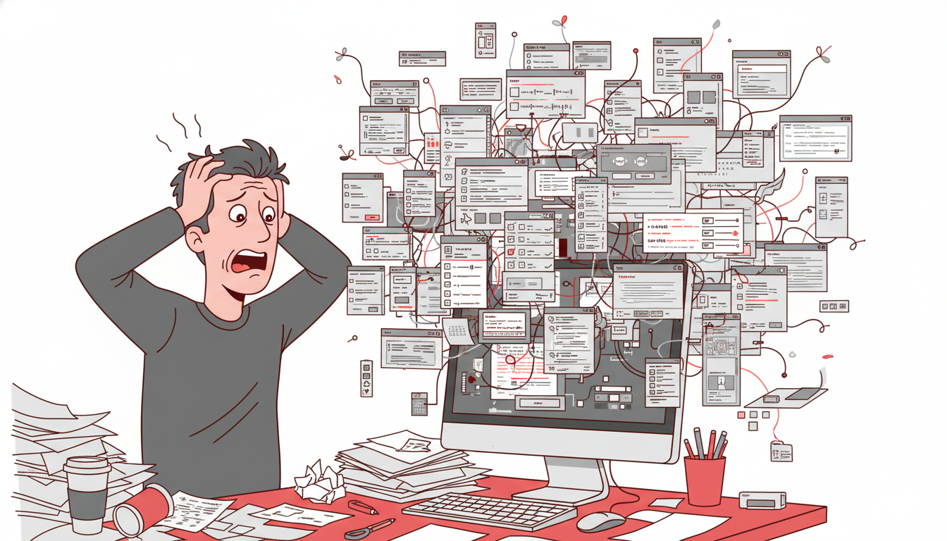
Not because they were cheap. Because they looked cheap. The design was functional but forgettable. The interface felt like something from 2010. The onboarding was confusing. The customer experience was an afterthought.
Mittal funded 12 SaaS startups in 2023. One condition: they had to invest seriously in design.
By 2024, the results were striking. The startups with serious design investment saw:
- Customer acquisition costs decrease 23% (users found them more credible)
- Feature adoption rates increase 31% (clearer interfaces meant users understood features faster)
- Churn rates decrease 18% (better experience meant users stayed longer)
- Contract values increase 15% (enterprise customers paid more for polished products)
The startups that ignored design investment showed none of these improvements.
Mittal now says: “Design is the differentiator for Indian SaaS. Technical excellence is table stakes. Design is how you win.”
The Numbers That Show Why This Moment Matters
India’s SaaS market is experiencing compound growth that’s almost hard to believe.
In 2018, the Indian SaaS market was valued at $3.5 billion. In 2023, it hit $15.4 billion. By 2028, estimates suggest it’ll reach $50+ billion.
That’s 40% annual growth. Decade after decade.
But here’s what matters more than the headline number: India is producing SaaS companies that are actually competing globally.
Companies like Razorpay, Freshworks, Unacademy, and Vedantu started in India and now compete with American companies in global markets.
These companies proved something important: Indian founders can build world-class SaaS.
What they didn’t prove (yet) is that Indian SaaS can compete on design excellence.
Most Indian SaaS companies are still winning on price and features. They’re cheaper than Salesforce. They have more features than Slack. They’re “good enough.”
Good enough is about to stop working.
Why Good Enough Isn’t Good Enough Anymore
The Indian SaaS market had a unique dynamic for 15 years: competition was weak. You could build a mediocre product, price it at 60% of the American alternative, and win easily.
That’s changing.
International competitors noticed India. Salesforce, HubSpot, Slack, Figma—every major SaaS company is now aggressively pursuing Indian customers.
These companies have design budgets larger than entire Indian SaaS companies’ revenue. Their design is world-class. Their onboarding is bulletproof.
When an Indian SaaS company with basic design competes against Salesforce with exceptional design, the price advantage shrinks. Users see the American product and think “this is clearly the more professional choice.”
Price can’t overcome that perception gap forever.
The companies winning now are the ones where design quality is obvious. They cost more than price-competitive alternatives, but they justify the cost through experience.
The Employee Expectation Shift
Here’s something happening in Indian companies that most founders miss:
Employees now have options. They’ve used products like Notion, Slack, Figma, Figma, Linear. They expect their tools to have that level of polish.
When a company implements a local SaaS alternative that feels clunky by comparison, employees complain.
“Why are we using this instead of Slack?”
The IT manager says: “Because it’s cheaper and it does the job.”
The employee thinks: “But it’s miserable to use.”
Companies are increasingly willing to pay more for tools that don’t make their teams miserable. The productivity cost of a bad interface exceeds the software savings.
Mittal’s portfolio companies realized this. They stopped competing on price. They started competing on experience.
And they started winning at higher price points.
The Design Talent Crunch That’s About to Explode
Here’s the real opportunity: there aren’t enough good designers in India for the SaaS boom.
India produces 200,000+ engineers annually. India produces roughly 5,000-10,000 product designers annually.
That’s a 20:1 ratio of engineers to designers.
Meanwhile, every SaaS company needs design. Not someday. Now.
This creates a massive wage gap. A junior designer in India earns ₹8-12 lakh annually. A senior design lead earns ₹25-40 lakh. Compare that to engineers at the same level (₹12-18 lakh junior, ₹35-50 lakh senior).
Designers are scarce. Scarcity means premium salaries.
But more importantly, scarcity means opportunity. Founders who figure out how to build design capabilities will have a massive advantage.
The companies investing in design today—building design systems, hiring experienced designers, prioritizing user research—will have competitive moats that price competitors can’t replicate.
The Enterprise Buying Pattern Shift
Indian enterprises used to buy software based on features and price.
This is changing. Especially in larger companies (₹100+ crore revenue).
Enterprise procurement now includes user experience in the evaluation criteria. IT leaders are tired of implementing software that their teams hate.
CFOs are tired of paying 60% less and still dealing with support costs from confused users.
When Mittal’s portfolio companies started selling to enterprises, they noticed something: enterprises would choose the more expensive option if the design was clearly superior.
A ₹20 lakh/year SaaS product with exceptional design beats a ₹12 lakh/year alternative with functional design.
The math is simple: even if adoption is 20% higher because the interface is better, the enterprise saves money. Better interface = faster onboarding = lower support costs = higher adoption.
Design isn’t a feature. It’s an economic multiplier.
The Competitive Vulnerability That Exists Right Now
Most Indian SaaS companies are vulnerable right now because:
- They have solid product-market fit (solving real problems)
- They have decent engineering (the core technology works)
- They have minimal design investment (interface is functional at best)
An American competitor with equal technology but superior design would crush them.
This is exactly what’s starting to happen. Slack is competing against Indian chat products. Linear is competing against Indian project management tools. Figma is competing against local design tools.
The products are similar in capability. The experience is vastly different.
But here’s the opportunity: most Indian SaaS companies haven’t noticed this vulnerability yet. They’re still building features and chasing revenue.
The ones who pivot to design investment now—before the market fully shifts—will own their categories.
3 Founders Getting It Right
Founder 1: The Fintech Pivot
A Delhi-based fintech SaaS platform was growing slowly. They had decent tech, decent features, 50+ customers.
The founder brought in a design lead (costing ₹30 lakh/year). Spent three months rebuilding the interface completely. Not new features. Same features, better design.
Results:
- Sales cycle decreased from 60 days to 35 days
- Customer acquisition cost dropped 28%
- Expansion revenue (selling more features to existing customers) increased 42%
One hire. Three months of work. Dramatic results.
Founder 2: The Retention Fix
A Bangalore-based HR SaaS platform had 200 customers but 35% annual churn. They were adding customers but losing them too fast.
They audited why customers were leaving. Top reason: “The interface is confusing. We can’t figure out how to use all the features.”
They hired a designer to improve onboarding (₹20 lakh over 6 months). Built guided tours. Improved clarity. Simplified navigation.
Churn dropped to 12%. Same product. Better onboarding. Customers stayed.
Founder 3: The Enterprise Play
A Mumbai-based inventory management SaaS was stuck at SMB segment. They couldn’t sell to enterprises because their interface looked “cheap” compared to international alternatives.
They hired a design system architect (₹40 lakh/year). Built a proper design system. Rebuilt the entire interface with enterprise-grade polish.
Within a year:
- Enterprise deals went from 5% to 40% of revenue
- Average deal size increased 3x
- Enterprise NRR increased to 140%
The design shift enabled a business model shift.
Why Most Indian SaaS Founders Still Underinvest in Design
I talk to Indian SaaS founders constantly. Almost all underinvest in design. Here are the reasons:
Reason 1: Founder Blindness
Most Indian SaaS founders built their first version themselves or with junior engineers. They optimized for speed and features. The interface works, so they think design is fine.
They don’t have context for what excellent design looks like because they haven’t used world-class products long enough.
Reason 2: Cost Perception
“A designer costs ₹25 lakh/year. An engineer costs ₹20 lakh. I’d rather hire engineers.”
This is mathematically wrong. One designer working on onboarding can reduce churn by 5-10%. One engineer working on features might increase revenue by 5%.
But the founder sees the feature and understands its value. Design improvements are invisible.
Reason 3: Benchmark Blindness
Indian SaaS founders benchmark against other Indian SaaS products. Most Indian SaaS has mediocre design, so founders think “if it’s as good as Razorpay’s dashboard, it’s fine.”
They’re not benchmarking against Slack or Figma or Linear. So they don’t see the gap.
Reason 4: Cash Flow Insecurity
Early-stage founders are obsessed with revenue. Design is seen as a luxury for companies that are already profitable.
This is where Mittal’s investment thesis is interesting. He told his portfolio founders: “Design investment will directly improve your metrics. It’s not optional. It’s required to compete.”
When an investor mandates design investment, founders take it seriously.
Reason 5: Talent Availability
It’s hard to hire good designers in India. This creates circular logic: “We can’t find a designer, so we’ll delay hiring one. Since we don’t have a designer, design investment isn’t happening anyway.”
This feeds on itself.
The Specific Design Investments That Matter Most
Not all design investments have equal ROI. Some matter more for Indian SaaS specifically.
Investment 1: Onboarding Design
Indian users often have less software experience than Western users. They need clearer onboarding.
A clean, step-by-step onboarding guide can reduce activation time from 2 hours to 15 minutes.
This is high-impact work. This matters more than making the dashboard beautiful.
Investment 2: Mobile Experience
60% of Internet users in India access via mobile. Many Indian SaaS products are desktop-first with mobile as an afterthought.
Building mobile-first (not just responsive, but optimized for mobile interaction) opens the market dramatically.
Investment 3: Localization Beyond Language
Translating English to Hindi is easy. Building for Indian use cases is hard.
Indian users have different payment preferences, different workflows, different expectations.
The SaaS companies winning are the ones who design specifically for Indian behavior, not just translating American products.
Investment 4: Design System
Early-stage products don’t need a design system. But at 10+ features, a design system dramatically improves velocity.
A junior designer can implement features from a solid design system. Without it, even junior features take longer.
Building a design system requires investment (₹10-15 lakh) but returns happen for years.
Investment 5: Customer Research
Most Indian SaaS products are built on founder assumptions.
Spending ₹5-10 lakh on actual customer research (interviews, testing) reveals what users actually need.
This often contradicts founder assumptions.
The Timeline For Design Investment
You don’t need to wait until you’re profitable to invest in design.
Stage 1: Seed/Pre-seed (before product launch)
Invest in user research. Interview 20-30 potential users. Design based on actual needs, not assumptions.
Cost: ₹3-5 lakh
Impact: 40%+ improvement in product-market fit probability
Stage 2: Series A (product exists, 50-100 customers)
Hire a design lead. Redesign onboarding. Build basics of a design system.
Cost: ₹20-30 lakh
Impact: 20-30% improvement in activation and retention
Stage 3: Series B (200-500 customers)
Build complete design system. Grow design team to 2-3 people. Redesign entire product.
Cost: ₹50-80 lakh
Impact: 25-40% improvement in customer acquisition and retention
Stage 4: Series C+ (1000+ customers)
Design team becomes a department. Invest in specialized designers (research, interaction, accessibility).
Cost: ₹100+ lakh
Impact: Enterprise market entry, premium pricing, brand differentiation
Most Indian SaaS companies skip Stages 2 and 3. They go from “cheap design” in Stage 1 directly to “hiring during Series C.”
The window between Series A and Series B is where design investment pays the biggest dividends.
Why Now Specifically
Three things are happening simultaneously that create the perfect moment:
1. Global Competition Arrived
International SaaS companies are now aggressively pursuing India. They have design excellence. They’re building India-specific versions.
This is the last window where Indian SaaS can establish category ownership before facing polished competitors.
2. Enterprise Buying Shifted
Indian enterprises now expect world-class interfaces. They have money to pay for it. They’re tired of “good enough.”
This creates a price umbrella where design-first products can charge premium prices.
3. Design Talent Pool Grew
India is producing more designers now (especially from design bootcamps). Talent is available if you pay for it.
Five years ago, finding a good designer was nearly impossible. Now it’s hard but doable.
The Founder Action Plan
If you’re building Indian SaaS right now, here’s what to do:
This Month:
Audit your product’s design against a world-class competitor in your category. Where do you lose?
Do an honest comparison. Don’t tell yourself “ours is simpler.” Ask yourself “would an enterprise customer choose ours over the competitor?”
Next Month:
Spend ₹2-3 lakh hiring a freelance designer for one critical flow (onboarding, checkout, core workflow).
Test it with 10 users. Measure time to completion. Ask for feedback.
You’ll learn whether design investment moves your metrics.
Quarter 2:
Hire a design lead (contract or part-time initially). Start building a proper design system.
This is the moment where design becomes systematic, not opportunistic.
Quarter 3-4:
Redesign your most friction-filled flow based on what you learned.
Measure everything. You should see 15-30% improvements in conversion or adoption for the redesigned flow.
Mittal’s Real Insight
Anupam Mittal says something that most Indian founders don’t want to hear:
“Indian SaaS will never win on price. America will always have bigger companies willing to undercut you. Your only path to sustainable competitive advantage is experience.”
He’s right.
Price competition is a race to the bottom. Someone in Eastern Europe will build it cheaper. Someone in South America will build it even cheaper.
The only defensible position is: “Our product is so much better to use that customers prefer us even at higher prices.”
This is what Mittal’s portfolio companies are learning.
What You Should Do This Week
If you’re building SaaS (Indian or otherwise), commit to one design improvement.
Not a small one. A meaningful redesign of something your users struggle with.
Spend ₹1-2 lakh. Hire a freelance designer. Spend 2-3 weeks.
Measure the impact on the key metric for that flow.
You’ll get concrete data on whether design investment works for your business.
Most founders who do this are shocked by the results. 20-30% improvements aren’t rare. They’re normal when you take design seriously.
That’s why Mittal is so bullish on Indian SaaS design: it’s the last major inefficiency in the market.
Fix it and you win.