RPS // Blogs // AI as design thinking partner: the shift that changes everything

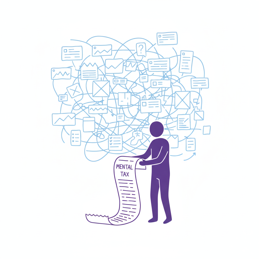
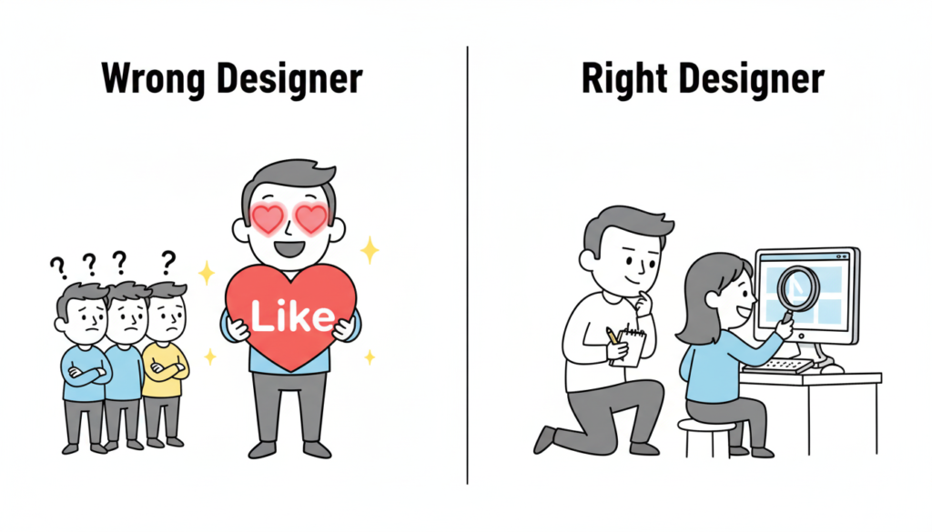
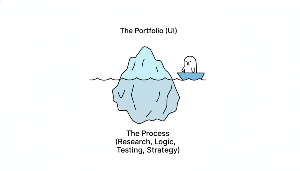
The most consequential change in how design teams use AI isn’t about generating mockups faster. It’s about thinking better. Across every major design publication and industry survey from 2024 to 2026, a clear consensus has emerged: AI’s greatest value to designers lies in ideation, critique, research synthesis, and strategic reasoning, not in producing visual assets. The data backs this up decisively. Foundation Capital’s 2025 survey of 400+ designers found that 84% use AI during exploration phases (research, ideation, strategy) versus just 39% during delivery. Figma’s own research shows only 33% of designers use AI to generate design assets, while 40% use it for data analysis and 38% for desk research. The tools haven’t caught up to the hype. Nielsen Norman Group’s May 2025 review found AI design tools still produce generic results with poor information hierarchy. But the thinking-partner use case is already delivering real returns. For design leads managing cross-functional teams in fintech and enterprise SaaS, this reframing isn’t academic. It changes how you staff projects, run critiques, synthesize research, and communicate with stakeholders.

From “enthusiastic intern” to outcome orchestrator

The design industry has converged on a spectrum of mental models for AI’s role, and understanding where your team sits on this spectrum matters more than which tools you’re using. Nielsen Norman Group, still the most cited authority in UX, has moved from their 2024 “AI as intern” metaphor to a far more ambitious 2026 framework called “outcome-oriented design.” In this model, designers stop crafting individual interfaces and instead define adaptive frameworks that respond to individual user goals. As Kate Moran and Sarah Gibbons wrote in March 2026, designers shift “from designing for the average to designing for the individual,” setting guardrails and constraints rather than pixel-level specifications.

John Maeda, now Microsoft’s CVP of Engineering for CoreAI Design & Research, frames this through his “UX → AX” (Agent Experience) paradigm: interfaces designed not just for humans but for AI agents that act on their behalf. His 2025 SXSW keynote outlined a taxonomy of collaboration spaces (chat, document, table, canvas) where human-AI partnership takes different forms. IDEO, meanwhile, has built an entire certificate program around “AI × Design Thinking,” with Managing Director Jenna Fizel positioning AI explicitly as a brainstorming partner.

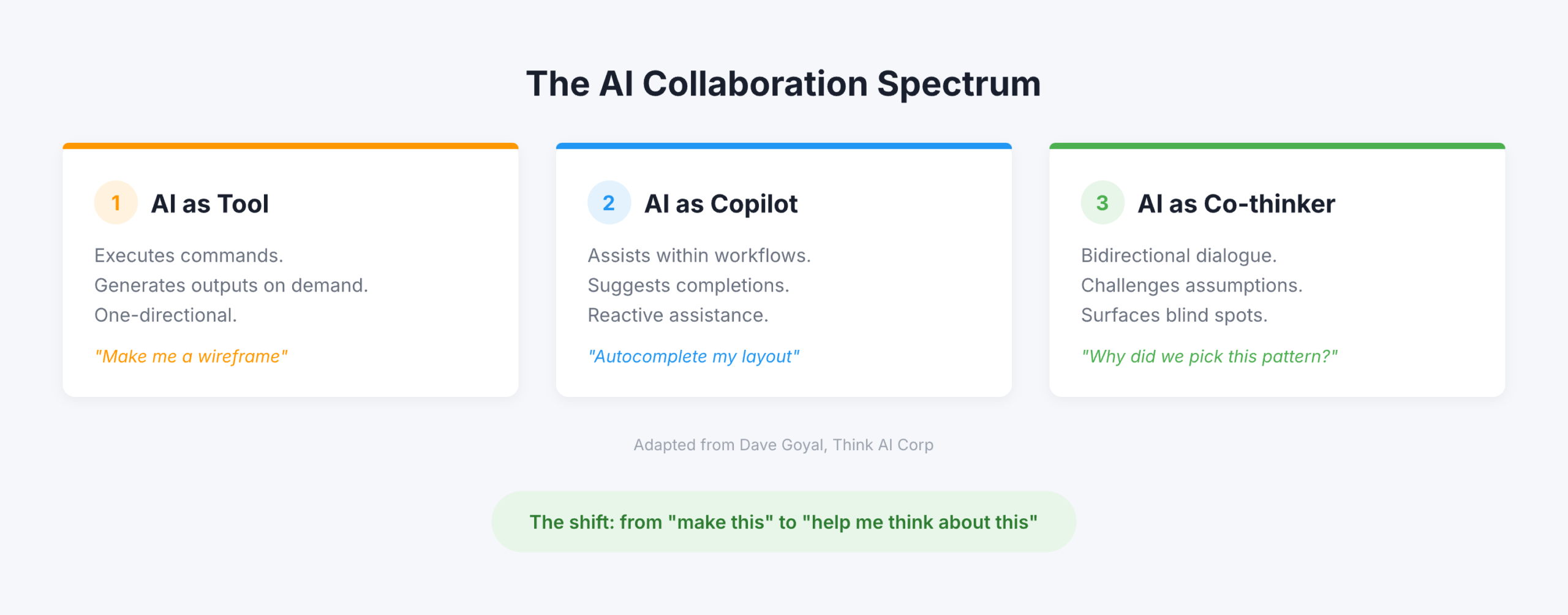
But the most useful framing for practitioners comes from Dave Goyal of Think AI Corp, who distinguishes between three levels. AI as “tool” executes commands and generates outputs. AI as “copilot” assists within workflows and suggests completions, what Goyal calls “a glorified autocomplete engine.” AI as “co-thinker” engages in bidirectional dialogue, challenges assumptions, and surfaces blind spots. The difference, Goyal argues, “is not in capability. It is in design intent.” Paul Boag of Smashing Magazine operationalized this most concretely: he creates Claude and ChatGPT projects loaded with client research, personas, survey results, and documentation, then uses the AI as “a co-worker who never gets tired and has a perfect memory.” Not to generate designs, but to challenge his thinking, review his work, and ask hard questions.

The data tells a more nuanced story than the hype

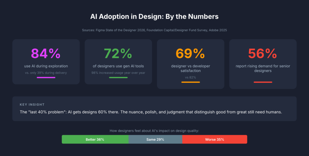
The adoption numbers are impressive on the surface but reveal important fault lines when you dig deeper. Figma’s State of the Designer 2026 (906 respondents across five regions) found that 72% of designers now use generative AI tools and 98% increased their usage over the past year. Adobe’s October 2025 survey of creative professionals reported that 99% use generative AI in some capacity, with 97% using it across multiple workflow stages. Yet these headline numbers mask a critical insight: designers are far less satisfied with AI than developers. Figma’s 2025 AI Report (2,500 users across seven countries) found developer satisfaction with AI tools at 82% versus just 69% for designers. Only 32% of all respondents said they could rely on AI output, and only 54% of designers said AI improves the quality of their work.

The Foundation Capital/Designer Fund survey adds crucial context. While 89% of designers report improved workflows, the adoption curve follows a clear pattern: heavy use in early-phase exploration, moderate use during creation, and minimal use in delivery. 96% of designers learned AI entirely through self-teaching, through side projects, peer tips, and social media. Formal training barely exists. Startups lead adoption, with early-stage designers more than twice as likely to fully integrate AI compared to enterprise teams. The “last 40% problem” persists: AI gets designs roughly 60% of the way there, but the nuance, polish, and judgment that distinguish good work from great work still require human hands.

The sentiment data is perhaps most telling. Figma’s 2026 survey found designers split almost perfectly into thirds on whether design has gotten better (36%), worse (35%), or stayed the same (29%) since AI’s rise. NNGroup declared 2026 “the year of AI fatigue.” Yet 82% of hiring managers said their company’s need for designers has increased or held steady, and 56% specifically report increasing demand for senior designers, those who bring the judgment and strategic thinking that AI cannot replicate.

Six ways design teams are using AI to think, not produce

The most compelling evidence for AI as thinking partner comes from practitioners documenting specific workflows. These fall into six categories that map directly to how agency design leads structure their work.

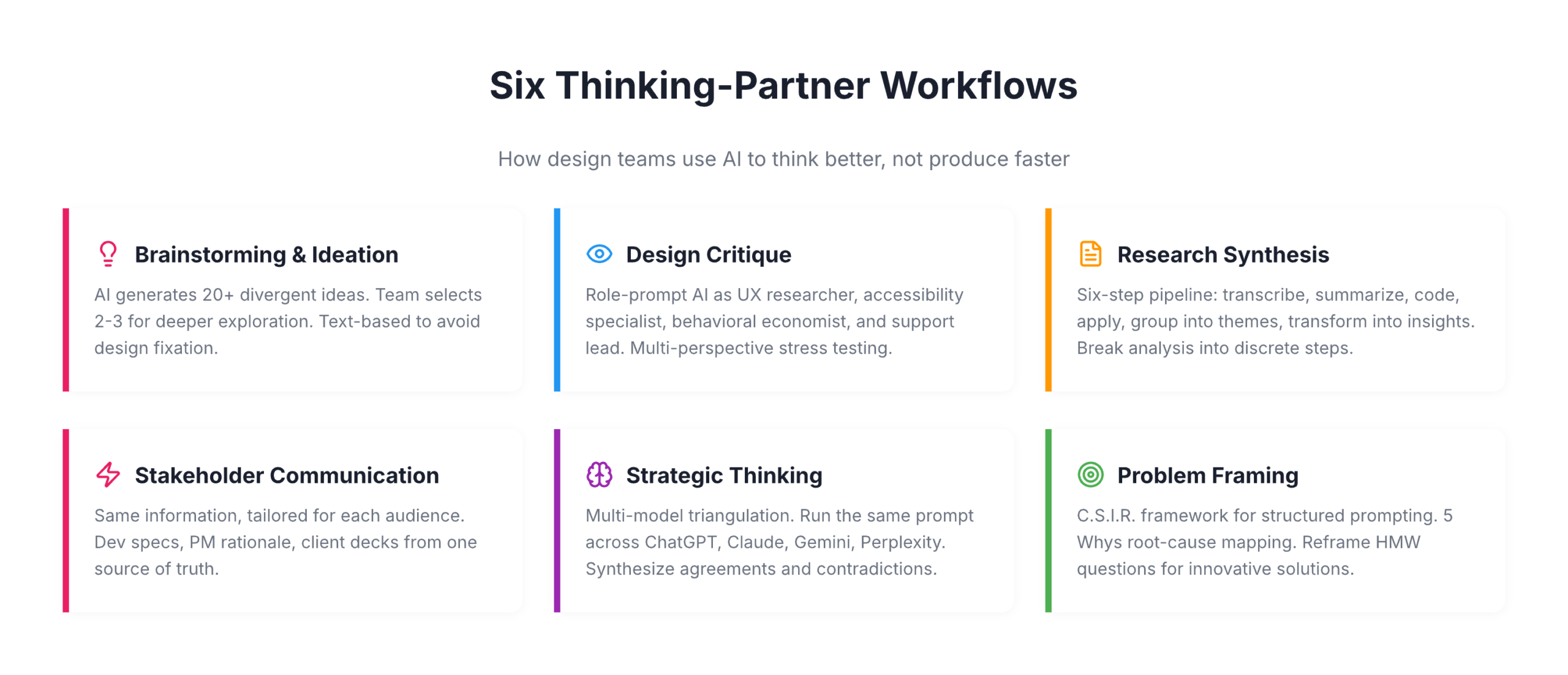
For brainstorming and ideation, Eleken, a SaaS design agency, has replaced traditional brainstorming’s awkward silence with a structured approach: AI generates 20+ possible solutions to a design problem, each team member selects 2-3 concepts that intrigue them, and those become starting points for deeper human exploration. IDEO U teaches a similar pattern: let AI generate divergent ideas, then use human creativity to “build on, combine, or completely flip these ideas on their head.” The key nuance, supported by a CHI 2024 study, is that AI image generators during ideation can actually increase design fixation and reduce originality. Text-based ideation with LLMs avoids this trap by keeping ideas abstract and malleable.

For design critique, Nicole Riemer of ROSE Digital published the most detailed framework. Her five-step process uses role prompting to stress-test features from multiple perspectives simultaneously: a UX researcher conducting a usability audit, an accessibility specialist evaluating WCAG compliance, a behavioral economist analyzing cognitive biases, and stakeholder perspectives including customer support leads asking “What could go wrong that would flood your queue?” The critical insight: never ask AI “Would you use this feature?” because it will always say yes. Instead, ask open-ended exploratory questions grounded in real persona data. Markiian Bobyliak of Supermega Design takes this further by connecting Claude Code directly to his project folder via MCP, giving AI access to Figma files, research documents, and stakeholder notes so it can review onboarding flows against actual user interviews and documented requirements.

For user research synthesis, the most rigorous approach comes from Great Question’s six-step pipeline: transcribe, summarize each segment, generate codes, apply codes to summaries, group into themes, and transform into actionable insights. The crucial principle is breaking complex analysis into discrete steps with clear inputs and outputs. UX researcher Dominika Mazur’s side-by-side comparison of human versus AI analysis found ChatGPT “reliable in coding and synthesizing” with a particular strength in processing speed, while human researchers excelled at “generating non-obvious insights.”

For stakeholder communication, Bobyliak’s workflow stands out: after finishing designs, he instructs Claude to create documentation tailored for different audiences from the same underlying information. Technical specs for developers, design rationale for future designers, business-goal alignment for product managers, and presentation content for clients that pulls real quotes from user interviews. Sandra Herz, an impact communication consultant, uses a similar approach, creating detailed stakeholder personas for critical decision-makers and then using AI to adapt pitches for each audience.

For strategic thinking, the emerging pattern is multi-model triangulation. Elizabeta Kuzevska of Revenue Experts AI runs the same competitive analysis prompt across ChatGPT, Claude, Gemini, and Perplexity simultaneously, keeps responses separate, then creates a synthesis prompt to identify agreements, contradictions, and unique insights. If you’re using one AI model for competitive intelligence, you’re building strategy on one model’s biased perspective.

For problem framing, the most structured approach is the C.S.I.R. framework (Context, Specific Info, Intent, Response Format) from AiforPro.net, which includes specific prompt patterns for root-cause mapping via the 5 Whys, reframing How Might We questions, and clustering problems by journey stage. Designer Erin Wilson demonstrated the power of reframing by comparing solutions generated from a conventional problem statement about climate change versus a reframed “How might we help people experience the impact of their carbon footprint?” The conventional framing produced conventional solutions while the reframed version generated innovative concepts like interactive VR simulators and personalized carbon impact stories.

Exercises that work on Monday morning

The gap between understanding AI-as-thinking-partner conceptually and using it effectively in practice is where most design teams stall. These five exercises, drawn from documented practitioner workflows, require no special setup beyond access to Claude or ChatGPT.

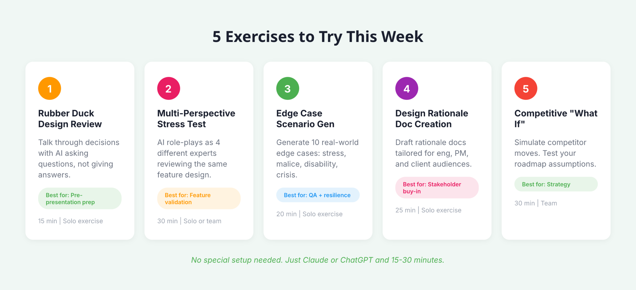
  • Rubber duck design review: Prompt AI with “Act as my rubber duck. I’ll talk through my design decisions and I need you to help clarify my thinking by asking questions and reflecting back what I say, without giving direct answers.” Walk through your latest design decision. The forced articulation reveals gaps in reasoning and prepares you for stakeholder presentations.
  • Multi-perspective stress test: Take your current feature design and run it through Nicole Riemer’s role-prompting framework. Feed the AI real persona data (not assumptions) and ask it to respond as a UX researcher, accessibility specialist, behavioral economist, and customer support lead, each evaluating the same feature from their perspective.
  • Edge case scenario generation: Describe your feature’s happy path and prompt: “Generate 10 contextual edge cases where real human behavior deviates from this path. Consider users under stress, users with malicious intent, users with disabilities, and users in crisis situations.” This exercise directly addresses the blind spots that cause major UX incidents.
  • Design rationale document creation: After making a key design decision, prompt AI with the decision context and ask it to draft a rationale document covering “why it matters,” a decision summary, supporting evidence, alternatives considered, and trade-offs accepted. Then create versions tailored for your engineering lead, your product manager, and your client.
  • Competitive “what if” analysis: Feed AI your product’s current positioning alongside competitor data and ask: “What if our primary competitor launched [specific feature] tomorrow? How should our design strategy adapt? What assumptions in our current roadmap become invalid?”

Building a persistent “design copilot” amplifies all of these exercises. Avani of ADPList published a detailed guide recommending designers treat this like onboarding a new team member: write a “hiring brief” defining the AI’s personality and role, upload brand guidelines, design system documentation, accessibility standards, past research, and product strategy, then use the prompt “Please review what I’ve shared and ask me sequential questions to help complete your understanding of our brand, design system, product, and design culture.” Once onboarded, this persistent context transforms every subsequent interaction from a cold start into a conversation with a knowledgeable colleague.

What this means for design leadership in 2026

The most important finding across this research isn’t any single statistic or framework. It’s the emerging consensus that AI’s impact on design is primarily cognitive, not productive. The teams gaining the most advantage aren’t the ones generating assets faster; they’re the ones thinking more rigorously, considering more perspectives, and communicating design rationale more effectively. NNGroup’s insight crystallizes it: the skills that matter now are “curated taste, research-informed contextual understanding, critical thinking, and careful judgment,” precisely the skills that define senior design leadership.

For design leads at agencies working across fintech and enterprise SaaS, this has immediate structural implications. The “last 40% problem” means AI won’t replace your production designers anytime soon, but the exploration-heavy adoption pattern (84% in exploration versus 39% in delivery) suggests your biggest ROI comes from integrating AI into discovery, research synthesis, and strategic framing. These are the phases where agency teams often face the tightest time constraints and where client value is highest. The multi-audience communication capability alone, translating the same design rationale into developer specs, PM strategy docs, and client presentations, addresses one of the most persistent bottlenecks in cross-functional agency work.

The counter-narrative matters too. The Psychology Today research finding that “while generative AI enhances individual creativity, it simultaneously narrows collective diversity” is a genuine risk for teams that over-rely on AI for ideation without maintaining diverse human perspectives. And the CHI 2024 finding about AI-assisted ideation increasing design fixation suggests that how you integrate AI into brainstorming matters as much as whether you do. The practitioners getting the best results treat AI as a sparring partner that expands their thinking, not a shortcut that replaces it. That distinction, between amplification and automation, will define which design teams thrive and which find themselves, as NN Group warned, already replaceable.

RPS // Blogs // Designing under real constraints

In theory, design is about creativity. In reality, it’s about navigating constraints. Tight timelines. Skipped processes. Unhappy stakeholders. Technical limits. AI inconsistencies. The real skill of a lead designer isn’t avoiding constraints, it’s designing through them.

“I am a UI UX Principal Designer, and I have all my life worked as a Designer, from Senior Designer, to Lead Designer, to Design Manager. But let me tell you, these constraints remain the exact same no matter your title. Here is what that actually looks like in practice”


1. Tight Timelines

  • The Constraint: 
    We often work with a lean team, and the client always works with tight timelines. They want the launch of features which are complex in just one sprint.
  • The Impact:
    Less time for validation means a higher risk of misalignment, and design becomes execution-focused instead of insight-driven.
  • How I Managed It: 
    The solution which we decided was to simply reduce the scope with respect to the core user pain points. We focused purely on the primary user journey for the sprint, knowing the rest of the edge cases can be updated later. When time shrinks, reduce scope, not clarity.

2. Skipped Process

  • The Constraint: 
    In one of my projects on a pharmacy management system, the client wanted me to deliver screens without the UX process. They just wanted us to be like AI Screen generators.
  • The Impact:
    When you skip the process, design becomes assumption-based. The client would inevitably look at the output and say that our UX was not good.
  • How I Managed It:
    What we did was, we involved the client in a workshop along with us and did a comprehensive UX activity to understand the briefs and problems much more. Involving the client made him so happy that he said, “Let’s do more of such activities for problem-solving.” With time, our processes were validated with the best UX results. Even when the process is skipped initially, you can still protect strategic thinking.

3. The “Unhappy with Everything” Stakeholder

  • The Constraint: 
    Handling clients who just say your design does not look good. The client gives vague inputs like spacing here is wrong, spelling is wrong, visually doesn’t look better.
  • The Impact:
    Morale drops, confidence shakes, and the conversation becomes emotional instead of objective.
  • How I Managed It: 
    We came up with an approach where we started giving the client options and clarity regarding the different styles. We made the client choose the design rather than giving one option for the client to just find problems with. Tying those options to specific business outcomes reframed the discussion overnight. Feedback became constructive.

4. Technology Constraints

  • The Constraint: 
    We consistently work on projects where development frameworks, responsiveness, and complex interactions become problems. Development flags that the design isn’t feasible with the current stack.
  • The Impact:
    Ambitious features get simplified, and tension rises between design and engineering.
  • How I Managed It: 
    A good PM and a communicator can solve this very well. Instead of pushing back blindly, sit down with engineering to walk through the technical limitations. Redesign the interaction to fit the framework smoothly—like using progressive disclosure instead of heavy animations. Sometimes constraints don’t weaken design; they refine it.

5. Animation Constraints

  • The Constraint:
    No time for motion design. No bandwidth for advanced animation implementation.
  • The Impact:
    The product feels static. Feedback loops feel mechanical instead of intuitive.

  • How i managed it (real life scenario) :
    In one project, we planned micro-interactions across the dashboard — hover states, smooth card transitions, animated graphs. The engineering timeline got compressed.

nstead of removing all motion, I prioritized three moments:

  • Button feedback
  • Success confirmation
  • Loading states

We documented exact easing, duration, and purpose not decorative animation.

Even minimal motion improved perceived performance and usability.

Animation doesn’t need to be dramatic.
It needs to be meaningful.


6. AI as a Constraint

  • The Constraint:
    AI tools generate layouts instantly, but spacing is inconsistent, logic is flawed, and components don’t align with the system.
  • The Impact:
    Speed increases, but design quality suffers. Junior designers may over-trust AI output.
  • How I Managed It:
    Instead of discarding AI entirely or blindly trusting it, I built an AI workflow to validate its output:
  • Grid validation
  • Token consistency
  • Accessibility checks
  • Logical user flow
    AI helps me explore quickly, but it never finalizes decisions. Judgment still belongs to the designer.

Final Reflection

Designing under constraints is not a phase; it is part of the job. Deadlines, uncertainty, trade-offs—these aren’t obstacles. They’re part of the craft.

The difference between average and exceptional designers isn’t creativity alone. It’s the ability to stay composed, strategic, and outcome-focused even when conditions aren’t ideal. That’s what real product design looks like.


RPS // Blogs // UX Audit Checklist – The 10-Point Framework That Exposes Flaws in Minutes
UX Audit Checklist - The 10-Point Framework That Exposes Flaws in Minutes

Let’s talk about the “A-word.”

Audit.

Just saying it out loud makes people want to take a nap. It sounds expensive. It sounds corporate. It sounds like a guy in a suit charging you $500 an hour to tell you that your font size is too small or that your logo is slightly off-center.

In the design world, we treat audits like root canals: painful, expensive, and something to be avoided until the patient is screaming.

But you don’t need a consultant to tell you your website sucks. You likely already know it. You feel it in your gut when you watch a user struggle with a form you built. You see it in the analytics where the drop-off rate looks like a cliff edge. You just don’t know where it sucks specifically.

Most UX audits are massive overkill.

Agencies love to deliver 100-page PDFs filled with jargon like “cognitive friction” and “information scent.” Those documents usually end up in a folder called “Old Stuff,” never to be read again. You don’t need a thesis. You don’t need a philosophy lecture. You need a 10-point checklist that exposes the ugly truth in under 20 minutes.

The “Common Sense” Framework

Most usability issues stem from a violation of basic heuristics—fancy words for “stuff Jakob Nielsen figured out 30 years ago.” These aren’t trends; they are the laws of physics for the web.

If you want to fix your product, stop looking at analytics for a second and look at the interface. Analytics tell you what is happening (they are leaving), but an audit tells you why.

Here is the framework. It’s not about perfection; it’s about triage. You are looking for the “bleeding neck” problems—the ones causing users to rage-quit—before you worry about the “paper cuts.”

1. Visibility of System Status (Don’t Leave Me Hanging)

Does the user know what’s going on? Is the button loading? Did the save work?
The Context: Silence is the enemy of UX. If a user clicks “Buy” and nothing happens for 3 seconds, they assume it’s broken. They will click again. They will double-charge their card. They will hate you.
The Check: Does every action have a reaction? Spinners, progress bars, and “Success” checkmarks aren’t decoration; they are reassurance.

2. Match Between System and Real World (Speak Human)

Are you speaking “Developer” or “Human“?
The Context: Users don’t know your internal terminology. They shouldn’t have to.
The Check: Look for jargon. Instead of “System Error 404,” try “We couldn’t find that page.” Instead of “Execute Protocol,” try “Run Backup.” If your grandmother wouldn’t understand the label, rewrite it.

3. User Control and Freedom (The Emergency Exit)

Is there an “Undo“? Can they get out of a flow easily?
The Context: Users make mistakes. They click the wrong link. They change their mind. If they feel trapped in a flow, they panic.
The Check: Ensure there is always a “Back,” “Cancel,” or “Home” button. Never trap a user in a modal or a multi-step form without a way out.

4. Consistency & Standards (Don’t Gaslight Me)

Does your “Submit” button say “Submit” on one page and “Save” on the next? Does the logo go to the homepage on the desktop app but not the mobile site?
The Context: Inconsistency makes users feel stupid. They learn a rule on page 1, and you break it on page 2. That creates cognitive friction.
The Check: Audit your terminology and placement. Pick a style and stick to it religiously.

5. Error Prevention (The Best Error is the One That Never Happens)

Don’t just fix errors; design them out of existence.
The Context: Error messages are a failure of design. Why did you let the user click that button if the form was empty?
The Check: Gray out invalid options. Disable the “Submit” button until the password is strong enough. Guide the user before they stumble.

6. Recognition Rather Than Recall (Don’t Make Me Think)

Don’t make the user memorize stuff from page 1 to page 2.
The Context: The human brain is lazy. It doesn’t want to hold information.
The Check: Are menu options clearly visible? Do form fields show examples (e.g., “[email protected]”) inside the box so the user knows the format? Make the options visible, not hidden in memory.

7. Flexibility and Efficiency of Use (Speed for Pros)

Can a power user speed through the task?
The Context: New users need guidance; experts need shortcuts.
The Check: Do you have “Skip” buttons for onboarding? Do you support keyboard shortcuts (Tab, Enter) for forms? Don’t slow down the experts just to hand-hold the newbies.

8. Aesthetic and Minimalist Design (Less is More)

Every extra element is competing for attention.
The Context: If everything is bold, nothing is bold. If you have three “Call to Action” buttons, you have zero.
The Check: Remove, remove, remove. If a paragraph doesn’t help the user achieve their goal, delete it. If a button isn’t critical, hide it.

9. Help Users Recognize, Diagnose, and Recover from Errors (Be Nice)

When things break, explain exactly how to fix them.
The Context: “Invalid Input” is useless. “Password must contain a symbol” is helpful.
The Check: Read your error messages. Are they blaming the user (“Illegal operation”) or helping them? Use plain English and highlight the specific field that needs fixing.

10. Help and Documentation (The Last Resort)

Ideally, the design is so good you don’t need a manual. But if you do…
The Context: Sometimes things are complex.
The Check: Is your help searchable? Is it context-aware (a help button right next to the complex feature)? Don’t bury the “Contact Support” link five levels deep.

How to Run the Audit (The “Fresh Eyes” Protocol)

As the folks at Eleken point out, a structured approach to reviewing your product against standard usability heuristics is the fastest way to spot those “tiny imperfections” that ruin the user experience.

But you can’t do it alone. You know where the bodies are buried. You know why that button is weirdly placed (because of a legacy API from 2019). Your users don’t care.

  1. Print the Checklist: Physical paper helps. It feels like a detective’s notebook.
  2. The “Jerk” Test: Go through your product and try to break it. Click randomly. Leave fields empty. Type gibberish.
  3. The “Mom” Test: Watch someone who isn’t in tech try to use your site. Don’t help them. Just watch where they pause.

Downloadable Asset

We’ve turned the heavy theory into a lightweight tool. Grab our “Is This Trash?” UX Audit Checklist. It’s a single-page PDF that walks you through the 10 critical heuristics listed above. Print it out, tape it to your monitor, and go to town.
[📥 Download the “Is This Trash?” Checklist]

FAQs

Q: Can I audit my own design?
A: You can try, but you’re blind to your own children’s flaws. You know why you built that confusing button (it seemed like a good idea at 2 AM). Your users don’t. Get a friend to do the checklist.

Q: What if I fail the audit?
A: You will fail the audit. Everyone fails the first audit. That’s the point. If you passed, you weren’t looking hard enough. Now fix it.

Q: Is a checklist better than user testing?
A: No. User testing is king. But a checklist is free and takes 10 minutes. Do the checklist first to fix the obvious, stupid stuff before you pay real humans to test it. Save your money for the complex problems.

Also Read: UX Design Patterns – Why Your “Unique” Design Is Hurting Your Users

RPS // Blogs // UX Design Patterns – Why Your “Unique” Design Is Hurting Your Users
UX Design Patterns - Why Your "Unique" Design Is Hurting Your Users

We all want to be the artist. The visionary. The one who reinvents the wheel.

We look at sites like Awwwards or Dribbble and see interfaces that float, glide, and defy gravity. We see elements that don’t look like buttons but feel like portals. We think, “If I build that, I will be famous.”

But in UX design, reinventing the wheel is usually just a fancy way of saying “confusing the hell out of your users.”

There is a dangerous myth in our industry that “unique” equals “good.” Agencies and junior designers alike often chase the Dribbble aesthetic—interfaces that look like sci-fi movie props but function about as well as a chocolate teapot. They build portfolios to impress other designers, forgetting that real users aren’t looking for art; they are looking to get a job done.

If your user has to learn how to use your interface, you have failed.

The Tyranny of Learning Curves

Users bring with them a “mental model“—a set of expectations based on every other app, site, and tool they’ve ever used. They know that a “hamburger menu” hides navigation. They know that a magnifying glass means search. They know that a trash can deletes things.

This isn’t laziness; it’s efficiency. The human brain is an energy-conserving machine. It loves patterns because patterns require less processing power.

This is known as Jakob’s Law: Users spend most of their time on other sites.

When you decide that your “Close” button should be a rotating hexagon in the bottom left corner instead of an “X” in the top right, you aren’t being creative. You’re being selfish. You are forcing the user to burn cognitive calories just to figure out how to leave the page. You are disrupting the flow they have established over thousands of hours of internet usage.

Every time a user pauses to ask, “Wait, where is the menu?” you are extracting a “mental tax.” If the tax gets too high, they close the tab and go to a competitor who respects their time.

The “Selfish Designer” Syndrome

Why do we break patterns? Usually, it’s ego. We want our work to stand out. We fear that if we use a standard left-sidebar navigation, our app will look “generic.”

Usability is invisible.

When a design works perfectly, the user doesn’t notice the design; they notice the task getting easier. If your design is loud, flashy, and confusing, the user notices you. And in B2B SaaS or e-commerce, the user doesn’t want to notice the designer. They want to pay their invoice, book their flight, or send their email.

The best design is the design that gets out of the way.

When to Use Patterns (and When to Break Them)

Does this mean you should copy-paste Bootstrap and call it a day? No. That’s laziness, not design. But you should use established UX design patterns as your foundation. You should only break the rules if you have a solution that is objectively 10x better than the standard.

Until then, stick to the script:

  • Navigation: Stick to standard layouts (top bar, left sidebar). Users shouldn’t need a map to find the “Home” button. If you hide your navigation inside a gesture-based mystery menu, you are playing a game of hide-and-seek that your user didn’t sign up for.
  • Input Forms: Don’t reinvent the radio button or the checkbox. These patterns exist because they work. We’ve all filled out thousands of forms. Don’t make us re-learn how to select “Male/Female/Other” or how to check a box.
  • Feedback: When something loads, show a spinner. When something saves, show a checkmark. Don’t invent a new language of “success.” If your error message is a cryptic riddle, you have failed.

“The usage of UX design patterns in your design process promotes creating usable and high-convertive websites… we know it from our experience.” — Eleken

Skeleton vs. Skin: How to Be Unique Without Being Confusing

This is the part where designers panic. “If I use common patterns, my app will look exactly like my competitor’s!”

False. This is where the distinction between Skeleton and Skin comes in.

  • The Skeleton: This is the structure. The placement of the navigation, the layout of the form fields, the position of the primary CTA. This should be standard. This should be boring.
  • The Skin: This is the visual design. The typography, the color palette, the iconography, the micro-interactions, the copywriting. This is where you can be as unique as you want.

You can have the most boring, standard left-sidebar layout in the world, but if you pair it with bold illustration, witty micro-copy, and a vibrant color palette, your brand will shine through. You can be distinct without being difficult.

Use a pattern library. There are tons of them (like GoodUI or UI Patterns) that offer battle-tested solutions based on A/B testing. These aren’t “crutches”; they are cheat codes for usability. They free up your brain power to solve the actual hard problems of the product, rather than wasting time deciding if your “Login” button should be oval or square.

Be Boring to Be Brave

Real creativity in UX isn’t making a button look like a banana. It’s solving a complex problem so seamlessly that the user never notices the design at all.

It takes guts to say, “We’re going to use a standard tab bar because it’s what our users expect.” It takes confidence to know that your product’s value lies in its utility, not in its novelty.

So, go ahead. Be boring. Your users will thank you for it. And by “thank you,” I mean they will actually use your product instead of rage-quitting.

Downloadable Asset

We’ve compiled a “Don’t Be Weird” Pattern Library. It’s a collection of the most effective, standard UI patterns for navigation, forms, and data tables that you can drop into your project to ensure users feel instantly at home.
[📥 Download the Pattern Library]

FAQs

Q: But what if my brand is ‘quirky’ and ‘different’?
A: Your brand voice can be quirky. Your navigation should be predictable. Don’t make me solve a riddle to find the “Login” button. You can be a comedian without hiding the exit sign.

Q: Are carousels (sliders) a safe pattern?
A: Lord, no. Carousels are often terrible for UX. They hide content, they auto-scroll when you’re trying to read, and mobile users hate swiping them. Only use them if you hate conversion rates.

Q: If I use standard patterns, won’t my site look generic?
A: Customizing the skin (typography, color, spacing) allows for branding without breaking the skeleton (usability). Don’t break the skeleton. A skeleton with a broken arm doesn’t look “edgy”; it looks like it needs a doctor.

Q: What is the one time I should break a pattern?
A: Only when the existing pattern is fundamentally broken for your specific use case. But be prepared for the learning curve. And test it. If your users fail, you were wrong. Go back to the standard.

Also Read: Profile Page Design – The Underrated Conversion Goldmine You’re Ignoring

RPS // Blogs // What 1/60th Onboarding Time Really Means
What 1/60th Onboarding Time Really Means

Most creative agencies use vague language when describing their onboarding process. “Fast.” “Efficient.” “Streamlined.

These words mean nothing. A client has no way to measure them.

1/60th onboarding time is different. It’s specific. It’s measurable. And it changes how agencies operate from day one.

Understanding 1/60th: The Math Behind the Concept
The name comes from a simple formula: reduce onboarding to 1/60th of traditional time.

If traditional onboarding takes 30 days, 1/60th equals 12 hours.
If traditional onboarding takes 60 hours, 1/60th equals 1 hour.
If traditional onboarding takes 2 weeks, 1/60th equals 3-4 hours.

This isn’t arbitrary. Real agencies using this model report that 1/60th of traditional onboarding time delivers 80-90% of the information they actually need to begin work.

The remaining 10-20% of questions? They emerge naturally during the project.

Real Example: Traditional vs. 1/60th Model

Traditional agency onboarding:

Day 1: Initial kickoff call (90 minutes) → 40-page onboarding document sent

Days 2-3: Client reviews document, returns with questions

Days 4-5: Calls to clarify questions

Days 6-10: Back and forth emails on specifics

Day 11: Finally, project actually begins

Total: 10 calendar days, 5-6 working days, multiple meetings

1/60th model:

Hour 1: Client completes structured intake form (15 minutes)

Hour 2: Designer reviews submission (15 minutes), asks clarifying questions via system

Hour 3: Client answers clarifications (15 minutes)

Hour 4: Team begins work with clear direction

Total: 4 hours, all within one day, one framework

Where Traditional Onboarding Breaks Down
The problem isn’t paperwork itself. The problem is inefficient paperwork.

Friction Point 1: Information Overload on Day One

Traditional agencies send 40-page onboarding documents hoping clients will fill out all sections completely.

Reality: Clients skim. They miss questions. They answer other questions incorrectly because they don’t understand context.

Example: “Who is your primary audience?” Client writes “Small business owners.” But the team later learns they actually mean “3-5 person companies in financial services in tier-1 cities.”

That’s a massive gap created by poor question design.

Friction Point 2: Repeating Information Multiple Formats

Client fills out onboarding form. Then goes on a kickoff call where the creative director asks the same questions again. Then an email comes with a checklist requesting the same information.

Why? Because different systems, different people, lack of synchronization.

Client frustration: “Didn’t I already answer this?”

Agency frustration: “We need written answers, not verbal.”

Result: Client loses confidence. Agency wastes time reformatting information.

Friction Point 3: Undefined Timeline for Getting Started

Traditional model: Client submits information. Agency says “We’ll review and get back to you.”

Client waits. Days pass. Client worries. Did they send the wrong info? Should they follow up?

Meanwhile, the creative director is busy and hasn’t looked at submission yet.

This delay kills momentum. Excitement from the initial “yes” evaporates.

By day 10 when actual work starts, trust is already fractured.

Real Data: The Cost of Slow Onboarding

Research from agencies implementing 1/60th shows:

Clients who wait 5+ days for feedback have 35% higher revision request rates (they’ve second-guessed their input by then)

Client project cancellation rate drops 22% when onboarding completes same day

Revision rounds decrease 40% when clients see direction within 24 hours

Client satisfaction scores increase 60% when they’re engaged within 4 hours of signup

What Changes With 1/60th Onboarding Speed
Everything becomes intentional instead of comprehensive.

Instead of 40-page forms, agencies use 15-question structured intake.

This isn’t cutting corners. It’s asking smarter questions.

Example comparison:

Traditional: “Tell us about your brand” (open-ended, vague response)

1/60th: “Rate your brand personality on these 5 dimensions [with slider], then upload 3 competitor brands you admire” (specific, directional, comparable)

Instead of long kickoff calls, agencies use guided digital flows.

A 90-minute kickoff call isn’t mandatory. Most of what’s discussed could be structured upfront through guided flows.

In 1/60th model:

Client completes intake (15 minutes)

Designer reviews and creates clarification questions (15 minutes)

Client answers clarifications (15 minutes)

Optional 15-minute call if needed (rarely)

Total: 1 hour instead of 90 minutes. More information collected. Both parties prepared.

Instead of asking “everything just in case,” agencies ask “what we need to begin.”

This is the psychological shift most agencies struggle with.

Traditional thinking: “What if we forget to ask something? Let’s ask everything.”

Result: Forms become so long that clients don’t complete them fully.

1/60th thinking: “What’s the minimum viable information to start producing work? We’ll ask follow-up questions as they naturally emerge.”

Result: Clients complete forms fully. You have what you need. Follow-ups feel natural, not exhausting.

Why Agencies Are Adopting 1/60th Model
The shift toward 1/60th isn’t trend-chasing. It’s responding to how work actually happens now.

Reason 1: Client Expectations Changed

Modern clients don’t tolerate slow processes. They see Figma boards same day. They expect feedback within hours. They’ve seen startups move fast.

An agency that takes 10 days to start work looks outdated.

1/60th model signals that the agency moves at modern speed.

Reason 2: Competitive Advantage

If Agency A takes 10 days to start and Agency B starts in 4 hours, which one looks more competent?

1/60th isn’t just about speed. It’s about perceived competence.

Reason 3: Better Project Outcomes

Counterintuitive truth: Less upfront info collection leads to better projects.

Why? Because forcing clients to answer every possible question leads to decision paralysis. They overthink.

When you ask strategically, clients give clearer answers. They think more clearly.

Clearer input + faster iteration = better final product.

Reason 4: Team Morale Improves

Designers hate vague starts. Unclear briefs lead to multiple revisions. Multiple revisions kill morale.

1/60th forces clarity early. Clarity leads to fewer revisions. Fewer revisions = happier, more productive teams.

Creative directors aren’t answering 50 emails clarifying vague information. They’re designing.

Real Numbers: What Agencies See With 1/60th
Agencies implementing 1/60th model report:

Average project start time: from 10 days to 4 hours (96% reduction)

Revision rounds: from 5-6 rounds to 2-3 rounds (50% reduction)

Client satisfaction scores: from 7.2/10 to 8.9/10

Repeat client rate: from 40% to 68%

Team billable hours increase: 12-15% (less time in unclear discovery)

These numbers come from agencies like Rock Paper Scissors Studio, Octet Design Studio, and others tracking the shift.

The 1/60th Framework: Step by Step
Step 1: Replace forms with guided inputs (Typeform, Airtable, Notion forms)
Step 2: Ask 15 strategic questions instead of 40 comprehensive questions
Step 3: Build in auto-clarification (system asks follow-up questions based on responses)
Step 4: Assign owner immediately (designer reads input within 1 hour)
Step 5: Deliver direction fast (wireframe or mood board within 24 hours)

USER Q&A SECTION

Q: Won’t a 4-hour onboarding miss important information?

A: No. Most “important” information agencies collect isn’t used until later in the project. And by then, clients have told you more through feedback. The 4-hour core gets 90% of what you need. The remaining 10% emerges naturally. Traditional 10-day onboarding collects information that sits unused.

Q: What if a client doesn’t respond fast? Does the timeline still work?

A: No. 1/60th only works if client engagement matches. But here’s what changes: agencies set clear timelines upfront. “Submit by Friday, we deliver direction Monday.” Clients respond when they have a deadline. When timeline is vague, they procrastinate.

Q: Doesn’t this only work for simple projects?

A: Complex projects benefit most. Clarity on day one prevents 20 hours of back-and-forth later. Simple projects work even faster. The principle applies regardless of complexity.

Q: How do you prevent misalignment if you don’t have long discovery?

A: You build iteration into timeline. First deliverable is intentionally “direction check” not “final design.” Client gives feedback. You adjust. This rapid iteration prevents misalignment better than lengthy upfront planning.

Q: What tools enable 1/60th onboarding?

A: Figma (for quick mockups), Airtable (for structured forms), Loom (for guided walkthroughs), and project management tools like Monday or Linear. The tools matter less than the process. The process matters most.

Also Read: The “Pretty Portfolio” Trap: Why Founders Hire the Wrong Designers

RPS // Blogs // The “Pretty Portfolio” Trap: Why Founders Hire the Wrong Designers
A founder wearing a hoodie, standing at a crossroads with two doors in front of him. Door A is shiny and glowing with squiggly, abstract shapes and stars above it, but there’s a small sign that says ‘Dead End’. Door B is a plain wooden door with a simple blueprint drawing on it, glowing softly and showing a bright path leading to a small doodle city skyline. The founder looks thoughtful, scratching his head. Clean white background, thin black lines, soft pastel accent colors (blue, yellow, orange). Minimalist doodle style, flat 2D composition.”

Most founders are visionaries. They can see the future of their industry, but they often struggle to “see” the difference between a designer who makes things look good and a designer who makes things work.

If you are a founder who doesn’t come from a design background, you likely make decisions based on your eyes. You look at a portfolio, see a sleek, dark-mode dashboard, and think, “This is the person I need.”

But that is exactly how you hire the wrong designer. In the world of UX design hiring, aesthetics are the baseline strategy is the differentiator.

The Mistake: Hiring for Taste, Not Process

The biggest mistake founders make is evaluating a designer based on their “taste.” Taste is subjective. What looks “cool” to you might be a nightmare for your actual users.

When you hire for aesthetics alone, you are hiring a digital decorator. But what your startup needs is a product designer. A product designer doesn’t just ask, “What color should this be?” They ask, “Why does this button exist in the first place?”

The Right Process: Research → Iterate → Measure → Refine.
The Wrong Process: The designer says, “Trust me, I have a feeling this will look great.”

Red Flags: The “Auteur” vs. The Problem Solver

Watch out for the designer who loves their work more than they love your users.

If a designer gets defensive when you show them negative user feedback, that is a massive red flag. A great designer is a scientist—they want to find the truth, even if it means their first three ideas were wrong.

A common red flag is the “Trust Me” approach. If a designer can’t explain the logic behind a layout using data or psychology, they are guessing. And guessing is expensive for a startup.

The Portfolio Trap: Teams vs. Individuals

Founders often see a portfolio featuring a world-class app like Uber or Airbnb and assume the candidate “built” it.

In reality, those apps are built by teams of 50+ designers. The candidate might have only worked on the “Forgot Password” flow. When hiring a UI designer, always ask: “What specifically was your role, and what were the constraints?” The best work often comes from designers who have worked on “ugly” but highly successful products because they had to solve real, messy problems.

How to Interview: Ask About Failures, Not Wins

Most designers are prepared to walk you through their best work. To find the right fit, you need to go off-script. Ask them: Walk me through your worst project.

A top-tier designer will tell you about a time they failed, what the data showed them, and how they pivoted. This reveals their product design strategy. It shows you if they have the humility to learn and the grit to fix things when they break.

The Story of Brian Chesky and the “Designer Founder”

When Brian Chesky and Joe Gebbia started Airbnb, they were designers. However, they didn’t just focus on making a pretty website. In the early days, they realized the business was failing because the photos of the apartments were terrible.

They didn’t just “redesign the UI.” They rented a camera, flew to New York, and took professional photos themselves. They treated design as a solution to a business problem (trust), not just a visual upgrade.

If you are a founder who can’t design, you need to hire someone who thinks like Chesky—someone who views design as a tool to achieve a business goal, not just an art project.

The Price of “Cheap” Design

Finally, let’s talk about compensation psychology. Many founders try to save money by hiring junior designers to do senior-level strategy.

Underpaying for design leads to “mediocre execution.” You might get a product that looks like a 10/10, but if the user flow is a 2/10, your churn rate will skyrocket. It is cheaper to hire one expensive designer who gets the process right than to hire three cheap designers who build something nobody can use.

4. Image Prompt (For “The Portfolio Trap” section)

A visual metaphor of an iceberg. The tip of the iceberg above water is labeled “The Portfolio (UI).” The massive part of the iceberg underwater is labeled “The Process (Research, Logic, Testing, Strategy).” This represents the depth required for a successful hire. Modern, clean 3D render.

Also Read: Beyond the Grid: Why Design is Breaking Free from Systems and Dashboards

RPS // Blogs // Beyond the Grid: Why Design is Breaking Free from Systems and Dashboards
Beyond the Grid: Why Design is Breaking Free from Systems and Dashboards

For the last decade, the world of UX/UI design has been obsessed with “the machine.” We fell in love with the efficiency of atomic design, the rigid predictability of 12-column grids, and the dopamine-chasing complexity of the “God-view” dashboard.

We built massive design systems to ensure every button looked identical, and we crammed every available data point into charts and graphs, assuming that more information equaled a better experience.

But a shift is happening. The era of the “system-first” approach is peaking, and in its wake, we are seeing the return of something we almost forgot: Humanity.

The Death of the Dashboard

The dashboard was once the ultimate status symbol of software. If your app had a screen with twenty different widgets, line graphs, and pie charts, it was “powerful.”

However, users are exhausted. They don’t want to be data analysts just to manage their daily tasks. They don’t want to navigate a cockpit of information; they want answers. We are moving away from Information Density toward Actionable Intimacy.

The new wave of design doesn’t ask the user to find the insight; it delivers the insight through natural language and contextual interfaces.1 Instead of a dashboard showing a 15% drop in engagement, the “quiet” UI simply suggests: “Your community is a bit quiet today; would you like to start a conversation with these three members?”

The dashboard is dying because it’s a barrier between the user and their goal. The future is a single, clear path.

The Design System Trap

Design systems were supposed to set us free. By automating the mundane, designers were meant to focus on “big picture” problems. Instead, many designers became librarians—managing documentation, debating border radii, and ensuring that everything felt consistent to the point of being sterile.

When every app uses the same rounded corners, the same inter-font, and the same “neutral-600” gray, we lose the soul of the product. Branding has been sacrificed at the altar of “usability,” resulting in a web that looks like one giant, endless template.

The “Quiet Human” movement is a rebellion against this sameness. It’s about reintroducing personality, intentional imperfection, and high-fidelity craft that doesn’t always fit perfectly into a React component library.

The Rise of Quiet, Intentional UX

So, what does it mean for design to become “quietly human” again? It manifests in three major shifts:

1. Anticipatory, Not Reactive

Instead of giving users a toolbox (the system) and telling them to build something, we are designing software that anticipates needs.2 It feels less like a machine and more like a helpful assistant who knows when to speak and when to stay silent.

2. Narrative Interfaces

We are moving away from “screens” and toward “stories.” Modern UI is beginning to mirror the way humans actually communicate—through flow, conversation, and gradual discovery. The rigid hierarchy of the sidebar and header is being replaced by organic, fluid layouts that adapt to the user’s emotional state.

3. Emotional Ergonomics

We’ve spent years perfecting physical ergonomics and digital accessibility, but we’re only now starting to value emotional ergonomics. This is design that respects a user’s mental bandwidth. It uses whitespace not just for “cleanliness,” but for breathing room. It uses color not just for “conversion,” but for mood.3

The Path Forward: Designing for the Soul

The “End of Dashboards” isn’t literally about deleting data displays; it’s about the end of the dashboard mindset. It’s a move away from treating users as data-processing units.

As AI takes over the heavy lifting of generating layouts and maintaining systems, the role of the designer is shifting.4 Our value no longer lies in how well we can organize a Figma file. Our value lies in our empathy, our taste, and our ability to make technology feel less like a cold tool and more like a warm extension of the human experience.

The future of design isn’t a system. It’s a feeling. And it’s finally getting quiet enough for us to hear it.

Also Read: How Successful SaaS Companies Make Design Decisions (Without Committee)

RPS // Blogs // Design Teams Are Dying. Here’s Why (And What’s Replacing Them)
Satya Nadella Microsoft decision design teams, design industry transformation, UX/UI design future, design firm India, tech leadership

Satya Nadella made a decision at Microsoft that shocked the design community.

In 2015, Microsoft consolidated its design team. Instead of having separate design teams for different product lines, they created one unified design system team. The move seemed like consolidation. It was actually transformation.

Twelve years later, the design team structure Nadella pioneered isn’t just alive, it’s become the future while traditional design teams are quietly disappearing.

The Uncomfortable Truth About Traditional Design Teams

The traditional in-house design team structure is slowly collapsing. Not because design matters less. But because the business model that supported these teams no longer makes financial sense.

Let me show you the numbers.

A typical in-house design team for a mid-sized SaaS company (Series A-B funding) consists of:

1 Design Lead: ₹20-30 lakh annually

3-4 Mid-level Designers: ₹12-18 lakh annually each

1-2 Junior Designers: ₹6-10 lakh annually each

1 Design Operations Manager: ₹10-15 lakh annually

Total annual cost: ₹80-120 lakh plus:

Office space allocation: ₹3-5 lakh annually

Design tools (Figma, Adobe, prototyping tools): ₹2-3 lakh annually

Training and conferences: ₹1-2 lakh annually

Benefits, taxes, HR overhead: ₹15-25 lakh annually

True annual cost: ₹101-155 lakh

For a Series B company spending ₹4-8 crore on engineering, ₹3-6 crore on marketing, allocating ₹1-2 crore to design seems reasonable.

Except here’s what’s actually happening:

Most startups don’t allocate ₹1-2 crore to design anymore. They’re allocating ₹40-60 lakh to design (contract designers, freelancers, fractional agencies).

Why? Because a traditional design team rarely delivers ₹1-2 crore in value compared to alternatives.

The Economics That Nobody Talks About
A Series B SaaS company with ₹10 crore ARR (annual recurring revenue) spends ₹1.5 crore annually on a design team.

AI replacing design teams, automation in UX/UI design, design industry disruption, design company India, artificial intelligence design tools

That same company could spend ₹40 lakh on:

Agency partnership (₹25-30 lakh for 40 hours/month)

Fractional design lead (₹10-15 lakh for strategy)

Contract designers for overflow (₹5 lakh as needed)

The remaining ₹1.1 crore stays in engineering, product, or sales.

From a pure ROI perspective: Which setup delivers more value?

A 2024 Bain & Company study of 200 SaaS companies found that companies with in-house design teams underperform companies with hybrid models (in-house lead + agency execution) by an average of 12% in growth metrics.

Why? Because dedicated in-house teams optimize for consistency and perfection. Hybrid models optimize for speed and impact.

What’s Actually Replacing Traditional Design Teams
The shift isn’t toward no design. It’s toward a different design structure.

Model 1: The Design Lead + Agency Model
One senior designer (₹20-30 lakh) + Contract agency (₹25-30 lakh) = ₹45-60 lakh

The in-house designer focuses on:

Product strategy

Design system evolution

Cross-team communication

Quality assurance

The agency focuses on:

Execution

Rapid prototyping

Specialized skills (motion design, interaction design)

Why this works: The expensive person (design lead) focuses on thinking. The agency handles execution. Most efficient allocation.

Companies like Wise, Stripe (in early days), and Mercury use this model.

Model 2: The Fractional Design Director + Freelancers Model
One fractional design director (₹10-15 lakh, 20 hours/week) + Multiple freelancers (₹8-15 lakh total)

The fractional director:

Sets product direction

Mentors designers

Ensures consistency

Freelancers:

Execute projects

Bring specialized skills

Provide flexibility

Why this works: You get leadership without paying for it full-time. Freelancers bring fresh perspectives and specialized expertise.

Model 3: The Distributed Design Model
No design team. Instead:

Design lead embedded with product team

Engineers who care about design

Design from first principles, not from pre-built systems

This works for smaller companies (seed/Series A) where design is simpler.

Examples: Figma itself uses this model internally for certain products.

Model 4: The Design Tool + AI-Assisted Model
(More on this below, but worth noting as an emerging replacement)

Less human design, more AI-augmented design combined with product-minded engineers.

Companies experimenting: Some AI-native companies, design-heavy startups testing the model.

Why Traditional Design Teams Are Failing
Let me be brutally honest about why in-house teams are struggling:

Design studio transformation, design team restructuring, future of design work, UI/UX design agency India, design automation strategy

Reason 1: You’re Paying for Consistency, Not Impact
A team of four designers costs ₹70 lakh annually. What do you get?

Consistency. Brand guidelines followed. Design systems maintained. Quality assured.

But here’s the problem: Your users don’t pay extra for consistency. They pay for solving their problems.

Sometimes solving problems requires breaking consistency.

Traditional design teams optimize for maintaining the system. They become bureaucratic gatekeepers instead of problem solvers.

Reason 2: Specialization Is Becoming Necessary, Not Luxury
Modern product design requires:

Interaction design specialists

Motion designers

Accessibility experts

Design systems specialists

Product strategists

User researchers

You can’t hire one person for each specialty. But you need all these skills.

Traditional teams try to hire generalists who do all of it poorly.

Hybrid models hire specialists project-by-project.

Reason 3: Design Team Incentives Are Misaligned
An in-house designer is measured by:

Number of designs completed

Adherence to brand guidelines

Design system consistency

Team happiness

Nobody’s measuring: “Did this design increase conversions?” “Did this reduce support tickets?” “Did this improve retention?”

When designers aren’t measured on product outcomes, they optimize for designer metrics (beautiful work, clean systems) instead of business metrics.

Reason 4: The Full-Time Cost Is Inefficient for Variable Work
Most product design doesn’t require full-time attention.

A Series B company needs:

Heavy design work during feature development (60 hours/week)

Light design work during optimization (15 hours/week)

Medium design work during scaling (30 hours/week)

With a full-time team, you’re either:

Overstaffed (wasting money during light periods)

Understaffed (scrambling during heavy periods)

A hybrid model scales with actual needs.

Reason 5: Attrition Kills Continuity
A senior designer leaves. Takes six months to replace. During that time, design quality suffers.

A freelancer leaves. You hire another freelancer immediately. No continuity loss.

The Role AI Is Playing (And Will Play)
AI isn’t replacing design teams. But it’s accelerating the transition away from traditional structures.

Here’s why:

AI handles repetitive design work:

Color variations

Layout adjustments for different screen sizes

Component documentation

Design handoff specifications

A junior designer spending 20% of time on this work is expensive. An AI doing it is free.

AI enables smaller teams:
A designer without AI might handle three projects simultaneously.
A designer with AI might handle five projects.

This makes traditional team structures even less efficient.

AI doesn’t replace strategy:
AI can’t answer: “What problem are users actually facing?”
AI can’t replace: Design thinking, user empathy, strategic direction.

What AI does: Handle execution faster so designers focus on thinking.

What This Means for Designers (Career Perspective)
This is genuinely important: Understanding this shift helps you future-proof your career.

The designers thriving in 2025:

Product strategists (understand business impact)

Design system architects (create scalable solutions)

Specialists (motion, interaction, accessibility experts)

Fractional leaders (can jump into any company and lead)

The designers struggling:

Generalists doing “everything reasonably well”

Execution-focused designers (replaceable by AI)

Team players without strategic thinking

Designers focused on aesthetics instead of outcomes

The trend: Toward specialization and strategic thinking.

Away from: Generalist execution.

The Real Future of Design Organization
Here’s what I think the design organization looks like in 2027:

The core team (1-2 people):

1 Design Lead (strategic, thinking-focused)

Optional: 1 Design Ops person (managing systems, tools, workflow)

The flexible layer:

Contract designers (executing specific projects)

Specialist freelancers (motion, interaction, accessibility)

Agency relationships (for rapid scaling)

The augmentation layer:

AI tools handling repetitive work

Design system handling consistency

Product engineers contributing design thinking

This structure costs ₹40-60 lakh annually instead of ₹120 lakh.

And honestly? It delivers better results because resources are allocated to thinking, not process.

Why Companies Are Slow to Transition
If hybrid models are clearly more efficient, why are companies slow to adopt them?

AI and human designer collaboration, design tools integration, machine learning design, design automation software, AI-powered design company

Three reasons:

  1. Hiring inertia: “We’ve always had a design team” is easier to justify than “We’re experimenting with hybrid.”
  2. Leadership visibility: Executives see a design team and think “we’re investing in design.” They see ₹40 lakh on agency and think “that’s all we spend on design?”

Same spend. Different perception.

  1. The misunderstanding of design:
    Most executives still think design = aesthetics.

When you think design = aesthetics, you hire a team.

When you realize design = solving user problems, you hire strategists + execution capacity.

The Closing Story: Satya’s Real Vision
Remember Satya Nadella’s consolidation in 2015?

Most people interpreted it as cost-cutting. “Microsoft is reducing design investment.”

That was wrong.

Nadella was actually transitioning Microsoft from a team of designers spread across products to a design-thinking organization where:

Design thinking is embedded in product teams

One design system ensures consistency

Specialists are hired for specialized work

One team sets direction; others execute

Twelve years later, that model enabled Microsoft to completely reinvent itself for the AI era.

They could move fast because design wasn’t stuck in traditional team structures.

This is the pattern playing out across the industry.

It’s not “design teams are dying.” It’s “design teams are evolving into something more strategic and less operational.”

What You Should Do
If you’re building a design team right now: Rethink the structure.

Design industry impact across sectors, AI design adoption, design transformation fintech, SaaS design automation, design firm services India

Instead of hiring four generalists, hire one strategic designer and use budget for contract specialists.

If you lead a design team: Start transitioning.

Slowly move from team = execution to team = strategy.

Hire contractors for project work.

Build a design system so consistency doesn’t require people.

Enable product teams to contribute design thinking.

The future isn’t “no design teams.” It’s “design teams that think instead of just execute.”

Also Read: Adobe UI Design Problems: Why Even Professional Designers Hate the Interface

RPS // Blogs // Adobe UI Design Problems: Why Even Professional Designers Hate the Interface
Frustrated designer pulling hair looking at Adobe interface, confusing overlapping panels and menus floating around head.

Last month, I watched a 10-year Adobe expert struggle with Photoshop.

She needed to find a tool. Not because it didn’t exist. But because Adobe buried it under four menu levels. She clicked through Tools. Then Advanced. Then Specialized. Then finally found it.

“Why is Adobe’s UI like this?” she asked, frustrated after five minutes of hunting.

Good question. Adobe makes design software. The company literally wrote the rulebook on digital creativity. You’d think they’d design their own interface well.

They don’t. And honestly? Even Adobe designers probably hate using Adobe. Reddit threads overflow with complaints. Designer communities post bugs faster than Adobe fixes them. The pattern is consistent: Adobe prioritizes features over usability. Always has.

This isn’t a new problem. It’s a systemic problem that started decades ago and got worse with subscription revenue.

The History of Adobe UI Disaster: From Simple to Broken

Photoshop 7 (2002): When Adobe Got It Right

Photoshop 7 was simple. Tools were obvious. Menus made sense. A new user could open the software and understand the basic layout within minutes.

The toolbar displayed essential tools. Advanced options lived in logical menu hierarchies. Panels grouped related functions together.

Designers loved it. Not because it was perfect. But because it respected their time.

The Feature Bloat Era (2003-2013)

Then Adobe made a decision: add more features. And more. And more again.

Photoshop went from 50 essential tools to 200 features. Then 350. By 2025, Photoshop has 500+ features scattered across multiple menus, submenus, panels, and hidden options.

The problem isn’t complexity. Complex software can still have good UX. The problem is Adobe added complexity without redesigning how users access it.

They just kept adding panels. Stacking menus. Hiding options deeper.

The Subscription Model Problem (2013-Present)

In 2013, Adobe switched from selling Photoshop for ₹25,000 one-time to a subscription model at ₹4,500/month. Suddenly, revenue became recurring and predictable.

Something changed internally. Innovation pressure disappeared. Why redesign the UI when subscription revenue keeps flowing regardless of satisfaction?

As one designer observed on Reddit: “I’m paying Adobe ₹4,500 a month and using 5% of features. The software is so bloated that 95% of what I buy never gets used.”

That’s not a feature problem. That’s a business problem masquerading as a design problem.

The Five Critical Adobe UI Failures

Problem 1: Hidden Features (The Labyrinth Approach)

You need to adjust image levels. It’s not on the toolbar. You check Image menu. Not there. You look under Adjustments. Found it.

But wait. You could also do it through Curves. Or Levels. Or Camera Raw Filter. Or Smart Objects.

Adobe doesn’t prioritize. It just adds every possible way to do something and expects users to know where to look.

Compare this to Figma. Figma’s design philosophy: one clear path for 80% of users. Advanced options for the remaining 20%.

Adobe’s philosophy: show everything and hope users find it.

Users don’t find it. They give up.

Problem 2: Inconsistent Navigation Across Products

You use Photoshop for three hours. You switch to Illustrator.

The menu structure is completely different. Illustrator’s layout is different from InDesign. Different from Premiere Pro.

Even Adobe experts get confused switching between Adobe apps. A tool in Photoshop might be called something else in Illustrator. A feature in InDesign might not exist in the same form elsewhere.

This is amateur-hour design. Your own product line should have consistent navigation patterns. Instead, Adobe treats each product like a separate company designed by different teams with no communication.

Problem 3: Overwhelming Defaults (Information Overload)

New user opens Photoshop. Sees 40 panels open by default. Layers panel. Channels panel. Paths panel. Brushes. Swatches. History. Actions. Adjustments. Properties.

They don’t know what any of them do. They don’t know how to close them. They just feel overwhelmed.

This is the opposite of progressive disclosure. Good design shows beginners what matters. Reveals complexity as they grow.

Adobe shows everything. Let users figure out what they don’t need.

Problem 4: Jargon Overload (Terminology for Experts, Not Users)

“Adjustment layers.” “Smart objects.” “Layer masks.” “Clipping masks.” “Blend modes.”

These terms make sense to Adobe experts. They’re gibberish to beginners.

Better UX would use plain language. Instead of “adjustment layers,” say “Adjust colors without permanent changes.” Instead of “smart objects,” say “Images that scale without losing quality.”

Adobe assumes users already know Photoshop terminology. That’s not design for users. That’s design for people who’ve already learned the broken system.

Problem 5: The Subscription Model Killed Innovation

When Adobe charged ₹25,000 one-time, they had to make their software good. Users could choose to stay with Photoshop 7 forever. No recurring revenue.

Then subscription arrived. Revenue became predictable. ₹4,500 × 37 million users = unlimited budget.

Suddenly, they stopped caring about making the UI better. They added random features to justify the monthly cost. Bloat justified by innovation metrics.

Photoshop 2025 is slower than Photoshop 2020. It crashes more often. It has more bugs. Reddit threads document daily frustrations.

One user reported: “I upgraded to Illustrator 2025 and encountered eight crashes daily using graph tools alone. It’s the most unstable version I’ve used.”

That’s not innovation. That’s degradation masked by new AI features.

Why Adobe Designers Likely Hate Adobe Too

Here’s the irony: Adobe’s own designers probably understand these problems better than anyone. They know the code is messy. They know the UI decisions reflect business pressure, not design principles.

But they work inside a system where:

  1. Product managers demand new features quarterly
  2. Performance takes a backseat to feature count
  3. Subscription revenue removes the pressure to innovate on UX
  4. Migrating users to new versions happens automatically

They can’t fix it without a complete redesign. Adobe won’t fund that because it doesn’t directly generate revenue.

Why Other Design Tools Are Winning

Figma: The Anti-Adobe Approach

Figma isn’t better because it’s newer. Figma is better because it prioritizes simplicity from day one.

Figma’s toolbar is simple. Tools are obvious. Advanced features exist but don’t clutter the interface.

When Figma added advanced features, they used progressive disclosure. Beginners see simple. Experts click a button to reveal advanced options.

This is basic UX design. Adobe ignores it.

Figma took market share from Adobe because designers actively chose to leave. They didn’t get pushed out by forced updates or degraded performance. They chose better UX.

By 2025, Figma is the industry standard for UI/UX design. Adobe XD, Adobe’s competitor, is officially in “maintenance mode.” No new features. Adobe stopped development entirely.

That’s not just market loss. That’s admitting defeat.

Affinity Designer: The One-Time Payment Alternative

Affinity Designer charges ₹4,500 one-time. Forever. No subscription.

Guess what? Their UI is clean. Their updates are frequent. They have to earn your continued loyalty through quality.

Subscription forced Adobe to stop caring about loyalty. Users are locked in through contract, not satisfaction.

Canva: Democratizing Design

Canva has 150 million active users. Not because designers prefer it. Because non-designers can actually use it without a manual.

Canva’s interface is so simple that someone with zero design experience can create something polished in 10 minutes.

Adobe assumes users already know design. Canva assumes users know nothing and designs accordingly.

Guess which approach won the casual market.

The Market Reality: Adobe Still Dominates But Losing Ground

Adobe maintains 58% market share in professional creative software. That’s still dominant.

But that number is shrinking. Fast.

Adobe’s non-professional market share declined 8% year-over-year. Designers are leaving. Small businesses are leaving. Freelancers are leaving.

Why? Because alternatives exist now. For the first time in decades, Adobe’s monopoly has legitimate competition.

Tools like:

  • Figma for UI/UX and collaboration
  • Canva for casual design and small business
  • Affinity Suite for one-time desktop tools
  • DaVinci Resolve for video editing
  • Midjourney for generative imagery

None of these tools have the feature count of Adobe. All of them have better UX.

Adobe’s AI Response: Too Late, Poorly Executed

Adobe’s answer to competition: add more AI.

They launched Firefly in 2023. Generated 22 billion content pieces by 2025. Integrated into Photoshop, Illustrator, and other tools.

The problem? The AI didn’t fix the UI.

You still can’t find tools easily. You still have 40 panels open by default. You still have to navigate through jargon-filled menus.

Adobe added AI on top of a broken foundation. That’s like putting a sports car engine in a car with a faulty steering wheel.

As Thomas Harmon noted in LinkedIn’s analysis: “Where Adobe slowly integrates Firefly into Creative Cloud, platforms like Midjourney and DALL-E are already enabling users to generate polished visuals in seconds.”

Adobe’s AI features feel like an afterthought. Competitors built AI-first from the ground up.

Industry Leaders on Adobe’s Problem

Don Norman, the legendary UX researcher and author of “The Design of Everyday Things,” has repeatedly spoken about how enterprise software ignores user needs.

Adobe is the textbook example.

“Good design is invisible. The user shouldn’t think about it. They should just work. Adobe makes users think about the interface constantly. That’s the opposite of good design.”

Companies doing it right:

  • Figma built an entire company philosophy around simplicity
  • Rock Paper Scissors Studio (rockpaperscissors.studio) has written extensively about why good UX design separates winners from losers in digital products
  • Basecamp famously kept their project management tool simple while competitors bloated theirs
  • Apple proved that simplicity scales to billions of users

None of these companies design by adding features. They design by prioritizing what actually matters.

The Lesson for All Designers

Adobe teaches us what NOT to do:

  1. Never assume more features = better product. More features create complexity. Complexity creates friction. Friction creates churn.
  2. Never ignore users just because you have market dominance. Customers will leave the moment something better exists. Adobe thought they were irreplaceable. They weren’t.
  3. Never make beginners suffer so experts feel powerful. Good design serves the majority. Experts can find advanced options without blocking everyone else.
  4. Never prioritize feature count over usability. One feature that works perfectly beats 100 features that confuse users.
  5. Never let subscription revenue remove the pressure to innovate on UX. The moment you feel safe from competition, you’ve already lost.

Closing: The Adobe Expert Who Left

That Adobe expert I mentioned? The one struggling with Photoshop?

She eventually switched to Figma for most work. Then Affinity for specialized tasks.

“I’m paying Adobe ₹4,500 a month and using 5% of features,” she told me. “Figma costs less and I understand 100% of what I’m using.”

Adobe had market dominance for decades. They assumed users had no choice. They got comfortable. They stopped innovating on UX.

Then Figma arrived with better design. And people left Adobe in droves.

The moral: Even market leaders can fall when they stop caring about user experience.

Adobe is the cautionary tale. It’s a $17 billion company with millions of users still losing market share because the interface frustrates people daily.

Don’t be Adobe. Don’t design software by adding features. Don’t rely on switching costs and contract lock-in to keep users.

Design interfaces that respect your users. Make them simple enough that beginners don’t panic. Powerful enough that experts don’t outgrow them.

That’s how you build products people actually want to use.

For deeper insights on UX principles that actually work, visit our blog section. We explore how great design separates category leaders from forgotten competitors.

Also Read: Finding Quality UX Courses Without Emptying Your Wallet: A Practical Guide

RPS // Blogs // When Your Fintech App Has a User Problem, Design Is Almost Never the Answer
When Your Fintech App Has a User Problem, Design Is Almost Never the Answer

Nearly 87% of fintech users drop off during onboarding. This statistic appears repeatedly across research reports, case studies, and industry publications.

But here’s what most founders don’t realize: the problem isn’t usually bad design. It’s bad structure.

A fintech startup in Bangalore spent four months redesigning their KYC flow. New colors. Modern interface. Animated transitions. Then they launched.

Drop-off rates stayed the same.

So they tried again. Different agency. Different approach. Same result.

The third time, they ran a proper UX audit.

Turns out, their problem wasn’t visual design. It was information architecture. They asked users to upload six documents upfront. Most users saw the list and left before providing anything.

The fix was structural, not aesthetic. Break the six documents into six separate screens. Progress bar to show advancement. One field per screen instead of overwhelming context.

Completion rate jumped from 12% to 76%.

What an Audit Actually Measures

An audit connects design friction to user behavior. It answers specific questions:

Where do users abandon? Not where you suspect. Where they actually stop.

Why do they abandon? By watching real users struggle, you uncover the real reason.

What fixes matter most? Some friction points affect 5% of users. Others affect 40%. Audit data tells you which ones cost most in lost revenue.

Do fixes work? Audits recommend changes. Then measure whether those changes impact the metrics you care about.

Most product teams skip this rigor. They design. Release. Hope users like it. When they don’t, they blame market conditions or blame users. Rarely do they dig into actual behavior.

The Audit Process Simplified

Start by gathering data. Pull analytics on where users drop off. Review support tickets. Look for patterns.

Then watch real users interact with your product. Not your team. Real users. Five is enough. Watch where they pause. What confuses them. Where they consider leaving.

Next, evaluate your current flow against fintech-specific principles. Does it clarify what happens with personal data? Does it explain why compliance steps matter? Does it show progress?

Prioritize which issues to fix based on user impact. Problems affecting 30% of users take priority over problems affecting 3% of users.

Finally, measure the impact of changes. Audits aren’t complete until you measure whether your fixes actually improved the metric that matters most.

Why This Matters

Fintech exists in a trust economy. One bad experience creates permanent skepticism. Users have other options. Plenty of them.

When users abandon your KYC flow, they’re not deciding your app is ugly. They’re deciding it doesn’t feel safe. The experience feels complex. The reasons feel unclear. Progress feels uncertain.

Design can’t fix those feelings. Structure can.

Real Impact

A lending platform discovered users didn’t understand why they needed to upload so many documents. Adding one-sentence explanations for each field cut form completion time by 73%.

An insurance platform realized users couldn’t find basic actions because important buttons weren’t visually prominent. Making those actions 40% larger reduced support volume by 60%.

A payments app found users confused by transaction status messages. Simplifying language from financial jargon to plain English improved user confidence 320%.

None of these required complete redesigns. All required audits that revealed the actual problem before throwing design resources at hypothetical issues.

When to Run an Audit

Run an audit if:

Your onboarding completion rate is below 50%. Drop-off rates above 40% during key flows. Support volume is high for basic tasks. You’re planning a redesign but don’t know what to prioritize. Growth has plateaued and you suspect UX friction.

Audits cost between 5 and 10% of typical project budgets. They reveal 80% of actual problems.

Skip the audit and you’ll likely spend 100% of redesign budget fixing things users don’t actually need fixed.

How to Get Started

Pull your analytics. Find your worst-performing flow. That’s where your audit begins.

Get session replay data. Tools like Hotjar or LogRocket let you watch real users struggle at exactly that point.

Run a basic usability test. Five users. One task. No guidance. Record what happens.

Ask yourself: at what exact moment do users get confused? What causes that confusion? Is it unclear writing? Too many options? Progress uncertainty?

That’s your audit. That’s where discovery begins.

The fintech companies growing fastest aren’t redesigning endlessly. They’re measuring obsessively. They’re testing with real users. They’re fixing what actually breaks instead of what looks wrong.

Start measuring. Everything changes from there.

Also Read: The UX Audit Process That Turns Fintech Drop-Offs Into Conversions