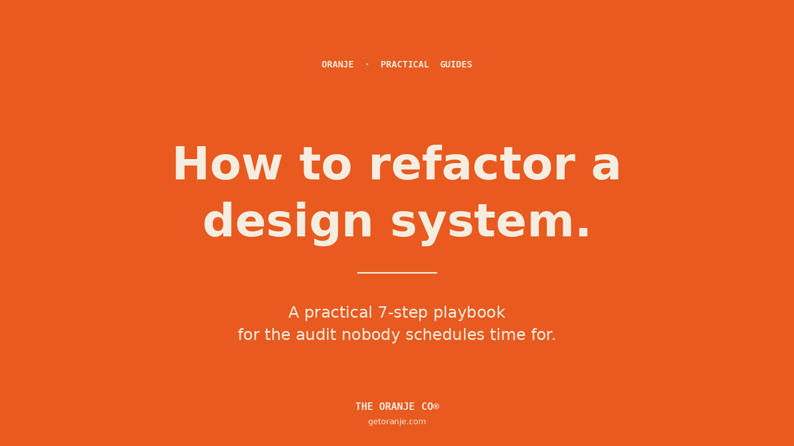
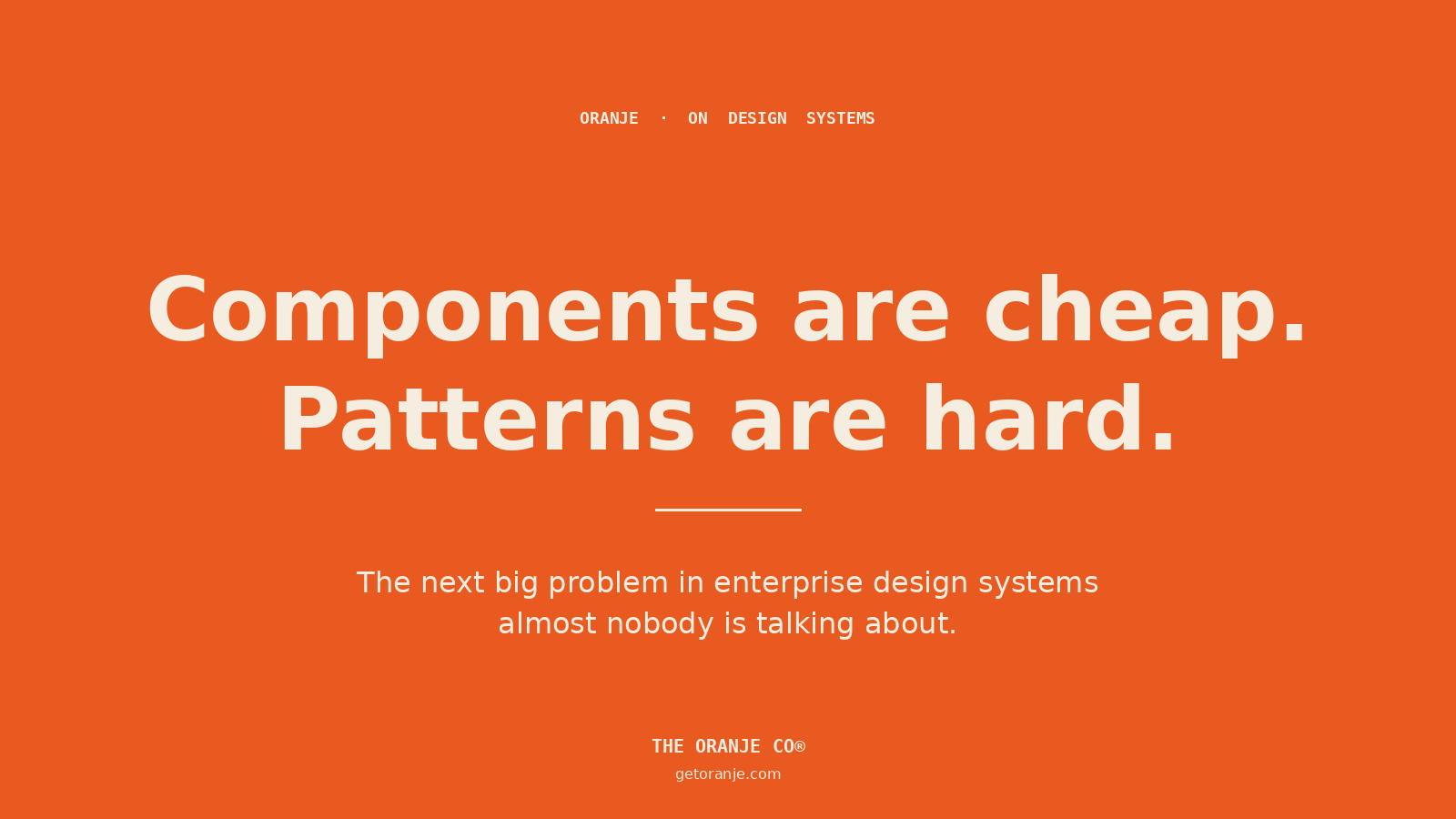
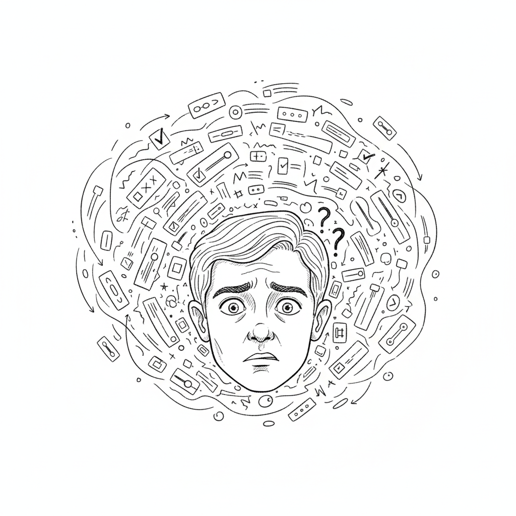
The audit nobody schedules time for, the cleanup nobody volunteers for, and how AI is quietly changing both.
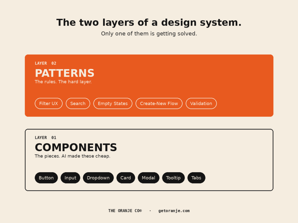
Every enterprise design system eventually develops the same illness.
You ship a few features. Different squads. Different sprints. Different “we just need it live by Friday” moments. Each decision is reasonable in isolation. Two years later you open your token file and find this:
color-blue-500: #2776BA
brand-blue-500: #2776BA
Same hex. Different names. Used inconsistently across the product.
You also have hardcoded values in components that nobody got around to tokenising, three subtly-different spacing scales, four ways to write a button hover state, and a design system Slack channel where someone asked “is –text-primary the same as color-text-base?” eight months ago. Nobody ever answered.
This is the unglamorous middle of every design system’s life. And it’s where the bill comes due , usually at the worst possible moment, when you’re trying to ship a rebrand, build dark mode, or migrate to a new front-end framework.
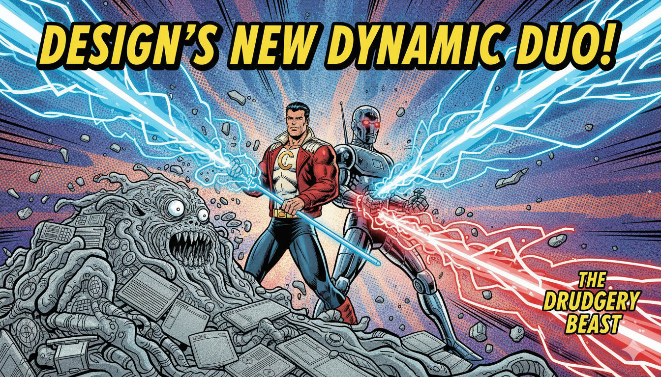
The good news: there’s a method to this work. The other good news, finally arriving in 2026, is that AI can take a meaningful chunk of the tedium off your plate , if you set it up correctly.
Here’s the practical playbook we’ve been running internally and with clients at The Oranje Co.
Before you start: signs you need a refactor
Don’t refactor a healthy system. But do refactor if you’re seeing any of these:
- The same value lives under multiple token names
- Designers and developers are arguing about which token to use
- Hardcoded hex/px values are creeping back into components
- A new joiner can’t tell which patterns are canonical
- You’re about to do a rebrand, dark mode launch, or framework migration
- Visual inconsistencies are showing up across product surfaces
- Your component library exists but adoption is patchy
If you nodded at three or more, you have what we’ve been calling pattern debt , and a refactor is overdue.
A note on the prompts below. Each step ends with a copy-paste prompt you can drop into Claude Code, Cursor, GitHub Copilot, or any agent that can read your codebase. They’re written to be strict , explicit scope, hard stops, no autonomous decisions where a human needs to be in the loop. Adjust the bracketed sections to your stack and conventions before running. Use them as starting points; refine for your team.
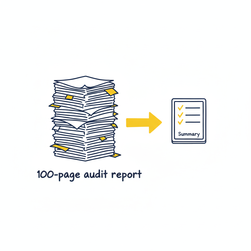
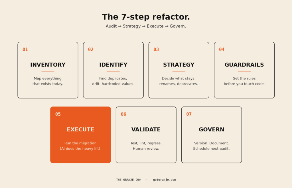
Step 1 , Inventory: map everything that exists today
Before you decide what the system should be, document what it is.
This step is almost always skipped, and it’s the reason most refactors fail. You can’t fix what you haven’t measured.
A complete inventory captures:
- Every defined token (name, value, type, file location)
- Every hardcoded value in components (yes, every one)
- Every component variant currently in production
- Every place a token is referenced across the codebase
- Every place the codebase diverges from the design files
Lucas Rappart puts it well: “Before you decide what the system should be, spend a week mapping what already exists. Open every page of the product.” A full inventory of an enterprise product can take a week of focused work. Don’t skip this.
Where AI helps here: crawling the codebase for token usage, hardcoded values, and component instances is exactly what modern code agents do well. Claude Opus 4.8’s 1M-token context window is on by default, meaning the model can hold an entire large codebase in working memory while executing. What used to take a week of grep-and-spreadsheet work now takes hours.
What you produce: one master inventory spreadsheet or database. Every token, every reference, every hardcoded value. This becomes the source of truth for the entire refactor.
📋 Prompt to copy-paste:
You are auditing a design system codebase. Crawl the entire repository at the path I provide and produce a complete inventory as a CSV with these columns:
– token_name
– token_value (hex / px / rem / etc.)
– token_type (color / spacing / typography / radius / shadow / motion / other)
– defined_in_file (full path)
– defined_at_line
– usage_count (how many times this token is referenced across the codebase)
– usage_files (top 10 files where it is used)
Then produce a second CSV listing every hardcoded value found inside component files (raw hex, raw px, raw font-size declarations) with:
– hardcoded_value
– value_type
– file
– line
– component_or_context
Do not modify any files. This is a read-only audit. Output: two CSVs and a one-paragraph summary of total tokens, total hardcoded values, and top 5 most-used tokens.
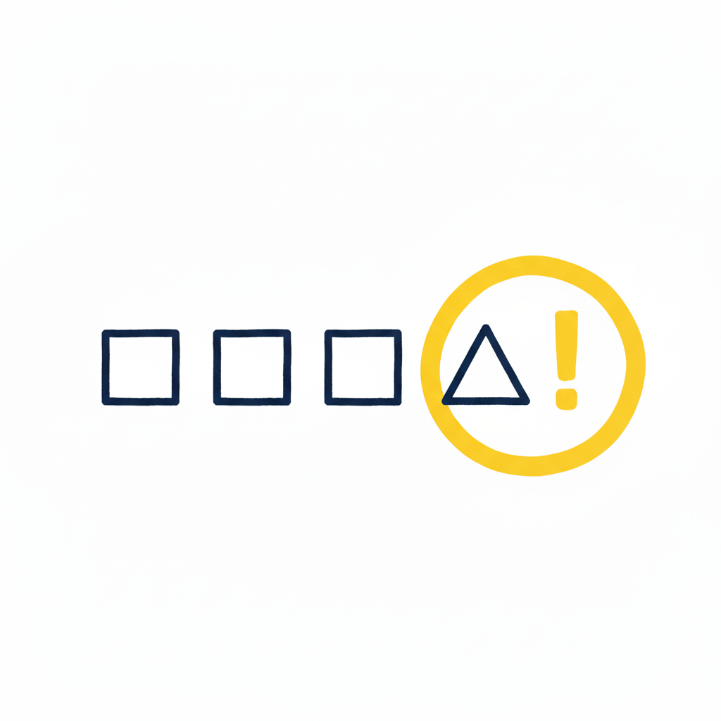
Step 2 , Identify: find duplicates, drift, and hardcoded values
Now you analyse the inventory. You’re looking for three categories of mess:
Duplicates. Same value, different names. color-blue-500 and brand-blue-500 both at #2776BA. The classic enterprise inheritance.
Drift. Near-duplicates that should be the same. #2776BA and #2876BC , close enough that no user would tell them apart, but they exist as separate tokens because two designers tokenised them independently.
Hardcoded values. Raw hex codes, raw pixel values, raw font sizes living directly in components. These are tokens that should exist but don’t.
A UX Planet piece on design tokens names the root cause directly: “Over time, different teams start using different names for the same color, leading to confusion and duplicate tokens. When the brand color changes, updating these scattered tokens becomes an overwhelming task.”
That’s exactly the pattern.
Where AI helps here: AI is genuinely excellent at this kind of structured analysis. Feed it your inventory, ask it to flag duplicates and near-duplicates with a similarity threshold, and you’ll have a clean exception report in minutes. Token extraction and analysis tooling can reduce manual labour by up to 50%.
What you produce: a clean list of every duplicate token, every drift instance, and every hardcoded value, with locations.
📋 Prompt to copy-paste:
Using the inventory CSVs from Step 1, identify three categories of issues:
1. EXACT DUPLICATES , tokens with identical values but different names. Group by value. For each group, list every token name, file location, and total usage count.
2. NEAR-DUPLICATES , tokens with values within a 2% similarity threshold for colors (use Delta E ≤ 3 for color values) or within 2px for spacing. Group by similarity cluster.
3. TOKEN CANDIDATES , hardcoded values that appear 3 or more times across the codebase and should be tokenised. Group by value and propose a token name following BEM-style naming (e.g., color-blue-500, space-md, font-size-lg).
Output a single report in markdown with three sections, one per category. For each item include: locations, usage count, and a one-line note on suspected cause (e.g., “likely independent tokenisation by separate squads”). Do not propose fixes yet. This is diagnostic only.
Step 3 , Strategy: decide what stays, renames, and deprecates
This is where humans take back the wheel.
For every duplicate or near-duplicate you found, you need an explicit decision:
- Keep , this token is canonical, leave it alone
- Rename , same value, better name (preserve the value, alias the old reference)
- Merge , multiple tokens collapse into one
- Deprecate , this token is being removed, mark for migration
- Add , a new token needs to exist (often a new generic scale)
The reason this stays human: the value is mechanical, but the naming convention is strategic. Are your tokens organised by colour family (blue-500), by brand (brand-primary), or by semantic role (color-action-primary)? Different choices serve different scaling needs. Get this wrong and you’ll refactor again in eighteen months.
Atlassian’s migrate to tokens guide explicitly emphasises this: their codemods generate suggestions, but “manual review is required.” Strategy doesn’t automate.
What you produce: a token-by-token migration map. Status column. Impact column. Proposed solution column. (If you’ve seen the spreadsheet floating around the design ops community for this kind of work, you know what we mean.)
📋 Prompt to copy-paste:
Using the duplicates and near-duplicates report from Step 2, generate a token migration map as a CSV with these columns:
– new_token_name
– new_value
– current_token_name (in codebase)
– current_value
– status (one of: KEEP / RENAME / MERGE / DEPRECATE / ADD / VALUE_CHANGED)
– impact (one-line description of what changes in the codebase)
– proposed_solution (the exact action: e.g., “rename color-blue-* to color-brand-blue-* and add alias”, “merge into single token”, “deprecate with 6-month sunset”)
– breaking_change (yes/no)
– affected_files_count
I will provide the naming convention to follow. Apply these rules:
– Brand-critical tokens MUST be preserved (do not change values, only rename)
– Generic scales should follow [INSERT YOUR CONVENTION e.g., “Tailwind”] naming
– Deprecated tokens get a comment marker explaining the migration path
– No autonomous decisions on tokens flagged as “ambiguous” , list those separately for human review
Output: the CSV migration map + a separate “needs human decision” list.
Step 4 , Guardrails: set the rules before you touch code
Before any code changes happen, lock down:
- Naming convention. Document it. Publish it. Make it impossible to add a token that violates it.
- What’s untouchable. Brand-critical tokens. Production-blocking surfaces. Customer-facing flows mid-migration.
- What’s reversible. Which changes you can ship behind a feature flag, which need full deployment.
- Who approves what. Single source of truth on who signs off on the migration plan, and who signs off on each merged PR.
- What “done” means. Concrete acceptance criteria. Visual regression passing? Zero hardcoded values? Adoption metric above X%?
Mike Cvet, who has written some of the sharpest material on migrations at scale, points out: “Will Larson says migrations are the sole scalable fix to tech debt. This makes sense if you think of migrations as refactoring at scale.” The implication: treat your refactor as a real migration project, not a cleanup sprint. That means real guardrails.
What you produce: a one-page document anyone on the team can read in 5 minutes that answers “what are the rules of this refactor.”
📋 Prompt to copy-paste:
I am about to run a design system refactor. Help me draft a one-page “rules of engagement” document covering:
1. NAMING CONVENTION , the exact rules for new token names (prefix, separator, scale, semantic vs literal). Include 5 examples of valid names and 5 examples of invalid names with reasons.
2. UNTOUCHABLE LIST , tokens that cannot change under any circumstances during this refactor. (I will provide the list.)
3. REVERSIBILITY MATRIX , for each category of change (rename / merge / deprecate / value change), state whether it can ship behind a feature flag, requires full deployment, or needs a coordinated release.
4. APPROVAL CHAIN , who signs off on the migration map, who reviews each PR, who owns final merge. (I will provide names/roles.)
5. DEFINITION OF DONE , concrete acceptance criteria. Visual regression passing. Zero hardcoded values added. Token usage above X% adoption. Documentation updated.
Output as a clean markdown document suitable for pasting into our team wiki.
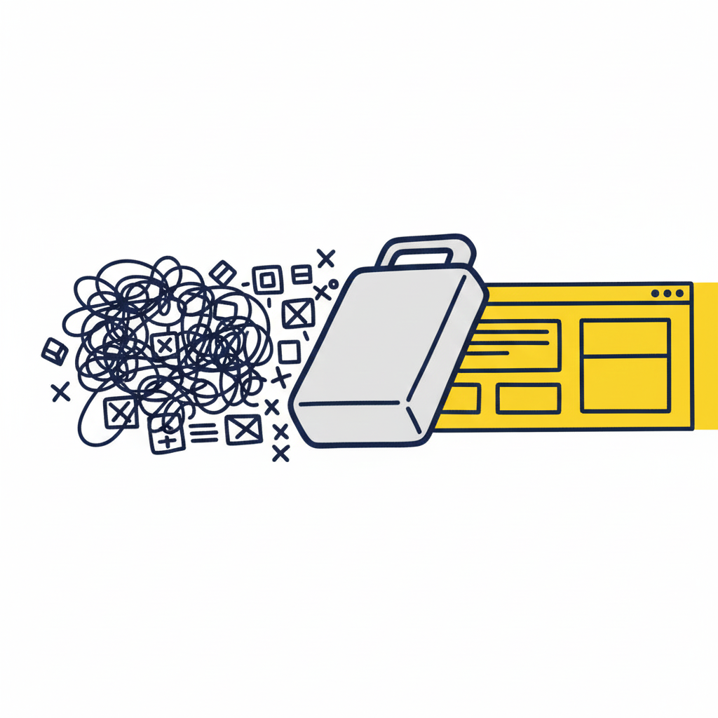
Step 5 , Execute: run the migration (AI does the heavy lift)
This is the step everyone wants to skip to. With proper Steps 1–4 in place, it’s also the step that’s changed the most in the last 18 months.
For each token in your migration map, the AI agent’s job is mechanical:
- Find every reference to the old token across the codebase
- Replace it with the new token (or alias) per the migration map
- Generate the changes as a reviewable PR
- Flag any usage that doesn’t fit the migration rules for human attention
Claude scores 82.1% on SWE-bench Verified , the industry-standard benchmark for resolving real GitHub issues in large codebases. As of February 2026, Claude Code was authoring roughly 4% of all public GitHub commits , about 135,000 commits a day, with a single-day peak of 326,000. Codebase-scale refactoring with AI is no longer experimental. It’s production reality.
That said: do NOT let the AI execute autonomously across thousands of files.
The right pattern is scoped, reviewable batches. Migrate one token family at a time. Open a PR for each. Run tests on each. Merge each only after a human reviews the diff. Yes, this is slower than a single grand migration. It’s also the difference between a clean refactor and a production incident.
What you produce: a series of small, reviewable PRs that incrementally migrate the codebase, with full test coverage on each.
📋 Prompt to copy-paste:
You are executing a design system migration based on the approved migration map I am providing. Follow these strict rules:
1. SCOPE , process ONE token family per execution (e.g., all color-blue-* tokens together, then stop). Do not bundle multiple families in a single PR.
2. FOR EACH TOKEN IN SCOPE:
– Find every reference across the codebase
– Apply the migration action from the map (rename / alias / merge / deprecate)
– Update the token definition file
– Update any documentation that references the token
– Run the existing test suite locally to confirm no regressions
3. OUTPUT , produce a single Pull Request with:
– A clear PR title in this format: “refactor(tokens): migrate [family] per migration map row [X-Y]”
– A PR description listing every file changed, every token migrated, and any edge cases encountered
– Commit history broken into logical commits (definition changes / usage updates / docs)
4. HARD STOPS , refuse to proceed and ask for human input if:
– A token in scope has more than 200 usages (flag for batched migration)
– Migration would touch any file in the UNTOUCHABLE LIST
– The action would create a circular alias
– You encounter a usage pattern not covered by the migration map
5. REPORT , at the end, output a summary of what shipped, what was deferred, and what needs human review.
Begin with the first token family in the migration map and stop after producing the PR. Wait for human review before continuing to the next family.
Step 6 , Validate: test, lint, regress, and have a human review
For every PR, run the full validation stack:
- Visual regression tests. Compare every screen pre- and post-migration. Flag any pixel-level differences. Tools like Applitools, Chromatic, and Percy do this well.
- Linting. New token usage should pass your naming convention rules. Hardcoded values should fail the lint.
- Type checking. Particularly important for TypeScript codebases with typed token references.
- Smoke tests. Critical user flows should pass automated end-to-end testing.
- Human visual QC. A designer who knows the system should look at every changed surface. AI cannot tell you that something “feels” wrong.
The recent piece on automating design system audits suggests prompts like: “Audit my prototype to find hardcoded values (colors, spacing, typography) that should use design tokens from our system.” That same approach works for validation , point the agent at the post-refactor codebase and ask it to flag anything that violates the rules.
What you produce: a clean test pass for every PR before merge, and a designer’s sign-off on visual changes.
📋 Prompt to copy-paste:
Validate the PR I am providing for a design system token migration. Run these checks and produce a structured validation report:
1. CONVENTION CHECK , every new or modified token name must match our naming convention. Flag any that don’t with file/line.
2. HARDCODED VALUE CHECK , scan the diff for any hardcoded hex codes, raw px values, or raw font sizes that were added (not just untouched). Flag each one as a regression.
3. ALIAS LOOP CHECK , confirm no token aliases to itself (directly or indirectly through another alias).
4. USAGE COMPLETENESS CHECK , for every renamed token in this PR, confirm zero remaining references to the OLD name anywhere in the codebase (outside of explicit deprecation comments).
5. BREAKING CHANGE SURFACE , list every component, screen, or route whose visual output could change because of these token changes. This becomes the visual QC checklist for the human reviewer.
6. ACCESSIBILITY SPOT CHECK , for color token changes, recalculate WCAG contrast ratios for the most common foreground/background pairings. Flag any pair that drops below AA.
Output: a markdown report with one section per check. Pass/fail for each. List of human-review items at the end.
Step 7 , Govern: version, document, and schedule the next audit
The refactor isn’t done when the migration ships. It’s done when you’ve built the infrastructure to prevent the same drift from accumulating again.
That means:
- Semantic versioning on your token library (major, minor, patch). Every change ships with release notes. Parallel HQ recommends introducing this explicitly: “Deprecate old components gradually and provide migration paths… most teams don’t version tokens; adopting versioning prevents breaking changes.”
- Updated documentation. Every new token, naming convention, and pattern decision is captured in your design system docs. Not in a Notion someone forgets about. In the same repo as the tokens themselves.
- Linting in CI/CD. Hardcoded values should fail the build. Non-conformant token names should fail the build. The system enforces itself going forward.
- A scheduled re-audit. Put it on the calendar. Every six months. Token sprawl is not a one-time problem.
- Clear ownership. A named person or small team owns the system. They review proposed additions before they merge.
What you produce: a maintained, versioned, governed design system , and a calendar invite for the next audit.
📋 Prompt to copy-paste:
Help me set up governance infrastructure for our design system so the drift we just refactored doesn’t accumulate again. Generate the following:
1. SEMANTIC VERSION LOG TEMPLATE , a markdown template for tracking token library releases (major / minor / patch) with sections for: what changed, why, migration notes, deprecation timeline.
2. CONTRIBUTION GUIDELINES , a one-page doc covering: how to propose a new token, the review process, who approves additions, and the criteria for rejection (with examples).
3. CI/CD LINT RULES , generate the lint configuration (for Stylelint or ESLint, my preference) that:
– Fails the build on hardcoded color, spacing, or font-size values
– Flags use of deprecated tokens
– Enforces our naming convention on any newly added tokens
– Warns on tokens that have not been used in the last 90 days (drift indicator)
4. RE-AUDIT SCHEDULE , a recurring 6-month audit checklist that I can paste into our team calendar, including: what to inventory, what to flag, who runs it, and what the output looks like.
5. OWNERSHIP DOC , a short doc naming the design system owner(s), their responsibilities, escalation path, and how external contributors interact with them.
Output all five as separate markdown documents I can paste directly into our team wiki and repo.
What AI can and can’t do (honest answer)
After running this playbook a few times, here’s the honest division of labour:
AI is great at:
- Crawling and inventorying the codebase
- Identifying duplicates and near-duplicates
- Generating migration maps from explicit rules
- Executing mechanical code transformations across files
- Producing reviewable PRs with proper commit hygiene
- Running automated validation passes
AI is not great at:
- Deciding the naming convention in the first place
- Making strategic calls about which token is canonical
- Understanding brand context that isn’t documented anywhere
- Catching that something “feels” off visually
- Owning the system longer-term
The pattern is clear. AI takes the mechanical pain off the human’s plate so the human can focus on judgment. That’s the whole game.
The Praxen piece on design tokens meeting agents puts the AI risk well: “Agents are powerful, but they’re also extremely confident liars if you let them be.” The fix is constraint , give the AI explicit rules, a whitelisted set of tokens it can use, and a strict review boundary it cannot cross unilaterally.
This is what we call governed velocity. Speed and an audit trail. Not vibe coding.
Common pitfalls
Three traps to avoid:
1. Refactoring without inventorying first. You’ll discover edge cases mid-migration that force you to start over. Always inventory first.
2. Letting the AI execute autonomously across thousands of files. Yes, it’s tempting. No, it’s not how production refactors work safely. Small batches, reviewable PRs, every time.
3. Skipping the governance step. Every refactor that doesn’t end with versioning + linting + scheduled re-audits will regenerate the same mess within 18 months. The refactor isn’t complete without it.
Where Oranje fits
We built The Oranje Co for the exact scenario this playbook describes design systems that need to evolve faster than enterprise governance traditionally allows.
The bet isn’t that AI replaces the refactor. It’s that AI, properly guard-railed, removes 60-70% of the manual tedium so design system teams can spend their time on the decisions that matter: strategy, naming, and judgment.
We’ve been running variants of this playbook on real client codebases. Token-by-token migration maps. AI-generated PRs landing inside the client’s own folder structure. Human QC built into the loop. Results that merge instead of triggering a refactoring tax.
Oranje is in beta now, with our enterprise launch coming soon. 🍊
If you’re a design lead or engineering lead carrying serious pattern debt and you’d like to be part of the early enterprise rollout, we’d love to hear from you.
Closing thought
Most design system content focuses on building a system from scratch. Almost nobody writes about the much messier reality: refactoring a system that’s already in production, has thousands of usages, and absolutely cannot break customer flows during the transition.
That’s where most enterprise teams actually live. And it’s the work that quietly determines whether your design system survives its third year.
The playbook above isn’t novel. The methodology has existed in pieces for years. What’s new in 2026 is that AI can finally take the mechanical 60% off your team’s plate, so the judgment-heavy 40% can get the attention it deserves.
Pattern debt isn’t permanent. It just needs a process. And maybe an accomplice.
Further reading
A curated list of the best resources to go deeper on each part of the playbook.
On design system audits
- Netguru , How to Run a Design System Audit: A Step-by-Step Guide , the cleanest 6-step audit framework, with practical checklists for each stage.
- Figma Community , How to do a design system audit , a Figma template with step-by-step guide and webinar walkthrough.
- Belka , Design System Audit Article + Webinar , practical perspective from a team that does these for clients.
On design tokens specifically
- Atlassian , Migrate to Tokens , the most comprehensive migration guide from a large, mature design system. Includes codemods.
- UX Planet , Design Tokens: A Double-Edged Sword , sharp analysis of common token failure modes and how to avoid them.
- Nulab , Everything You Need to Know About Design Tokens , comprehensive primer, good for getting a team aligned on what tokens are.
- Boldare , Design Tokens Explained: A Practical Guide , focuses on the audit-first approach for retrofitting tokens into existing codebases.
- Penpot , How to Create an Intuitive Design Token System , strong on token taxonomy and accessibility-aware token pairs.
On migrations at scale
- Mike Cvet , Migrations: Refactoring for Your System , the foundational thinking on large-scale code migrations as the only scalable fix to tech debt.
- Lucas Rappart , Building a Design System from Zero in 6 Weeks , pragmatic playbook from a Series A engagement, with strong advice on the “force a refactor sprint” approach.
On AI-assisted design system work
- The Design System Guide , How to Automate Design System Audits and Testing , practical AI prompts for design system audits, behaviour testing, and accessibility.
- Praxen , When Design Tokens Meet Agents , sharp essay on combining design tokens with AI agents, including how to prevent agents from hallucinating token names.
- Think Design , Design Tokens and AI: Scaling UX with Dynamic Systems , overview of how AI is transforming token creation, synchronisation, and naming.
On governance & maintenance
- Parallel HQ , Maintaining a Design System: Scaling Your UI/UX in 2026 , strong on semantic versioning, deprecation, and metrics that actually matter.
- Zeroheight , 2026 Design Systems Report , the most current data on what design system teams are actually struggling with. Adoption remains the #1 challenge for the fifth year running.
On tooling
- TokenOps , Figma Variables/Tokens Linter , purpose-built Figma plugin for token audits, duplicate detection, and remap/migration.
The Oranje Co is building infrastructure for the creative economy , closing the gap between design, system, and production code. Currently in beta, with enterprise launch coming soon. getoranje.com