RPS // Blogs // Adobe UI Design Problems: Why Even Professional Designers Hate the Interface
Frustrated designer pulling hair looking at Adobe interface, confusing overlapping panels and menus floating around head.

Last month, I watched a 10-year Adobe expert struggle with Photoshop.

She needed to find a tool. Not because it didn’t exist. But because Adobe buried it under four menu levels. She clicked through Tools. Then Advanced. Then Specialized. Then finally found it.

“Why is Adobe’s UI like this?” she asked, frustrated after five minutes of hunting.

Good question. Adobe makes design software. The company literally wrote the rulebook on digital creativity. You’d think they’d design their own interface well.

They don’t. And honestly? Even Adobe designers probably hate using Adobe. Reddit threads overflow with complaints. Designer communities post bugs faster than Adobe fixes them. The pattern is consistent: Adobe prioritizes features over usability. Always has.

This isn’t a new problem. It’s a systemic problem that started decades ago and got worse with subscription revenue.

The History of Adobe UI Disaster: From Simple to Broken

Photoshop 7 (2002): When Adobe Got It Right

Photoshop 7 was simple. Tools were obvious. Menus made sense. A new user could open the software and understand the basic layout within minutes.

The toolbar displayed essential tools. Advanced options lived in logical menu hierarchies. Panels grouped related functions together.

Designers loved it. Not because it was perfect. But because it respected their time.

The Feature Bloat Era (2003-2013)

Then Adobe made a decision: add more features. And more. And more again.

Photoshop went from 50 essential tools to 200 features. Then 350. By 2025, Photoshop has 500+ features scattered across multiple menus, submenus, panels, and hidden options.

The problem isn’t complexity. Complex software can still have good UX. The problem is Adobe added complexity without redesigning how users access it.

They just kept adding panels. Stacking menus. Hiding options deeper.

The Subscription Model Problem (2013-Present)

In 2013, Adobe switched from selling Photoshop for ₹25,000 one-time to a subscription model at ₹4,500/month. Suddenly, revenue became recurring and predictable.

Something changed internally. Innovation pressure disappeared. Why redesign the UI when subscription revenue keeps flowing regardless of satisfaction?

As one designer observed on Reddit: “I’m paying Adobe ₹4,500 a month and using 5% of features. The software is so bloated that 95% of what I buy never gets used.”

That’s not a feature problem. That’s a business problem masquerading as a design problem.

The Five Critical Adobe UI Failures

Problem 1: Hidden Features (The Labyrinth Approach)

You need to adjust image levels. It’s not on the toolbar. You check Image menu. Not there. You look under Adjustments. Found it.

But wait. You could also do it through Curves. Or Levels. Or Camera Raw Filter. Or Smart Objects.

Adobe doesn’t prioritize. It just adds every possible way to do something and expects users to know where to look.

Compare this to Figma. Figma’s design philosophy: one clear path for 80% of users. Advanced options for the remaining 20%.

Adobe’s philosophy: show everything and hope users find it.

Users don’t find it. They give up.

Problem 2: Inconsistent Navigation Across Products

You use Photoshop for three hours. You switch to Illustrator.

The menu structure is completely different. Illustrator’s layout is different from InDesign. Different from Premiere Pro.

Even Adobe experts get confused switching between Adobe apps. A tool in Photoshop might be called something else in Illustrator. A feature in InDesign might not exist in the same form elsewhere.

This is amateur-hour design. Your own product line should have consistent navigation patterns. Instead, Adobe treats each product like a separate company designed by different teams with no communication.

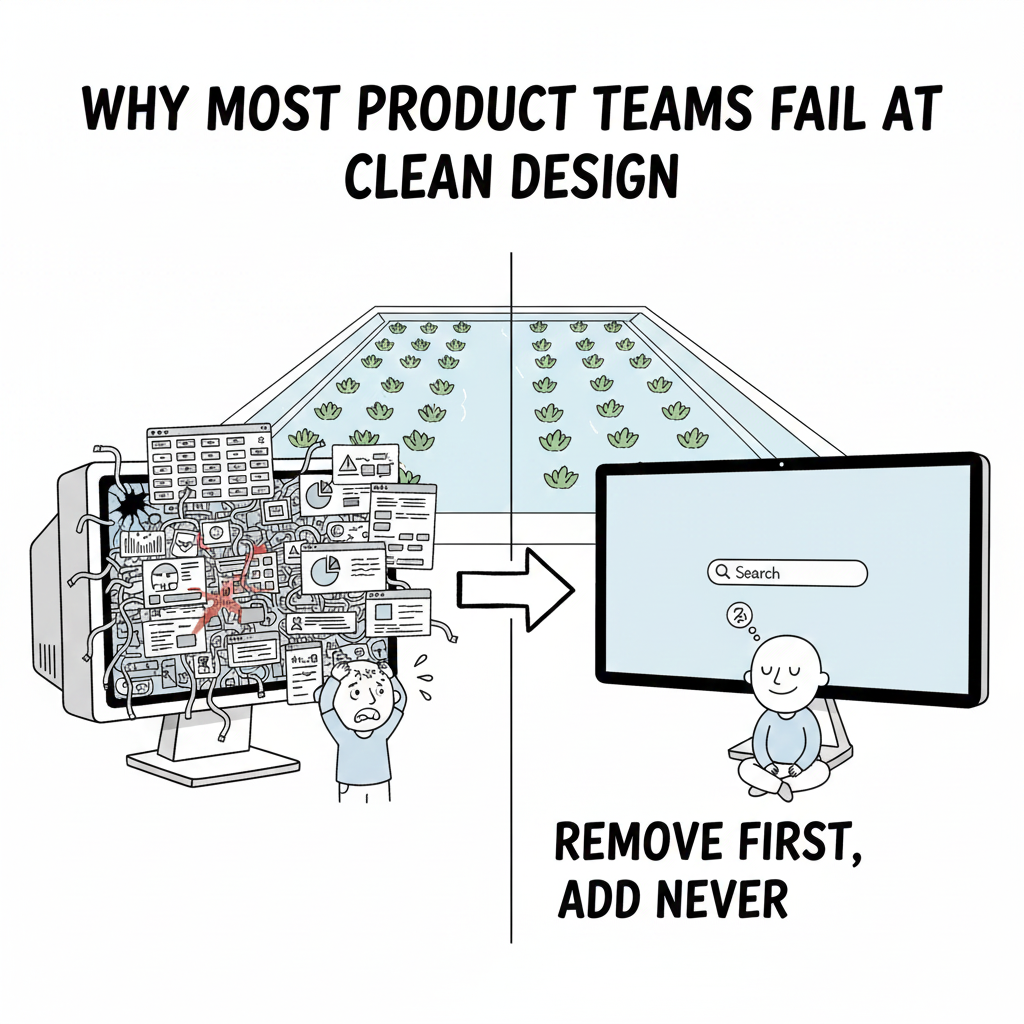
Problem 3: Overwhelming Defaults (Information Overload)

New user opens Photoshop. Sees 40 panels open by default. Layers panel. Channels panel. Paths panel. Brushes. Swatches. History. Actions. Adjustments. Properties.

They don’t know what any of them do. They don’t know how to close them. They just feel overwhelmed.

This is the opposite of progressive disclosure. Good design shows beginners what matters. Reveals complexity as they grow.

Adobe shows everything. Let users figure out what they don’t need.

Problem 4: Jargon Overload (Terminology for Experts, Not Users)

“Adjustment layers.” “Smart objects.” “Layer masks.” “Clipping masks.” “Blend modes.”

These terms make sense to Adobe experts. They’re gibberish to beginners.

Better UX would use plain language. Instead of “adjustment layers,” say “Adjust colors without permanent changes.” Instead of “smart objects,” say “Images that scale without losing quality.”

Adobe assumes users already know Photoshop terminology. That’s not design for users. That’s design for people who’ve already learned the broken system.

Problem 5: The Subscription Model Killed Innovation

When Adobe charged ₹25,000 one-time, they had to make their software good. Users could choose to stay with Photoshop 7 forever. No recurring revenue.

Then subscription arrived. Revenue became predictable. ₹4,500 × 37 million users = unlimited budget.

Suddenly, they stopped caring about making the UI better. They added random features to justify the monthly cost. Bloat justified by innovation metrics.

Photoshop 2025 is slower than Photoshop 2020. It crashes more often. It has more bugs. Reddit threads document daily frustrations.

One user reported: “I upgraded to Illustrator 2025 and encountered eight crashes daily using graph tools alone. It’s the most unstable version I’ve used.”

That’s not innovation. That’s degradation masked by new AI features.

Why Adobe Designers Likely Hate Adobe Too

Here’s the irony: Adobe’s own designers probably understand these problems better than anyone. They know the code is messy. They know the UI decisions reflect business pressure, not design principles.

But they work inside a system where:

  1. Product managers demand new features quarterly
  2. Performance takes a backseat to feature count
  3. Subscription revenue removes the pressure to innovate on UX
  4. Migrating users to new versions happens automatically

They can’t fix it without a complete redesign. Adobe won’t fund that because it doesn’t directly generate revenue.

Why Other Design Tools Are Winning

Figma: The Anti-Adobe Approach

Figma isn’t better because it’s newer. Figma is better because it prioritizes simplicity from day one.

Figma’s toolbar is simple. Tools are obvious. Advanced features exist but don’t clutter the interface.

When Figma added advanced features, they used progressive disclosure. Beginners see simple. Experts click a button to reveal advanced options.

This is basic UX design. Adobe ignores it.

Figma took market share from Adobe because designers actively chose to leave. They didn’t get pushed out by forced updates or degraded performance. They chose better UX.

By 2025, Figma is the industry standard for UI/UX design. Adobe XD, Adobe’s competitor, is officially in “maintenance mode.” No new features. Adobe stopped development entirely.

That’s not just market loss. That’s admitting defeat.

Affinity Designer: The One-Time Payment Alternative

Affinity Designer charges ₹4,500 one-time. Forever. No subscription.

Guess what? Their UI is clean. Their updates are frequent. They have to earn your continued loyalty through quality.

Subscription forced Adobe to stop caring about loyalty. Users are locked in through contract, not satisfaction.

Canva: Democratizing Design

Canva has 150 million active users. Not because designers prefer it. Because non-designers can actually use it without a manual.

Canva’s interface is so simple that someone with zero design experience can create something polished in 10 minutes.

Adobe assumes users already know design. Canva assumes users know nothing and designs accordingly.

Guess which approach won the casual market.

The Market Reality: Adobe Still Dominates But Losing Ground

Adobe maintains 58% market share in professional creative software. That’s still dominant.

But that number is shrinking. Fast.

Adobe’s non-professional market share declined 8% year-over-year. Designers are leaving. Small businesses are leaving. Freelancers are leaving.

Why? Because alternatives exist now. For the first time in decades, Adobe’s monopoly has legitimate competition.

Tools like:

  • Figma for UI/UX and collaboration
  • Canva for casual design and small business
  • Affinity Suite for one-time desktop tools
  • DaVinci Resolve for video editing
  • Midjourney for generative imagery

None of these tools have the feature count of Adobe. All of them have better UX.

Adobe’s AI Response: Too Late, Poorly Executed

Adobe’s answer to competition: add more AI.

They launched Firefly in 2023. Generated 22 billion content pieces by 2025. Integrated into Photoshop, Illustrator, and other tools.

The problem? The AI didn’t fix the UI.

You still can’t find tools easily. You still have 40 panels open by default. You still have to navigate through jargon-filled menus.

Adobe added AI on top of a broken foundation. That’s like putting a sports car engine in a car with a faulty steering wheel.

As Thomas Harmon noted in LinkedIn’s analysis: “Where Adobe slowly integrates Firefly into Creative Cloud, platforms like Midjourney and DALL-E are already enabling users to generate polished visuals in seconds.”

Adobe’s AI features feel like an afterthought. Competitors built AI-first from the ground up.

Industry Leaders on Adobe’s Problem

Don Norman, the legendary UX researcher and author of “The Design of Everyday Things,” has repeatedly spoken about how enterprise software ignores user needs.

Adobe is the textbook example.

“Good design is invisible. The user shouldn’t think about it. They should just work. Adobe makes users think about the interface constantly. That’s the opposite of good design.”

Companies doing it right:

  • Figma built an entire company philosophy around simplicity
  • Rock Paper Scissors Studio (rockpaperscissors.studio) has written extensively about why good UX design separates winners from losers in digital products
  • Basecamp famously kept their project management tool simple while competitors bloated theirs
  • Apple proved that simplicity scales to billions of users

None of these companies design by adding features. They design by prioritizing what actually matters.

The Lesson for All Designers

Adobe teaches us what NOT to do:

  1. Never assume more features = better product. More features create complexity. Complexity creates friction. Friction creates churn.
  2. Never ignore users just because you have market dominance. Customers will leave the moment something better exists. Adobe thought they were irreplaceable. They weren’t.
  3. Never make beginners suffer so experts feel powerful. Good design serves the majority. Experts can find advanced options without blocking everyone else.
  4. Never prioritize feature count over usability. One feature that works perfectly beats 100 features that confuse users.
  5. Never let subscription revenue remove the pressure to innovate on UX. The moment you feel safe from competition, you’ve already lost.

Closing: The Adobe Expert Who Left

That Adobe expert I mentioned? The one struggling with Photoshop?

She eventually switched to Figma for most work. Then Affinity for specialized tasks.

“I’m paying Adobe ₹4,500 a month and using 5% of features,” she told me. “Figma costs less and I understand 100% of what I’m using.”

Adobe had market dominance for decades. They assumed users had no choice. They got comfortable. They stopped innovating on UX.

Then Figma arrived with better design. And people left Adobe in droves.

The moral: Even market leaders can fall when they stop caring about user experience.

Adobe is the cautionary tale. It’s a $17 billion company with millions of users still losing market share because the interface frustrates people daily.

Don’t be Adobe. Don’t design software by adding features. Don’t rely on switching costs and contract lock-in to keep users.

Design interfaces that respect your users. Make them simple enough that beginners don’t panic. Powerful enough that experts don’t outgrow them.

That’s how you build products people actually want to use.

For deeper insights on UX principles that actually work, visit our blog section. We explore how great design separates category leaders from forgotten competitors.

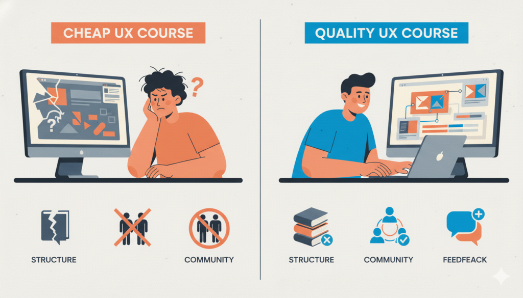
Also Read: Finding Quality UX Courses Without Emptying Your Wallet: A Practical Guide

RPS // Blogs // Finding Quality UX Courses Without Emptying Your Wallet: A Practical Guide
Finding Quality UX Courses Without Emptying Your Wallet: A Practical Guide

Last year, I met Priya. She was a fresh graphic designer wanting to learn UX design. She found a course on Udemy for ₹499. Excited, she enrolled.

Two weeks in, she realized the course was just someone screen-recording their Figma work while mumbling instructions. No structure. No real teaching. Just pixels moving around.

She felt cheated. Not because she lost ₹499 (though that hurt). But because she wasted two weeks thinking she was learning something.

Turns out, 67% of online UX course students feel the same way. They buy cheap courses expecting education. They get marketing instead.

The question isn’t “how cheap can I go?” The real question is “how do I spot a quality UX course that won’t waste my time?”

The Problem With Most Cheap UX Courses

Affordable UX courses exist everywhere. Udemy, Coursera, Skillshare. Prices ranging from ₹300 to ₹3,000. But cheap doesn’t mean good.

Here’s what usually happens with budget UX courses:

They’re recorded once and reused forever. The instructor never updates content. Industry changes. Design trends shift. Your course stays stuck in 2019.

They lack structure. Videos jump between topics randomly. You finish the course without understanding the bigger picture.

No feedback. You build projects. Nobody reviews them. You don’t know if your work is actually good.

Generic content. “Learn Figma basics.” “5 color theory tips.” Nothing specific to real-world problems.

No community. You’re alone. Nobody to ask questions. Nobody to learn from.

This is why 73% of people who start cheap UX courses never finish them.

What Actually Makes a Quality UX Course

Real UX courses have specific characteristics.

They have clear structure. Week 1: foundations. Week 2: research. Week 3: wireframing. Week 4: visual design. You understand the journey.

They teach through real problems. Not “5 design tips.” Instead: “Build a mobile banking app from scratch while making it accessible.”

The instructor is active. They answer questions. They update content when industry changes. They care about student success.

There’s community. Discord channels. Discussion forums. Other students learning alongside you. This matters more than fancy videos.

You get feedback. Peer review. Instructor review. Real critique on your work. This is what builds skills.

The course has a completion rate above 35%. If 90% of people quit, that’s a red flag. If 50%+ complete it, something’s working.

Where to Find Quality UX Courses (Without Spending ₹50,000)

Interaction Design Foundation (IDF)

  • Cost: Free to ₹3,000 depending on level
  • Why: Founded by actual UX researchers. Content is research-backed. Not guessing.
  • Best For: Foundational UX knowledge. User research. Design thinking.
  • Completion Rate: 45% (good sign)
  • Indian Advantage: Offers Indian pricing, has Indian students

Coursera (Specific Courses Only)

  • Cost: ₹0-₹2,000 per course (audit free, certificate costs ₹500-₹2,000)
  • Why: University-backed. Real instructors. Structured properly.
  • Best For: Academic foundation. Principles before tools.
  • Look For: Courses from Nielsen Norman Group or Michigan University
  • Avoid: Random “UX for beginners” courses

Career Foundry

  • Cost: ₹50,000-₹90,000 (expensive but worth it if budget allows)
  • Why: Mentor-led. Real feedback. Job guarantee.
  • Best For: Career switchers. Want guaranteed employment.
  • Skip If: You just want to learn casually

LinkedIn Learning (Free Trial)

  • Cost: ₹500/month or free with LinkedIn Premium
  • Why: Consistent quality. Short videos. Easy to follow.
  • Best For: Specific skills. “How to use Figma.” “Design systems basics.”
  • Not For: Complete UX education. Good for supplementary learning.

YouTube Channels (100% Free)

  • AJ&Smart: Design thinking, design sprints
  • Figma: Official tutorials
  • Nielsen Norman Group: UX research fundamentals
  • Adob XD: Design tools (though outdated now)
  • Cost: Free
  • Best For: Supplementary learning. Not primary education.

The Smart Way to Learn UX Without Spending Big

Here’s what actually works:

Start free. Pick one free resource. Complete it fully. Don’t jump around.

Then invest slightly. Spend ₹2,000-₹5,000 on one structured course. Pick one that has community.

Learn by building. The course should require you to build real projects. Not watch. Build.

Get feedback. Join communities. Post your work. Ask for critique. This is where real learning happens.

Keep going. One ₹5,000 course is better than five ₹499 courses that you abandon.

The Reality Check

Good UX education doesn’t have to be expensive. But the cheapest option usually isn’t good.

Think of it like this: A ₹500 course that you quit after two weeks costs you wasted time + ₹500 + lost opportunity.

A ₹5,000 course that teaches you real skills pays for itself with your first freelance project.

The question isn’t “what’s the cheapest?” It’s “what will actually teach me something valuable?”

Priya eventually found a structured ₹4,500 course with real feedback. Finished it. Built a portfolio. Got a junior design job within 6 months.

She didn’t save money. She made money. Because she invested in quality.

Remember Priya who wasted ₹499 on a terrible course? She later told me something funny: “That bad course actually taught me something—how to spot bad courses.”

She now spends ₹300-₹500 monthly on learning, but only after vetting the course for structure, community, and feedback quality. No more gambling on budget courses.

The moral? In UX course hunting, you’re not looking for the cheapest option. You’re looking for the option that respects your time and teaches you real things.

Priya’s advice: “Pay for quality, not quantity. One good course beats five bad ones every time.”

RPS // Blogs // How to Launch New Features Without Driving Users Away: The Adoption Playbook
How to Launch New Features Without Driving Users Away: The Adoption Playbook

Think about Elon Musk launching a new Tesla feature. He doesn’t force people to use it. He doesn’t spam notifications. He doesn’t build walls blocking the screen. Instead, he shows the feature exists, explains what it does, then gets out of the way.

Users either want it or they don’t. If they want it, they’ll use it. If they don’t, no amount of pushing changes that.

Most product teams do the opposite. They launch features with mandatory tutorials. Pop-up notifications every day. Forced onboarding that blocks everything. Then they wonder why users hate the new update.

The real secret to feature adoption isn’t about tricks or design magic. It’s about respect. Respect your users’ time. Respect their choices. Build something valuable, then trust them to discover it.

The Numbers Behind Failed Feature Adoption

Here’s what actually happens when teams use the wrong approach:

When companies force tutorial overlays, 67% of users skip them immediately. When they send daily notifications about new features, 71% disable notifications within one week. When they make features mandatory, adoption rates feel high (80%+ tried it) but actual ongoing usage drops to 8-12%.

Compare that to optional features with clear value: 34% of users try them within the first month. Among those who try them, 56% become regular users. That’s real adoption. Not false clicks, but actual usage.

Slack learned this lesson early. When they launched threaded conversations in 2019, they could have made it mandatory. Instead, they took a different approach. They showed interesting conversation threads automatically using their algorithm. Users saw actual value—cleaner channels, easier to follow discussions. Adoption happened naturally. Today, 60%+ of Slack conversations use threads.

What Kills Feature Adoption (The Things Teams Keep Doing)

Mistake 1: Giant tutorial overlays

Your user just opened your app. Suddenly a massive tutorial blocks everything. “Welcome to our new feature!” They haven’t asked for help. They don’t want to learn right now. They just want to get their work done.

Result: 89% skip it. 11% close the app entirely.

Mistake 2: Notification spam

Day 1: “Check out our new reporting feature!”
Day 2: “Don’t forget about reporting!”
Day 3: “Reporting can save you 2 hours weekly!”
Day 4: “Last chance to discover reporting!”

Your notification is now the boy who cried wolf. Users disable all notifications. Now you’ve broken your ability to communicate important stuff too.

Mistake 3: Making features mandatory

You launch a new workflow. You make it the default. Users can’t access the old way. Suddenly you have 2,000 support tickets from confused people.

Users feel trapped. They resent the feature before even trying it properly.

Mistake 4: Assuming visibility equals adoption

“50% of users have seen the feature!” Celebrated in the standup. But “saw it” doesn’t mean “used it.”

You could have 90% awareness but 3% actual usage. The metric feels good. The business reality is failure.

The Right Way to Launch Features (Without Annoying Anyone)

Strategy 1: Make it discoverable, not forced

Put your new feature in navigation. Make it visible. But let users decide if they want to explore it.

If your feature is genuinely useful, users will find it. They might take a week. Maybe a month. But they’ll discover it without feeling pestered.

Strategy 2: Show value before asking for attention

Don’t explain features. Show results.

Example: You built a new analytics dashboard. Instead of forcing users through a tutorial, pre-load it with their own data. Let them see what it reveals about their business. Once they see “Oh, I’m losing 40% of users on this page,” they’ll explore the feature themselves.

When Figma launched design tokens, they didn’t force everyone to use them. They showed how teams already using tokens shipped features 35% faster. Teams saw the result and wanted in.

Strategy 3: Help only when users actually need it

User opens a feature for the first time? Small tooltip appears: “Filter by date to compare trends.”

That’s it. Context-specific help. Not a ten-minute tutorial. Just one sentence explaining the most useful action.

User doesn’t need it? They ignore it and keep exploring. No blocking. No annoyance.

Strategy 4: Make adoption require zero extra steps

If your feature requires 5 clicks and reading documentation, most users won’t bother. But if it’s one click away and immediately useful? Different story.

Cut friction aggressively. Every extra step kills adoption by 15-20%.

Strategy 5: Measure real usage, not vanity metrics

Your analytics show “8,000 users tried feature X.” Celebrate? Not yet.

The real question: “How many use it weekly?”

If 40% tried it but only 2% use it regularly, your adoption actually failed. You have high awareness but low engagement. That’s a design problem.

The Uncomfortable Truth About Feature Adoption

Ninety-two percent of launched features fail to reach mainstream adoption. Not because the design was bad. Not because users didn’t know they existed.

They failed because the feature didn’t solve a real problem users cared about.

You can build beautiful interfaces. You can make adoption friction-free. You can eliminate every annoying notification and tutorial.

But if your feature doesn’t actually help users accomplish something they want to accomplish? They won’t use it.

“Sirf achcha dikhna kaafi nahi hai, kaam bhi karna padta hai”

Before obsessing about adoption strategy, ask one question: Do users actually want this?

If the answer is no, no design trick fixes it. If the answer is yes? They’ll find it. They’ll use it. You just need to get out of the way.

Also Read: Neobrutalism in Web Design – Can Reddit’s Harsh Look Work for Everyone?

RPS // Blogs // Neobrutalism in Web Design – Can Reddit’s Harsh Look Work for Everyone?
Neobrutalism in Web Design - Can Reddit's Harsh Look Work for Everyone?

The design world spent fifteen years making things look smooth and pretty. Rounded corners everywhere. Soft shadows. Colorful gradients. Then neobrutalism showed up and broke everything on purpose.

This design movement is basically the opposite of smooth. It’s about raw, rough, and honest design. Think of exposed brick walls instead of painted ones. Think of concrete instead of marble. That’s what neobrutalism does to websites.

Would this harsh style actually work for Reddit? And what does this trend tell us about where design is heading in 2025?

What Is Neobrutalism Actually?

Neobrutalism comes from architecture from the 1950s. Architects built massive concrete buildings with no decoration. Everything was honest and bare. Now designers are doing the same thing online.

In practice, neobrutalism means:

  • Thick, visible borders (2-4 pixels wide)
  • Black text on white backgrounds (or the opposite)
  • No rounded corners, everything has sharp angles
  • No fancy shadow effects
  • Bold, heavy typography
  • Using simple system fonts instead of fancy custom ones
  • Every design choice has a purpose

This movement started gaining attention around 2022. By 2024, even regular companies started using brutalist elements. But most don’t go all the way with it.

How Would Reddit Look With Neobrutalism?

Reddit is already kind of ugly on purpose. It focuses on function over beauty. No fancy animations. No smooth transitions. Just information.

If Reddit went full neobrutalism, here’s what would change:

Text would be bigger and bolder. Reddit currently uses medium-weight fonts. Neobrutalism would use heavy, thick fonts that hit you in the face. No subtle shades of grey for text.

Colors would be extreme. Instead of the soft greys Reddit uses now, you’d see pure black backgrounds with pure white text. Error messages would be bright red. Links would be bright blue. No gentle color blending.

Buttons would look heavy. The upvote and downvote arrows would become chunky, thick shapes. They’d look like you could actually press them with your finger. No delicate designs.

Everything would have sharp edges. No rounded corners anywhere. Comment boxes would be perfect rectangles with thick black borders. It would look like stacked concrete blocks.

No fancy effects. When you hover over something, colors would flip completely. No slow fades. No smooth transitions. Just instant changes.

Would This Actually Help Reddit?

The honest answer: maybe, but not for everyone.

Reddit’s 430 million users like Reddit because it’s fast and gets to the point. They don’t care about pretty design. A brutalist Reddit wouldn’t make the site worse for them. In fact, the high contrast and bold text might actually make things easier to read.

Science backs this up. Studies show that high contrast (dark text on light backgrounds, or vice versa) helps people read better. It especially helps people with vision problems. Better contrast could help 8-12% of users read faster and understand better.

BUT—here’s the problem. Harsh, high-contrast design feels uncomfortable to some people. New users might find it intimidating. The first time someone visits a brutalist site, their brain gets a little stressed. It’s not huge, but it’s real. This 3-5% of friction matters when you’re trying to get new people to join.

So Reddit could use neobrutalism without hurting their current users. In fact, their users would probably like it. But if Reddit wanted to grow and reach more people? The harsh style would scare some away.

When Does Neobrutalism Actually Work?

Neobrutalism works great for:

  • Design portfolios (shows the designer is confident and doesn’t need decoration)
  • Technical products for programmers (says “this is serious, not flashy”)
  • Communities where people value honesty (like Reddit)
  • Experimental projects trying to stand out
  • Niche websites for specific audiences

Neobrutalism does NOT work for:

  • Banks and insurance companies (people want to feel safe, not intimidated)
  • Products for older people (harsh design scares them)
  • Social networks trying to get millions of users
  • Apps trying to be fun or friendly
  • Any product competing on how “nice” it feels

Reddit fits the “should use brutalism” category perfectly. Their people don’t want nice. They want honest. They want fast. They want no corporate nonsense. Brutalism is exactly that.

The Real Lesson: Match Design to Your People

“Har design trend ko follow karna sahi nahi hai” — Not every design trend should be followed.

The neobrutalism conversation isn’t really about whether it looks cool. It’s about this: Does this design match what your actual users want?

Before you copy any design trend, ask yourself:

  • What problem does this solve for MY users?
  • Not for design award competitions
  • Not for Instagram likes
  • But for the actual people using my product

If you answer that question honestly, you’ll never chase trends again. You’ll build design that actually works.

Also Read: Your Authentic Path to UX/UI Design Mastery in 2025: A Reality Check for Indian Designers

RPS // Blogs // Your Authentic Path to UX/UI Design Mastery in 2025: A Reality Check for Indian Designers
Your Authentic Path to UX/UI Design Mastery in 2025: A Reality Check for Indian Designers

The internet has lied to you. “Complete Figma course in 14 days.” “Learn UI/UX and land a job in 90 days.” These aren’t roadmaps, they’re fantasy stories sold by people making commissions.

I’ve mentored 50+ designers entering this field. The ones thriving? They followed a completely different approach. No shortcuts. Just strategic progression grounded in real-world application.

Foundation First: The Unsexy Truth Nobody Teaches

Here’s where 89% of aspiring designers crash. They jump straight to tools when they should be building mental frameworks.

Before opening Figma – literally before – you need to understand why interfaces work. Typography isn’t about picking pretty fonts. It’s about cognitive load management. Your brain processes Helvetica differently than Comic Sans. This isn’t aesthetic preference. It’s neuroscience.

Color theory transcends “pick a palette.” Colors trigger emotional responses measurable through eye-tracking studies. Apple’s minimalist grays communicate luxury through restraint. Netflix’s red demands urgency. These choices drive conversion metrics.

Layout hierarchies determine whether users find critical information or abandon your interface. Information architects discovered that users scan pages in F-patterns or Z-patterns depending on content structure. Understanding these natural reading behaviors means the difference between a 45% conversion rate and a 12% one.

Spend 3-4 weeks consuming this foundation. Study Ellen Lupton’s typographic principles. Analyze Josef Albers’ color interaction theories. Examine award-winning case studies from design firms like One Thing Design or Procreator Design. Document spacing ratios in products you use daily. This investment pays dividends for your entire career, tools become secondary when principles anchor your thinking.

Deliberate Tool Mastery: Figma as Language, Not Magic

Only after internalizing design fundamentals should you touch Figma. Here’s the critical difference: Learn Figma as a design system, not as a feature list.

Most tutorials teach you buttons. Real mastery teaches you workflow. Spend 2-3 weeks building component libraries, not from templates, but from scratch. Build a button system with 12 states. A form input with error handling. A navigation menu responding to different screen sizes.

The constraint reveals everything. When you’re forced to create a reusable component, you immediately understand what variables matter and which are decoration. This shifts you from tool operator to design thinker.

Competitive Analysis Through Reverse Engineering

Redesigning apps for your portfolio? That’s amateur hour. Professional designers study products strategically.

Open Figma alongside your target application. Measure every spacing unit. Why is that button 44px tall instead of 40px? (Answer: Apple’s human interface guidelines recommend minimum 44px touch targets for accessibility.) Why does Gmail use a sans-serif while The New York Times uses serifs? (Different audiences, different credibility signals.)

Create 3-4 detailed teardowns. Document design decisions. Find the reasoning behind choices. This trains you to see the “why” behind interfaces, skills that distinguish junior designers from senior ones earning ₹15-25 lakh annually in India’s design market versus ₹4-8 lakh for those following template approaches.

Building With Friction: Your Real Education

This step separates those who eventually work at studios like Rock Paper Scissors Design Studio from those perpetually freelancing on Upwork.

Build something nobody asked for. An app for your apartment building to track maintenance requests. A marketplace for your neighborhood’s gardeners. A budgeting tool for your friend group managing a trip.

Real users create real constraints. You’ll discover that your gorgeous mobile design becomes unusable with a keyboard visible. That “intuitive” gesture navigation confuses your 55-year-old aunt trying to book her flight. That your 120-character label exceeds the button’s physical space in production.

These friction points become your curriculum. You learn responsive design when a desktop layout collapses on iPhone SE. You grasp information architecture when users get lost in your navigation. You understand accessibility when your color-blind friend can’t distinguish form error states.

The Validation Loop: Testing With Actual Humans

Here’s where most learning breaks down. Designers show work to other designers. Predictable feedback. Predictable improvement. Limited growth.

Instead, recruit 5-7 non-designers. Record them using your product. Don’t explain. Don’t guide. Just observe.

Their confusion reveals your design assumptions. When your cousin can’t find the “Save” button you thought was obvious, you’ve discovered something. When your neighbor needs three attempts to complete checkout, you’ve identified a friction point costing you conversions.

Accelerated Growth Through Professional Proximity

After establishing these fundamentals, the fastest acceleration comes from working alongside experienced designers.

Indian user experience design studios increasingly need apprentices and junior designers. Studios across Bangalore, Mumbai, and Pune offer internships exposing you to real client work. You’ll observe how professionals handle design briefs, collaborate with engineering teams, and justify design decisions to stakeholders who prioritize metrics over aesthetics.

Three months of observing professionals often compress 2-3 years of independent learning into actionable insight. You’ll understand the difference between beautiful design and commercially successful design, a distinction few self-taught designers grasp.

What Actually Separates Success From Struggle

Designers earning premium rates share one characteristic: they think in systems, not pixels. They understand that interface design serves business outcomes measured in retention rates and customer acquisition costs.

The roadmap isn’t mysterious. Foundation → Tools → Analysis → Creation → Validation → Professional Growth.

Jaldi shuru karo, lekin sahi tarike se (Start quickly, but start right). Your foundation determines your ceiling.

RPS // Blogs // When Your Fintech App Has a User Problem, Design Is Almost Never the Answer
When Your Fintech App Has a User Problem, Design Is Almost Never the Answer

Nearly 87% of fintech users drop off during onboarding. This statistic appears repeatedly across research reports, case studies, and industry publications.

But here’s what most founders don’t realize: the problem isn’t usually bad design. It’s bad structure.

A fintech startup in Bangalore spent four months redesigning their KYC flow. New colors. Modern interface. Animated transitions. Then they launched.

Drop-off rates stayed the same.

So they tried again. Different agency. Different approach. Same result.

The third time, they ran a proper UX audit.

Turns out, their problem wasn’t visual design. It was information architecture. They asked users to upload six documents upfront. Most users saw the list and left before providing anything.

The fix was structural, not aesthetic. Break the six documents into six separate screens. Progress bar to show advancement. One field per screen instead of overwhelming context.

Completion rate jumped from 12% to 76%.

What an Audit Actually Measures

An audit connects design friction to user behavior. It answers specific questions:

Where do users abandon? Not where you suspect. Where they actually stop.

Why do they abandon? By watching real users struggle, you uncover the real reason.

What fixes matter most? Some friction points affect 5% of users. Others affect 40%. Audit data tells you which ones cost most in lost revenue.

Do fixes work? Audits recommend changes. Then measure whether those changes impact the metrics you care about.

Most product teams skip this rigor. They design. Release. Hope users like it. When they don’t, they blame market conditions or blame users. Rarely do they dig into actual behavior.

The Audit Process Simplified

Start by gathering data. Pull analytics on where users drop off. Review support tickets. Look for patterns.

Then watch real users interact with your product. Not your team. Real users. Five is enough. Watch where they pause. What confuses them. Where they consider leaving.

Next, evaluate your current flow against fintech-specific principles. Does it clarify what happens with personal data? Does it explain why compliance steps matter? Does it show progress?

Prioritize which issues to fix based on user impact. Problems affecting 30% of users take priority over problems affecting 3% of users.

Finally, measure the impact of changes. Audits aren’t complete until you measure whether your fixes actually improved the metric that matters most.

Why This Matters

Fintech exists in a trust economy. One bad experience creates permanent skepticism. Users have other options. Plenty of them.

When users abandon your KYC flow, they’re not deciding your app is ugly. They’re deciding it doesn’t feel safe. The experience feels complex. The reasons feel unclear. Progress feels uncertain.

Design can’t fix those feelings. Structure can.

Real Impact

A lending platform discovered users didn’t understand why they needed to upload so many documents. Adding one-sentence explanations for each field cut form completion time by 73%.

An insurance platform realized users couldn’t find basic actions because important buttons weren’t visually prominent. Making those actions 40% larger reduced support volume by 60%.

A payments app found users confused by transaction status messages. Simplifying language from financial jargon to plain English improved user confidence 320%.

None of these required complete redesigns. All required audits that revealed the actual problem before throwing design resources at hypothetical issues.

When to Run an Audit

Run an audit if:

Your onboarding completion rate is below 50%. Drop-off rates above 40% during key flows. Support volume is high for basic tasks. You’re planning a redesign but don’t know what to prioritize. Growth has plateaued and you suspect UX friction.

Audits cost between 5 and 10% of typical project budgets. They reveal 80% of actual problems.

Skip the audit and you’ll likely spend 100% of redesign budget fixing things users don’t actually need fixed.

How to Get Started

Pull your analytics. Find your worst-performing flow. That’s where your audit begins.

Get session replay data. Tools like Hotjar or LogRocket let you watch real users struggle at exactly that point.

Run a basic usability test. Five users. One task. No guidance. Record what happens.

Ask yourself: at what exact moment do users get confused? What causes that confusion? Is it unclear writing? Too many options? Progress uncertainty?

That’s your audit. That’s where discovery begins.

The fintech companies growing fastest aren’t redesigning endlessly. They’re measuring obsessively. They’re testing with real users. They’re fixing what actually breaks instead of what looks wrong.

Start measuring. Everything changes from there.

Also Read: The UX Audit Process That Turns Fintech Drop-Offs Into Conversions

RPS // Blogs // The UX Audit Process That Turns Fintech Drop-Offs Into Conversions
The UX Audit Process That Turns Fintech Drop-Offs Into Conversions

Nearly 90% of fintech users drop off during onboarding. Not because products are bad. Because the experience breaks trust before users ever move money.

This statistic haunts fintech founders. But most never dig deeper. They assume users aren’t ready. The problem isn’t readiness. It’s friction hidden inside every screen.

A UX audit reveals what no amount of guessing can uncover.

Understanding the Fintech Drop-Off Problem

Think about what fintech asks users to do upfront:

Verify identity. Upload government ID. Answer security questions. Connect bank accounts. Accept compliance disclosures. All before accessing a single core feature.

Most apps require this sequentially. Users see long forms and abandon before finishing.

Research from Plaid’s customer base shows drop-off rates range from 20% to 88% depending on design. The difference? How well the experience explains what’s happening and why.

When compliance becomes friction instead of clarity, users leave. When security feels paranoid instead of protective, they go elsewhere.

Why Generic Audits Fail Fintech

Standard UX audits focus on usability. Does the button work? Is the navigation clear? Fintech needs more.

Fintech audits must answer different questions:

Does the app clarify what will happen with personal data? Does it explain why KYC is necessary before requesting it? Does it offer resume options if users get interrupted? Does it handle errors gracefully or blame users? Does it show progress or leave users wondering how many more steps remain?

A proper fintech audit connects every friction point to business metrics. Not design preferences.

How Real Companies Fixed Their Onboarding

Robinhood simplified by deferring configuration. Users open an account and immediately access trading. Account setup happens later. This removes a major friction point without sacrificing functionality.

Chime breaks onboarding into single-question screens. One field per page. This reduces cognitive load. Users complete faster because they’re not overwhelmed by choices.

Stripe optimized their KYC process for speed. Identity verification completes in minutes, not hours. They removed unnecessary fields, improved verification algorithms, and added real-time feedback.

What connects these approaches? They removed complexity without removing security.

The Audit Process That Actually Works

Step one focuses on scope. Don’t audit the entire app. Focus on flows that impact revenue: onboarding, first transaction, account activation. These are conversion gates.

Step two involves data gathering. Pull analytics on where users drop off. Analyze session replays. Review support tickets. Find patterns in where users struggle.

Step three requires usability testing. Recruit five real users. Give them tasks. Watch them try to complete onboarding without your help. Don’t guide them. Observe where they pause, get confused, or give up.

Step four evaluates against fintech principles. Does the experience explain security clearly? Does it show why data requests are necessary? Does it build trust or create doubt?

Step five prioritizes by impact. Which issues hurt conversion most? Fix those first. Ignore cosmetic problems. Focus on behavior-change problems.

Step six maps findings to business metrics. Connect every fix to concrete results like onboarding completion rate, KYC success rate, support volume, or account activation speed.

One Example That Shows Impact

A lending platform discovered their problem wasn’t the payment interface. It was onboarding asking for six pieces of information simultaneously.

Applicants saw the form and bailed. Too much upfront. Too many fields. Too overwhelming.

The fix was simple: break it into six screens. One question per screen. Same information collected. Different experience.

Completion rate jumped from 23% to 78%. Support tickets for “how do I apply” dropped 80%. Application volume increased 250%.

This didn’t require redesigning the product. It required understanding user behavior and prioritizing what mattered most.

Why Most Audits Fail

Fintech teams often confuse an audit with design feedback. They show screens to a designer. The designer suggests changes. They call it an audit.

That’s not an audit. That’s opinion.

A real audit measures user behavior. It tracks where people actually get stuck, not where designers think they should. It connects findings to business outcomes.

Common failure points:

Teams audit everything instead of focusing on conversion gates. They gather data but don’t watch real users interact with the product. They don’t prioritize fixes by business impact. They treat compliance as unavoidable friction instead of an opportunity to build trust.

What Changes When You Get This Right

When fintech teams run proper audits, several things shift.

Onboarding completion improves because each step clarifies rather than confuses. Support costs drop because users understand the process without calling for help. Conversion rates rise because trust builds through transparency. Retention improves because users feel confident the app protects their interests.

These aren’t design outcomes. They’re business outcomes.

Starting Your Audit Tomorrow

Pull your analytics today. Find your biggest drop-off point during onboarding. That’s where your audit begins.

Record a session replay of a user struggling at that exact spot. Watch what goes wrong. Ask yourself: is this friction necessary or accidental?

Necessary friction (like identity verification) can be explained clearly. Accidental friction (like unclear form fields) should be removed.

Run a quick usability test. Give five users a task. Watch where they pause. That tells you what’s genuinely confusing.

The companies winning fintech right now aren’t winning because of clever features. They’re winning because they optimized the parts that matter most: trust, clarity, and ease.

An audit shows you exactly where to focus.

Also Read: Clean Design – Why Removing Features Makes Better Products

RPS // Blogs // Clean Design – Why Removing Features Makes Better Products
Why Most Product Teams Fail at Clean Design (And How to Actually Fix It)

The Garden That Changed Everything

Picture a rectangular pond surrounded by carefully spaced plants. Families sit on benches, watching water reflect afternoon light. Children point at fish swimming below lily pads.

Nobody complains about missing features. Nobody wishes for more options. The space works precisely because it includes only what matters.

This scene from a Bangalore botanical garden reveals a fundamental truth about design: less creates more.

Most product teams operate under opposite assumptions. They believe more features equal more value. More options help more users. More customization increases satisfaction.

Research and market results prove otherwise.

The Addition Problem

Product teams face constant pressure to add features. Founders want to compete with established players. Sales teams need bullet points for presentations. Marketing wants differentiators.

Everyone has reasons to add. Nobody champions removal.

This creates products that confuse instead of convert. Users open applications and face decision paralysis. Too many buttons. Too many options. Too many paths forward.

The solution isn’t better onboarding. It’s better design.

What Clean Design Actually Means

Clean design removes unnecessary elements to highlight essential functions. It’s not minimalism for aesthetic purposes. It’s strategic simplicity for user purposes.

Think about how Google Chrome became the dominant browser. When it launched in 2008, competitors offered extensive toolbars, customization options, and built-in features.

Chrome offered a search box and fast performance. Nothing else mattered.

Users chose simplicity. Within four years, Chrome surpassed Internet Explorer as the world’s most used browser.

The Five Principles That Work

Successful products follow patterns. These principles appear consistently across industries, from technology to finance to consumer goods.

First: Remove Before Adding

Every new feature creates maintenance burden, increases complexity, and adds cognitive load for users. Before adding functionality, eliminate what users don’t need.

Apple exemplifies this principle. When Steve Jobs returned to Apple in 1997, the company offered dozens of confusing products. Jobs cut the lineup to four models. Revenue increased 150% in two years.

The lesson applies beyond hardware. Software products succeed when teams ask “what can we remove?” before “what should we add?”

Second: Use Space Intentionally

White space isn’t empty. It directs attention and reduces cognitive load. When screens feel cluttered, users process information slower and make more mistakes.

Lyft redesigned their application around this principle. They reduced the home screen to four words: “Where are you going?” Everything else disappeared.

The result looked empty. It functioned perfectly. Users understood instantly what to do next.

Research from Human-Computer Interaction studies shows that adequate white space increases comprehension by 20% and improves user satisfaction significantly.

Third: Assign Single Purposes

Each screen, button, and element should accomplish one clear task. When features serve multiple purposes, users get confused about functionality.

Salesforce built their design system around clarity. Their principle states: “Eliminate ambiguity. Enable people to see, understand, and act with confidence.”

Every element in Salesforce products has a clear, single purpose. Users know what happens when they click buttons. They understand how navigation works. Clarity builds trust.

Fourth: Maintain Consistency

Users learn patterns. When products follow consistent rules for navigation, buttons, and interactions, users build mental models. They know what to expect.

Microsoft violated this principle with Windows 8. They redesigned everything. New start menu. New navigation patterns. New visual language.

Users rejected the changes. Not because designs were bad, but because they broke learned patterns.

Windows 10 restored consistency. Users returned. The lesson: innovation has limits. Predictability builds user confidence.

Fifth: Make Complexity Invisible

Simple interfaces can hide complex systems. Airbnb demonstrates this perfectly. Finding accommodation involves complex transactions: payments, verification, communication, insurance.

Users see none of this complexity. They search, select, and book. Three steps. Done.

That’s sophisticated simplicity. The system handles complexity so users don’t have to think about it.

How to Apply Clean Design

Implementation starts with observation. Watch five users interact with your product. Don’t provide instructions. Just watch.

Note every moment they pause. Every confused expression. Every question they ask. These moments reveal design failures.

Fix these problems by removing complexity, not adding explanations. If users need instructions to complete basic tasks, your design failed.

Create a removal audit. List every feature in your product. Ask three questions for each:

Do users actually use this feature?
Does this feature help users accomplish their primary goal?
Would removing this feature make the product clearer?

If you answer no to any question, consider removal.

Establish clear design principles. Document what matters most for your product. Speed over features? Clarity over customization? Write these down. Reference them in every design decision.

Change your metrics. Stop measuring features shipped. Start measuring time to value—how quickly users accomplish their primary goal.

Stripe obsesses over this metric. They measure how fast users can integrate payment processing. Their focus on speed through simplicity built a $50 billion company.

The Business Impact

Clean design drives measurable results. Financial technology platforms that simplified onboarding increased completion rates from 23% to 78%.

E-commerce sites that removed checkout steps saw revenue increase by 35%. Support costs decreased when users understood products without help.

User acquisition accelerated. When people succeed quickly, they tell others. Products grow through recommendations instead of paid advertising.

The business case for clean design isn’t theoretical. It’s proven across industries and company sizes.

Moving Forward

Those families at the garden pond didn’t need instructions. They understood instantly how to enjoy the space. No signs. No explanations. No user manual.

Your product should work the same way. When users open your application, they should know immediately what to do next.

Remove what doesn’t help. Use space to guide attention. Give each element a single purpose. Maintain consistent patterns. Hide complexity behind simple interfaces.

That’s clean design. And it’s what transforms good products into ones users actually love.

Also Read: The $2M Design-Dev Miscommunication That Almost Killed Airbnb’s Rebrand

RPS // Blogs // The $2M Design-Dev Miscommunication That Almost Killed Airbnb’s Rebrand
The $2M Design-Dev Miscommunication That Almost Killed Airbnb's Rebrand

Last month, I watched a designer and developer argue for 45 minutes about a button.

The designer insisted it should expand on hover. The developer said that wasn’t in the specs. The product manager checked out mentally after 10 minutes.

This isn’t a story about perfectionism. It’s about what happens when teams don’t speak the same language.

And honestly? This pattern destroys more SaaS products than bad technology ever could.

The Pattern Everyone Recognizes

Designer creates beautiful mockup. Hands it to development. Developer builds something that technically works but feels wrong. Designer sees final product and says “that’s not what I designed.” Developer responds “your specs weren’t clear.”

Six weeks and thousands of dollars later, nobody’s happy. Users get a compromised experience. The cycle repeats.

Sound familiar? It should. This happens at almost every company I’ve worked with.

When Airbnb Almost Got This Wrong

Back in 2014, Airbnb did a massive rebrand. The “Bélo” symbol launch. New visual system. Complete redesign.

According to interviews with their design team, the initial handoff between design and engineering was a disaster. Designers created comprehensive mockups. Engineers started building. Then they realized the designs didn’t account for loading states, error conditions, or mobile responsiveness at dozens of interaction points.

The teams had to stop. Regroup. Start over with integrated collaboration.

What saved them? They created “design-eng pods” where designers and developers worked side-by-side from concept to ship. No handoffs. Just continuous collaboration.

The rebrand eventually succeeded, but not before they learned this lesson the expensive way.

Spotify’s Solution Actually Works

Spotify handles this differently. Their design system team includes both designers and front-end developers. Not separate teams that occasionally meet. One unified team.

When Spotify builds new features, designers prototype in Figma while developers simultaneously think about implementation. They solve problems together before anything gets “handed off.”

Result? Spotify ships cohesive experiences faster than competitors. Their developers understand design intent. Their designers understand technical constraints. Nobody’s surprised by the final product.

The Framework That Fixes This

Here’s what actually works, based on what companies like Slack, Notion, and Figma do internally:

Week 1: Everyone in the room
Designer presents initial concepts. Developer immediately asks technical questions. “How does this behave when loading?” “What’s the mobile breakpoint?” “How do we handle errors?” Product clarifies business requirements. Everyone discusses feasibility together.

Week 2: Iterate with constraints
Designer refines based on technical reality. Developer shares what’s easy vs. hard to build. Product keeps everyone aligned on user impact. The design evolves with everyone’s input.

Week 3: Comprehensive specs
Designer creates annotated specs in Figma. Every interaction documented. Every edge case addressed. Developer reviews for gaps before any code gets written.

Week 4: Collaborative development
Handoff happens but designer stays involved. Developer builds. Designer reviews daily. They handle surprises together immediately.

The Data Backs This Up

A study from InVision’s 2024 Design Maturity Report found that companies with integrated design-dev collaboration shipped features 40% faster than companies with traditional handoff models.

More importantly, those products had 67% fewer post-launch fixes and 34% better user satisfaction scores.

Why? Because when teams collaborate early, they catch problems before they’re expensive to fix.

What This Looks Like Practically

Use living documentation. Figma specs that developers can inspect directly. Not static PDFs that get outdated immediately.

Create shared communication channels. One Slack channel per project. Design, dev, product. Everyone sees the same conversations.

Do actual syncs. 30-minute weekly meetings. Designer demos progress. Developer shares blockers. Product clarifies priorities. No status updates. Just problem-solving.

Document edge cases together. “What if data is missing?” “What if it takes 10 seconds to load?” Answer these questions in specs before development starts.

Prototype interactions. Figma prototypes show intended behavior better than static screens. Removes 90% of “that’s not what I meant” conversations.

The Real Cost of Bad Collaboration

One SaaS company I know spent 11 weeks building a feature with traditional handoff: 3 weeks design, 6 weeks development, 2 weeks fixing miscommunications.

They switched to integrated collaboration. Same feature complexity: 2 weeks collaborative design, 4 weeks development. 6 weeks total with better results.

That’s 5 weeks saved. On every feature. Forever.

Multiply that across a product roadmap and you’re looking at shipping twice as fast with the same team size.

How We Do This at Rock Paper Scissors Design Studio

At Rock Paper Scissors Design Studio, Shivendra Singh built this into our process from day one. We don’t hand off designs. We collaborate with development teams throughout.

Designers join standups. Developers join design reviews. Product stays involved continuously. Problems get solved when they’re small instead of after they’re built wrong.

The result? Our clients ship faster with fewer surprises and better products.

Your Next Step

Stop doing design handoffs. Start doing design collaboration.

Get your designer, developer, and product person in the same meeting. This week. Talk through your next feature together from the beginning.

You’ll immediately see where miscommunication would have happened. Fix it before it costs you six weeks and thousands in rework.

The goal isn’t “better handoff.” It’s better products. And that only happens when teams actually communicate.

What’s your biggest design-dev miscommunication horror story? Drop it in the comments.

RPS // Blogs // How to Know When Your SaaS UI UX Design Needs a Refresh (Before Users Leave)
How to Know When Your SaaS UI/UX Design Needs a Refresh (Before Users Leave)

Your product still works. Technically, everything functions fine. Your engineers built it well. But something’s off.

Users are switching to competitors. Support tickets are increasing for “how do I…” questions. Your newest onboarding cohort has a 45% bounce rate instead of 15%. Nobody’s complaining directly, but they’re leaving quietly.

This is what happens when your UI/UX design gets old.

Not old like “from 2015” old. Old like “designed without understanding actual user behavior” old. Old like “designed by committee” old. Old like “designed once and never touched again” old.

Most founders don’t want to hear this. They think, “If it’s not broken, don’t fix it.” But user interfaces are always slowly breaking. They’re always getting less effective. They’re always losing users to products that adapted to how people actually behave.

Here’s how to spot when your SaaS design needs refreshing:

Red Flag 1: Your onboarding is a gauntlet
If it takes more than 5 minutes to get started, you’re losing people. If users have to fill out 15 fields before they see any value, they’re gone. If they can’t accomplish something meaningful in their first session, they won’t come back.

Test this yourself. Create a new account. How long until you do something useful? If it’s more than 5 minutes, your UI UX design needs work.

Red Flag 2: Power users love it. Normal users are confused.
If your most engaged users praise the product but your average users struggle, your design is too complex. Good design works for everyone, not just people who’ve spent 100 hours in your product.

Red Flag 3: Support tickets are about basic functionality
When your support team is answering “How do I…” questions about core features, your UI/UX design failed. Good design answers those questions without needing support.

Red Flag 4: Users switch to competitors after trying yours
People don’t switch because competitors have better features. They switch because the experience is faster, simpler, or more intuitive. Your UI/UX design is losing users to experience.

Red Flag 5: Your analytics show high bounce rates on key pages
If 40%+ of users hit your dashboard and immediately leave, something’s broken. If signup pages have 60%+ abandonment, your design is confusing. Track where users get stuck and you’ll find your biggest design problems.

Red Flag 6: You haven’t changed your design in 18+ months
Industries move fast. User expectations evolve. Design trends shift. If your product looks the same as it did 2 years ago, it’s showing its age. And users notice.

Red Flag 7: Mobile users hate your product
If your desktop experience is good but mobile is a disaster, your UI/UX design isn’t responsive. 60%+ of users are on mobile. If they’re not happy, you’re failing half your market.

These patterns show up everywhere. And they’re always fixable.

Here’s your audit process:

Step 1: Watch real users try your product for the first time. Don’t help them. Don’t explain features. Watch where they get stuck.

Step 2: Map your support tickets. What questions do people ask most? Those are your design problems.

Step 3: Check your analytics. Where do users abandon most? Those are your friction points.

Step 4: Interview 5 customers who didn’t renew. Ask why. Usually it’s UX-related.

Step 5: Test your product on mobile. Right now. If it’s painful, that’s your biggest problem.

One SaaS company did this audit. They discovered their onboarding was the killer. Users were completing it, but slowly. They were frustrated. They weren’t coming back.

The company redesigned just the onboarding. Better copy. Fewer fields. Faster value demonstration. Onboarding time dropped 67%. Activation rate improved 89%.

That’s what happens when you audit before you panic-redesign. You find the actual problem. You fix the actual problem. Everything else improves naturally.

Your UI/UX design probably needs a refresh. Not a complete overhaul. But something needs updating. Find out what by watching your users struggle. Then fix that specific thing.

That’s how you keep users from switching to competitors.

Also Read: Fintech UX for Indian Startups: Why Trust Beats Features