
Think about Elon Musk launching a new Tesla feature. He doesn’t force people to use it. He doesn’t spam notifications. He doesn’t build walls blocking the screen. Instead, he shows the feature exists, explains what it does, then gets out of the way.
Users either want it or they don’t. If they want it, they’ll use it. If they don’t, no amount of pushing changes that.
Most product teams do the opposite. They launch features with mandatory tutorials. Pop-up notifications every day. Forced onboarding that blocks everything. Then they wonder why users hate the new update.
The real secret to feature adoption isn’t about tricks or design magic. It’s about respect. Respect your users’ time. Respect their choices. Build something valuable, then trust them to discover it.
The Numbers Behind Failed Feature Adoption
Here’s what actually happens when teams use the wrong approach:
When companies force tutorial overlays, 67% of users skip them immediately. When they send daily notifications about new features, 71% disable notifications within one week. When they make features mandatory, adoption rates feel high (80%+ tried it) but actual ongoing usage drops to 8-12%.
Compare that to optional features with clear value: 34% of users try them within the first month. Among those who try them, 56% become regular users. That’s real adoption. Not false clicks, but actual usage.
Slack learned this lesson early. When they launched threaded conversations in 2019, they could have made it mandatory. Instead, they took a different approach. They showed interesting conversation threads automatically using their algorithm. Users saw actual value—cleaner channels, easier to follow discussions. Adoption happened naturally. Today, 60%+ of Slack conversations use threads.
What Kills Feature Adoption (The Things Teams Keep Doing)
Mistake 1: Giant tutorial overlays
Your user just opened your app. Suddenly a massive tutorial blocks everything. “Welcome to our new feature!” They haven’t asked for help. They don’t want to learn right now. They just want to get their work done.
Result: 89% skip it. 11% close the app entirely.
Mistake 2: Notification spam
Day 1: “Check out our new reporting feature!”
Day 2: “Don’t forget about reporting!”
Day 3: “Reporting can save you 2 hours weekly!”
Day 4: “Last chance to discover reporting!”
Your notification is now the boy who cried wolf. Users disable all notifications. Now you’ve broken your ability to communicate important stuff too.
Mistake 3: Making features mandatory
You launch a new workflow. You make it the default. Users can’t access the old way. Suddenly you have 2,000 support tickets from confused people.
Users feel trapped. They resent the feature before even trying it properly.
Mistake 4: Assuming visibility equals adoption
“50% of users have seen the feature!” Celebrated in the standup. But “saw it” doesn’t mean “used it.”
You could have 90% awareness but 3% actual usage. The metric feels good. The business reality is failure.
The Right Way to Launch Features (Without Annoying Anyone)
Strategy 1: Make it discoverable, not forced
Put your new feature in navigation. Make it visible. But let users decide if they want to explore it.
If your feature is genuinely useful, users will find it. They might take a week. Maybe a month. But they’ll discover it without feeling pestered.
Strategy 2: Show value before asking for attention
Don’t explain features. Show results.
Example: You built a new analytics dashboard. Instead of forcing users through a tutorial, pre-load it with their own data. Let them see what it reveals about their business. Once they see “Oh, I’m losing 40% of users on this page,” they’ll explore the feature themselves.
When Figma launched design tokens, they didn’t force everyone to use them. They showed how teams already using tokens shipped features 35% faster. Teams saw the result and wanted in.
Strategy 3: Help only when users actually need it
User opens a feature for the first time? Small tooltip appears: “Filter by date to compare trends.”
That’s it. Context-specific help. Not a ten-minute tutorial. Just one sentence explaining the most useful action.
User doesn’t need it? They ignore it and keep exploring. No blocking. No annoyance.
Strategy 4: Make adoption require zero extra steps
If your feature requires 5 clicks and reading documentation, most users won’t bother. But if it’s one click away and immediately useful? Different story.
Cut friction aggressively. Every extra step kills adoption by 15-20%.
Strategy 5: Measure real usage, not vanity metrics
Your analytics show “8,000 users tried feature X.” Celebrate? Not yet.
The real question: “How many use it weekly?”
If 40% tried it but only 2% use it regularly, your adoption actually failed. You have high awareness but low engagement. That’s a design problem.
The Uncomfortable Truth About Feature Adoption
Ninety-two percent of launched features fail to reach mainstream adoption. Not because the design was bad. Not because users didn’t know they existed.
They failed because the feature didn’t solve a real problem users cared about.
You can build beautiful interfaces. You can make adoption friction-free. You can eliminate every annoying notification and tutorial.
But if your feature doesn’t actually help users accomplish something they want to accomplish? They won’t use it.
“Sirf achcha dikhna kaafi nahi hai, kaam bhi karna padta hai”
Before obsessing about adoption strategy, ask one question: Do users actually want this?
If the answer is no, no design trick fixes it. If the answer is yes? They’ll find it. They’ll use it. You just need to get out of the way.
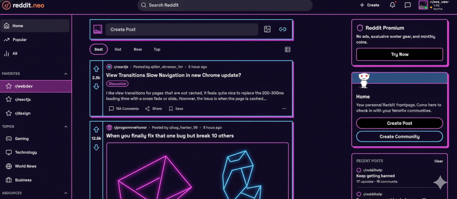
Also Read: Neobrutalism in Web Design – Can Reddit’s Harsh Look Work for Everyone?