RPS // Blogs // How to refactor a design system: a practical 7-step playbook

The audit nobody schedules time for, the cleanup nobody volunteers for, and how AI is quietly changing both.

Every enterprise design system eventually develops the same illness.

You ship a few features. Different squads. Different sprints. Different “we just need it live by Friday” moments. Each decision is reasonable in isolation. Two years later you open your token file and find this:

color-blue-500:  #2776BA

brand-blue-500:  #2776BA

Same hex. Different names. Used inconsistently across the product.

You also have hardcoded values in components that nobody got around to tokenising, three subtly-different spacing scales, four ways to write a button hover state, and a design system Slack channel where someone asked “is –text-primary the same as color-text-base?” eight months ago. Nobody ever answered.

This is the unglamorous middle of every design system’s life. And it’s where the bill comes due , usually at the worst possible moment, when you’re trying to ship a rebrand, build dark mode, or migrate to a new front-end framework.

The good news: there’s a method to this work. The other good news, finally arriving in 2026, is that AI can take a meaningful chunk of the tedium off your plate , if you set it up correctly.

Here’s the practical playbook we’ve been running internally and with clients at The Oranje Co.

Before you start: signs you need a refactor

Don’t refactor a healthy system. But do refactor if you’re seeing any of these:

  • The same value lives under multiple token names
  • Designers and developers are arguing about which token to use
  • Hardcoded hex/px values are creeping back into components
  • A new joiner can’t tell which patterns are canonical
  • You’re about to do a rebrand, dark mode launch, or framework migration
  • Visual inconsistencies are showing up across product surfaces
  • Your component library exists but adoption is patchy

If you nodded at three or more, you have what we’ve been calling pattern debt , and a refactor is overdue.

A note on the prompts below. Each step ends with a copy-paste prompt you can drop into Claude Code, Cursor, GitHub Copilot, or any agent that can read your codebase. They’re written to be strict , explicit scope, hard stops, no autonomous decisions where a human needs to be in the loop. Adjust the bracketed sections to your stack and conventions before running. Use them as starting points; refine for your team.

Step 1 , Inventory: map everything that exists today

Before you decide what the system should be, document what it is.

This step is almost always skipped, and it’s the reason most refactors fail. You can’t fix what you haven’t measured.

A complete inventory captures:

  • Every defined token (name, value, type, file location)
  • Every hardcoded value in components (yes, every one)
  • Every component variant currently in production
  • Every place a token is referenced across the codebase
  • Every place the codebase diverges from the design files

Lucas Rappart puts it well: “Before you decide what the system should be, spend a week mapping what already exists. Open every page of the product.” A full inventory of an enterprise product can take a week of focused work. Don’t skip this.

Where AI helps here: crawling the codebase for token usage, hardcoded values, and component instances is exactly what modern code agents do well. Claude Opus 4.8’s 1M-token context window is on by default, meaning the model can hold an entire large codebase in working memory while executing. What used to take a week of grep-and-spreadsheet work now takes hours.

What you produce: one master inventory spreadsheet or database. Every token, every reference, every hardcoded value. This becomes the source of truth for the entire refactor.

📋 Prompt to copy-paste:

You are auditing a design system codebase. Crawl the entire repository at the path I provide and produce a complete inventory as a CSV with these columns:

– token_name

– token_value (hex / px / rem / etc.)

– token_type (color / spacing / typography / radius / shadow / motion / other)

– defined_in_file (full path)

– defined_at_line

– usage_count (how many times this token is referenced across the codebase)

– usage_files (top 10 files where it is used)

Then produce a second CSV listing every hardcoded value found inside component files (raw hex, raw px, raw font-size declarations) with:

– hardcoded_value

– value_type

– file

– line

– component_or_context

Do not modify any files. This is a read-only audit. Output: two CSVs and a one-paragraph summary of total tokens, total hardcoded values, and top 5 most-used tokens.

Step 2 , Identify: find duplicates, drift, and hardcoded values

Now you analyse the inventory. You’re looking for three categories of mess:

Duplicates. Same value, different names. color-blue-500 and brand-blue-500 both at #2776BA. The classic enterprise inheritance.

Drift. Near-duplicates that should be the same. #2776BA and #2876BC , close enough that no user would tell them apart, but they exist as separate tokens because two designers tokenised them independently.

Hardcoded values. Raw hex codes, raw pixel values, raw font sizes living directly in components. These are tokens that should exist but don’t.

A UX Planet piece on design tokens names the root cause directly: “Over time, different teams start using different names for the same color, leading to confusion and duplicate tokens. When the brand color changes, updating these scattered tokens becomes an overwhelming task.”

That’s exactly the pattern.

Where AI helps here: AI is genuinely excellent at this kind of structured analysis. Feed it your inventory, ask it to flag duplicates and near-duplicates with a similarity threshold, and you’ll have a clean exception report in minutes. Token extraction and analysis tooling can reduce manual labour by up to 50%.

What you produce: a clean list of every duplicate token, every drift instance, and every hardcoded value, with locations.

📋 Prompt to copy-paste:

Using the inventory CSVs from Step 1, identify three categories of issues:

1. EXACT DUPLICATES , tokens with identical values but different names. Group by value. For each group, list every token name, file location, and total usage count.

2. NEAR-DUPLICATES , tokens with values within a 2% similarity threshold for colors (use Delta E ≤ 3 for color values) or within 2px for spacing. Group by similarity cluster.

3. TOKEN CANDIDATES , hardcoded values that appear 3 or more times across the codebase and should be tokenised. Group by value and propose a token name following BEM-style naming (e.g., color-blue-500, space-md, font-size-lg).

Output a single report in markdown with three sections, one per category. For each item include: locations, usage count, and a one-line note on suspected cause (e.g., “likely independent tokenisation by separate squads”). Do not propose fixes yet. This is diagnostic only.

Step 3 , Strategy: decide what stays, renames, and deprecates

This is where humans take back the wheel.

For every duplicate or near-duplicate you found, you need an explicit decision:

  • Keep , this token is canonical, leave it alone
  • Rename , same value, better name (preserve the value, alias the old reference)
  • Merge , multiple tokens collapse into one
  • Deprecate , this token is being removed, mark for migration
  • Add , a new token needs to exist (often a new generic scale)

The reason this stays human: the value is mechanical, but the naming convention is strategic. Are your tokens organised by colour family (blue-500), by brand (brand-primary), or by semantic role (color-action-primary)? Different choices serve different scaling needs. Get this wrong and you’ll refactor again in eighteen months.

Atlassian’s migrate to tokens guide explicitly emphasises this: their codemods generate suggestions, but “manual review is required.” Strategy doesn’t automate.

What you produce: a token-by-token migration map. Status column. Impact column. Proposed solution column. (If you’ve seen the spreadsheet floating around the design ops community for this kind of work, you know what we mean.)

📋 Prompt to copy-paste:

Using the duplicates and near-duplicates report from Step 2, generate a token migration map as a CSV with these columns:

– new_token_name

– new_value

– current_token_name (in codebase)

– current_value

– status (one of: KEEP / RENAME / MERGE / DEPRECATE / ADD / VALUE_CHANGED)

– impact (one-line description of what changes in the codebase)

– proposed_solution (the exact action: e.g., “rename color-blue-* to color-brand-blue-* and add alias”, “merge into single token”, “deprecate with 6-month sunset”)

– breaking_change (yes/no)

– affected_files_count

I will provide the naming convention to follow. Apply these rules:

– Brand-critical tokens MUST be preserved (do not change values, only rename)

– Generic scales should follow [INSERT YOUR CONVENTION e.g., “Tailwind”] naming

– Deprecated tokens get a comment marker explaining the migration path

– No autonomous decisions on tokens flagged as “ambiguous” , list those separately for human review

Output: the CSV migration map + a separate “needs human decision” list.

Step 4 , Guardrails: set the rules before you touch code

Before any code changes happen, lock down:

  • Naming convention. Document it. Publish it. Make it impossible to add a token that violates it.
  • What’s untouchable. Brand-critical tokens. Production-blocking surfaces. Customer-facing flows mid-migration.
  • What’s reversible. Which changes you can ship behind a feature flag, which need full deployment.
  • Who approves what. Single source of truth on who signs off on the migration plan, and who signs off on each merged PR.
  • What “done” means. Concrete acceptance criteria. Visual regression passing? Zero hardcoded values? Adoption metric above X%?

Mike Cvet, who has written some of the sharpest material on migrations at scale, points out: “Will Larson says migrations are the sole scalable fix to tech debt. This makes sense if you think of migrations as refactoring at scale.” The implication: treat your refactor as a real migration project, not a cleanup sprint. That means real guardrails.

What you produce: a one-page document anyone on the team can read in 5 minutes that answers “what are the rules of this refactor.”

📋 Prompt to copy-paste:

I am about to run a design system refactor. Help me draft a one-page “rules of engagement” document covering:

1. NAMING CONVENTION , the exact rules for new token names (prefix, separator, scale, semantic vs literal). Include 5 examples of valid names and 5 examples of invalid names with reasons.

2. UNTOUCHABLE LIST , tokens that cannot change under any circumstances during this refactor. (I will provide the list.)

3. REVERSIBILITY MATRIX , for each category of change (rename / merge / deprecate / value change), state whether it can ship behind a feature flag, requires full deployment, or needs a coordinated release.

4. APPROVAL CHAIN , who signs off on the migration map, who reviews each PR, who owns final merge. (I will provide names/roles.)

5. DEFINITION OF DONE , concrete acceptance criteria. Visual regression passing. Zero hardcoded values added. Token usage above X% adoption. Documentation updated.

Output as a clean markdown document suitable for pasting into our team wiki.

Step 5 , Execute: run the migration (AI does the heavy lift)

This is the step everyone wants to skip to. With proper Steps 1–4 in place, it’s also the step that’s changed the most in the last 18 months.

For each token in your migration map, the AI agent’s job is mechanical:

  • Find every reference to the old token across the codebase
  • Replace it with the new token (or alias) per the migration map
  • Generate the changes as a reviewable PR
  • Flag any usage that doesn’t fit the migration rules for human attention

Claude scores 82.1% on SWE-bench Verified , the industry-standard benchmark for resolving real GitHub issues in large codebases. As of February 2026, Claude Code was authoring roughly 4% of all public GitHub commits , about 135,000 commits a day, with a single-day peak of 326,000. Codebase-scale refactoring with AI is no longer experimental. It’s production reality.

That said: do NOT let the AI execute autonomously across thousands of files.

The right pattern is scoped, reviewable batches. Migrate one token family at a time. Open a PR for each. Run tests on each. Merge each only after a human reviews the diff. Yes, this is slower than a single grand migration. It’s also the difference between a clean refactor and a production incident.

What you produce: a series of small, reviewable PRs that incrementally migrate the codebase, with full test coverage on each.

📋 Prompt to copy-paste:

You are executing a design system migration based on the approved migration map I am providing. Follow these strict rules:

1. SCOPE , process ONE token family per execution (e.g., all color-blue-* tokens together, then stop). Do not bundle multiple families in a single PR.

2. FOR EACH TOKEN IN SCOPE:

   – Find every reference across the codebase

   – Apply the migration action from the map (rename / alias / merge / deprecate)

   – Update the token definition file

   – Update any documentation that references the token

   – Run the existing test suite locally to confirm no regressions

3. OUTPUT , produce a single Pull Request with:

   – A clear PR title in this format: “refactor(tokens): migrate [family] per migration map row [X-Y]”

   – A PR description listing every file changed, every token migrated, and any edge cases encountered

   – Commit history broken into logical commits (definition changes / usage updates / docs)

4. HARD STOPS , refuse to proceed and ask for human input if:

   – A token in scope has more than 200 usages (flag for batched migration)

   – Migration would touch any file in the UNTOUCHABLE LIST

   – The action would create a circular alias

   – You encounter a usage pattern not covered by the migration map

5. REPORT , at the end, output a summary of what shipped, what was deferred, and what needs human review.

Begin with the first token family in the migration map and stop after producing the PR. Wait for human review before continuing to the next family.

Step 6 , Validate: test, lint, regress, and have a human review

For every PR, run the full validation stack:

  • Visual regression tests. Compare every screen pre- and post-migration. Flag any pixel-level differences. Tools like Applitools, Chromatic, and Percy do this well.
  • Linting. New token usage should pass your naming convention rules. Hardcoded values should fail the lint.
  • Type checking. Particularly important for TypeScript codebases with typed token references.
  • Smoke tests. Critical user flows should pass automated end-to-end testing.
  • Human visual QC. A designer who knows the system should look at every changed surface. AI cannot tell you that something “feels” wrong.

The recent piece on automating design system audits suggests prompts like: “Audit my prototype to find hardcoded values (colors, spacing, typography) that should use design tokens from our system.” That same approach works for validation , point the agent at the post-refactor codebase and ask it to flag anything that violates the rules.

What you produce: a clean test pass for every PR before merge, and a designer’s sign-off on visual changes.

📋 Prompt to copy-paste:

Validate the PR I am providing for a design system token migration. Run these checks and produce a structured validation report:

1. CONVENTION CHECK , every new or modified token name must match our naming convention. Flag any that don’t with file/line.

2. HARDCODED VALUE CHECK , scan the diff for any hardcoded hex codes, raw px values, or raw font sizes that were added (not just untouched). Flag each one as a regression.

3. ALIAS LOOP CHECK , confirm no token aliases to itself (directly or indirectly through another alias).

4. USAGE COMPLETENESS CHECK , for every renamed token in this PR, confirm zero remaining references to the OLD name anywhere in the codebase (outside of explicit deprecation comments).

5. BREAKING CHANGE SURFACE , list every component, screen, or route whose visual output could change because of these token changes. This becomes the visual QC checklist for the human reviewer.

6. ACCESSIBILITY SPOT CHECK , for color token changes, recalculate WCAG contrast ratios for the most common foreground/background pairings. Flag any pair that drops below AA.

Output: a markdown report with one section per check. Pass/fail for each. List of human-review items at the end.

Step 7 , Govern: version, document, and schedule the next audit

The refactor isn’t done when the migration ships. It’s done when you’ve built the infrastructure to prevent the same drift from accumulating again.

That means:

  • Semantic versioning on your token library (major, minor, patch). Every change ships with release notes. Parallel HQ recommends introducing this explicitly: “Deprecate old components gradually and provide migration paths… most teams don’t version tokens; adopting versioning prevents breaking changes.”
  • Updated documentation. Every new token, naming convention, and pattern decision is captured in your design system docs. Not in a Notion someone forgets about. In the same repo as the tokens themselves.
  • Linting in CI/CD. Hardcoded values should fail the build. Non-conformant token names should fail the build. The system enforces itself going forward.
  • A scheduled re-audit. Put it on the calendar. Every six months. Token sprawl is not a one-time problem.
  • Clear ownership. A named person or small team owns the system. They review proposed additions before they merge.

What you produce: a maintained, versioned, governed design system , and a calendar invite for the next audit.

📋 Prompt to copy-paste:

Help me set up governance infrastructure for our design system so the drift we just refactored doesn’t accumulate again. Generate the following:

1. SEMANTIC VERSION LOG TEMPLATE , a markdown template for tracking token library releases (major / minor / patch) with sections for: what changed, why, migration notes, deprecation timeline.

2. CONTRIBUTION GUIDELINES , a one-page doc covering: how to propose a new token, the review process, who approves additions, and the criteria for rejection (with examples).

3. CI/CD LINT RULES , generate the lint configuration (for Stylelint or ESLint, my preference) that:

   – Fails the build on hardcoded color, spacing, or font-size values

   – Flags use of deprecated tokens

   – Enforces our naming convention on any newly added tokens

   – Warns on tokens that have not been used in the last 90 days (drift indicator)

4. RE-AUDIT SCHEDULE , a recurring 6-month audit checklist that I can paste into our team calendar, including: what to inventory, what to flag, who runs it, and what the output looks like.

5. OWNERSHIP DOC , a short doc naming the design system owner(s), their responsibilities, escalation path, and how external contributors interact with them.

Output all five as separate markdown documents I can paste directly into our team wiki and repo.

What AI can and can’t do (honest answer)

After running this playbook a few times, here’s the honest division of labour:

AI is great at:

  • Crawling and inventorying the codebase
  • Identifying duplicates and near-duplicates
  • Generating migration maps from explicit rules
  • Executing mechanical code transformations across files
  • Producing reviewable PRs with proper commit hygiene
  • Running automated validation passes

AI is not great at:

  • Deciding the naming convention in the first place
  • Making strategic calls about which token is canonical
  • Understanding brand context that isn’t documented anywhere
  • Catching that something “feels” off visually
  • Owning the system longer-term

The pattern is clear. AI takes the mechanical pain off the human’s plate so the human can focus on judgment. That’s the whole game.

The Praxen piece on design tokens meeting agents puts the AI risk well: “Agents are powerful, but they’re also extremely confident liars if you let them be.” The fix is constraint , give the AI explicit rules, a whitelisted set of tokens it can use, and a strict review boundary it cannot cross unilaterally.

This is what we call governed velocity. Speed and an audit trail. Not vibe coding.

Common pitfalls

Three traps to avoid:

1. Refactoring without inventorying first. You’ll discover edge cases mid-migration that force you to start over. Always inventory first.

2. Letting the AI execute autonomously across thousands of files. Yes, it’s tempting. No, it’s not how production refactors work safely. Small batches, reviewable PRs, every time.

3. Skipping the governance step. Every refactor that doesn’t end with versioning + linting + scheduled re-audits will regenerate the same mess within 18 months. The refactor isn’t complete without it.

Where Oranje fits

We built The Oranje Co for the exact scenario this playbook describes design systems that need to evolve faster than enterprise governance traditionally allows.

The bet isn’t that AI replaces the refactor. It’s that AI, properly guard-railed, removes 60-70% of the manual tedium so design system teams can spend their time on the decisions that matter: strategy, naming, and judgment.

We’ve been running variants of this playbook on real client codebases. Token-by-token migration maps. AI-generated PRs landing inside the client’s own folder structure. Human QC built into the loop. Results that merge instead of triggering a refactoring tax.

Oranje is in beta now, with our enterprise launch coming soon. 🍊

If you’re a design lead or engineering lead carrying serious pattern debt and you’d like to be part of the early enterprise rollout, we’d love to hear from you.

Closing thought

Most design system content focuses on building a system from scratch. Almost nobody writes about the much messier reality: refactoring a system that’s already in production, has thousands of usages, and absolutely cannot break customer flows during the transition.

That’s where most enterprise teams actually live. And it’s the work that quietly determines whether your design system survives its third year.

The playbook above isn’t novel. The methodology has existed in pieces for years. What’s new in 2026 is that AI can finally take the mechanical 60% off your team’s plate, so the judgment-heavy 40% can get the attention it deserves.

Pattern debt isn’t permanent. It just needs a process. And maybe an accomplice.

Further reading

A curated list of the best resources to go deeper on each part of the playbook.

On design system audits

On design tokens specifically

On migrations at scale

On AI-assisted design system work

On governance & maintenance

On tooling


The Oranje Co is building infrastructure for the creative economy , closing the gap between design, system, and production code. Currently in beta, with enterprise launch coming soon. getoranje.com

RPS // Blogs // Components are cheap. Patterns are hard.

The next big problem in enterprise design systems almost nobody is talking about.

A client said something to me last week that I haven’t stopped thinking about.

“You’re solving the screen problem, great. But can you help us with our design system patterns? Our dashboards have the same filter behaving three different ways.”

That single sentence captures the part of the design systems story almost nobody is talking about right now.

Every conversation about AI in design is stuck on components. Generate me a button. Build me a screen. Spin up a card. And honestly , that part is mostly solved. Tools like v0, Stitch, Replit, Figma’s own AI features have all made it absurdly easy to produce a UI element that looks polished and works on first glance.

But components are the easy layer.

Patterns are the hard one.

And in 2026, the gap between “we have a beautiful component library” and “we ship a consistent product” has become the most expensive, least-discussed problem in enterprise design.

The filter story

Back to that client conversation.

Their main dashboard had three different sets of filters across three sections of the portal. One slid in from the right as a side panel. One opened as a modal. One expanded inline above the table. Same user task , filter a list of records , and three completely different muscle memories required.

Nobody on their team had designed it this way on purpose.

It happened the way it always happens in enterprises. Different squads. Different sprints. Different “we needed it shipped by Friday” moments. Each filter implementation was perfectly reasonable in isolation. Combined, they made the product feel like three different products.

Their component library was healthy. Their button looked the same everywhere. Their inputs were tokenized correctly. The components were not the problem.

The pattern was.

What’s the difference, actually?

The terms get used interchangeably, and that’s part of why the problem stays invisible. So let’s be precise.

A component is a reusable UI element. A button. An input. A dropdown. It’s a concrete thing, with specific styling and behavior, that you can drop into a screen. As UXPin puts it, “a component library is a collection of reusable, coded UI elements.”

A pattern is one level up. It’s a solution to a recurring problem. Filtering a list. Authenticating a user. Showing an empty state. Validating a form. Patterns describe how components combine to accomplish a task , every time that task shows up in your product.

The U.S. government’s CMS Design System defines it well: “A pattern is more than the sum of its parts. Patterns are solutions, whereas a component can be considered a UI chunk.”

Or to put it the way I find easiest to remember: components are the lego pieces. Patterns are the rules for what you can build with them, and how it should behave.

Why AI made components cheap

The current wave of AI design tools is genuinely impressive at the component layer. You can describe a button and get six variations. You can sketch a screen and get clean React code in seconds. The marginal cost of producing a UI element has collapsed.

Most of the design system industry has noticed. Zeroheight’s 2026 Design Systems Report found that AI adoption among design system practitioners jumped sharply year over year , but with one important caveat: the excitement is highest for “documentation generation and process automation,” not AI-generated design itself. Practitioners are pragmatic. They want AI to handle the repetitive stuff so they can focus on the harder problems.

Which is exactly the point. The repetitive stuff is the component layer.

The harder problems live one layer above.

Why patterns are still hard

So why hasn’t AI cracked patterns the way it cracked components?

Three reasons.

1. Patterns are organizational, not visual. A button is a visual artifact. A filter pattern is a decision , about how filtering should feel across your entire product. That decision involves UX research, product strategy, content tone, accessibility constraints, and an opinion about how your product wants users to feel. No general-purpose AI tool has access to any of that context. It can generate a filter UI. It can’t decide that filtering should always behave the same way across your seven dashboards.

2. Patterns are enforced, not generated. Components live in a library. Patterns live in every screen of your product, forever. That means the work isn’t producing the pattern once , it’s keeping the pattern consistent as the product grows, teams change, and edge cases multiply. As Ryda Rashid wrote in late 2025, “every design system has a silent killer: design drift. Not malicious. Not intentional. Just… human. Different teams move at different speeds. New product squads introduce ‘just one more exception.’ Engineers override styles to hit deadlines.”

That drift accumulates. Slowly. Invisibly.

3. Patterns are expensive to define well. Nathan Curtis, who has thought about this longer than almost anyone in the field, put it bluntly years ago: “Patterns are expensive. Composing patterns takes time and iteration, comparisons and conversations, whittling down to essential truths. That’s not quick and easy to do well.”

It still isn’t.

Pattern debt

Every enterprise product has it. Almost nobody schedules time to fix it.

Call it pattern debt.

It’s the parallel to technical debt , and just as costly. The difference is that technical debt is at least visible to engineers in code reviews. Pattern debt is mostly invisible until a user complains, an audit finds it, or a new designer joins your team and asks “wait, why does this work three different ways?”

Pattern debt accumulates from a thousand small, individually-defensible decisions:

  • A new squad ships a feature without checking the existing filter pattern
  • An engineer overrides a component to hit a deadline and never comes back to undo it
  • A designer interprets the same pattern differently than the last designer did
  • A token gets duplicated because two teams didn’t realize the other had defined it
  • An “exception” gets made for one screen and quietly becomes the new precedent

Each individual decision saves an hour. Across two years, the product becomes inconsistent in ways that take quarters of effort to undo.

The kicker: most enterprises don’t even know how much pattern debt they’re carrying, because nobody is measuring it.

What this actually costs

You don’t have to take my word that pattern inconsistency is expensive. The research is clear.

Adrenalin’s analysis of enterprise design systems cites Baymard Institute research showing that consistent interfaces improve conversion by up to 20%, while 68% of users abandon products that feel inconsistent or confusing. McKinsey data in the same piece estimates that streamlined design systems cut 30-40% of development costs through reduced duplication and technical debt.

Other research stacks on top:

  • Lucidpress found consistent brand presentation across platforms increases revenue by up to 23%
  • Stanford research has shown that 94% of users’ first impressions of a website are design-related , directly influencing trust
  • Forrester estimates UX improvements can lift conversion rates by up to 400% in some categories

None of these stats are talking about button styling. They’re talking about the experience of moving through your product. That experience is governed almost entirely by patterns.

The components might be perfect. If the filter pattern shifts between sections, the user doesn’t think “what a great button library.” They think “this product feels confusing.” And they leave.

What enforcing patterns actually requires

Solving pattern debt is harder than solving component debt because patterns sit at the intersection of design, code, and organizational behavior.

To enforce a pattern across an enterprise product, you typically need:

  1. A canonical definition of what the pattern is and when to use it
  2. Reusable assets (components configured to enact the pattern) that designers and engineers actually reach for
  3. Enforcement:  something that flags when a pattern is being violated, before it ships
  4. Maintenance: a way to update the pattern as the product evolves, without breaking the surfaces that already use it
  5. Buy-in across teams so the pattern is respected even when it slows a single squad down

Most enterprises do step 1 (sometimes), step 2 (partially), and skip steps 3-5 entirely.

This isn’t a failure of effort. It’s a failure of infrastructure. The tools we use today – Figma, Storybook, Notion docs, the design system Slack channel, were not built to enforce pattern consistency. They were built to make components accessible. Two different jobs.

Where we’re spending real time

This is the layer we’ve been working on at Oranje.

Not just generating screens. Not just producing components. The harder problem: codifying the patterns underneath a product, and keeping them consistent across the product as it grows.

The idea isn’t to replace your design system. It’s to make the system enforce itself, to close the gap between “we have a documented pattern” and “every surface of our product actually uses it.”

Oranje is in beta right now, with our enterprise launch coming soon. 🍊

If you’re a design lead carrying serious pattern debt and you’d like to be part of the early enterprise rollout, we’d love to hear from you.

The honest closing thought

Most design system conversations in 2026 are still happening at the wrong altitude. The industry keeps celebrating faster components when the real cost , the part that actually shapes whether your product feels coherent , is happening one layer above.

If you’re a design lead, here’s the honest question: when did you last audit pattern consistency across your own product? Not components. Not tokens. Patterns.

If the answer is “I’m not sure” or “we don’t really have a process for that,” you’re not alone. Most enterprises don’t.

That’s the gap.

That’s the work.

Further reading

If you want to go deeper on the components-vs-patterns distinction and the state of design systems in 2026:

The Oranje Co is building infrastructure for the creative economy , closing the gap between design, system, and production code. getoranje.com

RPS // Blogs // Wireframing Tools That Don’t Slow You Down (And Actually Improve Communication)
Wireframing tools for UX workflow - Rock Paper Scissors Design Studio Shivendra Singh design methodology

You’re in a designer meeting. Someone says, “We need to redesign the dashboard.”

Immediately, someone asks, “Which tool should we use? Figma? Adobe XD? Sketch?”

And suddenly you’re 20 minutes deep into tool debates instead of design thinking.

Here’s the truth: the tool doesn’t matter. The thinking matters.

But some tools are better for speed. Some tools are better for collaboration. Some tools slow you down with complexity.

You want wireframing tools that:

  • Get out of your way
  • Work well with developers
  • Allow quick iteration
  • Don’t require learning curves

Let me break down what actually works:

Figma
Pros: Collaboration is incredible. Teams can work simultaneously. Handoff to developers is smooth. Components work great. Free tier exists.
Cons: Learning curve if you’ve never used it. Can be overwhelming with features.
Verdict: Best for teams that need collaboration and have developers who understand Figma.

Wireframe.cc or Balsamiq
Pros: Fast. Simple. No learning curve. Good for thinking. Bad for delivering to developers.
Cons: Output looks like wireframes, not finished designs. Developers still need to interpret your vision.
Verdict: Best for early thinking. Quick exploration. Not for final handoff.

Adobe XD
Pros: Solid. Good prototyping. Reasonable collaboration.
Cons: Expensive. Not as developer-friendly as Figma.
Verdict: Works but not best choice unless you’re already in Adobe ecosystem.

Pen and paper
Pros: Fastest. Forces thinking. Removes perfectionism.
Cons: Can’t iterate digitally. Hard to share with remote team.
Verdict: Best for initial ideation. Use this first.

At Rock Paper Scissors Design Studio, Shivendra Singh uses a process:

Step 1: Sketch on paper. 10 minutes. Quick thinking.
Step 2: Move to Balsamiq. 30 minutes. Low-fidelity wireframe.
Step 3: Jump to Figma. 2-3 hours. High-fidelity design.
Step 4: Handoff to developers.

This flow takes 4-5 hours. Jumping straight to Figma takes 8+ hours because you’re deciding too much at once.

The best tool is the one your team uses consistently. Not the fanciest tool. The one that becomes second nature.

Real example: A SaaS company switched from Adobe XD to Figma. They were worried about the change. Within 2 weeks, designers were faster. Developers were happier. Handoff improved.

Tool matters less than you think. Process matters more.

Pick one tool. Learn it deeply. Master it. Then optimize your workflow around it.

Don’t jump tools every 3 months chasing the shiny new thing. Master one. Compound your skills.

Also Read: How to Know When Your SaaS UI UX Design Needs a Refresh (Before Users Leave)

RPS // Blogs // Design Tool Graveyards: When Software Giants Become Digital Ghosts
Design Tool Graveyards: When Software Giants Become Digital Ghosts

You know that feeling when you find an old USB drive and discover files from apps that literally don’t exist anymore? Yeah, that’s the design tool graveyard for you. Every few years, tools that seemed unstoppable just… vanish. And honestly? The stories behind their disappearances are way more fascinating than you’d think.

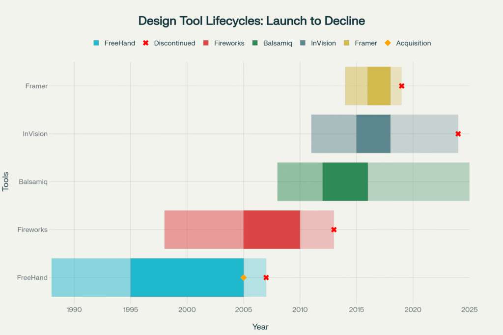
Timeline of Forgotten Design Tools: Rise and Fall (1988-2025).

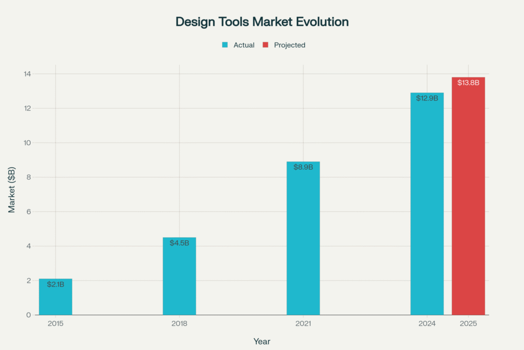
The data doesn’t lie, we’ve witnessed some of the most dramatic tool transitions in software history. Between 2015 and 2025, the entire design tools market exploded from $2.1 billion to a projected $13.8 billion, but most of the original players got buried along the way.

Let’s dig into the digital graveyard and see what we can learn from these fallen giants.

When Adobe Fireworks Got Fired by Adobe

Back in the early 2000s, if you were doing web design, you lived in Fireworks. This wasn’t some random tool; it had over 2 million web designers at its peak. While Photoshop was busy being a photo editor and Illustrator was doing its vector thing, Fireworks was the only tool actually built for screen design.

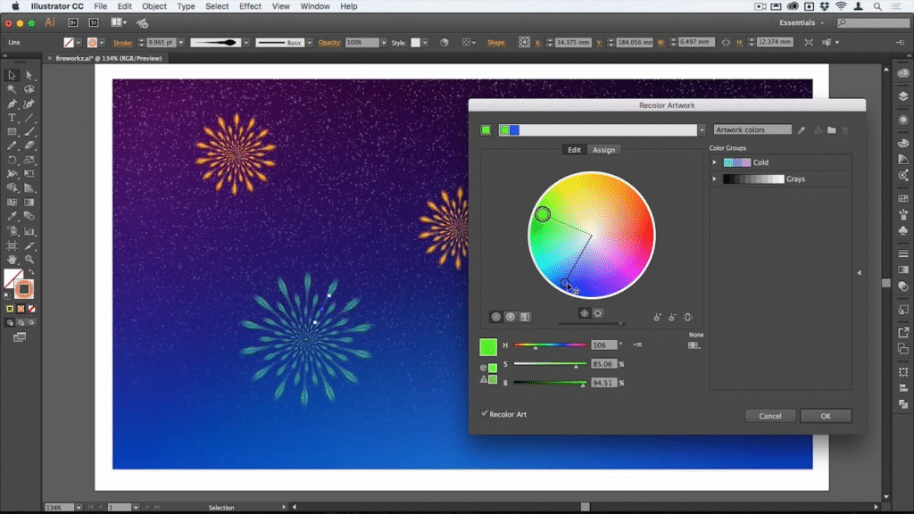
Illustrator CC interface showing fireworks artwork with recolor tool active, illustrating vector graphics design and color editing.

The wild part? Fireworks could handle both raster and vector work seamlessly. You could slice images for HTML export, create clickable hotspots, and build actual prototypes. In 2009, it commanded a solid 15% market share in the design tools space. But here’s where it gets messy Adobe bought Macromedia in 2005 and suddenly had two tools doing similar things.

Design Tools Market Growth: From Tool Chaos to Platform Consolidation (2015-2025)

By May 2013, Adobe just… pulled the plug. Their reasoning? “Overlap with other Adobe products.” Translation: “Why maintain three design tools when we can just make people use Photoshop and Illustrator?” The design community was not happy. Reddit threads from that day are still painful to read one designer literally posted “Good night, sweet prince”

But get this Adobe kept selling it even after discontinuing development. Talk about milking a dead cow. Today, that 0.04% market share is basically digital archaeology.

FreeHand: The Vector Tool That Could’ve Been King

Before Illustrator became the default, FreeHand was the scrappy underdog that illustrators absolutely swore by. We’re talking about 500,000+ passionate illustrators who argued it was faster, more intuitive, and less bloated than anything Adobe had.

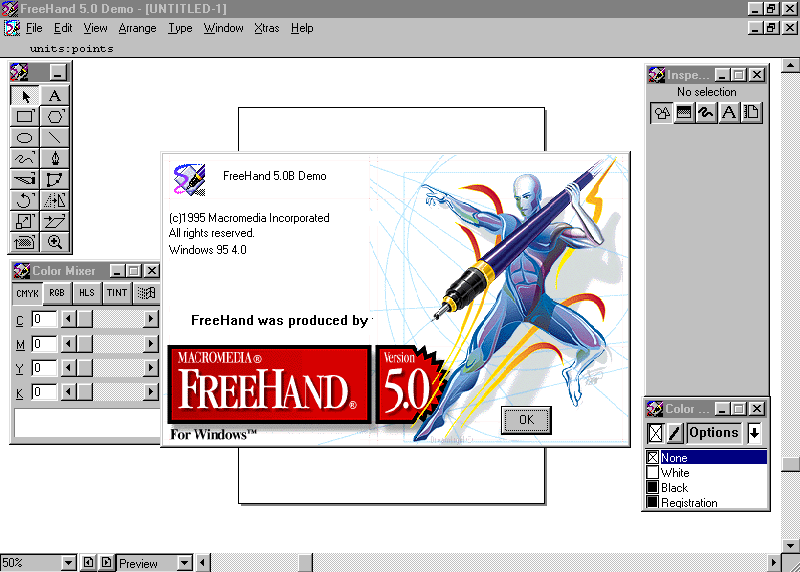
Screenshot of Macromedia FreeHand 5.0B demo running on Windows 95, highlighting the classic vector illustration software interface from 1995. .webdesignmuseum

FreeHand’s text handling was legendary. Multi-page documents, linked columns, precision that made Illustrator look clunky. At its peak in 2003, it held 25% of the vector illustration market. But then Adobe swooped in, bought Macromedia, and boom FreeHand became a casualty of corporate strategy.

The Federal Trade Commission actually forced Adobe to sell FreeHand back to prevent monopolization in 1994. But when Adobe acquired Macromedia again in 2005? Game over. By 2007, FreeHand was officially dead.

The loyalty was insane though. Even years after discontinuation, FreeHand users were filing antitrust lawsuits and petitioning for its revival. When a tool fits your brain that perfectly, letting go is brutal.

Balsamiq: When Sketchy Was Actually Good

Remember when wireframes looked intentionally rough? That was Balsamiq’s whole thing. In a world obsessed over pixel-perfect mockups, Balsamiq said “Nah, let’s keep it sketchy so people focus on functionality, not fonts.”

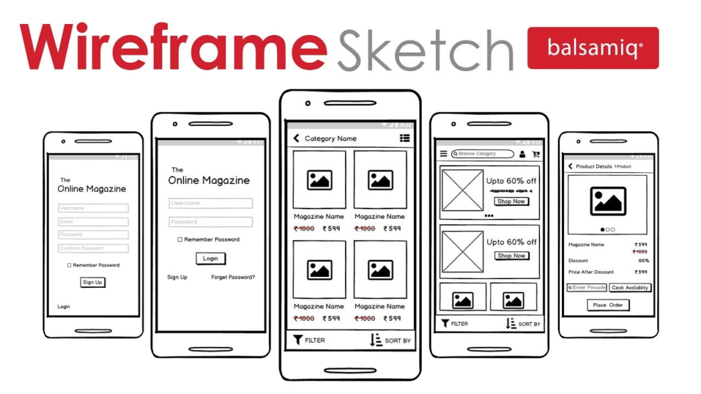
Wireframe sketches of a mobile online magazine app created using Balsamiq, showcasing early-stage UI layouts and interactions.

The strategy was genius. Product managers, developers, and designers could throw together screens in minutes. The hand-drawn aesthetic screamed “This is early, let’s discuss flow, not polish.” By 2014, Balsamiq owned 40% of the wireframing market.

But here’s what killed it: the rise of integrated platforms. Tools like Figma and Adobe XD started offering wireframe-to-high-fidelity workflows without platform switching. Suddenly, Balsamiq felt like an extra step nobody wanted to take.

The wireframe tools market is actually growing, projected to hit $2.5 billion by 2033 with a 9.4% CAGR. But that growth is going to integrated platforms, not specialized wireframe tools. Balsamiq still exists, but with less than 5% market share, it’s basically on life support.

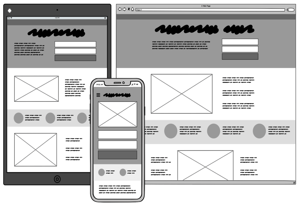
Grayscale wireframe mockups shown on tablet, smartphone, and desktop illustrating Balsamiq’s sketch-style interface design approach. upttik.undiksha.ac

Framer Classic: When Designers Learned to Code (Briefly)

Before Framer became a no-code website builder, Framer Classic was this insane code-driven prototyping tool. If you knew a little JavaScript, you could create prototypes that felt completely real not just screen-to-screen transitions, but fully functional, dynamic interfaces.

The learning curve was brutal, but the payoff was massive. We’re talking about 100,000+ developer-designers who could impress stakeholders with prototypes that actually worked. At its peak in 2017, Framer Classic held 8% of the advanced prototyping market.

But then Framer pivoted hard toward accessibility for non-coders. Great for business, devastating for the original user base. The “classic” version became a relic, and a whole generation of designer-developers lost one of their sharpest tools.

The irony? Framer’s current success as a website builder proves there was demand for powerful design tools. They just abandoned their power users to chase a broader market.

InVision: The Collaboration King That Got Dethroned

This one hurts the most. InVision was THE collaboration tool for design teams. Seven million users at its peak, valued at $2 billion, and basically invented design collaboration as we know it.

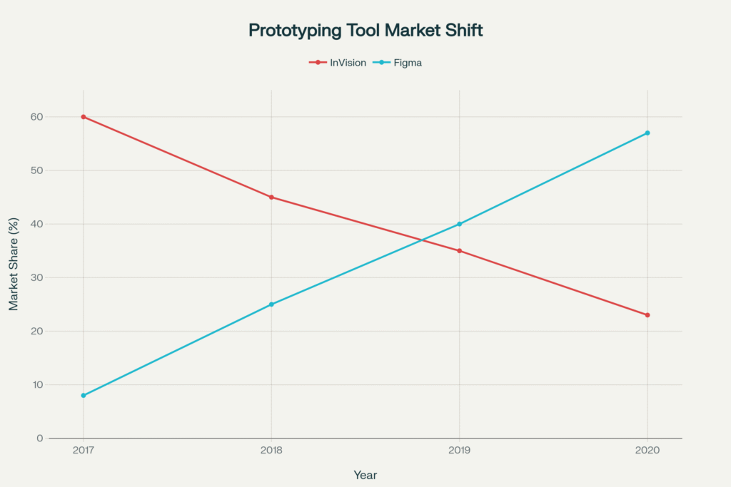
The Great Design Tool Flip: InVision vs Figma Market Share (2017-2020).

The numbers tell a brutal story. In 2017, InVision dominated prototyping with 60% market share. By 2020? Down to 23% while Figma exploded from 8% to 57%. That’s not gradual decline, that’s industry disruption in real time.

What happened was simple: Figma merged design, prototyping, and collaboration into one platform. InVision suddenly felt like a middleman. Why export from Sketch to prototype in InVision when you could just do everything in Figma?

The company tried pivoting with Freehand (their whiteboarding tool) and InVision Studio (their Figma competitor), but it was too late. They sold Freehand to Miro and shut down everything else by the end of 2024. From a $2 billion valuation to complete shutdown in less than five years.

The Pattern Behind the Graveyard

Here’s what’s fascinating: these tools didn’t die because they sucked. They died because the design ecosystem evolved faster than they could adapt.

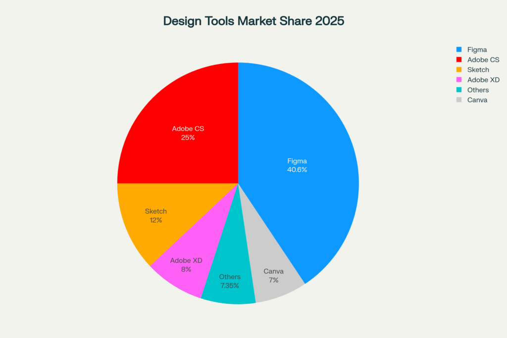
Today's Design Tools Market: The Survivors and Winners (2025)
Today’s Design Tools Market: The Survivors and Winners (2025)

Look at today’s market: Figma owns 40.65%, Adobe Creative Suite has 25%, and everything else is fighting for scraps. The market rewards speed, integration, and flexibility. Standalone tools that excel at one thing consistently lose to platforms that can do enough of everything in one place.

But there’s a deeper cultural shift here. Ten years ago, having separate tools for wireframing, design, and prototyping was normal. Today, we expect one product to do it all. Convenience wins, even if we lose some specialization in the process.

The data shows a clear evolution: specialized tools dominated from 1988-2010, acquisition wars raged from 2005-2015, and we’re now in the platform consolidation era (2015-2025). The combined peak user base of these forgotten tools? Over 10.6 million designers. That’s not a small market that’s an entire generation of creative professionals who had to relearn their workflows.

What This Means for Today’s Tools

Here’s the uncomfortable truth: today’s favorite tool could be tomorrow’s nostalgia. The design tools market is projected to hit $18.95 billion by 2030, but that growth is concentrating around fewer, more integrated platforms.

Adobe tried to acquire Figma for $20 billion in 2022 but got blocked by regulators. That tells you everything about market consolidation fears. When one company tries to spend $20 billion to eliminate competition, the market has clearly consolidated too much.

The lesson? Tools don’t just compete on features anymore. They compete on ecosystems. Figma didn’t just build better prototyping, they built a better workflow that eliminated the need for multiple tools.

For designers, this means staying adaptable. The principles of good design outlive any software, but the tools we use to execute those principles are more temporary than we’d like to admit.

The Silver Lining in Software Graveyards

But here’s what gives me hope: good design thinking outlives any platform. I’ve seen small studios keep the thoughtful process work alive, where the craft goes beyond the platform and into the experience itself.

Because the best design tool isn’t the one with the most features it’s the one that shapes how you see the problem. And that mindset? That’s timeless.

Even as we mourn these fallen tools, their influence lives on. Fireworks taught us about web-first design. FreeHand showed us what precise vector work looked like. Balsamiq proved that sometimes rough is better. Framer Classic bridged design and development. InVision invented design collaboration.

Their ghosts haunt every modern design tool. Every time you use components in Figma, you’re using FreeHand’s multi-page concepts. Every time you collaborate in real-time, you’re using InVision’s innovation. Every time you prototype with code, you’re channeling Framer Classic’s spirit.

The tools may be gone, but the ideas never die. They just get reborn in shinier, more integrated packages.

And who knows? Maybe in 10 years, someone will write an article about “that time when Figma dominated everything” while using some AI-powered design tool we can’t even imagine yet.

The graveyard keeps growing, but so does the evolution of how we create. That’s the real story here not the death of tools, but the endless cycle of creative destruction that keeps pushing design forward. Now excuse me while I go back up all my Sketch files… just in case.

RPS // Blogs // Design Tool Graveyards: When Software Giants Become Digital Ghosts
Design Tool Graveyards: When Software Giants Become Digital Ghosts

You know that feeling when you find an old USB drive and discover files from apps that literally don’t exist anymore? Yeah, that’s the design tool graveyard for you. Every few years, tools that seemed unstoppable just… vanish. And honestly? The stories behind their disappearances are way more fascinating than you’d think.

Timeline of Forgotten Design Tools: Rise and Fall (1988-2025). 

The data doesn’t lie, we’ve witnessed some of the most dramatic tool transitions in software history. Between 2015 and 2025, the entire design tools market exploded from $2.1 billion to a projected $13.8 billion, but most of the original players got buried along the way.

Let’s dig into the digital graveyard and see what we can learn from these fallen giants.

When Adobe Fireworks Got Fired by Adobe

Back in the early 2000s, if you were doing web design, you lived in Fireworks. This wasn’t some random tool; it had over 2 million web designers at its peak. While Photoshop was busy being a photo editor and Illustrator was doing its vector thing, Fireworks was the only tool actually built for screen design.

Illustrator CC interface showing fireworks artwork with recolor tool active, illustrating vector graphics design and color editing.

The wild part? Fireworks could handle both raster and vector work seamlessly. You could slice images for HTML export, create clickable hotspots, and build actual prototypes. In 2009, it commanded a solid 15% market share in the design tools space. But here’s where it gets messy Adobe bought Macromedia in 2005 and suddenly had two tools doing similar things.

Design Tools Market Growth: From Tool Chaos to Platform Consolidation (2015-2025)

By May 2013, Adobe just… pulled the plug. Their reasoning? “Overlap with other Adobe products.” Translation: “Why maintain three design tools when we can just make people use Photoshop and Illustrator?” The design community was not happy. Reddit threads from that day are still painful to read one designer literally posted “Good night, sweet prince”

But get this Adobe kept selling it even after discontinuing development. Talk about milking a dead cow. Today, that 0.04% market share is basically digital archaeology.

FreeHand: The Vector Tool That Could’ve Been King

Before Illustrator became the default, FreeHand was the scrappy underdog that illustrators absolutely swore by. We’re talking about 500,000+ passionate illustrators who argued it was faster, more intuitive, and less bloated than anything Adobe had.

Screenshot of Macromedia FreeHand 5.0B demo running on Windows 95, highlighting the classic vector illustration software interface from 1995. .webdesignmuseum

FreeHand’s text handling was legendary. Multi-page documents, linked columns, precision that made Illustrator look clunky. At its peak in 2003, it held 25% of the vector illustration market. But then Adobe swooped in, bought Macromedia, and boom FreeHand became a casualty of corporate strategy.

The Federal Trade Commission actually forced Adobe to sell FreeHand back to prevent monopolization in 1994. But when Adobe acquired Macromedia again in 2005? Game over. By 2007, FreeHand was officially dead.

The loyalty was insane though. Even years after discontinuation, FreeHand users were filing antitrust lawsuits and petitioning for its revival. When a tool fits your brain that perfectly, letting go is brutal.

Balsamiq: When Sketchy Was Actually Good

Remember when wireframes looked intentionally rough? That was Balsamiq’s whole thing. In a world obsessed over pixel-perfect mockups, Balsamiq said “Nah, let’s keep it sketchy so people focus on functionality, not fonts.”

Wireframe sketches of a mobile online magazine app created using Balsamiq, showcasing early-stage UI layouts and interactions.

The strategy was genius. Product managers, developers, and designers could throw together screens in minutes. The hand-drawn aesthetic screamed “This is early, let’s discuss flow, not polish.” By 2014, Balsamiq owned 40% of the wireframing market.

But here’s what killed it: the rise of integrated platforms. Tools like Figma and Adobe XD started offering wireframe-to-high-fidelity workflows without platform switching. Suddenly, Balsamiq felt like an extra step nobody wanted to take.

The wireframe tools market is actually growing, projected to hit $2.5 billion by 2033 with a 9.4% CAGR. But that growth is going to integrated platforms, not specialized wireframe tools. Balsamiq still exists, but with less than 5% market share, it’s basically on life support.

Grayscale wireframe mockups shown on tablet, smartphone, and desktop illustrating Balsamiq’s sketch-style interface design approach. upttik.undiksha.ac

Framer Classic: When Designers Learned to Code (Briefly)

Before Framer became a no-code website builder, Framer Classic was this insane code-driven prototyping tool. If you knew a little JavaScript, you could create prototypes that felt completely real not just screen-to-screen transitions, but fully functional, dynamic interfaces.

The learning curve was brutal, but the payoff was massive. We’re talking about 100,000+ developer-designers who could impress stakeholders with prototypes that actually worked. At its peak in 2017, Framer Classic held 8% of the advanced prototyping market.

But then Framer pivoted hard toward accessibility for non-coders. Great for business, devastating for the original user base. The “classic” version became a relic, and a whole generation of designer-developers lost one of their sharpest tools.

The irony? Framer’s current success as a website builder proves there was demand for powerful design tools. They just abandoned their power users to chase a broader market.

InVision: The Collaboration King That Got Dethroned

This one hurts the most. InVision was THE collaboration tool for design teams. Seven million users at its peak, valued at $2 billion, and basically invented design collaboration as we know it.

The Great Design Tool Flip: InVision vs Figma Market Share (2017-2020).

The numbers tell a brutal story. In 2017, InVision dominated prototyping with 60% market share. By 2020? Down to 23% while Figma exploded from 8% to 57%. That’s not gradual decline, that’s industry disruption in real time.

What happened was simple: Figma merged design, prototyping, and collaboration into one platform. InVision suddenly felt like a middleman. Why export from Sketch to prototype in InVision when you could just do everything in Figma?

The company tried pivoting with Freehand (their whiteboarding tool) and InVision Studio (their Figma competitor), but it was too late. They sold Freehand to Miro and shut down everything else by the end of 2024. From a $2 billion valuation to complete shutdown in less than five years.

The Pattern Behind the Graveyard

Here’s what’s fascinating: these tools didn’t die because they sucked. They died because the design ecosystem evolved faster than they could adapt.

Today’s Design Tools Market: The Survivors and Winners (2025)

Look at today’s market: Figma owns 40.65%, Adobe Creative Suite has 25%, and everything else is fighting for scraps. The market rewards speed, integration, and flexibility. Standalone tools that excel at one thing consistently lose to platforms that can do enough of everything in one place.

But there’s a deeper cultural shift here. Ten years ago, having separate tools for wireframing, design, and prototyping was normal. Today, we expect one product to do it all. Convenience wins, even if we lose some specialization in the process.

The data shows a clear evolution: specialized tools dominated from 1988-2010, acquisition wars raged from 2005-2015, and we’re now in the platform consolidation era (2015-2025). The combined peak user base of these forgotten tools? Over 10.6 million designers. That’s not a small market that’s an entire generation of creative professionals who had to relearn their workflows.

What This Means for Today’s Tools

Here’s the uncomfortable truth: today’s favorite tool could be tomorrow’s nostalgia. The design tools market is projected to hit $18.95 billion by 2030, but that growth is concentrating around fewer, more integrated platforms.

Adobe tried to acquire Figma for $20 billion in 2022 but got blocked by regulators. That tells you everything about market consolidation fears. When one company tries to spend $20 billion to eliminate competition, the market has clearly consolidated too much.

The lesson? Tools don’t just compete on features anymore. They compete on ecosystems. Figma didn’t just build better prototyping, they built a better workflow that eliminated the need for multiple tools.

For designers, this means staying adaptable. The principles of good design outlive any software, but the tools we use to execute those principles are more temporary than we’d like to admit.

The Silver Lining in Software Graveyards

But here’s what gives me hope: good design thinking outlives any platform. I’ve seen small studios like Rock Paper Scissors Studio keep the thoughtful process work alive, where the craft goes beyond the platform and into the experience itself.

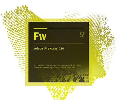
Logo and splash screen for Adobe Fireworks CS6 Portable edition with retro digital design elements.

Because the best design tool isn’t the one with the most features it’s the one that shapes how you see the problem. And that mindset? That’s timeless.

Even as we mourn these fallen tools, their influence lives on. Fireworks taught us about web-first design. FreeHand showed us what precise vector work looked like. Balsamiq proved that sometimes rough is better. Framer Classic bridged design and development. InVision invented design collaboration.

Their ghosts haunt every modern design tool. Every time you use components in Figma, you’re using FreeHand’s multi-page concepts. Every time you collaborate in real-time, you’re using InVision’s innovation. Every time you prototype with code, you’re channeling Framer Classic’s spirit.

The tools may be gone, but the ideas never die. They just get reborn in shinier, more integrated packages.

And who knows? Maybe in 10 years, someone will write an article about “that time when Figma dominated everything” while using some AI-powered design tool we can’t even imagine yet.

The graveyard keeps growing, but so does the evolution of how we create. That’s the real story here not the death of tools, but the endless cycle of creative destruction that keeps pushing design forward. Now excuse me while I go back up all my Sketch files… just in case.