RPS // Blogs // UX Design Patterns – Why Your “Unique” Design Is Hurting Your Users
UX Design Patterns - Why Your "Unique" Design Is Hurting Your Users

We all want to be the artist. The visionary. The one who reinvents the wheel.

We look at sites like Awwwards or Dribbble and see interfaces that float, glide, and defy gravity. We see elements that don’t look like buttons but feel like portals. We think, “If I build that, I will be famous.”

But in UX design, reinventing the wheel is usually just a fancy way of saying “confusing the hell out of your users.”

There is a dangerous myth in our industry that “unique” equals “good.” Agencies and junior designers alike often chase the Dribbble aesthetic—interfaces that look like sci-fi movie props but function about as well as a chocolate teapot. They build portfolios to impress other designers, forgetting that real users aren’t looking for art; they are looking to get a job done.

If your user has to learn how to use your interface, you have failed.

The Tyranny of Learning Curves

Users bring with them a “mental model“—a set of expectations based on every other app, site, and tool they’ve ever used. They know that a “hamburger menu” hides navigation. They know that a magnifying glass means search. They know that a trash can deletes things.

This isn’t laziness; it’s efficiency. The human brain is an energy-conserving machine. It loves patterns because patterns require less processing power.

This is known as Jakob’s Law: Users spend most of their time on other sites.

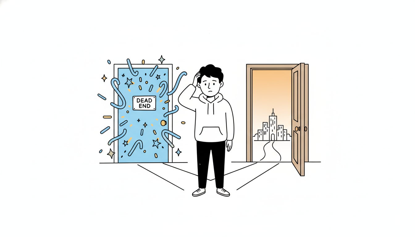
When you decide that your “Close” button should be a rotating hexagon in the bottom left corner instead of an “X” in the top right, you aren’t being creative. You’re being selfish. You are forcing the user to burn cognitive calories just to figure out how to leave the page. You are disrupting the flow they have established over thousands of hours of internet usage.

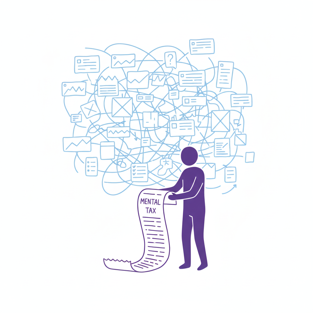
Every time a user pauses to ask, “Wait, where is the menu?” you are extracting a “mental tax.” If the tax gets too high, they close the tab and go to a competitor who respects their time.

The “Selfish Designer” Syndrome

Why do we break patterns? Usually, it’s ego. We want our work to stand out. We fear that if we use a standard left-sidebar navigation, our app will look “generic.”

Usability is invisible.

When a design works perfectly, the user doesn’t notice the design; they notice the task getting easier. If your design is loud, flashy, and confusing, the user notices you. And in B2B SaaS or e-commerce, the user doesn’t want to notice the designer. They want to pay their invoice, book their flight, or send their email.

The best design is the design that gets out of the way.

When to Use Patterns (and When to Break Them)

Does this mean you should copy-paste Bootstrap and call it a day? No. That’s laziness, not design. But you should use established UX design patterns as your foundation. You should only break the rules if you have a solution that is objectively 10x better than the standard.

Until then, stick to the script:

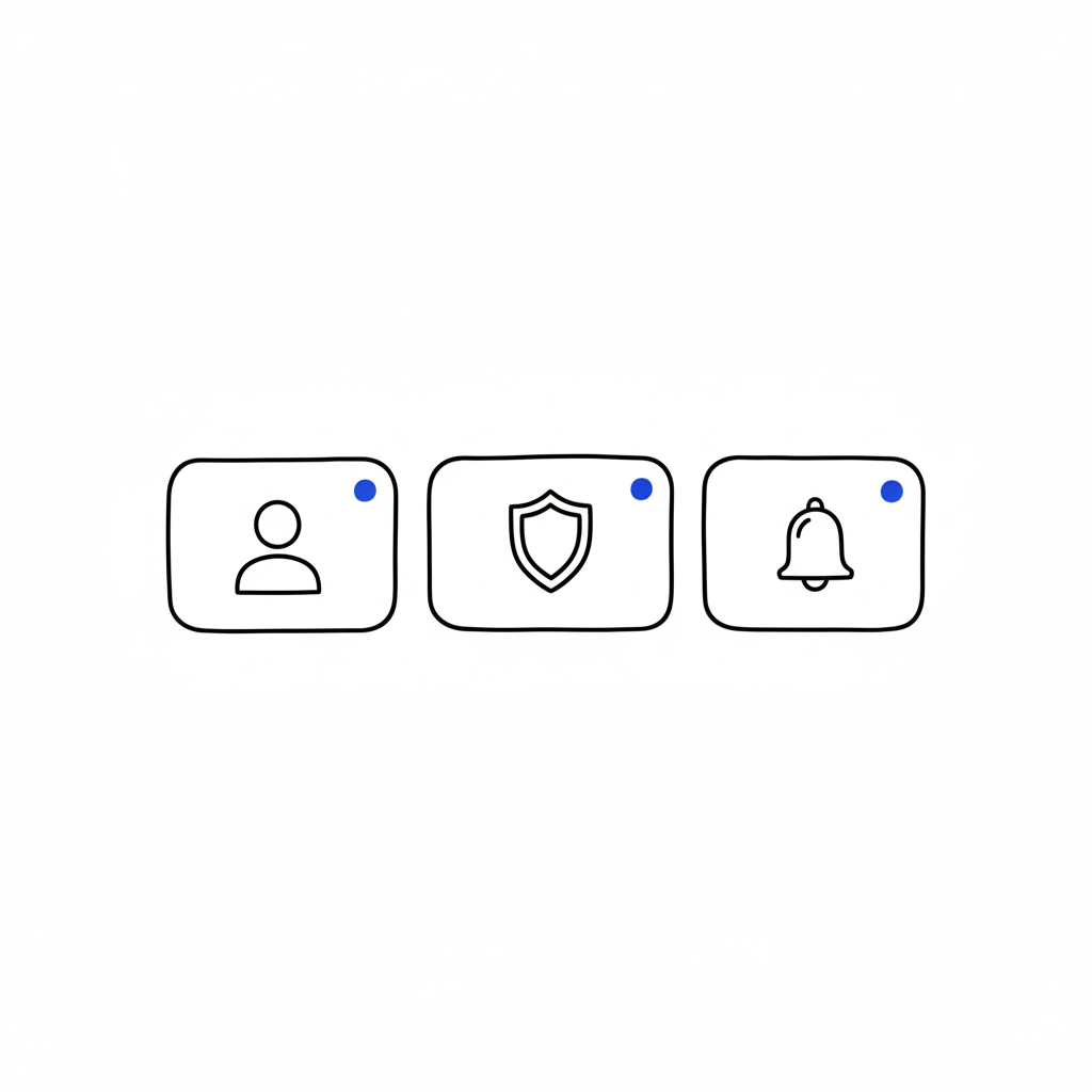
  • Navigation: Stick to standard layouts (top bar, left sidebar). Users shouldn’t need a map to find the “Home” button. If you hide your navigation inside a gesture-based mystery menu, you are playing a game of hide-and-seek that your user didn’t sign up for.
  • Input Forms: Don’t reinvent the radio button or the checkbox. These patterns exist because they work. We’ve all filled out thousands of forms. Don’t make us re-learn how to select “Male/Female/Other” or how to check a box.
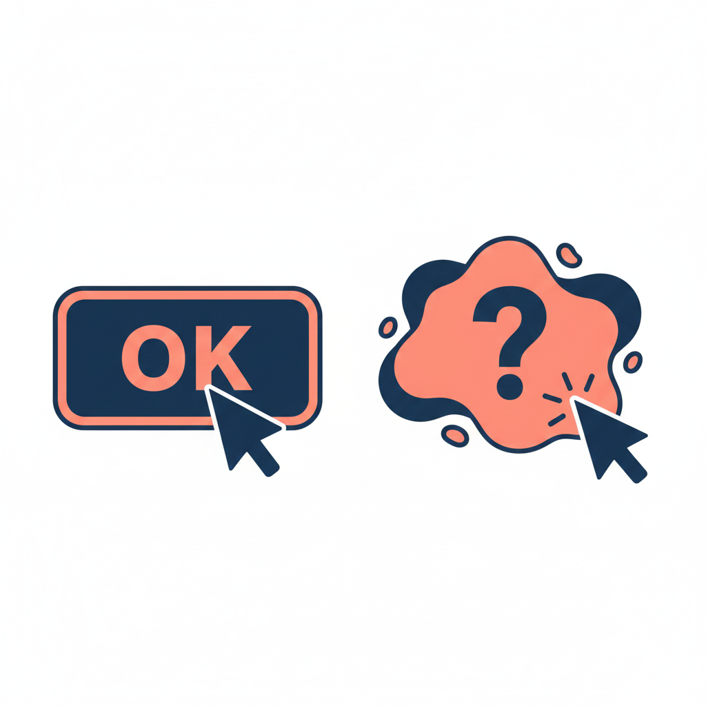
  • Feedback: When something loads, show a spinner. When something saves, show a checkmark. Don’t invent a new language of “success.” If your error message is a cryptic riddle, you have failed.

“The usage of UX design patterns in your design process promotes creating usable and high-convertive websites… we know it from our experience.” — Eleken

Skeleton vs. Skin: How to Be Unique Without Being Confusing

This is the part where designers panic. “If I use common patterns, my app will look exactly like my competitor’s!”

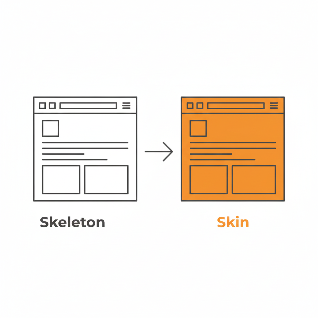
False. This is where the distinction between Skeleton and Skin comes in.

  • The Skeleton: This is the structure. The placement of the navigation, the layout of the form fields, the position of the primary CTA. This should be standard. This should be boring.
  • The Skin: This is the visual design. The typography, the color palette, the iconography, the micro-interactions, the copywriting. This is where you can be as unique as you want.

You can have the most boring, standard left-sidebar layout in the world, but if you pair it with bold illustration, witty micro-copy, and a vibrant color palette, your brand will shine through. You can be distinct without being difficult.

Use a pattern library. There are tons of them (like GoodUI or UI Patterns) that offer battle-tested solutions based on A/B testing. These aren’t “crutches”; they are cheat codes for usability. They free up your brain power to solve the actual hard problems of the product, rather than wasting time deciding if your “Login” button should be oval or square.

Be Boring to Be Brave

Real creativity in UX isn’t making a button look like a banana. It’s solving a complex problem so seamlessly that the user never notices the design at all.

It takes guts to say, “We’re going to use a standard tab bar because it’s what our users expect.” It takes confidence to know that your product’s value lies in its utility, not in its novelty.

So, go ahead. Be boring. Your users will thank you for it. And by “thank you,” I mean they will actually use your product instead of rage-quitting.

Downloadable Asset

We’ve compiled a “Don’t Be Weird” Pattern Library. It’s a collection of the most effective, standard UI patterns for navigation, forms, and data tables that you can drop into your project to ensure users feel instantly at home.
[📥 Download the Pattern Library]

FAQs

Q: But what if my brand is ‘quirky’ and ‘different’?
A: Your brand voice can be quirky. Your navigation should be predictable. Don’t make me solve a riddle to find the “Login” button. You can be a comedian without hiding the exit sign.

Q: Are carousels (sliders) a safe pattern?
A: Lord, no. Carousels are often terrible for UX. They hide content, they auto-scroll when you’re trying to read, and mobile users hate swiping them. Only use them if you hate conversion rates.

Q: If I use standard patterns, won’t my site look generic?
A: Customizing the skin (typography, color, spacing) allows for branding without breaking the skeleton (usability). Don’t break the skeleton. A skeleton with a broken arm doesn’t look “edgy”; it looks like it needs a doctor.

Q: What is the one time I should break a pattern?
A: Only when the existing pattern is fundamentally broken for your specific use case. But be prepared for the learning curve. And test it. If your users fail, you were wrong. Go back to the standard.

Also Read: Profile Page Design – The Underrated Conversion Goldmine You’re Ignoring

RPS // Blogs // Profile Page Design – The Underrated Conversion Goldmine You’re Ignoring
Profile Page Design: The Underrated Conversion Goldmine You’re Ignoring

Let’s be honest. When was the last time you got excited about a “Settings” page?

Exactly. Never.

In the design world, the profile or settings page is the digital equivalent of the utility closet. It’s where we shove the brooms, the mismatched Tupperware, and the holiday decorations. As long as the door closes and the clutter is hidden, we’re happy. We prioritize the landing page, the dashboard, and the analytics graphs. We treat the profile page like a tax form, a necessary evil.

Your profile page is a retention killer.

We spend months agonizing over landing page hero images and CTA button colors. But the moment a user signs up, where do they go to set up their account? The profile page. If that experience is cluttered, confusing, or ugly, you’ve just poured gasoline on your churn rate.

You can have the sexiest onboarding flow in the world, but if the user feels lost the second they try to upload an avatar or change their password, they’re gone. The “First Time User Experience” doesn’t end at the signup screen; it ends when the user successfully customizes their space.

Why “Boring” Pages Matter (The Psychology of Ownership)

A profile page isn’t just a data dump; it’s a user’s personal space within your product. It’s the only part of the app that truly belongs to them. In a sea of charts, graphs, and other people’s data, the profile page is the only mirror.

If you treat it like an afterthought—hiding it behind a vague gear icon or making it look like a 1990s database form—you are subtly telling the user that they are an afterthought. You are telling them that their personal comfort is secondary to the system’s efficiency.

This creates a disconnect. In SaaS, specifically, trust is currency. If a user feels they don’t have control over their own identity (can they change their name? can they delete their credit card?), they subconsciously stop trusting the platform with their work.

According to insights from top agencies like Eleken, a well-structured profile page isn’t about looking cool; it’s about information hierarchy. You need to separate the “critical” (email, password, billing) from the “nice-to-have” (newsletter preferences, dark mode toggle, social links). This distinction reduces cognitive load. A user shouldn’t have to scan 50 options just to figure out how to log out.

How to Stop the Clutter

The biggest mistake in profile page UI is trying to show everything at once. We’ve seen massive enterprise tools where the settings page is a literal wall of text—300 form fields with no visual break. That is not a page; that is a resignation letter.

Here is how to fix it:

1. Group the Logic (Don’t Mix “Danger” with “Delight”)

Don’t put “Delete Account” next to “Change Profile Picture.” That’s anxiety-inducing. Group things by intent: Identity (photo, name, bio), Security (password, 2FA), and Notifications. Keep the destructive actions (Delete Account, Downgrade Plan) in a separate, clearly marked “Danger Zone” or bottom of the page. This gives the user psychological safety while navigating.

2. Visual Hierarchy is King

The user’s name and photo should be the stars of the show. Give them real estate. The billing info should be visible but not screaming for attention. Use whitespace aggressively. If a section looks dense, users assume it will be difficult to use.

3. Empty States are Marketing

If a user hasn’t filled out their bio yet, don’t just show empty lines or a gray placeholder. That’s a wasted opportunity. Use that space to teach them the value of the feature. instead of a blank box, try: “Add a bio so teammates know who you are” or “Upload a logo to appear on your invoices.”

“The page that belongs to users… Most profile pages don’t make headlines… But open any app you’ve used, and chances are you’ll find your fingerprints all over that little corner.”Iryna Parashchenko, Eleken

4. Don’t Forget Mobile

This is where most profile pages die. A layout that looks clean on a 27-inch monitor becomes a thumb-twisting nightmare on an iPhone. On mobile, complex forms should be broken into bite-sized steps or collapsible accordions. If you are forcing a user to pinch-and-zoom just to update their phone number, you have failed mobile UX 101.

The “Invisible” Design Goal

The best profile pages are the ones you don’t notice. They feel obvious. They feel like the app was built specifically for that one user. When the design is “invisible,” the user feels a sense of agency and competence. They feel smart because they didn’t have to hunt for anything. And when a user feels smart, they stay.

FAQs

Q: Can I put a link to my design portfolio in the user’s profile for them?
A: You can try, but they will likely change it to a link to their cat’s Instagram. Prioritize their content, not yours.

Q: Is dark mode mandatory for settings?
A: Only if you want users to like you. Yes, it’s mandatory. Blinding white settings at 2 AM is a crime against eyes.

Q: How many tabs is too many tabs?
A: If you need a compass to navigate your settings page, you have failed. Stick to three or four max. Group the rest under “Advanced.”

Q: Should I hide the “Delete Account” button to reduce churn?
A: Never. Hiding it makes you look shady and desperate. Make it accessible, but ask for confirmation. If they really want to leave, a hidden button won’t stop them, just make them angrier.

Also Read: Apple’s Cross-Device UX: How Continuity & Handoff Drive 800M+ Active Users

RPS // Blogs // The “Pretty Portfolio” Trap: Why Founders Hire the Wrong Designers
A founder wearing a hoodie, standing at a crossroads with two doors in front of him. Door A is shiny and glowing with squiggly, abstract shapes and stars above it, but there’s a small sign that says ‘Dead End’. Door B is a plain wooden door with a simple blueprint drawing on it, glowing softly and showing a bright path leading to a small doodle city skyline. The founder looks thoughtful, scratching his head. Clean white background, thin black lines, soft pastel accent colors (blue, yellow, orange). Minimalist doodle style, flat 2D composition.”

Most founders are visionaries. They can see the future of their industry, but they often struggle to “see” the difference between a designer who makes things look good and a designer who makes things work.

If you are a founder who doesn’t come from a design background, you likely make decisions based on your eyes. You look at a portfolio, see a sleek, dark-mode dashboard, and think, “This is the person I need.”

But that is exactly how you hire the wrong designer. In the world of UX design hiring, aesthetics are the baseline strategy is the differentiator.

The Mistake: Hiring for Taste, Not Process

The biggest mistake founders make is evaluating a designer based on their “taste.” Taste is subjective. What looks “cool” to you might be a nightmare for your actual users.

When you hire for aesthetics alone, you are hiring a digital decorator. But what your startup needs is a product designer. A product designer doesn’t just ask, “What color should this be?” They ask, “Why does this button exist in the first place?”

The Right Process: Research → Iterate → Measure → Refine.
The Wrong Process: The designer says, “Trust me, I have a feeling this will look great.”

Red Flags: The “Auteur” vs. The Problem Solver

Watch out for the designer who loves their work more than they love your users.

If a designer gets defensive when you show them negative user feedback, that is a massive red flag. A great designer is a scientist—they want to find the truth, even if it means their first three ideas were wrong.

A common red flag is the “Trust Me” approach. If a designer can’t explain the logic behind a layout using data or psychology, they are guessing. And guessing is expensive for a startup.

The Portfolio Trap: Teams vs. Individuals

Founders often see a portfolio featuring a world-class app like Uber or Airbnb and assume the candidate “built” it.

In reality, those apps are built by teams of 50+ designers. The candidate might have only worked on the “Forgot Password” flow. When hiring a UI designer, always ask: “What specifically was your role, and what were the constraints?” The best work often comes from designers who have worked on “ugly” but highly successful products because they had to solve real, messy problems.

How to Interview: Ask About Failures, Not Wins

Most designers are prepared to walk you through their best work. To find the right fit, you need to go off-script. Ask them: Walk me through your worst project.

A top-tier designer will tell you about a time they failed, what the data showed them, and how they pivoted. This reveals their product design strategy. It shows you if they have the humility to learn and the grit to fix things when they break.

The Story of Brian Chesky and the “Designer Founder”

When Brian Chesky and Joe Gebbia started Airbnb, they were designers. However, they didn’t just focus on making a pretty website. In the early days, they realized the business was failing because the photos of the apartments were terrible.

They didn’t just “redesign the UI.” They rented a camera, flew to New York, and took professional photos themselves. They treated design as a solution to a business problem (trust), not just a visual upgrade.

If you are a founder who can’t design, you need to hire someone who thinks like Chesky—someone who views design as a tool to achieve a business goal, not just an art project.

The Price of “Cheap” Design

Finally, let’s talk about compensation psychology. Many founders try to save money by hiring junior designers to do senior-level strategy.

Underpaying for design leads to “mediocre execution.” You might get a product that looks like a 10/10, but if the user flow is a 2/10, your churn rate will skyrocket. It is cheaper to hire one expensive designer who gets the process right than to hire three cheap designers who build something nobody can use.

4. Image Prompt (For “The Portfolio Trap” section)

A visual metaphor of an iceberg. The tip of the iceberg above water is labeled “The Portfolio (UI).” The massive part of the iceberg underwater is labeled “The Process (Research, Logic, Testing, Strategy).” This represents the depth required for a successful hire. Modern, clean 3D render.

Also Read: Beyond the Grid: Why Design is Breaking Free from Systems and Dashboards

RPS // Blogs // When Your Fintech App Has a User Problem, Design Is Almost Never the Answer
When Your Fintech App Has a User Problem, Design Is Almost Never the Answer

Nearly 87% of fintech users drop off during onboarding. This statistic appears repeatedly across research reports, case studies, and industry publications.

But here’s what most founders don’t realize: the problem isn’t usually bad design. It’s bad structure.

A fintech startup in Bangalore spent four months redesigning their KYC flow. New colors. Modern interface. Animated transitions. Then they launched.

Drop-off rates stayed the same.

So they tried again. Different agency. Different approach. Same result.

The third time, they ran a proper UX audit.

Turns out, their problem wasn’t visual design. It was information architecture. They asked users to upload six documents upfront. Most users saw the list and left before providing anything.

The fix was structural, not aesthetic. Break the six documents into six separate screens. Progress bar to show advancement. One field per screen instead of overwhelming context.

Completion rate jumped from 12% to 76%.

What an Audit Actually Measures

An audit connects design friction to user behavior. It answers specific questions:

Where do users abandon? Not where you suspect. Where they actually stop.

Why do they abandon? By watching real users struggle, you uncover the real reason.

What fixes matter most? Some friction points affect 5% of users. Others affect 40%. Audit data tells you which ones cost most in lost revenue.

Do fixes work? Audits recommend changes. Then measure whether those changes impact the metrics you care about.

Most product teams skip this rigor. They design. Release. Hope users like it. When they don’t, they blame market conditions or blame users. Rarely do they dig into actual behavior.

The Audit Process Simplified

Start by gathering data. Pull analytics on where users drop off. Review support tickets. Look for patterns.

Then watch real users interact with your product. Not your team. Real users. Five is enough. Watch where they pause. What confuses them. Where they consider leaving.

Next, evaluate your current flow against fintech-specific principles. Does it clarify what happens with personal data? Does it explain why compliance steps matter? Does it show progress?

Prioritize which issues to fix based on user impact. Problems affecting 30% of users take priority over problems affecting 3% of users.

Finally, measure the impact of changes. Audits aren’t complete until you measure whether your fixes actually improved the metric that matters most.

Why This Matters

Fintech exists in a trust economy. One bad experience creates permanent skepticism. Users have other options. Plenty of them.

When users abandon your KYC flow, they’re not deciding your app is ugly. They’re deciding it doesn’t feel safe. The experience feels complex. The reasons feel unclear. Progress feels uncertain.

Design can’t fix those feelings. Structure can.

Real Impact

A lending platform discovered users didn’t understand why they needed to upload so many documents. Adding one-sentence explanations for each field cut form completion time by 73%.

An insurance platform realized users couldn’t find basic actions because important buttons weren’t visually prominent. Making those actions 40% larger reduced support volume by 60%.

A payments app found users confused by transaction status messages. Simplifying language from financial jargon to plain English improved user confidence 320%.

None of these required complete redesigns. All required audits that revealed the actual problem before throwing design resources at hypothetical issues.

When to Run an Audit

Run an audit if:

Your onboarding completion rate is below 50%. Drop-off rates above 40% during key flows. Support volume is high for basic tasks. You’re planning a redesign but don’t know what to prioritize. Growth has plateaued and you suspect UX friction.

Audits cost between 5 and 10% of typical project budgets. They reveal 80% of actual problems.

Skip the audit and you’ll likely spend 100% of redesign budget fixing things users don’t actually need fixed.

How to Get Started

Pull your analytics. Find your worst-performing flow. That’s where your audit begins.

Get session replay data. Tools like Hotjar or LogRocket let you watch real users struggle at exactly that point.

Run a basic usability test. Five users. One task. No guidance. Record what happens.

Ask yourself: at what exact moment do users get confused? What causes that confusion? Is it unclear writing? Too many options? Progress uncertainty?

That’s your audit. That’s where discovery begins.

The fintech companies growing fastest aren’t redesigning endlessly. They’re measuring obsessively. They’re testing with real users. They’re fixing what actually breaks instead of what looks wrong.

Start measuring. Everything changes from there.

Also Read: The UX Audit Process That Turns Fintech Drop-Offs Into Conversions

RPS // Blogs // How I Cut Client Onboarding to 1/60th the Industry Time – And Built a Design Studio That Actually Moves Fast
Offsite 2025 Nandi Hill - Presentations, Client Onboarding and get together.

December 2024. I got a WhatsApp at 11:47 PM from a fintech founder I’d never met: “Our users are abandoning the app in 8 minutes. Can you help?”

Most design agencies would have responded with a discovery timeline 4-6 weeks minimum, maybe 8-12 if they’re being “thorough.” They’d schedule stakeholder interviews, conduct lengthy user research, build elaborate presentations, and charge ₹15-25 lakh before a single pixel moved.

I sent back: “We can have insights by Friday and prototypes testing by Monday.”

He thought I was joking. Until we actually did it.

That’s when I realized something most of the design industry hasn’t figured out yet: speed isn’t the enemy of quality. Bureaucracy is.

The Onboarding Crisis Killing Indian Startups

Here’s what nobody talks about: the average design agency takes 6-8 weeks just to onboard a new client. By the time they’ve scheduled kickoff meetings, aligned stakeholders, conducted discovery workshops, and finally started actual design work, most Indian startups have already burned through a significant portion of their runway.

Meanwhile, 68% of Indian fintech users abandon apps during onboarding not because the products are bad, but because the experiences feel like government paperwork. The irony? The agencies hired to fix this problem mirror the same friction in their own processes.

When I founded Rock Paper Scissors Design Studio in 2020 during lockdown, I didn’t set out to revolutionize onboarding. I just couldn’t afford the traditional agency bloat. No fancy office in Bandra. No endless internal meetings. No discovery phases that stretched longer than the actual design work.

What I discovered instead was this: when you remove unnecessary friction from your own operations, you become exceptional at removing it for your clients.

The 1/60th Breakthrough Nobody Expected

The math is simple but shocking. Traditional design agencies typically take 8-12 weeks from contract signing to delivering initial concepts. That’s roughly 60 business days.

Rock Paper Scissors Studio delivers strategic insights, initial prototypes, and actionable design directions in 1 day.

One day versus sixty days. That’s the 1/60th onboarding time advantage.

But here’s the critical part: this isn’t about cutting corners or rushing quality. It’s about eliminating the organizational theater that masquerades as “process.”

What We Eliminated (And What We Kept)

Most agencies drown in ceremony:

  • Week 1-2: Kickoff meetings and stakeholder alignment
  • Week 3-4: User research and competitive analysis
  • Week 5-6: Workshops and ideation sessions
  • Week 7-8: Internal reviews and presentation prep
  • Week 9-12: Finally, some actual design work

We flipped the script entirely.

Day 1: Deep-dive strategy call. We extract every critical insight about their business, users, pain points, and goals in 60-90 minutes. No fluff. No corporate small talk. Just strategic questions that matter.

Day 2-3: AI-powered research and competitive analysis. While traditional agencies schedule research meetings, we’re already analyzing user behavior patterns, mapping friction points, and identifying opportunities.

Day 4-5: Initial concepts and prototypes. Not polished presentations working prototypes that clients can actually interact with and test.

By the time traditional agencies are still scheduling their second stakeholder alignment meeting, we’ve already delivered testable solutions.

The Secret Nobody Talks About

The real breakthrough isn’t speed. It’s intelligent automation married to human expertise.

At Rock Paper Scissors Studio, we use AI to handle the 40% of design work that’s repetitive: research aggregation, pattern analysis, competitive benchmarking, asset preparation. That frees our designers to focus entirely on what actually requires human intelligence: understanding psychology, removing friction, and crafting experiences that feel effortless.

This is what Shivendra Singh, our CEO, calls “design-systems thinking” building frameworks that scale efficiently without sacrificing craft.

From Mumbai to Bangalore: The Distributed Advantage

Operating across four cities Bangalore, Mumbai, and Delhi gives us another unfair advantage. While traditional agencies waste 2-3 hours daily in commutes and office politics, our distributed team operates 35% more efficiently.

No meetings for the sake of meetings. No office drama. Just focused execution.

This model also cuts our operational costs significantly, which means we can deliver the same quality as ₹20-30 lakh agency projects for half the cost and in a fraction of the time.

Real Client, Real Results

October 2025. Qualtech Edge, a BFSI platform that had been innovating for two decades, approached us with a rebrand challenge. They were launching Qualtech 2.0 at Global Fintech Fest 2025 and needed a complete identity transformation, new logo, new website, marketing collaterals, and boardroom presentations. Traditional agencies quoted 12-16 week timelines. We delivered a launch-ready brand in a timeline that felt like fintech speed, not agency speed, applying the same 1/60th onboarding time principles that reduce client friction across everything we build.

The Formula That Changed Everything

Here’s what makes the 1/60th onboarding time methodology work:

Smart Research at Scale: We analyze thousands of user sessions using AI, understanding behavioral patterns across different states, languages, and demographics insights that would take traditional agencies weeks to compile.

Rapid Prototyping Without the Theater: We test 10 design variations in the time traditional agencies produce one polished presentation. We’re optimizing for learning speed, not presentation aesthetics.

Predictive UX Powered by Data: Machine learning trained on Indian fintech patterns helps us design for Bharat, not just metro India. We’re solving problems before clients even articulate them.

Compliance Automation: AI handles Aadhaar verification, PAN validation, and GST compliance checks while keeping the frontend beautifully simple.

The Results Speak Louder Than Process Documents

Across Fortune 500 brands, fintech unicorns, and bootstrapped SaaS companies, the pattern repeats itself:

  • Mumbai insurance platform: Onboarding reduced from 45 minutes to 8 minutes
  • Lending apps: Completion rates increased 340%
  • Pune wealth platforms: Customer Acquisition Cost cut by 45%

One breakthrough project involved a lending platform targeting tier-2 and tier-3 cities. Traditional agencies quoted ₹18 lakh and 10 weeks. Using AI-powered behavior analysis, Rock Paper Scissors Studio mapped drop-off points in 48 hours and rebuilt the entire experience.

Results after 30 days:

  • Bounce rate: 87% → 12%
  • Conversion rate: 2.3% → 23.7%
  • Loan approval time: 3 weeks → 2 hours
  • CAC: ₹847 → ₹127

That’s ₹60,000 saved per 100 customers, the difference between startup survival and shutdown.

Why This Matters Beyond Speed

Indian startups don’t have the luxury of slow design. Funding cycles are tightening. Competition is intensifying. User expectations are rising.

When we deliver 1/60th onboarding time, we’re not just saving weeks on a calendar. We’re preserving the runway. We’re accelerating time-to-market. We’re giving founders the velocity they need to test, learn, and iterate before their competitors catch up.

Shivendra Singh puts it simply: “Indian startups don’t have the luxury of slow design. Markets move fast. Funding dries up fast. You either deliver speed with intelligence, or you become irrelevant.”

The Philosophy That Drives Everything

At Rock Paper Scissors Design Studio, we believe design should never be the bottleneck. It should be the accelerator.

That means:

  • No politics, no micromanagement, no egos just space where creativity thrives
  • Remote-first culture that prioritizes output over office attendance
  • Design with purpose: solving real problems, creating real change
  • Velocity married to intelligence, never one at the expense of the other

The Future Is Already Here

The 1/60th onboarding revolution isn’t approaching; it’s already disrupting how forward-thinking companies build digital products.

The question for founders, CTOs, and product leaders: Will they adapt to this new velocity? Or will they continue scheduling discovery calls while competitors launch, test, and iterate?

At Rock Paper Scissors Studio, we’ve already made our choice. We’re building faster, smarter, and more efficiently than the industry thought possible.

And we’re just getting started.

RPS // Blogs // Select the Best A/B Testing Tool for UI/UX Design and Deliver Quality Work
Select the Best A/B Testing Tool for UI/UX Design and Deliver Quality Work.

Top UX Trends for 2025 A Glimpse into the future

A/B testing is a method of comparing two different versions of a webpage or an advertisement by randomly showcasing them before audiences. The one with more engagement is chosen over the other.
A/B testing helps UI/UX designers gather statistical data based on user choice. UI/UX design becomes more engaging rather than designing based on the opinions of the designer.
As the testing process involves user inputs, it can provide a better user experience. 

Let’s focus on some of the top-tier A/B testing tools for UI/UX designers. 

Top 5 Tools for A/B Testing 

Approximately 33% of companies that are at the highest level of success are running A/B testing for more than a year. It suggests that they have better ROI for A/B testing. 

Here are the top 5 tools for you to run A/B testing as a UI/UX designer.

Tool 1: Optimizely
A/B testing and multivariate testing are some of the crucial tests you can perform on Optimizely. It is a great tool for User Experience (UX) designers to experiment with UI/UX designs.

Key Features
You can run Optimizely for an unlimited time with different variables. It can run concurrent experiments with different variables. Any person without a degree in coding can use the tool to their benefit.
To perfect your UI/UX design as per your target audience, you can manually select customer age, locations, and other data. It helps to improve your decision-making process.

How It Helps UI/UX Designers

UI/UX designers can base their selection on solid customer engagement statistics using Optimizely. Besides, designers can explore their creativity with the feature of conducting unlimited concurrent experiments. 

Pros and Cons
Pros:
You can even use Optimizely WYSIWYG editor without any coding knowledge
It’s so easy to use that a person from the marketing team could also use it by providing relevant information. Easy to understand statistics and graphs for better understanding of the test
The dashboard of the tool is easy to use, it shows test insights helping developers decide

Cons:
The cost of the tool may be expensive for new or small to medium business organizations.
If you upload heavy code, it may slow down and take some time to load
The HTML editor panel sometimes crashes and shows the first few lines of the code.
Sometimes it is difficult to connect the tool with Google Analytics

Our verdict

Use Optimizely if you do not have an issue with its expensive pricing. However, it is a great option for developers to experiment with their creative ideas. But be careful with the volume of commands, it may crash with too much pressure.

Tool 2: VWO (Visual Website Optimizer)
A/B testing and optimizing conversions are two of the excellent features of the VWO platform.

Key Features
User-friendly UI is the most attractive feature of the platform. Anyone with no experience in coding or technical knowledge may find the platform useful. Users can easily run tests by changing small features like changes in headlines, image alterations, and others. 

How It Enhances User Experience

The visual editor of the platform is great for editing and running tests, reducing time for development. The easy-to-use editing and testing features allow users to act without the help of professional developers.

Pros and Cons
Pros:
It not only conducts A/B testing but also channels traffic to the best-performing sites through split URL testing
Non-technical team members can also join the developer in editing UI/US design because it has a user-friendly interface
To evaluate the eligibility of a user as a targeting audience, VWO has a feature called “check once” or “check continuously”

Cons:
It requires a large number of visitors to conduct a test and find a result
Its findings are not accurate in terms of A/B testing, rather it shows “likeliness to beat control”
You cannot easily calculate the total number of days the test has been conducted on the platform

Our verdict

The platform is suitable for small businesses at a growing stage. Any non-technical personnel can run small and easy changes. But complex editing may require expertise and more time.

Tool 3: Google Optimize
When it comes to offering tools to improve the personalized experience of users, Google Optimize is the tool you turn to.

Key Features
The tool is integrated with Google Analytics, helping you to learn about effective test results. The tool offers a no-code visual editor as well as options for professional coders to use advanced code editors.

Benefits for UI/UX Designers

UI/UX designers can create two different HTML to present different options. The tool can help identify the content that is performing better. It uses Bayesian statistics to accurately calculate test results.

Pros and Cons
Pros:
Unlike other tools mentioned above, Google Optimize is free to use. You don’t need to pay anything to use the tool. 
No coding knowledge is necessary for its usage. However advanced features are there for professionals to use code editors.
It provides a flicker-free experience during client-side testing. It also offers server-side testing.

Cons:
It has a limit over simultaneous experiments
Google Optimize does not allow script length of codes beyond 10240
There is no customer support for the free version – Google Optimize, unless you upgrade to Optimize 360
You won’t get the segmentation feature to test your target audience through A/B testing

Our verdict

Before committing to a paid version of any A/B testing tool, try Google Optimize. Try out its features first. It should be enough for you if you are starting your business.

Tool 4: Freshmarketer
It is another option for UI/UX designers to conduct A/B testing with their website designs.

Key Features
It lets the designers test different versions of the website and run A/B testing. It helps them to determine the most engaging version of the web design. Besides, the tool offers segmentation of target audiences helping web designers improve customer experience.

How It Improves Conversion Rates
The tool offers split testing which lets designers know the most effective web design. Based on the result, the designers can improve the conversion rate for the site.

Pros and Cons
Pros:
A heat map is one of the excellent features by Freshmarketer
The customer support team provides assistance all the time
Session reply from customers is an excellent feature of the tool, providing a unique view of customer interaction 

Cons:
The tool does not offer different internal tests
The free plan is too basic for customers to conduct A/B testing and related activities

Our verdict

You can go for Freshmarketer if you prefer using features like heat maps and replay customer sessions. It will help you identify areas that customers prefer. You can give it a try and if you run into any trouble, their customer support will be able to help you.

Tool 5: Adobe Target
Adobe Target can be a great tool to conduct A/B testing for multiple channels.

Key Features
You can use Adobe personalization, A/B and multivariate testing to provide a better experience to customers. Based on the test result, you can customize the user experience.

Why UI/UX Designers Choose Adobe Target
Adobe Target also splits traffic into two versions of web pages or mobile app elements. Then compare the engagement level among those two. The designer can then decide on keeping the better-performing version.

Pros and Cons
Pros:
Its report tells you the number of visitors, visitors’ countries, etc.
You can create a target audience based on their country, region and others
The tool is easy to use for people with no coding skills

Cons:
Customer support is not that helpful at all
The area to write text is small, so it can be challenging for designers to write codes on the tool
Targeting audiences from a geographical area is only limited to the paid version

Our verdict

If you want to pay a good amount for the paid version of the tool, then it can be useful for your campaigns. Use the tool if you conduct business internationally as it will allow you to view visitors from around the world. 

Conclusion
When it comes to choosing the best A/B testing tool for UI/UX designers, free tools top the user choice list. Especially if it comes from Google itself. We also suggest you try Google Optimize. 
You don’t need coding knowledge to operate the tool. Another benefit of the tool is its flicker-free experience during testing. 


However, if you want to try another tool, use the VWO A/B testing tool. User-friendly interface is what attracts customers to use the tool. 


A/B testing is a great way to improve your customer experience as it involves making decisions on solid statistics. Users also contribute to the UI designing process. Ultimately user experience helps to improve how customers feel visiting your websites. Hence, A/B testing is valuable to UI/UX designers. 

RPS // Blogs // Create a UI design system for your website with our easy-to-use guide
Create a UI design system for your website with our easy-to-use guide

A Complete Guide to Creating a UI Design System for Your Website in 8 Simple Steps

Projected to exceed 3.693 billion USD by 2028, the global market for UI design is fast growing. The main reason is that website design is the main impression for 94% of users. A good UI design increases conversion rates by 200%. 

Thus, having a UI design that suits your brand image, and is functional and navigable is the need of the hour for brands.

What is a UI Design System?

With a focus on aesthetics, UI focuses on creating an interface design (across devices) that users find interactive and easy-to-use. When designed and implemented well, UI improves the usability of your website and drives user engagement, making your website more productive.

Whether you want to make your website fun, interactive, or informative, the right UI design will help you achieve your website goals.

Definition of a UI Design System

Using a collection of standards, patterns, and interactive design, a UI design system aims to provide users a consistent experience across digital products and platforms. When it comes to designing a website, the UI design system standardizes the way the multiple pages have been designed. This reduces the time taken to recreate each page.

Why Do Websites Need a UI Design System?

In websites, visual consistency is a key and helps maintain uniformity. An intelligent UI design system ensures that:

  • Your website is scalable.
  • It is easy to implement changes and make updates.
  • Collaborative work is easier between the developing team and the designers.
  • You can control quality over the website.

Benefits of a UI Design System

Across all software systems, the use of UI design system has gained popularity due to the following reasons:

  • Makes a website unique and can act as a USP.
  • Make your website reflect the brand image.
  • Creates a better user experience.
  • Reduces the risk of losing knowledge when losing a team member.
  • Improves the speed and responsiveness of your website.
  • Draws more users to the website.
  • Facilitates easy navigation across web pages.
  • Makes it easier to convert customers and boost sales.

Preparing to Build Your UI Design System

Whether you want to revamp your website or deploy a new one, the best way forward is to pick a design that resonates with your brand. This carries over from the interface that you have to the tone that you use. 61.5% of designers state that clients will leave a site due to poor structure and navigation.

Thus, you need to decide whether to keep your current layout, start from scratch, or merge some existing elements with a new design. Audit your current website, and identify elements that can be useful and those that need to be scrapped. 

To add, a key component to having the UI design is identifying your target audience. A website catering to the professional sphere will be vastly different from that catering to Gen Z consumers. Pick a design that works well for your target audience. Once this is done, you are ready to get started.

8 Simple Steps to Create a UI Design System

Though UI design has a broad scope and can involve a lot, you can take a piecemeal approach with the following steps:

Step 1: Define Your Design Principles

The more haphazard the design, the higher the bounce rate* for a website. Lay out a guide that outlines every aspect from scope to design to usability. This will help create uniformity between the multiple pages. Further, this should be device compatible since 50% of users visit the mobile website of a brand instead of downloading an app.

* Bounce rate: The percentage of unengaged sessions. The user stays on the website for less than 10 seconds, does not view any other page in the website, and there are no key events. 

Step 2: Create a Visual Style Guide

Pick a typography that makes your content stand out and easy to read. Further, using the brand colors on the website creates a link between the brand and the website. To add, the content (images, texts, links, etc.) should be spaced properly to create an appealing style.

The best way to do this is to create a visual guide before the developers start working on the website’s design.

Step 3: Build a Component Library

Take all the functional/decorative items such as input fields, menus, buttons, and images. Sort through them to identify what is usable and what is not.

Once you have what is useful, create a repository from which you can pick components as required.

Step 4: Document Interaction Patterns

Test how interactive your design is. This includes the hover effects, button animations, sliding images, pop ups, menus, drop downs, etc. Check their functionality and response time. Faster websites have 11% higher conversion rates and increased engagement by 20%.

Step 5: Set Up Accessibility Standards

To increase the target audience base and ensure that people have an easier time navigating your website, it needs to meet the accessibility standards. This ensures that people, whether differently abled or otherwise, can use the website. This means being perceivable, operable, understandable, and robust. 

Make sure that the website sticks to the WCAG 2.0 guidelines and can be scaled up as and when required. 

Step 6: Choose the Right Tools

Figma, Sketch, Adobe XD, and InVision are some of the top tools that can help test your website at the design and prototype stage. Pick the tool that suits you best to run all the checks before roll-out. 

Step 7: Test Your Design System

A firm belief of 83% of users is that websites should provide a seamless experience no matter the device. No matter the target audience, websites need to be usable, consistent across the pages, and accessible via different devices. During the testing stage, you need to keep this in mind. 


Some of the most important checks for a website before roll-out are usability, readability, layout consistency, performance, security, and device compatibility. Check all aspects of the website, from response time to formatting before the website is deployed.

Step 8: Maintain and Update Regularly

Website development is not a one-and-done job. Create a route via which the website can be updated regularly to keep up with the security protocols that are deployed as well as other changes that are implemented across the internet. Further, this ensures that the website remains compatible with the different browser versions.

Examples of Effective UI Design Systems

Whether you want to build your own UI design system or use one already in use as a model, you need to be aware of some of the best UI design systems available. Our list includes the below:

Google Material Design System

An easy-to-use system, its main features include Starter Kits for designers, Design Source Files, Themes, Layout, Typography, Mobile Guidelines, and more. Thus, it has turned out to be the preferred choice for many.

Apple Human Interface Guidelines

Emphasizing user experience and with an extensive design system resource, it simplifies UI design. This makes it useful for advanced designers and novices alike.

Atlassian Design System

Accounting for brand values and using digital experience to increase productivity, this system tracks every step and offers agile practices in product development.

Polaris by Shopify

An easy-to-follow style guide, this makes effective use of design elements for a better user experience.

Carbon Design System by IBM

To meet the needs of large corporations, this tool is more targeted toward businesses that work in the professional sphere such as consulting, finance, IT, and others. Further, it offers integration with tools such as Adobe and Sketch for designers as well as developers.

Common Mistakes often Faced in UI Design

70% designers state that poor design and response time is the biggest reason why clients leave a website. For the best user experience, make sure to avoid the following:

  • A mismatch in design across web pages.
  • A tough-to-navigate interface.
  • Having a poor touch target (for mobile devices).
  • Formatting errors such as poor typography, bad iconography, alignment issues, etc.
  • Not having a balance between text and images.
  • Focusing on uniqueness but not usability.
  • Not testing the website properly before deploying.

Conclusion

Your website needs to reflect your brand image, being one of the first things your customers will see. Hence, it needs to be as flawless as can be for an excellent user experience.Having the right UI design system is a must when it comes to addressing this. Revamp your existing website with the steps listed in this guide or create a new, more functional website for your clients.

RPS // Blogs // The Future of UX What’s Driving Change in 2025
The Future of UX What’s Driving Change in 2025

The Future of UX: What’s Driving Change in 2025

As technology evolves and user expectations rise, UX design is entering a new era. In 2025, the focus is on creating smarter, more intuitive, and sustainable experiences. From AI-driven personalization to eco-conscious design, here’s how UX is being redefined.
 
Chatbots Everywhere: The Future of Seamless UX
Chatbots are transforming user interactions, now handling over 85% of customer engagements. They provide instant, 24/7 support, enhancing convenience and satisfaction. As AI makes them smarter and more intuitive, chatbots will continue to be a key element of seamless digital experiences.
 
AI-Powered Experiences: Personalization at Its Best
Artificial Intelligence is revolutionizing UX by tailoring content, recommendations, and interactions based on user behaviour. AI not only enhances engagement but also streamlines tasks and boosts efficiency, making digital experiences more intuitive and rewarding.
 
Sustainable UX: Designing for a Greener Tomorrow
With growing environmental consciousness, sustainable UX is gaining momentum. By reducing digital waste, optimizing resources, and promoting eco-friendly practices, UX designers are shaping experiences that benefit both users and the planet.
 
Micro interactions & Animations: Elevating Engagement
Small yet impactful, micro interactions and animations make interfaces more engaging and user-friendly. These subtle elements guide users smoothly through their journey while adding a touch of charm. Animations enhance emotional connections, fostering stronger relationships between users and digital platforms. When executed thoughtfully, they transform mundane interactions into delightful experiences.
 
Looking Ahead
The UX landscape in 2025 is driven by intelligence, sustainability, and engagement. As technology advances, designers play a crucial role in crafting experiences that are not just efficient and seamless but also meaningful and responsible. The future of UX is about connecting users, technology, and the world in more thoughtful ways.