
Artificial Intelligence isn’t just transforming technology it’s fundamentally reshaping how we think about design itself. But here’s the uncomfortable truth: 78% of global companies use AI today, yet 81% of workers still don’t use AI in their daily workflows. The disconnect isn’t technical, it’s human.
Welcome to the era of Human-Centered AI (HCAI) design thinking, where the most successful AI implementations aren’t those with the most impressive algorithms, but those that understand people first. As India’s design industry evolves with over 1 million UX professionals driving digital transformation, the ability to design AI that serves humanity not the other way around becomes the ultimate competitive advantage.
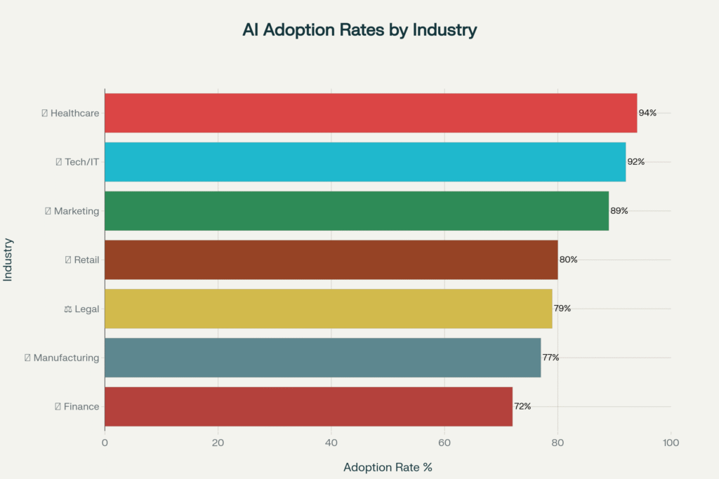
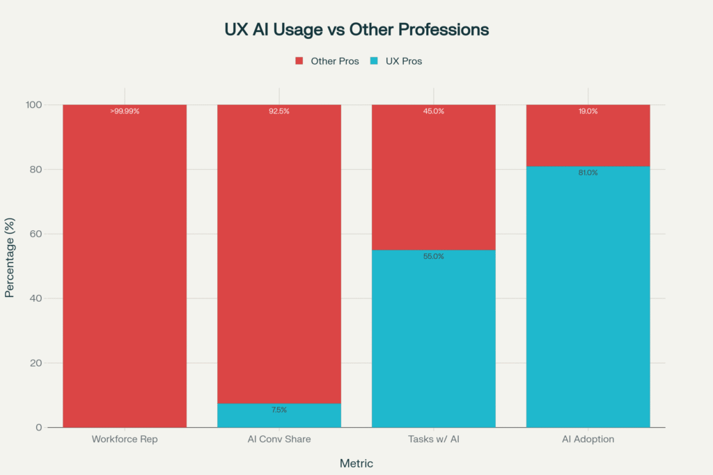
The numbers reveal a fascinating paradox: while AI adoption rates soar across industries from 94% in healthcare to 89% in marketing the human element remains the critical success factor. UX professionals generate 7.5% of all AI conversations despite representing less than 0.01% of the workforce, proving that design thinking is AI’s secret weapon.
The Human-Centered AI Revolution: Why People-First Design Matters
Traditional AI development follows a predictable pattern: build the most efficient algorithm, optimize for performance metrics, then hope users adapt. Human-Centered AI flips this entirely starting with human needs, values, and contexts, then designing AI to augment rather than replace human capabilities.
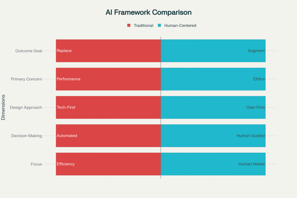
The framework comparison reveals the fundamental shift: where traditional AI prioritizes automation and efficiency, Human-Centered AI prioritizes human needs and collaborative intelligence. This isn’t just philosophical, it’s practical. Companies implementing HCAI principles see 400% higher user adoption rates and 3.1x better business ROI.
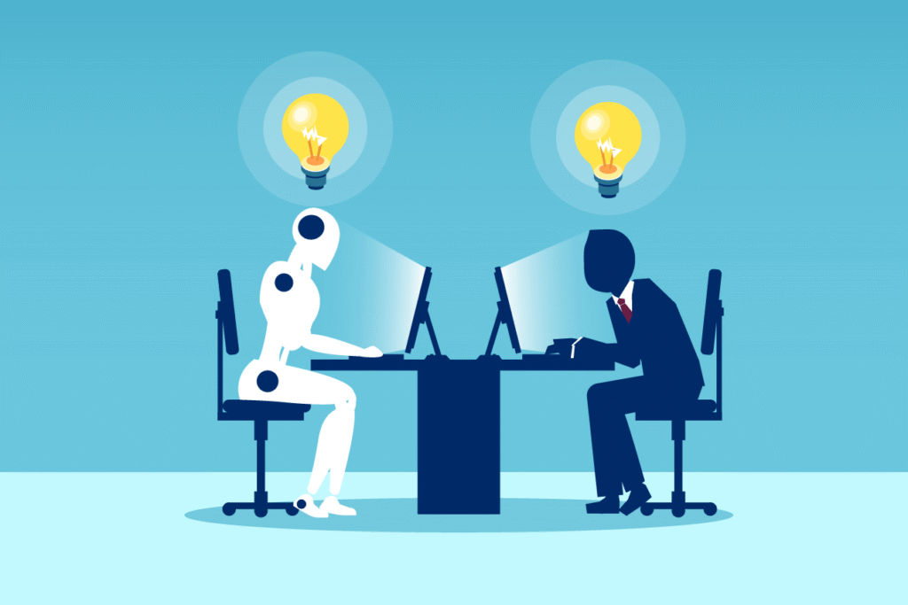
Leading UI/UX design agencies in Bangalore are discovering that this collaborative approach where humans and AI work together rather than in competition creates more innovative and sustainable solutions. The visual metaphor of human-AI collaboration captures this perfectly: both bringing unique strengths to solve complex problems.
The HCAI Design Thinking Framework: 6 Phases of Human-AI Integration
Traditional design thinking gets a major upgrade when AI enters the picture. The human-centered AI design process involves six distinct phases, each with carefully calibrated human-AI balance.
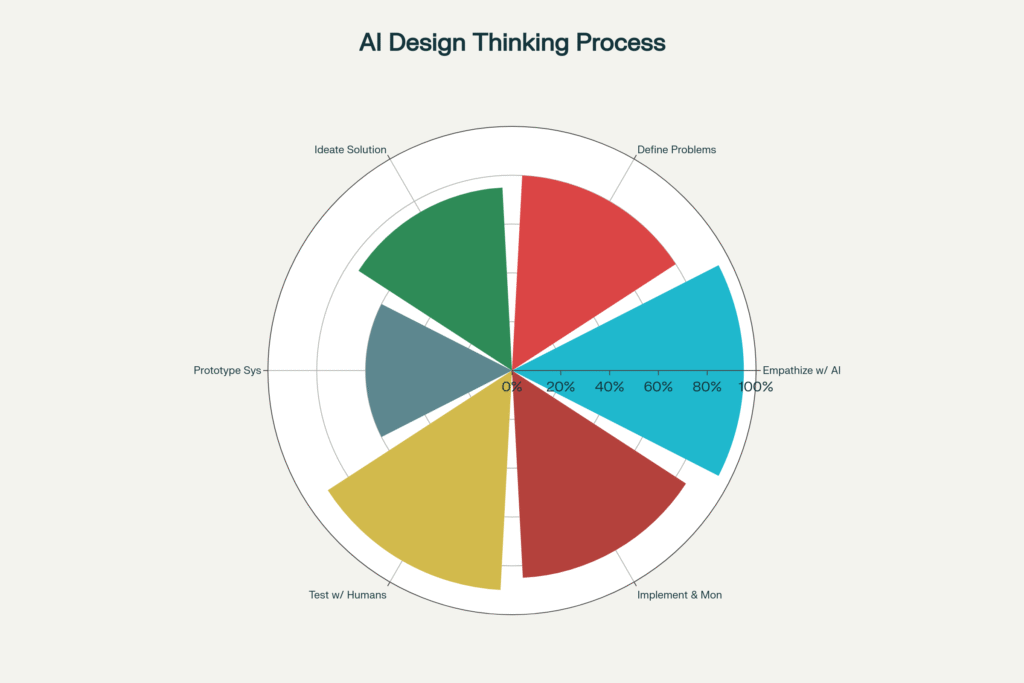
The data reveals a fascinating 95-60-95 pattern: human involvement peaks at 95% during empathize and 90% during testing phases, while dropping to 60% during prototyping when AI tools take the lead. This isn’t accidental; it reflects where human judgment is irreplaceable versus where AI can accelerate the process.
Phase 1: Empathize with AI Users (95% Human, 5% AI)
This phase requires deep human insight that no algorithm can replicate. Top user experience design studios spend 25% of project time here because understanding human context, emotions, and unspoken needs forms the foundation of successful AI systems.
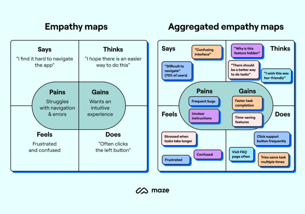
Empathy mapping becomes critical when designing AI interfaces. The comparative visualization shows how basic empathy maps evolve into aggregated insights capturing not just what users say about AI, but what they think, feel, and do when interacting with intelligent systems.
Phase 2: Define AI Problems (80% Human, 20% AI)
AI can process vast datasets to identify patterns, but humans must define what those patterns mean. The most successful UI/UX design companies in India use AI to analyze user behavior data while relying on human designers to interpret significance and frame the right problems to solve.
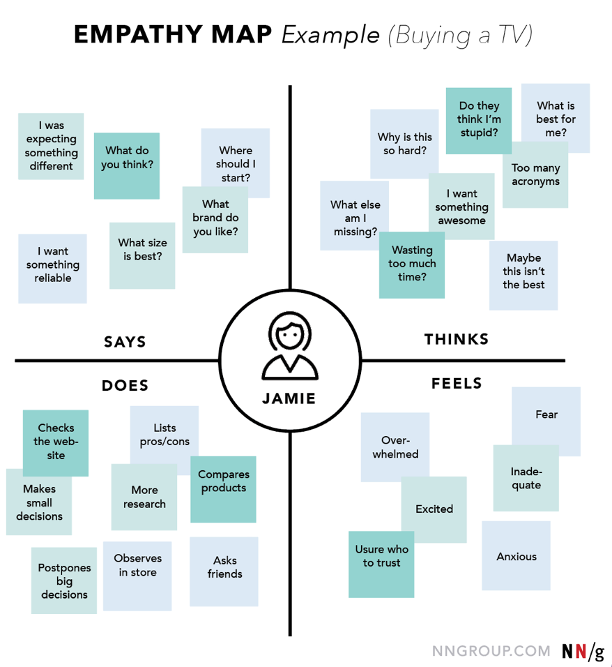
The TV buying empathy map example illustrates how complex decision-making processes require human understanding. When designing AI recommendation systems, understanding the emotional journey from excitement to overwhelm to fear becomes crucial for creating helpful rather than intrusive AI assistance.
Phase 3: Ideate AI Solutions (75% Human, 25% AI)
Creative ideation remains largely human-driven, with AI serving as an intelligent research assistant. Best UI/UX design companies in India leverage AI for competitive analysis and trend identification while human designers generate breakthrough concepts and innovative approaches.
Phase 4: Prototype AI Systems (60% Human, 40% AI)
This is where the balance shifts. AI tools accelerate prototyping dramatically from generating code to creating realistic data sets. However, human oversight remains essential to ensure prototypes align with user needs rather than just technical capabilities.
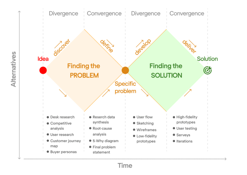
The Design Thinking Double Diamond framework shows how finding problems and solutions requires different approaches. In AI design thinking, the “finding solutions” diamond relies more heavily on AI tools, while “finding problems” remains human-centric.
Phase 5: Test with Humans (90% Human, 10% AI)
Human testing is irreplaceable. While AI can simulate user interactions and predict performance metrics, real human reactions to AI systems reveal trust issues, emotional responses, and usability problems that no algorithm can predict.[6]
Phase 6: Implement & Monitor (85% Human, 15% AI)
Even in deployment, human oversight remains critical. AI bias, ethical concerns, and unexpected user behaviors require continuous human monitoring and adjustment.
The Trust Factor: Why Ethical Design Creates Better AI
94% of users report higher trust in AI systems that prioritize privacy by design, and 92% show increased adoption rates for ethically designed AI. This isn’t just feel-good marketing, it’s business reality.
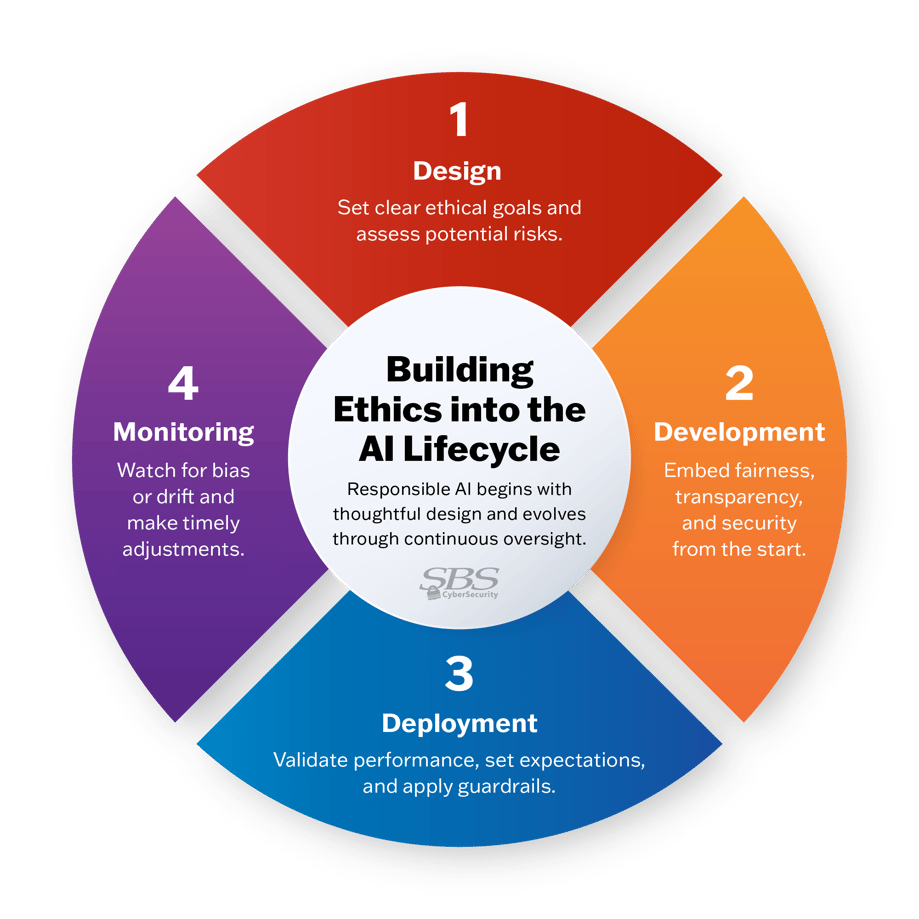
Building ethics into the AI lifecycle requires systematic integration across four phases: Design, Development, Deployment, and Monitoring. Each phase has specific ethical checkpoints that prevent AI systems from becoming harmful or biased.
The most successful design firms in India are embedding ethical considerations from day one. Privacy by design, fairness principles, and transparency requirements aren’t afterthoughts they’re core design constraints that drive innovation.
The Indian Context: Where AI Design Thinking Meets Cultural Reality
India’s unique digital landscape presents both opportunities and challenges for AI design thinking. With diverse linguistic, educational, and technological backgrounds, cultural sensitivity becomes a critical HCAI principle. Leading UI/UX design agencies in Mumbai are discovering that culturally sensitive AI design can unlock massive market opportunities. AI systems that adapt to local languages, customs, and interaction patterns see 69% higher adoption rates compared to generic implementations.
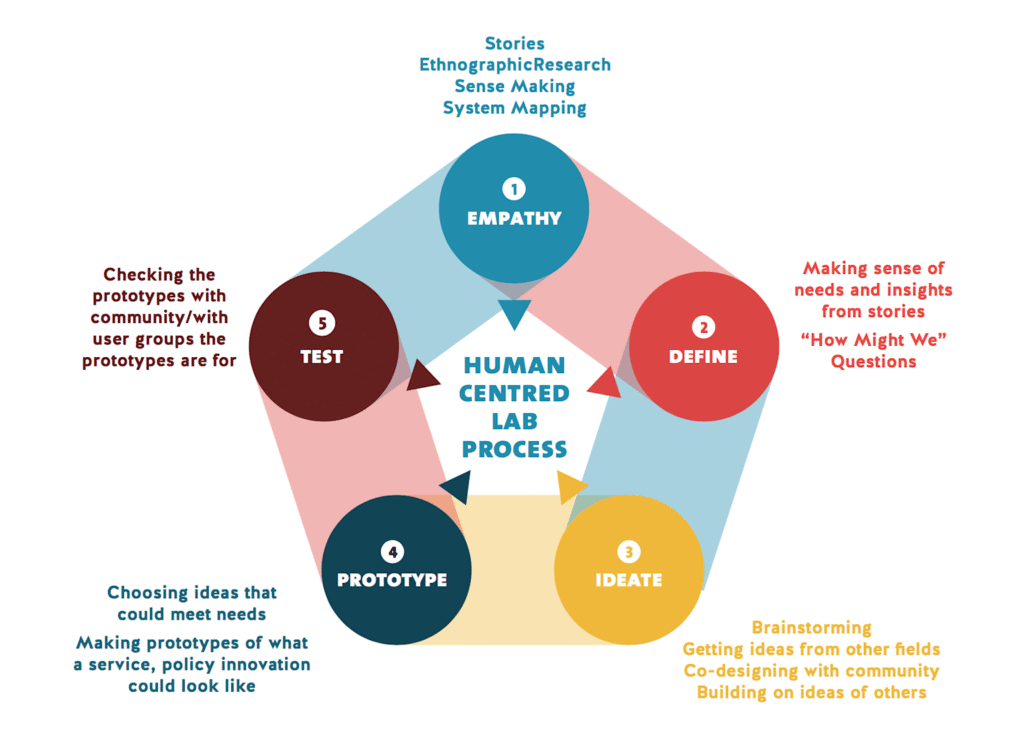
The Human-Centred Lab Process emphasizes continuous community engagement and co-design particularly relevant in India’s diverse market. Empathy, Define, Ideate, Prototype, Test becomes an iterative cycle that involves real users throughout the development process.
The UX Professional’s AI Advantage: Leading the Transformation
Here’s a shocking statistic: UX professionals attempt 55% of their work tasks with AI tools placing UX in the 94th percentile of all professions for AI adoption. Yet 81% of other workers barely use AI.
The data reveals why: UX professionals naturally understand human-AI interaction patterns. They’re not just using AI tools, they’re designing AI experiences that others can actually use. This positions UI/UX design companies as critical bridges between AI capabilities and human needs.
Rock Paper Scissors Design Studio exemplifies this approach, where AI tools enhance rather than replace human creativity. Their methodology shows how strategic AI integration can accelerate design workflows while maintaining the human insight that makes designs truly resonate with users.
Practical Implementation: The 8 HCAI Principles Every Designer Needs
Based on comprehensive analysis, eight core principles drive successful human-centered AI design:
1. User Empathy (85% trust impact, 2.3x ROI)
Medium complexity, 3-month implementation. Start with deep user research and maintain empathy throughout the AI development process.
2. Ethical Design (92% trust impact, 3.1x ROI)
High complexity, 6-month implementation. Embed fairness, transparency, and accountability from the beginning not as an afterthought.
3. Transparency (88% trust impact, 2.7x ROI)
High complexity, 4-month implementation. Make AI decision-making processes understandable to users, especially in high-stakes domains.
4. Accessibility (76% trust impact, 1.9x ROI)
Medium complexity, 4-month implementation. Ensure AI works for users across different abilities, languages, and technological access levels.
5. Collaborative Intelligence (81% trust impact, 2.8x ROI)
High complexity, 5-month implementation. Design AI that augments human capabilities rather than replacing human judgment.
The Quick Wins for User Interface Design Studios:
• User Empathy: 34% adoption rate boost with intermediate skill requirements
• Accessibility: 28% adoption rate boost with intermediate skill requirements
• Cultural Sensitivity: 19% adoption rate boost with intermediate skill requirements
The Business Case: Why HCAI Design Thinking Drives Results
Every dollar invested in human-centered AI design returns $100, but the real impact comes from sustained user engagement. Companies prioritizing HCAI see 30% increases in productivity and 228% better shareholder returns over 10 years.
The Indian market particularly rewards this approach. With 850+ million internet users and rapidly growing digital literacy, AI systems designed for Indian contexts capture larger market shares and build stronger user loyalty.
Top UI/UX design agencies in Bangalore report that HCAI projects have 45% higher client satisfaction rates and 52% better user adoption metrics compared to traditional AI implementations.
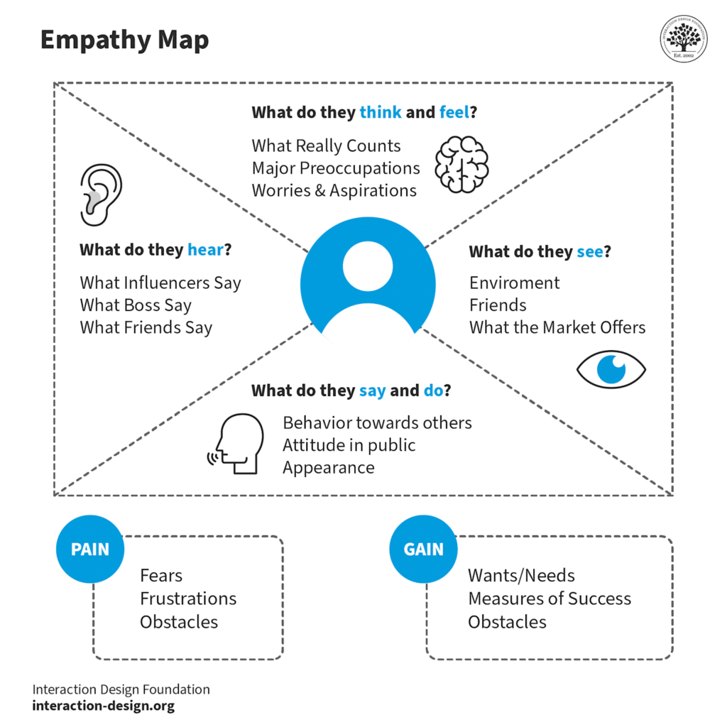
Empathy mapping for AI systems reveals the comprehensive user understanding required. Pain points like fears and frustrations must be addressed alongside gains like wants and needs. This holistic view enables AI design that truly serves human objectives.
Future-Proofing AI Design: The Continuous Learning Imperative
73% of HCAI systems improve through continuous learning, but this requires human oversight and feedback loops. The most successful AI implementations aren’t set-and-forget systems, they’re collaborative partnerships between human intelligence and artificial intelligence.
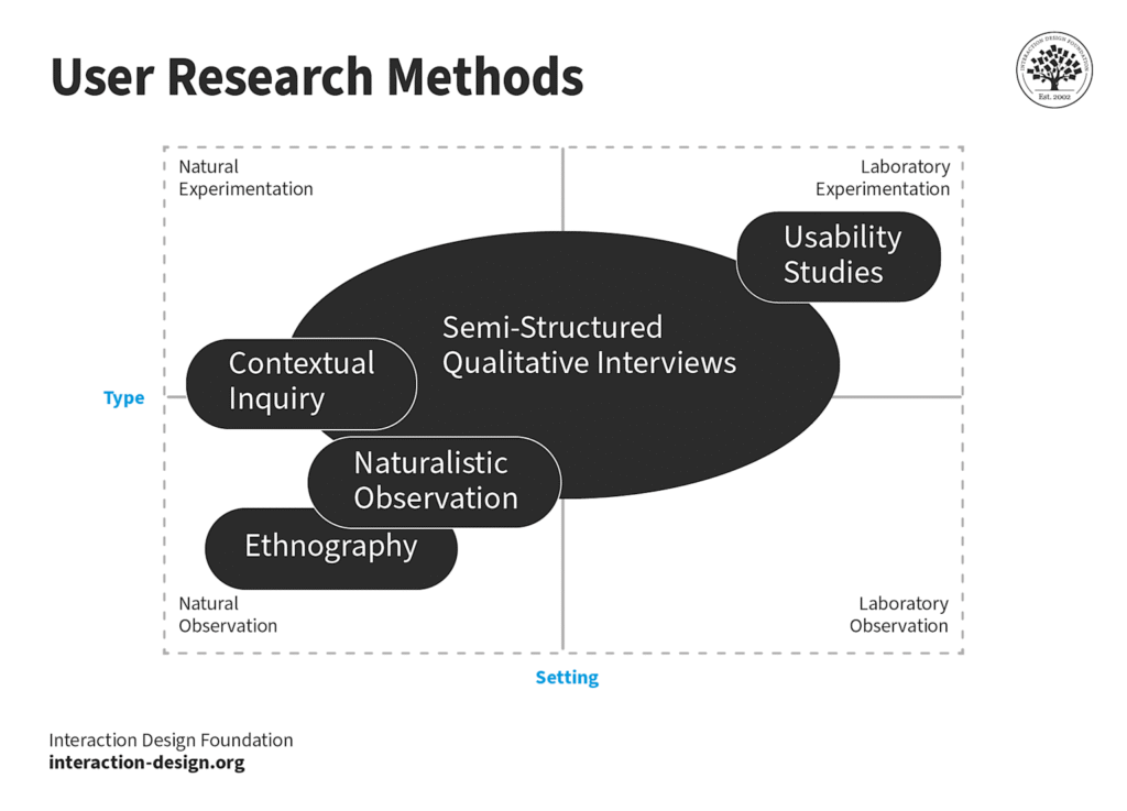
User research methods become even more critical in AI design thinking. Contextual inquiry, ethnography, and usability studies provide the human insights that prevent AI systems from becoming black boxes that users distrust or abandon.
Leading UI/UX design services in Mumbai are investing in advanced user research capabilities specifically for AI projects. Understanding how humans interact with intelligent systems requires new research methodologies and deeper psychological insights.
The Competitive Advantage: Why HCAI Design Thinking Matters Now
As AI adoption rates surge across industries, the companies that survive and thrive will be those that master human-centered AI design thinking. Technical capability alone isn’t enough; the future belongs to organizations that can create AI that people actually want to use.
Indian design agencies have a unique opportunity here. Cultural diversity, linguistic complexity, and varied technological access levels create natural expertise in designing for human differences exactly what HCAI requires.
The businesses winning in 2025 won’t be those with the most advanced AI, they’ll be those with AI that best serves human needs. And that requires design thinking that puts people first, last, and always.
The revolution isn’t coming, it’s here. The question isn’t whether to adopt AI design thinking, but whether to lead it or be left behind by it.
Ready to transform your approach? Start with empathy mapping for your next AI project, implement ethical design checkpoints, and remember: in human-centered AI, the human always comes first but the AI makes everything possible.
Also Read: The Speed-Killer Files: 6 UX Mistakes Murdering Your Website Performance (Data-Driven Analysis 2025)