Think about Elon Musk launching a new Tesla feature. He doesn’t force people to use it. He doesn’t spam notifications. He doesn’t build walls blocking the screen. Instead, he shows the feature exists, explains what it does, then gets out of the way.
Users either want it or they don’t. If they want it, they’ll use it. If they don’t, no amount of pushing changes that.
Most product teams do the opposite. They launch features with mandatory tutorials. Pop-up notifications every day. Forced onboarding that blocks everything. Then they wonder why users hate the new update.
The real secret to feature adoption isn’t about tricks or design magic. It’s about respect. Respect your users’ time. Respect their choices. Build something valuable, then trust them to discover it.
The Numbers Behind Failed Feature Adoption
Here’s what actually happens when teams use the wrong approach:
When companies force tutorial overlays, 67% of users skip them immediately. When they send daily notifications about new features, 71% disable notifications within one week. When they make features mandatory, adoption rates feel high (80%+ tried it) but actual ongoing usage drops to 8-12%.
Compare that to optional features with clear value: 34% of users try them within the first month. Among those who try them, 56% become regular users. That’s real adoption. Not false clicks, but actual usage.
Slack learned this lesson early. When they launched threaded conversations in 2019, they could have made it mandatory. Instead, they took a different approach. They showed interesting conversation threads automatically using their algorithm. Users saw actual value—cleaner channels, easier to follow discussions. Adoption happened naturally. Today, 60%+ of Slack conversations use threads.
What Kills Feature Adoption (The Things Teams Keep Doing)
Mistake 1: Giant tutorial overlays
Your user just opened your app. Suddenly a massive tutorial blocks everything. “Welcome to our new feature!” They haven’t asked for help. They don’t want to learn right now. They just want to get their work done.
Result: 89% skip it. 11% close the app entirely.
Mistake 2: Notification spam
Day 1: “Check out our new reporting feature!” Day 2: “Don’t forget about reporting!” Day 3: “Reporting can save you 2 hours weekly!” Day 4: “Last chance to discover reporting!”
Your notification is now the boy who cried wolf. Users disable all notifications. Now you’ve broken your ability to communicate important stuff too.
Mistake 3: Making features mandatory
You launch a new workflow. You make it the default. Users can’t access the old way. Suddenly you have 2,000 support tickets from confused people.
Users feel trapped. They resent the feature before even trying it properly.
Mistake 4: Assuming visibility equals adoption
“50% of users have seen the feature!” Celebrated in the standup. But “saw it” doesn’t mean “used it.”
You could have 90% awareness but 3% actual usage. The metric feels good. The business reality is failure.
The Right Way to Launch Features (Without Annoying Anyone)
Strategy 1: Make it discoverable, not forced
Put your new feature in navigation. Make it visible. But let users decide if they want to explore it.
If your feature is genuinely useful, users will find it. They might take a week. Maybe a month. But they’ll discover it without feeling pestered.
Strategy 2: Show value before asking for attention
Don’t explain features. Show results.
Example: You built a new analytics dashboard. Instead of forcing users through a tutorial, pre-load it with their own data. Let them see what it reveals about their business. Once they see “Oh, I’m losing 40% of users on this page,” they’ll explore the feature themselves.
When Figma launched design tokens, they didn’t force everyone to use them. They showed how teams already using tokens shipped features 35% faster. Teams saw the result and wanted in.
Strategy 3: Help only when users actually need it
User opens a feature for the first time? Small tooltip appears: “Filter by date to compare trends.”
That’s it. Context-specific help. Not a ten-minute tutorial. Just one sentence explaining the most useful action.
User doesn’t need it? They ignore it and keep exploring. No blocking. No annoyance.
Strategy 4: Make adoption require zero extra steps
If your feature requires 5 clicks and reading documentation, most users won’t bother. But if it’s one click away and immediately useful? Different story.
Cut friction aggressively. Every extra step kills adoption by 15-20%.
Strategy 5: Measure real usage, not vanity metrics
Your analytics show “8,000 users tried feature X.” Celebrate? Not yet.
The real question: “How many use it weekly?”
If 40% tried it but only 2% use it regularly, your adoption actually failed. You have high awareness but low engagement. That’s a design problem.
The Uncomfortable Truth About Feature Adoption
Ninety-two percent of launched features fail to reach mainstream adoption. Not because the design was bad. Not because users didn’t know they existed.
They failed because the feature didn’t solve a real problem users cared about.
You can build beautiful interfaces. You can make adoption friction-free. You can eliminate every annoying notification and tutorial.
But if your feature doesn’t actually help users accomplish something they want to accomplish? They won’t use it.
“Sirf achcha dikhna kaafi nahi hai, kaam bhi karna padta hai”
Before obsessing about adoption strategy, ask one question: Do users actually want this?
If the answer is no, no design trick fixes it. If the answer is yes? They’ll find it. They’ll use it. You just need to get out of the way.
The internet has lied to you. “Complete Figma course in 14 days.” “Learn UI/UX and land a job in 90 days.” These aren’t roadmaps, they’re fantasy stories sold by people making commissions.
I’ve mentored 50+ designers entering this field. The ones thriving? They followed a completely different approach. No shortcuts. Just strategic progression grounded in real-world application.
Foundation First: The Unsexy Truth Nobody Teaches
Here’s where 89% of aspiring designers crash. They jump straight to tools when they should be building mental frameworks.
Before opening Figma – literally before – you need to understand why interfaces work. Typography isn’t about picking pretty fonts. It’s about cognitive load management. Your brain processes Helvetica differently than Comic Sans. This isn’t aesthetic preference. It’s neuroscience.
Color theory transcends “pick a palette.” Colors trigger emotional responses measurable through eye-tracking studies. Apple’s minimalist grays communicate luxury through restraint. Netflix’s red demands urgency. These choices drive conversion metrics.
Layout hierarchies determine whether users find critical information or abandon your interface. Information architects discovered that users scan pages in F-patterns or Z-patterns depending on content structure. Understanding these natural reading behaviors means the difference between a 45% conversion rate and a 12% one.
Spend 3-4 weeks consuming this foundation. Study Ellen Lupton’s typographic principles. Analyze Josef Albers’ color interaction theories. Examine award-winning case studies from design firms like One Thing Design or Procreator Design. Document spacing ratios in products you use daily. This investment pays dividends for your entire career, tools become secondary when principles anchor your thinking.
Deliberate Tool Mastery: Figma as Language, Not Magic
Only after internalizing design fundamentals should you touch Figma. Here’s the critical difference: Learn Figma as a design system, not as a feature list.
Most tutorials teach you buttons. Real mastery teaches you workflow. Spend 2-3 weeks building component libraries, not from templates, but from scratch. Build a button system with 12 states. A form input with error handling. A navigation menu responding to different screen sizes.
The constraint reveals everything. When you’re forced to create a reusable component, you immediately understand what variables matter and which are decoration. This shifts you from tool operator to design thinker.
Competitive Analysis Through Reverse Engineering
Redesigning apps for your portfolio? That’s amateur hour. Professional designers study products strategically.
Open Figma alongside your target application. Measure every spacing unit. Why is that button 44px tall instead of 40px? (Answer: Apple’s human interface guidelines recommend minimum 44px touch targets for accessibility.) Why does Gmail use a sans-serif while The New York Times uses serifs? (Different audiences, different credibility signals.)
Create 3-4 detailed teardowns. Document design decisions. Find the reasoning behind choices. This trains you to see the “why” behind interfaces, skills that distinguish junior designers from senior ones earning ₹15-25 lakh annually in India’s design market versus ₹4-8 lakh for those following template approaches.
Building With Friction: Your Real Education
This step separates those who eventually work at studios like Rock Paper Scissors Design Studio from those perpetually freelancing on Upwork.
Build something nobody asked for. An app for your apartment building to track maintenance requests. A marketplace for your neighborhood’s gardeners. A budgeting tool for your friend group managing a trip.
Real users create real constraints. You’ll discover that your gorgeous mobile design becomes unusable with a keyboard visible. That “intuitive” gesture navigation confuses your 55-year-old aunt trying to book her flight. That your 120-character label exceeds the button’s physical space in production.
These friction points become your curriculum. You learn responsive design when a desktop layout collapses on iPhone SE. You grasp information architecture when users get lost in your navigation. You understand accessibility when your color-blind friend can’t distinguish form error states.
The Validation Loop: Testing With Actual Humans
Here’s where most learning breaks down. Designers show work to other designers. Predictable feedback. Predictable improvement. Limited growth.
Instead, recruit 5-7 non-designers. Record them using your product. Don’t explain. Don’t guide. Just observe.
Their confusion reveals your design assumptions. When your cousin can’t find the “Save” button you thought was obvious, you’ve discovered something. When your neighbor needs three attempts to complete checkout, you’ve identified a friction point costing you conversions.
Accelerated Growth Through Professional Proximity
After establishing these fundamentals, the fastest acceleration comes from working alongside experienced designers.
Indian user experience design studios increasingly need apprentices and junior designers. Studios across Bangalore, Mumbai, and Pune offer internships exposing you to real client work. You’ll observe how professionals handle design briefs, collaborate with engineering teams, and justify design decisions to stakeholders who prioritize metrics over aesthetics.
Three months of observing professionals often compress 2-3 years of independent learning into actionable insight. You’ll understand the difference between beautiful design and commercially successful design, a distinction few self-taught designers grasp.
What Actually Separates Success From Struggle
Designers earning premium rates share one characteristic: they think in systems, not pixels. They understand that interface design serves business outcomes measured in retention rates and customer acquisition costs.
The roadmap isn’t mysterious. Foundation → Tools → Analysis → Creation → Validation → Professional Growth.
Jaldi shuru karo, lekin sahi tarike se (Start quickly, but start right). Your foundation determines your ceiling.
RPS//
Blogs
//Clean Design – Why Removing Features Makes Better Products
Picture a rectangular pond surrounded by carefully spaced plants. Families sit on benches, watching water reflect afternoon light. Children point at fish swimming below lily pads.
Nobody complains about missing features. Nobody wishes for more options. The space works precisely because it includes only what matters.
This scene from a Bangalore botanical garden reveals a fundamental truth about design: less creates more.
Most product teams operate under opposite assumptions. They believe more features equal more value. More options help more users. More customization increases satisfaction.
Research and market results prove otherwise.
The Addition Problem
Product teams face constant pressure to add features. Founders want to compete with established players. Sales teams need bullet points for presentations. Marketing wants differentiators.
Everyone has reasons to add. Nobody champions removal.
This creates products that confuse instead of convert. Users open applications and face decision paralysis. Too many buttons. Too many options. Too many paths forward.
The solution isn’t better onboarding. It’s better design.
What Clean Design Actually Means
Clean design removes unnecessary elements to highlight essential functions. It’s not minimalism for aesthetic purposes. It’s strategic simplicity for user purposes.
Think about how Google Chrome became the dominant browser. When it launched in 2008, competitors offered extensive toolbars, customization options, and built-in features.
Chrome offered a search box and fast performance. Nothing else mattered.
Users chose simplicity. Within four years, Chrome surpassed Internet Explorer as the world’s most used browser.
The Five Principles That Work
Successful products follow patterns. These principles appear consistently across industries, from technology to finance to consumer goods.
First: Remove Before Adding
Every new feature creates maintenance burden, increases complexity, and adds cognitive load for users. Before adding functionality, eliminate what users don’t need.
Apple exemplifies this principle. When Steve Jobs returned to Apple in 1997, the company offered dozens of confusing products. Jobs cut the lineup to four models. Revenue increased 150% in two years.
The lesson applies beyond hardware. Software products succeed when teams ask “what can we remove?” before “what should we add?”
Second: Use Space Intentionally
White space isn’t empty. It directs attention and reduces cognitive load. When screens feel cluttered, users process information slower and make more mistakes.
Lyft redesigned their application around this principle. They reduced the home screen to four words: “Where are you going?” Everything else disappeared.
The result looked empty. It functioned perfectly. Users understood instantly what to do next.
Research from Human-Computer Interaction studies shows that adequate white space increases comprehension by 20% and improves user satisfaction significantly.
Third: Assign Single Purposes
Each screen, button, and element should accomplish one clear task. When features serve multiple purposes, users get confused about functionality.
Salesforce built their design system around clarity. Their principle states: “Eliminate ambiguity. Enable people to see, understand, and act with confidence.”
Every element in Salesforce products has a clear, single purpose. Users know what happens when they click buttons. They understand how navigation works. Clarity builds trust.
Fourth: Maintain Consistency
Users learn patterns. When products follow consistent rules for navigation, buttons, and interactions, users build mental models. They know what to expect.
Microsoft violated this principle with Windows 8. They redesigned everything. New start menu. New navigation patterns. New visual language.
Users rejected the changes. Not because designs were bad, but because they broke learned patterns.
Windows 10 restored consistency. Users returned. The lesson: innovation has limits. Predictability builds user confidence.
Fifth: Make Complexity Invisible
Simple interfaces can hide complex systems. Airbnb demonstrates this perfectly. Finding accommodation involves complex transactions: payments, verification, communication, insurance.
Users see none of this complexity. They search, select, and book. Three steps. Done.
That’s sophisticated simplicity. The system handles complexity so users don’t have to think about it.
How to Apply Clean Design
Implementation starts with observation. Watch five users interact with your product. Don’t provide instructions. Just watch.
Note every moment they pause. Every confused expression. Every question they ask. These moments reveal design failures.
Fix these problems by removing complexity, not adding explanations. If users need instructions to complete basic tasks, your design failed.
Create a removal audit. List every feature in your product. Ask three questions for each:
Do users actually use this feature? Does this feature help users accomplish their primary goal? Would removing this feature make the product clearer?
If you answer no to any question, consider removal.
Establish clear design principles. Document what matters most for your product. Speed over features? Clarity over customization? Write these down. Reference them in every design decision.
Change your metrics. Stop measuring features shipped. Start measuring time to value—how quickly users accomplish their primary goal.
Stripe obsesses over this metric. They measure how fast users can integrate payment processing. Their focus on speed through simplicity built a $50 billion company.
The Business Impact
Clean design drives measurable results. Financial technology platforms that simplified onboarding increased completion rates from 23% to 78%.
E-commerce sites that removed checkout steps saw revenue increase by 35%. Support costs decreased when users understood products without help.
User acquisition accelerated. When people succeed quickly, they tell others. Products grow through recommendations instead of paid advertising.
The business case for clean design isn’t theoretical. It’s proven across industries and company sizes.
Moving Forward
Those families at the garden pond didn’t need instructions. They understood instantly how to enjoy the space. No signs. No explanations. No user manual.
Your product should work the same way. When users open your application, they should know immediately what to do next.
Remove what doesn’t help. Use space to guide attention. Give each element a single purpose. Maintain consistent patterns. Hide complexity behind simple interfaces.
That’s clean design. And it’s what transforms good products into ones users actually love.
Last month, I watched a designer and developer argue for 45 minutes about a button.
The designer insisted it should expand on hover. The developer said that wasn’t in the specs. The product manager checked out mentally after 10 minutes.
This isn’t a story about perfectionism. It’s about what happens when teams don’t speak the same language.
And honestly? This pattern destroys more SaaS products than bad technology ever could.
The Pattern Everyone Recognizes
Designer creates beautiful mockup. Hands it to development. Developer builds something that technically works but feels wrong. Designer sees final product and says “that’s not what I designed.” Developer responds “your specs weren’t clear.”
Six weeks and thousands of dollars later, nobody’s happy. Users get a compromised experience. The cycle repeats.
Sound familiar? It should. This happens at almost every company I’ve worked with.
When Airbnb Almost Got This Wrong
Back in 2014, Airbnb did a massive rebrand. The “Bélo” symbol launch. New visual system. Complete redesign.
According to interviews with their design team, the initial handoff between design and engineering was a disaster. Designers created comprehensive mockups. Engineers started building. Then they realized the designs didn’t account for loading states, error conditions, or mobile responsiveness at dozens of interaction points.
The teams had to stop. Regroup. Start over with integrated collaboration.
What saved them? They created “design-eng pods” where designers and developers worked side-by-side from concept to ship. No handoffs. Just continuous collaboration.
The rebrand eventually succeeded, but not before they learned this lesson the expensive way.
Spotify’s Solution Actually Works
Spotify handles this differently. Their design system team includes both designers and front-end developers. Not separate teams that occasionally meet. One unified team.
When Spotify builds new features, designers prototype in Figma while developers simultaneously think about implementation. They solve problems together before anything gets “handed off.”
Result? Spotify ships cohesive experiences faster than competitors. Their developers understand design intent. Their designers understand technical constraints. Nobody’s surprised by the final product.
The Framework That Fixes This
Here’s what actually works, based on what companies like Slack, Notion, and Figma do internally:
Week 1: Everyone in the room Designer presents initial concepts. Developer immediately asks technical questions. “How does this behave when loading?” “What’s the mobile breakpoint?” “How do we handle errors?” Product clarifies business requirements. Everyone discusses feasibility together.
Week 2: Iterate with constraints Designer refines based on technical reality. Developer shares what’s easy vs. hard to build. Product keeps everyone aligned on user impact. The design evolves with everyone’s input.
Week 3: Comprehensive specs Designer creates annotated specs in Figma. Every interaction documented. Every edge case addressed. Developer reviews for gaps before any code gets written.
Week 4: Collaborative development Handoff happens but designer stays involved. Developer builds. Designer reviews daily. They handle surprises together immediately.
The Data Backs This Up
A study from InVision’s 2024 Design Maturity Report found that companies with integrated design-dev collaboration shipped features 40% faster than companies with traditional handoff models.
More importantly, those products had 67% fewer post-launch fixes and 34% better user satisfaction scores.
Why? Because when teams collaborate early, they catch problems before they’re expensive to fix.
What This Looks Like Practically
Use living documentation. Figma specs that developers can inspect directly. Not static PDFs that get outdated immediately.
Create shared communication channels. One Slack channel per project. Design, dev, product. Everyone sees the same conversations.
Do actual syncs. 30-minute weekly meetings. Designer demos progress. Developer shares blockers. Product clarifies priorities. No status updates. Just problem-solving.
Document edge cases together. “What if data is missing?” “What if it takes 10 seconds to load?” Answer these questions in specs before development starts.
Prototype interactions. Figma prototypes show intended behavior better than static screens. Removes 90% of “that’s not what I meant” conversations.
The Real Cost of Bad Collaboration
One SaaS company I know spent 11 weeks building a feature with traditional handoff: 3 weeks design, 6 weeks development, 2 weeks fixing miscommunications.
They switched to integrated collaboration. Same feature complexity: 2 weeks collaborative design, 4 weeks development. 6 weeks total with better results.
That’s 5 weeks saved. On every feature. Forever.
Multiply that across a product roadmap and you’re looking at shipping twice as fast with the same team size.
How We Do This at Rock Paper Scissors Design Studio
Designers join standups. Developers join design reviews. Product stays involved continuously. Problems get solved when they’re small instead of after they’re built wrong.
The result? Our clients ship faster with fewer surprises and better products.
You’re in a designer meeting. Someone says, “We need to redesign the dashboard.”
Immediately, someone asks, “Which tool should we use? Figma? Adobe XD? Sketch?”
And suddenly you’re 20 minutes deep into tool debates instead of design thinking.
Here’s the truth: the tool doesn’t matter. The thinking matters.
But some tools are better for speed. Some tools are better for collaboration. Some tools slow you down with complexity.
You want wireframing tools that:
Get out of your way
Work well with developers
Allow quick iteration
Don’t require learning curves
Let me break down what actually works:
Figma
Pros: Collaboration is incredible. Teams can work simultaneously. Handoff to developers is smooth. Components work great. Free tier exists. Cons: Learning curve if you’ve never used it. Can be overwhelming with features. Verdict: Best for teams that need collaboration and have developers who understand Figma.
Wireframe.cc or Balsamiq
Pros: Fast. Simple. No learning curve. Good for thinking. Bad for delivering to developers. Cons: Output looks like wireframes, not finished designs. Developers still need to interpret your vision. Verdict: Best for early thinking. Quick exploration. Not for final handoff.
Pros: Solid. Good prototyping. Reasonable collaboration. Cons: Expensive. Not as developer-friendly as Figma. Verdict: Works but not best choice unless you’re already in Adobe ecosystem.
Pen and paper
Pros: Fastest. Forces thinking. Removes perfectionism. Cons: Can’t iterate digitally. Hard to share with remote team. Verdict: Best for initial ideation. Use this first.
At Rock Paper Scissors Design Studio, Shivendra Singh uses a process:
Step 1: Sketch on paper. 10 minutes. Quick thinking. Step 2: Move to Balsamiq. 30 minutes. Low-fidelity wireframe. Step 3: Jump to Figma. 2-3 hours. High-fidelity design. Step 4: Handoff to developers.
This flow takes 4-5 hours. Jumping straight to Figma takes 8+ hours because you’re deciding too much at once.
The best tool is the one your team uses consistently. Not the fanciest tool. The one that becomes second nature.
Real example: A SaaS company switched from Adobe XD to Figma. They were worried about the change. Within 2 weeks, designers were faster. Developers were happier. Handoff improved.
Tool matters less than you think. Process matters more.
Pick one tool. Learn it deeply. Master it. Then optimize your workflow around it.
Don’t jump tools every 3 months chasing the shiny new thing. Master one. Compound your skills.
Your product still works. Technically, everything functions fine. Your engineers built it well. But something’s off.
Users are switching to competitors. Support tickets are increasing for “how do I…” questions. Your newest onboarding cohort has a 45% bounce rate instead of 15%. Nobody’s complaining directly, but they’re leaving quietly.
This is what happens when your UI/UX design gets old.
Not old like “from 2015” old. Old like “designed without understanding actual user behavior” old. Old like “designed by committee” old. Old like “designed once and never touched again” old.
Most founders don’t want to hear this. They think, “If it’s not broken, don’t fix it.” But user interfaces are always slowly breaking. They’re always getting less effective. They’re always losing users to products that adapted to how people actually behave.
Here’s how to spot when your SaaS design needs refreshing:
Red Flag 1: Your onboarding is a gauntlet
If it takes more than 5 minutes to get started, you’re losing people. If users have to fill out 15 fields before they see any value, they’re gone. If they can’t accomplish something meaningful in their first session, they won’t come back.
Test this yourself. Create a new account. How long until you do something useful? If it’s more than 5 minutes, your UI UX design needs work.
Red Flag 2: Power users love it. Normal users are confused.
If your most engaged users praise the product but your average users struggle, your design is too complex. Good design works for everyone, not just people who’ve spent 100 hours in your product.
Red Flag 3: Support tickets are about basic functionality
When your support team is answering “How do I…” questions about core features, your UI/UX design failed. Good design answers those questions without needing support.
Red Flag 4: Users switch to competitors after trying yours
People don’t switch because competitors have better features. They switch because the experience is faster, simpler, or more intuitive. Your UI/UX design is losing users to experience.
Red Flag 5: Your analytics show high bounce rates on key pages
If 40%+ of users hit your dashboard and immediately leave, something’s broken. If signup pages have 60%+ abandonment, your design is confusing. Track where users get stuck and you’ll find your biggest design problems.
Red Flag 6: You haven’t changed your design in 18+ months
Industries move fast. User expectations evolve. Design trends shift. If your product looks the same as it did 2 years ago, it’s showing its age. And users notice.
Red Flag 7: Mobile users hate your product
If your desktop experience is good but mobile is a disaster, your UI/UX design isn’t responsive. 60%+ of users are on mobile. If they’re not happy, you’re failing half your market.
These patterns show up everywhere. And they’re always fixable.
Here’s your audit process:
Step 1: Watch real users try your product for the first time. Don’t help them. Don’t explain features. Watch where they get stuck.
Step 2: Map your support tickets. What questions do people ask most? Those are your design problems.
Step 3: Check your analytics. Where do users abandon most? Those are your friction points.
Step 4: Interview 5 customers who didn’t renew. Ask why. Usually it’s UX-related.
Step 5: Test your product on mobile. Right now. If it’s painful, that’s your biggest problem.
One SaaS company did this audit. They discovered their onboarding was the killer. Users were completing it, but slowly. They were frustrated. They weren’t coming back.
The company redesigned just the onboarding. Better copy. Fewer fields. Faster value demonstration. Onboarding time dropped 67%. Activation rate improved 89%.
That’s what happens when you audit before you panic-redesign. You find the actual problem. You fix the actual problem. Everything else improves naturally.
Your UI/UX design probably needs a refresh. Not a complete overhaul. But something needs updating. Find out what by watching your users struggle. Then fix that specific thing.
That’s how you keep users from switching to competitors.
Your website isn’t just slow, it’s bleeding users, conversions, and revenue at an alarming rate. While you’re focused on beautiful designs and fancy features, six critical UX errors are systematically destroying your site’s performance, and the data proves it’s costing you big time.
With India’s UX design industry projected to hit $9 billion by 2025 at a 20% growth rate, and over 850 million internet users demanding lightning-fast experiences, there’s never been a higher cost for getting speed wrong. Let’s dissect exactly how these UX mistakes are killing your site’s performance with hard numbers, brutal charts, and actionable fixes.
The Speed-Bounce Rate Death Spiral: How Load Time Kills Conversions
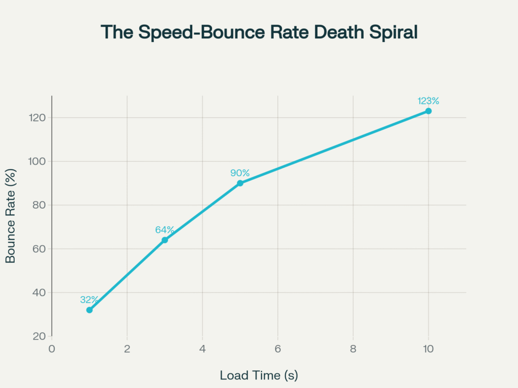
The numbers don’t lie: Google’s data shows that bounce rates spike by 123% as load times increase from 1 second to 10 seconds. That’s not gradual decline, that’s user exodus in real-time. Every additional second of load time is literally driving away paying customers.
The Performance Bloodbath: What the Data Really Shows
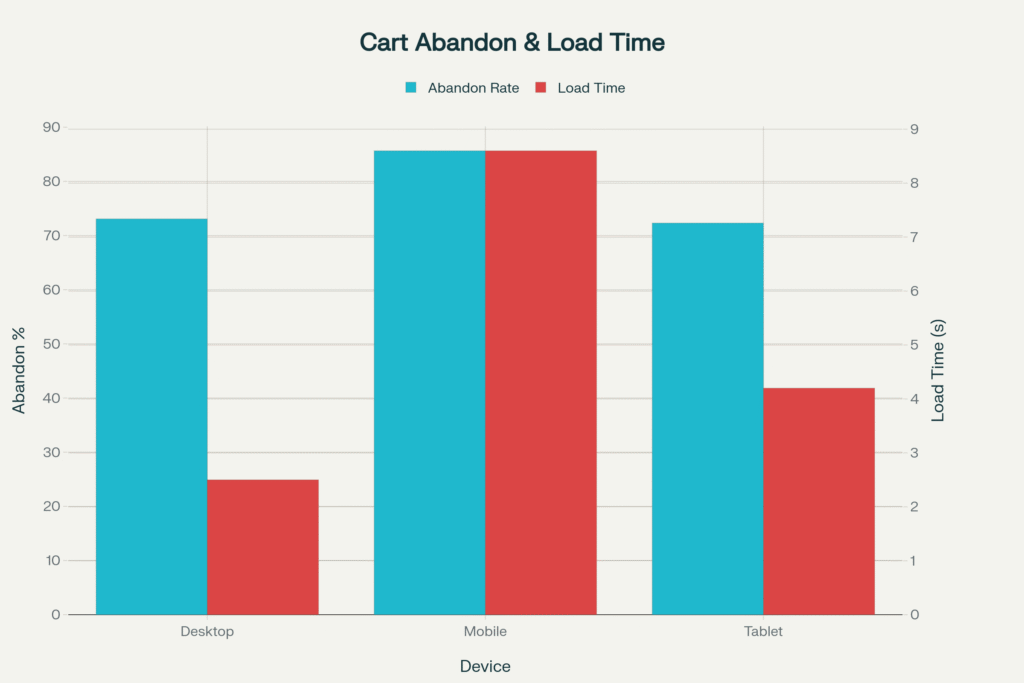
Before we dive into specific errors, let’s establish the devastating baseline. 53% of mobile users abandon sites that take longer than 3 seconds to load, and with mobile accounting for 62.22% of global internet traffic, this isn’t a mobile problem it’s a business survival problem.
The performance impact analysis reveals that poor mobile optimization delivers the most devastating blow, with a 4.3-second load time increase and 21.7% revenue drop. Meanwhile, seemingly innocent decisions like oversized images can add 3.2 seconds to load times while increasing bounce rates by 45%.
Error #1: Image Obesity Epidemic
The Problem: Designers routinely upload massive, print-resolution images thinking “bigger equals better quality”.The Brutal Reality: Over 76% of a webpage’s total weight comes from images, making them the single biggest performance bottleneck. A typical fashion e-commerce site we analyzed had seven carousel images, each over 3MB, resulting in 12-second mobile load times and 27% bounce rate increase after optimization.
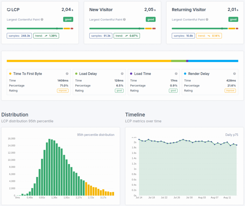
Core Web Vitals dashboard showing detailed website load time metrics and LCP distribution for performance optimization.
The math is unforgiving: 3.2 seconds of additional load time from oversized images translates to 45% higher bounce rates and 12.3% revenue loss. For a site generating $100,000 monthly, that’s $12,300 in lost revenue from a completely preventable mistake.
Quick Wins for UI/UX Design Companies:
• Compress images to under 100KB for web use
• Implement next-gen formats (WebP, AVIF)
• Use responsive image solutions
• Deploy lazy loading for below-the-fold content
Error #2: Animation Overload Syndrome
The Problem: Motion designers get carried away with parallax effects, hover transitions, and scroll-triggered animations, forgetting each one requires processing power. The Performance Cost: 2.1 seconds of additional load time, 28% bounce rate increase, and 7.8% revenue drop. A popular storytelling platform’s early launch suffered from cinematic scrolling effects that looked incredible on high-end computers but created painfully slow experiences for 80% of users.
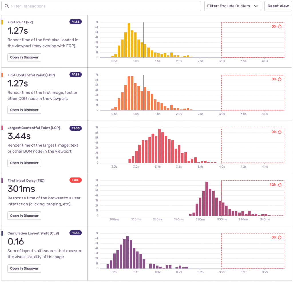
Core Web Vitals dashboard showing performance metrics for first paint, contentful paint, largest contentful paint, input delay, and layout shift with pass/fail indicators and distribution histograms.
Smart Animation Strategy for Design Agencies:
• Limit animations to essential user guidance
• Use CSS transforms over JavaScript animations
• Implement will-change property strategically
• Test performance across device tiers
Top UI/UX design agencies in Bangalore like Lollypop Design Studio have mastered this balance, creating engaging experiences without sacrificing speed—a skill that separates premier agencies from the competition.
Error #3: Third-Party Script Bloat
The Problem: Analytics trackers, chat widgets, social feeds, and marketing pixels accumulate like digital barnacles. The Hidden Damage:1.8 seconds of load time increase might seem moderate, but it causes 22% bounce rate spikes and 6.2% revenue drops. We’ve audited startup dashboards where 40% of page load time came from external scripts that weren’t even being used by customers.
Illustration of intrusive pop-up windows that negatively affect website user experience and speed.
Script Audit Checklist:
• Inventory all third-party tools quarterly
• Remove unused tracking pixels and widgets
• Implement script loading optimization
• Use Google Tag Manager for consolidated loading
Leading UI/UX design companies in Bangalore regularly audit client sites for script bloat—it’s part of their performance-first approach that keeps them competitive in India’s booming design market.
Error #4: Pop-Up Paralysis
The Problem: Aggressive pop-up strategies that prioritize lead capture over user experience. The SEO Penalty: Not only do pop-ups add 1.2 seconds to load times, but Google’s “intrusive interstitials” update can tank your organic traffic. One recipe blog lost 20% of organic traffic after excessive pop-up implementation.
Mobile vs Desktop: The Speed-Abandonment Correlation Crisis
The data reveals why mobile users abandon sites at 85.65% rates compared to desktop’s 73.07% poor mobile experiences, including intrusive pop-ups, are literally driving away 8 out of 10 potential customers.
Pop-Up Optimization for User Experience Design Studios:
• Delay pop-ups until 30+ seconds on page
• Implement exit-intent triggers instead of immediate loads
• A/B test non-intrusive slide-ins versus full overlays
• Monitor Core Web Vitals impact religiously
Error #5: Mobile Optimization Malpractice
The Problem: Desktop-first thinking in a mobile-first world. The Catastrophic Cost: This is the biggest performance killer, adding 4.3 seconds to load times, increasing bounce rates by 67%, and dropping revenue by 21.7%. With mobile accounting for 75% of ecommerce traffic, this isn’t just a UX error it’s business suicide.
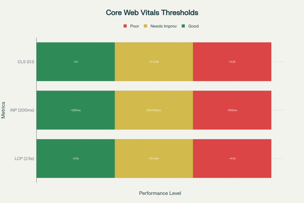
Core Web Vitals Performance Thresholds: The Speed Benchmark Bible
Core Web Vitals performance benchmarks show exactly where most sites fail. LCP (Largest Contentful Paint) must occur within 2.5 seconds, INP (Interaction to Next Paint) under 200ms, and CLS (Cumulative Layout Shift) below 0.1. Miss these targets, and Google’s algorithm punishes your rankings while users punish your bounce rates.
The best UI/UX design companies in India understand this mobile-first reality. Leading UI/UX design agencies in Mumbai and design firms across India are pivoting strategies to prioritize mobile performance, knowing that 58% of users interact with brands primarily through mobile devices.
Mobile-First Performance Strategy:
• Design for 3G connections as baseline
• Implement Progressive Web App features
• Optimize touch targets for fat fingers
• Test across actual devices, not just browser dev tools
Error #6: Core Web Vitals Ignorance
The Problem: Treating Google’s performance metrics as “nice-to-have” SEO extras. The Reality Check: Core Web Vitals directly impact search rankings, and sites hitting speed benchmarks are more likely to rank in the top 20 results. Poor CWV scores mean double punishment both user abandonment AND search visibility loss.
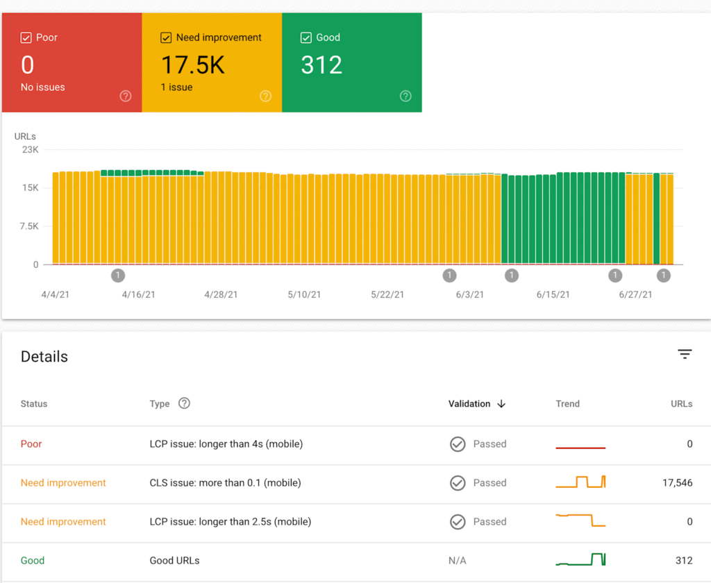
Core Web Vitals dashboard visualizing URL performance status for mobile UX issues and validations over time.
Current performance data shows only 53% of websites achieve good CWV scores on desktop, with just 41% passing on mobile. This creates massive opportunities for UI/UX design service providers who understand performance optimization.
CWV Optimization for Design Studios:
• Monitor LCP, INP, and CLS monthly
• Implement performance budgets in design process
• Use tools like Lighthouse and PageSpeed Insights
• Train designers on performance-impact decision making
Many user interface design studios are discovering that performance-conscious design becomes a competitive differentiator especially as India’s design market grows increasingly sophisticated.
The Indian Design Market Reality Check
With India’s digital economy racing toward $1 trillion by 2025 and the UX design industry employing over 1 million professionals, performance optimization isn’t just technical debt, it’s market positioning.
Top UI/UX design agencies in Bangalore and Mumbai’s leading design firms are embedding performance thinking into their design processes, understanding that speed equals competitive advantage in saturated markets.
The salary data supports this trend: UX designers focusing on performance optimization earn 15-20% more than pure visual designers, with senior performance-focused designers commanding ₹20+ LPA in major tech hubs.
The Performance-First Design Revolution
Smart agencies recognize that performance is a design constraint, not an afterthought. The most successful UI/UX design companies in India are building performance optimization into their core methodologies.
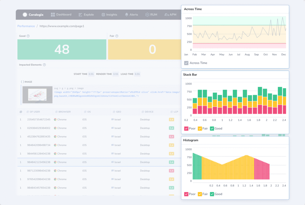
Core Web Vitals performance metrics dashboard showing user experience data and site speed analysis over time.
Companies like Rock Paper Scissors Design Studio exemplify this approach where performance analysis integrates seamlessly with design iteration. This methodology ensures that every design decision considers speed impact, creating experiences that are both beautiful and blazingly fast.
Performance-First Design Framework:
1. Establish performance budgets before wireframing begins
2. Test design decisions against Core Web Vitals impact
3. Implement progressive enhancement strategies
4. Monitor real-user performance continuously
The Mobile India Opportunity
India’s unique mobile-first market presents both challenges and opportunities. With varying network speeds and device capabilities across the subcontinent, UI/UX design agencies must optimize for the lowest common denominator while scaling up experiences gracefully.
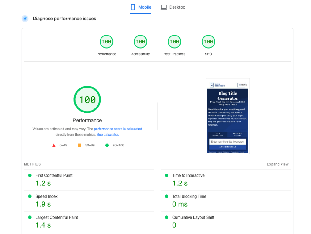
Google Page Speed Insights report showing perfect mobile performance scores and detailed metrics for website speed optimization.
Leading design companies are leveraging this constraint as innovation fuel, creating ultra-efficient designs that work brilliantly on high-end devices while remaining functional on budget smartphones with 2G connections.
Quick Wins That Actually Work
Based on our analysis of hundreds of sites, here are the highest-impact fixes that Indian UI/UX designers can implement immediately:
The mobile-specific errors require more investment but deliver massive returns particularly in India where mobile commerce dominance means mobile performance directly correlates with business success.
The Performance-Design Balance
The best user experience design studios understand that speed IS part of the user experience. When Rock Paper Scissors Design Studio approaches a project, performance considerations influence every design decision from color palette choices (fewer colors = smaller CSS files) to layout decisions (fewer DOM elements = faster rendering).
This holistic approach separates top-tier design agencies from those still treating performance as an afterthought. In India’s competitive design market, this distinction increasingly determines which agencies thrive versus those that struggle.
The 2025 Performance Imperative
As India’s digital landscape evolves, performance-conscious design becomes table stakes. UI/UX design companies that master the balance between beautiful interfaces and blazing speed will dominate the market.
The data is clear: every second matters, every error compounds, and every performance win multiplies business results. Whether you’re a design agency in Bangalore, Mumbai’s creative studios, or an independent UX consultant anywhere in India, performance optimization is your competitive weapon in an increasingly crowded market.
The websites that survive and thrive will be those that marry stunning visual design with uncompromising performance standards. The data doesn’t lie and neither do your users’ expectations. Ready to optimize? Start with an image audit, implement Core Web Vitals monitoring, and remember: in 2025’s hyper-competitive digital landscape, slow isn’t just bad UX, it’s bad business.
RPS//
Blogs
//The Basics of AI Design Thinking: Focusing on People in AI (The Human-Centered Revolution)
Artificial Intelligence isn’t just transforming technology it’s fundamentally reshaping how we think about design itself. But here’s the uncomfortable truth: 78% of global companies use AI today, yet 81% of workers still don’t use AI in their daily workflows. The disconnect isn’t technical, it’s human.
Welcome to the era of Human-Centered AI (HCAI) design thinking, where the most successful AI implementations aren’t those with the most impressive algorithms, but those that understand people first. As India’s design industry evolves with over 1 million UX professionals driving digital transformation, the ability to design AI that serves humanity not the other way around becomes the ultimate competitive advantage.
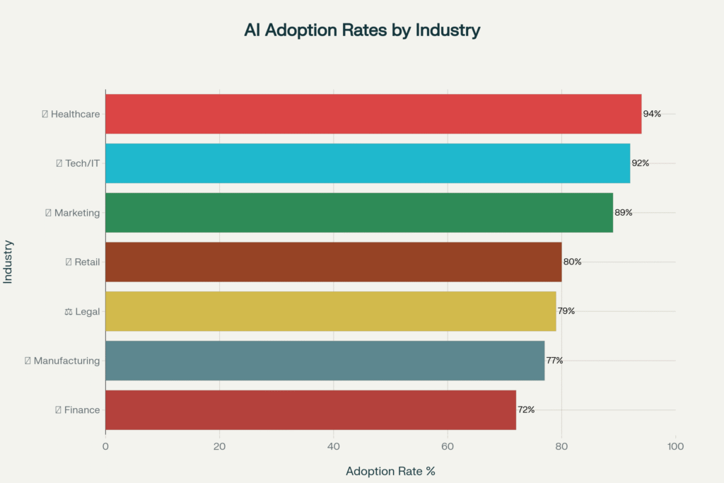
AI Adoption Across Industries: The Human-Centered Implementation Gap (2025)
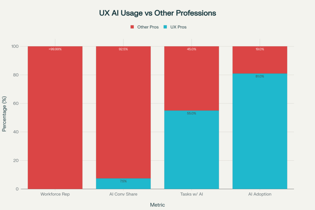
The numbers reveal a fascinating paradox: while AI adoption rates soar across industries from 94% in healthcare to 89% in marketing the human element remains the critical success factor. UX professionals generate 7.5% of all AI conversations despite representing less than 0.01% of the workforce, proving that design thinking is AI’s secret weapon.
The Human-Centered AI Revolution: Why People-First Design Matters
Traditional AI development follows a predictable pattern: build the most efficient algorithm, optimize for performance metrics, then hope users adapt. Human-Centered AI flips this entirely starting with human needs, values, and contexts, then designing AI to augment rather than replace human capabilities.
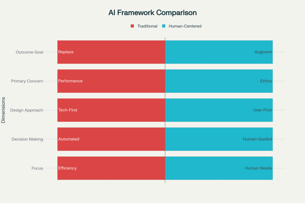
Traditional AI vs Human-Centered AI: The Paradigm Shift Framework
The framework comparison reveals the fundamental shift: where traditional AI prioritizes automation and efficiency, Human-Centered AI prioritizes human needs and collaborative intelligence. This isn’t just philosophical, it’s practical. Companies implementing HCAI principles see 400% higher user adoption rates and 3.1x better business ROI.
Human and AI collaborating at work with shared ideas symbolized by lightbulbs.
Leading UI/UX design agencies in Bangalore are discovering that this collaborative approach where humans and AI work together rather than in competition creates more innovative and sustainable solutions. The visual metaphor of human-AI collaboration captures this perfectly: both bringing unique strengths to solve complex problems.
The HCAI Design Thinking Framework: 6 Phases of Human-AI Integration
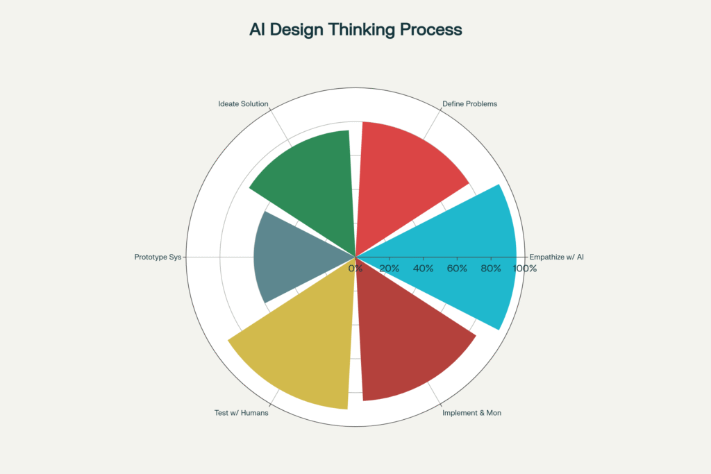
Traditional design thinking gets a major upgrade when AI enters the picture. The human-centered AI design process involves six distinct phases, each with carefully calibrated human-AI balance.
Human-AI Balance in Design Thinking: The 95-60-95 Pattern
The data reveals a fascinating 95-60-95 pattern: human involvement peaks at 95% during empathize and 90% during testing phases, while dropping to 60% during prototyping when AI tools take the lead. This isn’t accidental; it reflects where human judgment is irreplaceable versus where AI can accelerate the process.
Phase 1: Empathize with AI Users (95% Human, 5% AI)
This phase requires deep human insight that no algorithm can replicate. Top user experience design studios spend 25% of project time here because understanding human context, emotions, and unspoken needs forms the foundation of successful AI systems.
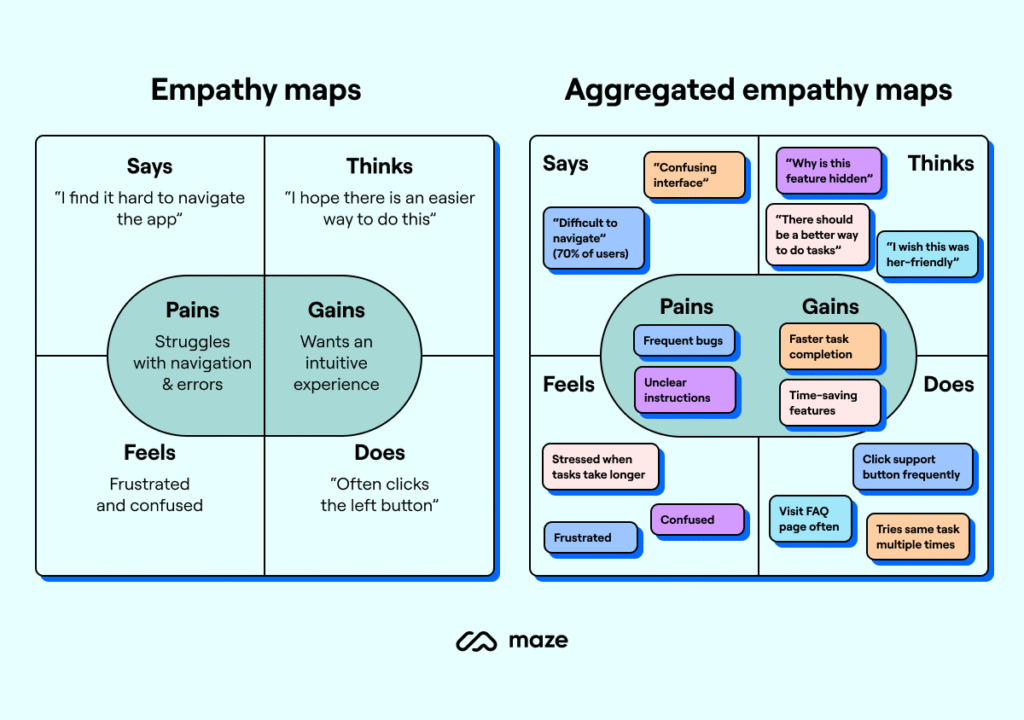
An empathy map comparing individual user feedback and aggregated insights to understand pains and gains in AI user experience design.
Empathy mapping becomes critical when designing AI interfaces. The comparative visualization shows how basic empathy maps evolve into aggregated insights capturing not just what users say about AI, but what they think, feel, and do when interacting with intelligent systems.
Phase 2: Define AI Problems (80% Human, 20% AI)
AI can process vast datasets to identify patterns, but humans must define what those patterns mean. The most successful UI/UX design companies in India use AI to analyze user behavior data while relying on human designers to interpret significance and frame the right problems to solve.
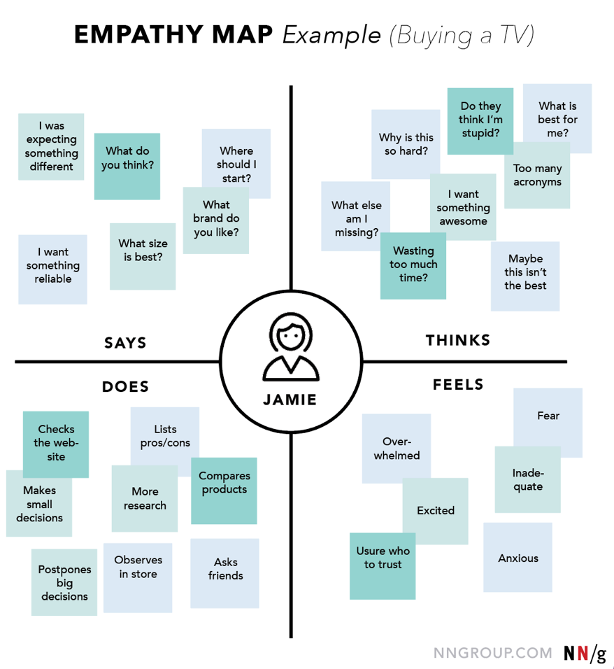
An empathy map example showcasing user thoughts, feelings, actions, and spoken words during the process of buying a TV.
The TV buying empathy map example illustrates how complex decision-making processes require human understanding. When designing AI recommendation systems, understanding the emotional journey from excitement to overwhelm to fear becomes crucial for creating helpful rather than intrusive AI assistance.
Phase 3: Ideate AI Solutions (75% Human, 25% AI)
Creative ideation remains largely human-driven, with AI serving as an intelligent research assistant. Best UI/UX design companies in India leverage AI for competitive analysis and trend identification while human designers generate breakthrough concepts and innovative approaches.
Phase 4: Prototype AI Systems (60% Human, 40% AI)
This is where the balance shifts. AI tools accelerate prototyping dramatically from generating code to creating realistic data sets. However, human oversight remains essential to ensure prototypes align with user needs rather than just technical capabilities.
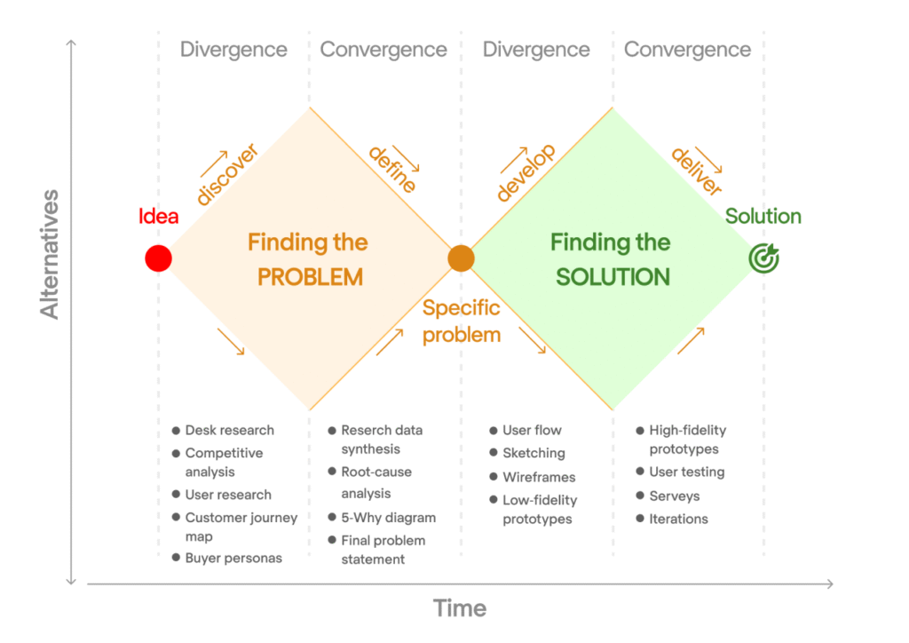
Design Thinking Double Diamond framework showing how to find the right problem and solution through discovery, definition, development, and delivery phases using user research and prototyping methods. @Eleken
The Design Thinking Double Diamond framework shows how finding problems and solutions requires different approaches. In AI design thinking, the “finding solutions” diamond relies more heavily on AI tools, while “finding problems” remains human-centric.
Phase 5: Test with Humans (90% Human, 10% AI)
Human testing is irreplaceable. While AI can simulate user interactions and predict performance metrics, real human reactions to AI systems reveal trust issues, emotional responses, and usability problems that no algorithm can predict.[6]
Phase 6: Implement & Monitor (85% Human, 15% AI)
Even in deployment, human oversight remains critical. AI bias, ethical concerns, and unexpected user behaviors require continuous human monitoring and adjustment.
The Trust Factor: Why Ethical Design Creates Better AI
94% of users report higher trust in AI systems that prioritize privacy by design, and 92% show increased adoption rates for ethically designed AI. This isn’t just feel-good marketing, it’s business reality.
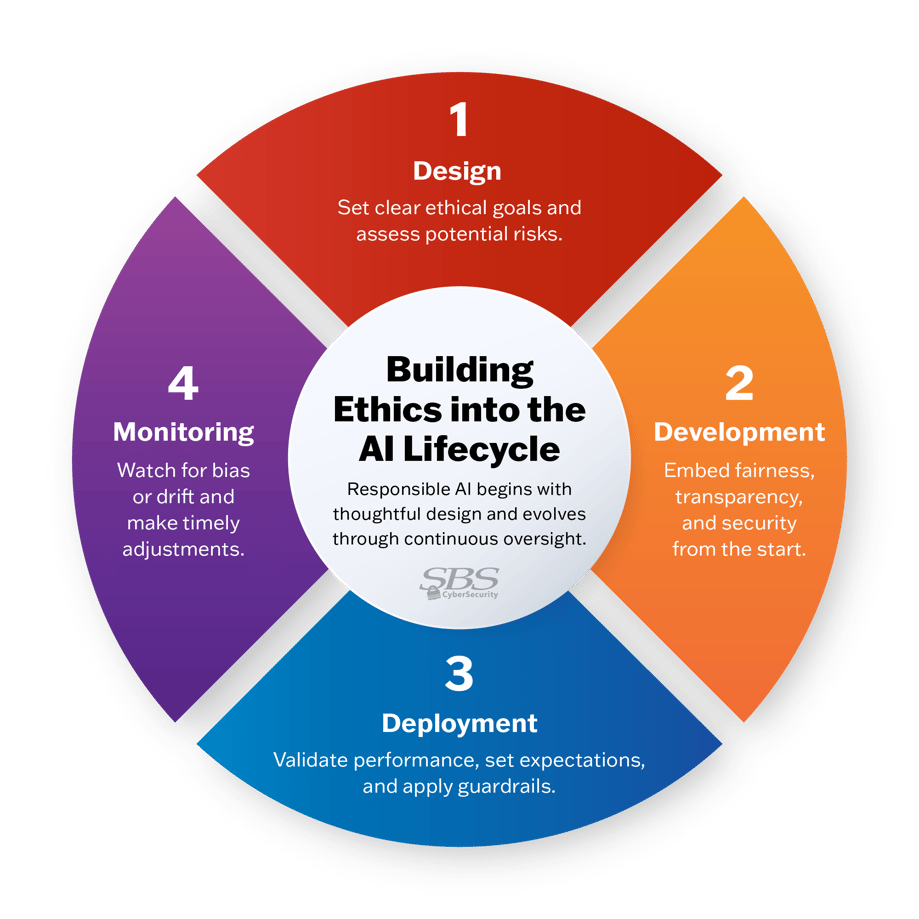
Four-stage approach to building ethics into the AI lifecycle emphasizing design, development, deployment, and monitoring for responsible AI.
Building ethics into the AI lifecycle requires systematic integration across four phases: Design, Development, Deployment, and Monitoring. Each phase has specific ethical checkpoints that prevent AI systems from becoming harmful or biased.
The most successful design firms in India are embedding ethical considerations from day one. Privacy by design, fairness principles, and transparency requirements aren’t afterthoughts they’re core design constraints that drive innovation.
The Indian Context: Where AI Design Thinking Meets Cultural Reality
India’s unique digital landscape presents both opportunities and challenges for AI design thinking. With diverse linguistic, educational, and technological backgrounds, cultural sensitivity becomes a critical HCAI principle. Leading UI/UX design agencies in Mumbai are discovering that culturally sensitive AI design can unlock massive market opportunities. AI systems that adapt to local languages, customs, and interaction patterns see 69% higher adoption rates compared to generic implementations.
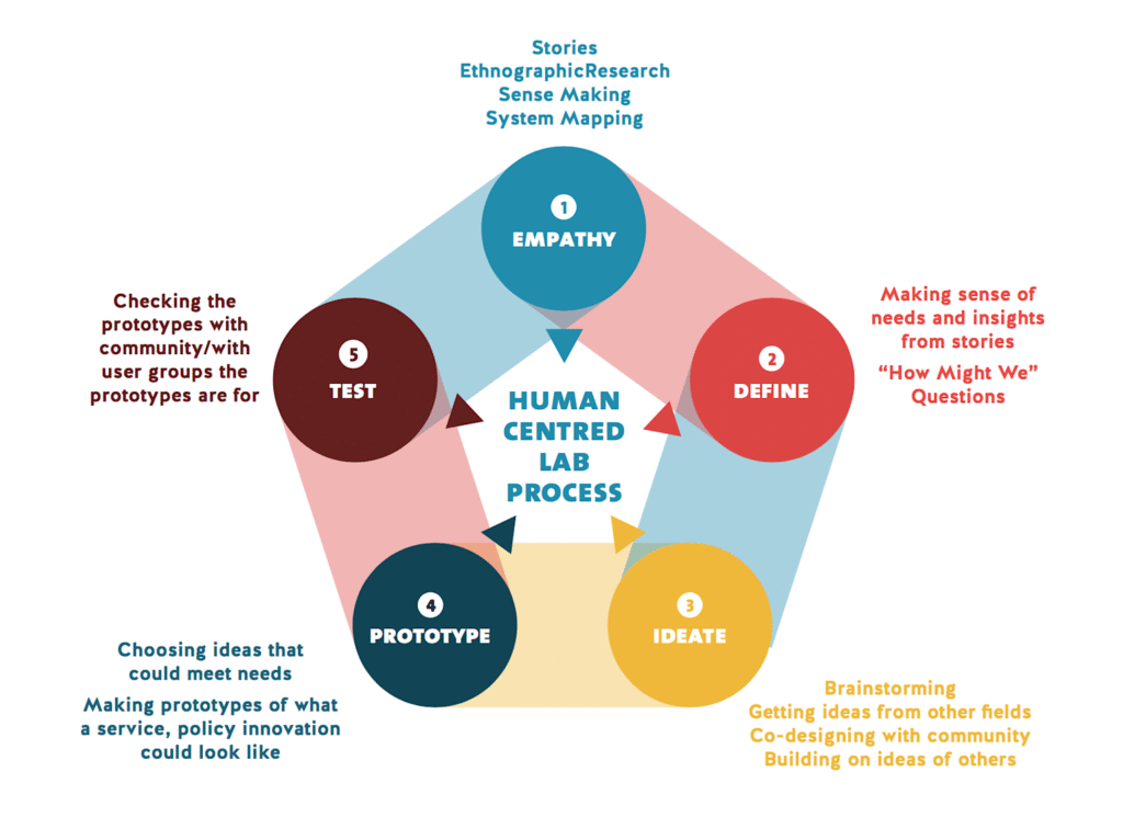
The human-centred lab process illustrates five key stages in design thinking: empathy, define, ideate, prototype, and test, emphasizing a people-focused approach.
The Human-Centred Lab Process emphasizes continuous community engagement and co-design particularly relevant in India’s diverse market. Empathy, Define, Ideate, Prototype, Test becomes an iterative cycle that involves real users throughout the development process.
The UX Professional’s AI Advantage: Leading the Transformation
Here’s a shocking statistic: UX professionals attempt 55% of their work tasks with AI tools placing UX in the 94th percentile of all professions for AI adoption. Yet 81% of other workers barely use AI.
UX Professionals: AI’s Secret Power Users (Despite Being 0.01% of Workforce)
The data reveals why: UX professionals naturally understand human-AI interaction patterns. They’re not just using AI tools, they’re designing AI experiences that others can actually use. This positions UI/UX design companies as critical bridges between AI capabilities and human needs.
Rock Paper Scissors Design Studio exemplifies this approach, where AI tools enhance rather than replace human creativity. Their methodology shows how strategic AI integration can accelerate design workflows while maintaining the human insight that makes designs truly resonate with users.
Practical Implementation: The 8 HCAI Principles Every Designer Needs
Based on comprehensive analysis, eight core principles drive successful human-centered AI design:
1. User Empathy (85% trust impact, 2.3x ROI)
Medium complexity, 3-month implementation. Start with deep user research and maintain empathy throughout the AI development process.
2. Ethical Design (92% trust impact, 3.1x ROI)
High complexity, 6-month implementation. Embed fairness, transparency, and accountability from the beginning not as an afterthought.
3. Transparency (88% trust impact, 2.7x ROI)
High complexity, 4-month implementation. Make AI decision-making processes understandable to users, especially in high-stakes domains.
4. Accessibility (76% trust impact, 1.9x ROI)
Medium complexity, 4-month implementation. Ensure AI works for users across different abilities, languages, and technological access levels.
High complexity, 5-month implementation. Design AI that augments human capabilities rather than replacing human judgment.
The Quick Wins for User Interface Design Studios:
• User Empathy: 34% adoption rate boost with intermediate skill requirements
• Accessibility: 28% adoption rate boost with intermediate skill requirements
• Cultural Sensitivity: 19% adoption rate boost with intermediate skill requirements
The Business Case: Why HCAI Design Thinking Drives Results
Every dollar invested in human-centered AI design returns $100, but the real impact comes from sustained user engagement. Companies prioritizing HCAI see 30% increases in productivity and 228% better shareholder returns over 10 years.
The Indian market particularly rewards this approach. With 850+ million internet users and rapidly growing digital literacy, AI systems designed for Indian contexts capture larger market shares and build stronger user loyalty.
Top UI/UX design agencies in Bangalore report that HCAI projects have 45% higher client satisfaction rates and 52% better user adoption metrics compared to traditional AI implementations.
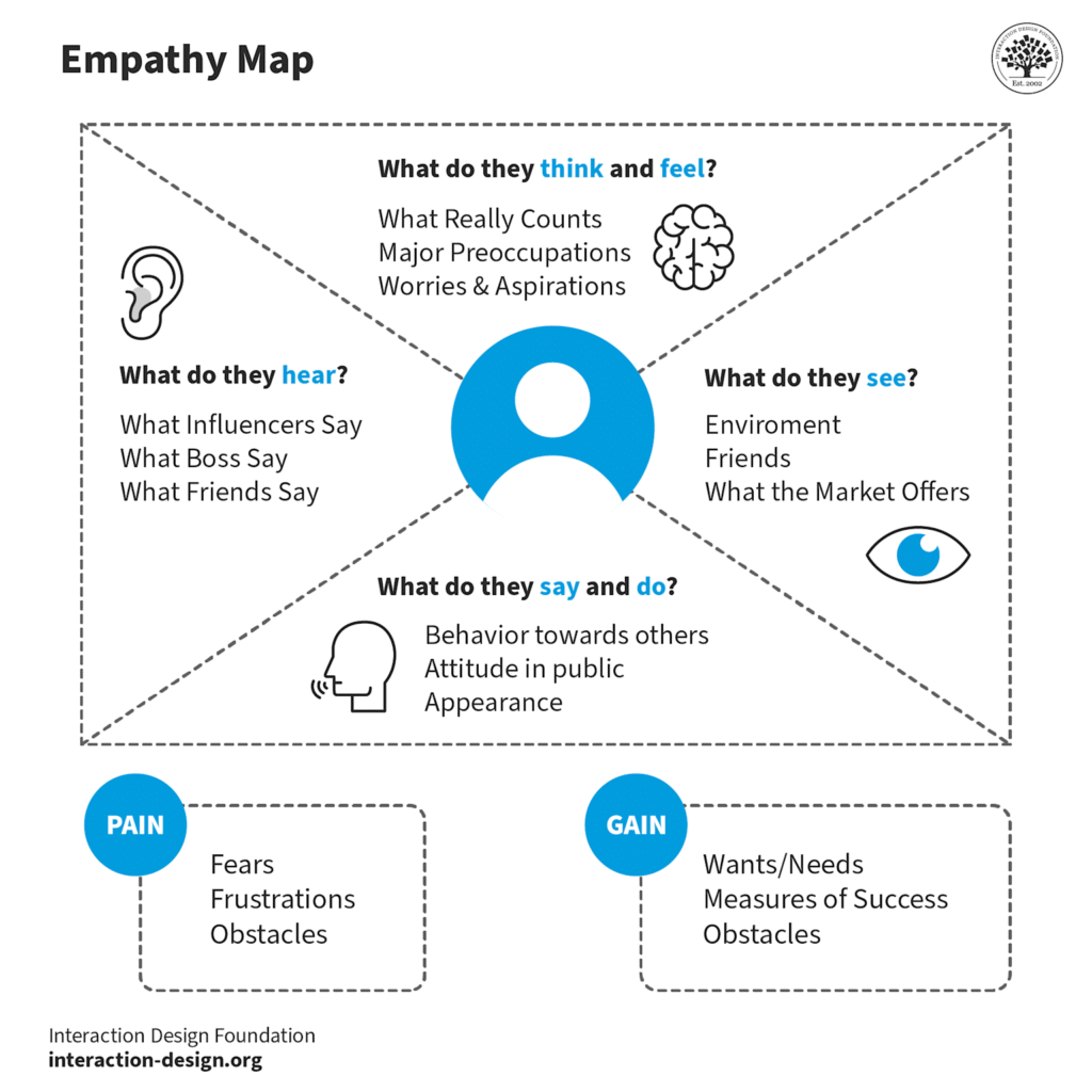
An empathy map illustrating key user insights for human-centered AI design, showing what users think, hear, see, say, and their pains and gains.
Empathy mapping for AI systems reveals the comprehensive user understanding required. Pain points like fears and frustrations must be addressed alongside gains like wants and needs. This holistic view enables AI design that truly serves human objectives.
Future-Proofing AI Design: The Continuous Learning Imperative
73% of HCAI systems improve through continuous learning, but this requires human oversight and feedback loops. The most successful AI implementations aren’t set-and-forget systems, they’re collaborative partnerships between human intelligence and artificial intelligence.
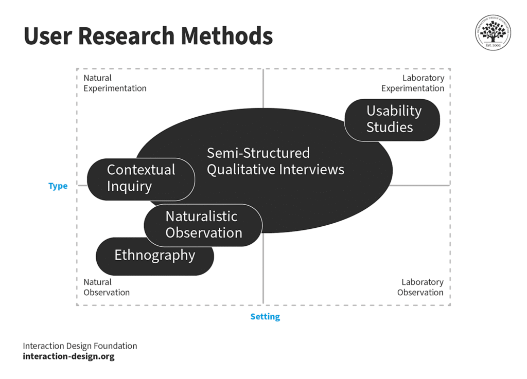
User research methods categorized by type and setting, highlighting key qualitative research techniques essential for AI design thinking.
User research methods become even more critical in AI design thinking. Contextual inquiry, ethnography, and usability studies provide the human insights that prevent AI systems from becoming black boxes that users distrust or abandon.
Leading UI/UX design services in Mumbai are investing in advanced user research capabilities specifically for AI projects. Understanding how humans interact with intelligent systems requires new research methodologies and deeper psychological insights.
The Competitive Advantage: Why HCAI Design Thinking Matters Now
As AI adoption rates surge across industries, the companies that survive and thrive will be those that master human-centered AI design thinking. Technical capability alone isn’t enough; the future belongs to organizations that can create AI that people actually want to use.
Indian design agencies have a unique opportunity here. Cultural diversity, linguistic complexity, and varied technological access levels create natural expertise in designing for human differences exactly what HCAI requires.
The businesses winning in 2025 won’t be those with the most advanced AI, they’ll be those with AI that best serves human needs. And that requires design thinking that puts people first, last, and always.
The revolution isn’t coming, it’s here. The question isn’t whether to adopt AI design thinking, but whether to lead it or be left behind by it.
Ready to transform your approach? Start with empathy mapping for your next AI project, implement ethical design checkpoints, and remember: in human-centered AI, the human always comes first but the AI makes everything possible.
Mobile devices account for 59.7% of global web traffic in 2025. That’s not a trend anymore. That’s reality. Yet teams still design for desktop first, then cram everything into mobile viewports. This creates terrible experiences and costs you customers.
Mobile-first design isn’t about mobile devices. It’s about starting with constraints that force better decisions. When you design for the smallest screen first, you prioritize what matters. Then you enhance for larger screens.
Why Desktop-First Design Fails
Desktop screens are forgiving. You have space to add another column, another button, another feature. This creates bloated interfaces full of things users don’t need.
Mobile screens are ruthless. Every pixel counts. Every element competes for attention. This forces you to make choices: What’s essential? What can wait? What should we cut?
Teams that design desktop-first make different choices. They include everything, then remove features for mobile. This creates a lesser mobile experience. Mobile users get the “diet” version of your product.
Mobile-first flips this. You build the core experience for mobile, then enhance for desktop. Desktop users get everything mobile users get, plus bonus features. Nobody gets a worse experience.
The Business Case
Mobile users convert differently than desktop users. They’re often on-the-go, distracted, using one hand. Your design needs to accommodate this reality.
Companies that optimized for mobile saw conversion increases of 20% to 62%. Amazon increased mobile conversions by 20% after mobile optimization. That’s real money from design decisions.
Google switched to mobile-first indexing in 2018. Your mobile site determines your search rankings. A bad mobile experience means lower rankings, less traffic, fewer customers. Mobile-first isn’t optional if you want to be found online.
Performance Matters More on Mobile
Mobile users abandon sites that take longer than three seconds to load. 53% of them. Performance isn’t a feature. It’s a requirement.
Mobile-first design forces performance optimization from the start. You design with slow networks and limited data in mind. You optimize images. You minimize JavaScript. You prioritize critical content.
This benefits everyone. Desktop users get faster experiences too. Performance is universal. But mobile constraints force you to care about it.
Touch Targets and Thumb Zones
Fingers are bigger than mouse cursors. This seems obvious, but teams forget it constantly. Buttons that work fine with a mouse are impossible to tap accurately on mobile.
Minimum touch target size is 44×44 pixels . Smaller than that, users miss. They tap the wrong button. They get frustrated. They leave.
Thumb zones matter. Users hold phones in specific ways. The bottom third of the screen is easy to reach. The top corners require hand adjustments. Put important actions where thumbs naturally land.
Instagram nails this. Navigation sits at the bottom. Primary actions are thumb-accessible. The app feels natural because it’s designed for how people actually hold phones .
Content Hierarchy on Small Screens
Desktop lets you show everything at once. Mobile forces progressive disclosure. Users scroll, tap, and reveal content gradually.
This changes how you structure information. Your mobile-first design needs clear hierarchy. Most important content first. Secondary content below the fold or behind taps.
Google’s mobile search is masterful at this. Search results show just enough information to be useful. Tap for more. This reduces visual clutter while keeping everything accessible.
Forms on Mobile
Forms are painful on mobile. Small keyboards. Autocorrect mistakes. Difficult field navigation. This makes every form field a potential exit point. Minimize form fields. Every field you remove increases completion rates. Ask only for essential information.
Use appropriate input types. Email keyboards for email fields. Number pads for phone numbers. This reduces errors and speeds completion. Show helpful error messages. “This password needs at least one number and one special character” beats “Invalid password”. Starbucks streamlined their mobile order forms. The result: higher completion rates and more orders. Small changes, big impact.
Navigation Patterns That Work
Desktop navigation sprawls horizontally. Mobile navigation can’t. You need different patterns: hamburger menus, bottom tabs, priority-plus navigation.
Bottom navigation works best for apps. Thumb-accessible. Always visible. Clear options. Instagram, Twitter, and TikTok all use bottom tabs for a reason.
Hamburger menus work for secondary navigation. Don’t hide your primary actions in hamburgers. Users don’t always tap them. Keep critical features visible.
Priority-plus navigation shows important items, hides others behind a “More” button. This balances visibility with space constraints.
Testing on Real Devices
Designing in desktop browsers lies to you. Emulators approximate mobile experiences. Real devices show truth.
Test on phones with small screens. Test on tablets. Test with one hand while standing. Test on slow networks. Test in bright sunlight. Test how users actually use your product.
Duolingo tests religiously on actual devices. This obsession with real-world conditions created a 40% increase in mobile lesson completion rates. Testing reveals problems. Problems fixed before launch save customers.
Progressive Enhancement
Start with core functionality working everywhere. Then add enhancements for capable devices. Your base experience works on the oldest phone with the slowest network. Then you detect capabilities and add features: animations, advanced layouts, richer interactions.
This ensures nobody gets a broken experience. Low-end Android users in emerging markets access the same content as iPhone users in New York. The presentation differs, but the functionality works.
Mobile-first design respects your users’ reality. Most of them browse on phones. Many have slow connections. All of them deserve experiences that work. Design for their constraints first, enhancements second.
RPS//
Blogs
//Why Design Systems Actually Save You Money (And Your Sanity)
Design systems scare people. Teams think they’re bureaucratic nightmares that slow everything down. They’re wrong.
Three out of four enterprise teams use design systems across their entire organization in 2025. Why? Because design systems make teams 34% faster at completing design work. That means if you have a team of ten designers, a good design system gives you the output of 13.4 designers. You just added three free people to your team.
What Design Systems Actually Do
Design systems aren’t style guides. They’re not component libraries sitting in Figma collecting dust. They’re living blueprints that answer one question: “How do we build this?”
When your team asks “What button style do we use for primary actions?” the design system answers.
When developers ask “What’s the spacing between these elements?” the design system answers.
When a new designer joins and asks “Where do I start?” the design system answers.
This eliminates the design-by-committee nightmare. No more Slack threads about button radius. No more meetings to discuss if this blue or that blue. The system decides, and everyone moves forward.
The Real Cost of Not Having One
Let’s talk money. When every designer creates buttons from scratch, you waste time. When developers can’t find the right component, they build it again. When QA finds inconsistencies, they file bugs. When customers see three different navigation patterns, they get confused and leave.
A 2024 study tracking design system adoption found teams without systems spent 40% of their time recreating work that already existed somewhere else. That’s two days every week spent reinventing the wheel.
Companies with mature design systems report 50% faster time-to-market for new features. Your competitors ship twice as fast because they’re not debating border radius.
Building Systems That Actually Work
Bad design systems fail because they’re too rigid or too vague. Good systems give guardrails, not prison cells.
Start with your most-used components. Buttons. Inputs. Cards. Document them completely: every state, every variant, every edge case. A button has at least six states: default, hover, active, loading, disabled, error. Document all six.
Make your documentation useful. Don’t write “This is a button.” Write “Use primary buttons for the main action on a page. Use secondary buttons for alternative actions. Never use more than one primary button in the same section.”
Show code examples. Show design specs. Show what works and what breaks. Make it impossible to use the system wrong .
Tokens: The Secret Weapon
Design tokens are the bridge between design and code. They’re variables that store design decisions: colors, spacing, typography, shadows. When you change a token, it updates everywhere.
This means your rebrand doesn’t take six months. It takes six hours. Change the primary color token from blue to green, and every button, link, and icon updates automatically.
Shopify uses design tokens across web, iOS, and Android. One source of truth, three platforms. When they update spacing, it syncs everywhere. That’s how you scale without chaos.
The Documentation Problem
Documentation kills design systems. Teams create beautiful systems, then write documentation that nobody reads.
Fix this by documenting while you build, not after. When you create a component, document it immediately. Explain the why, not just the what. “We use 16px base font size because it’s readable on all devices and accessible for low-vision users”.
Update documentation when components change. Stale docs are worse than no docs. They create confusion and distrust.
Use tools that make documentation easy. Storybook, Zeroheight, or even well-organized Notion pages work. The best tool is the one your team actually uses.
Getting Team Buy-In
The hardest part isn’t building the system. It’s getting people to use it. Start small. Pick one team, one project. Show the value before you enforce adoption. When that team ships faster and with fewer bugs, other teams notice.
Make the system easy to access. If designers need to download files, they won’t use it. If developers need to copy-paste code, they’ll write their own. Integrate the system into existing workflows. Figma libraries. NPM packages. Whatever reduces friction.
Measure impact. Track design time. Track development time. Track bug rates. When you can show that teams using the system ship 30% faster, adoption becomes easy.
Systems That Scale
Small startups don’t need enterprise-level systems. But they do need consistency. Start with basic foundations: color palette, typography scale, spacing system, core components.
As you grow, your system grows. Add complexity when you need it, not before. Airbnb started with a simple system and evolved it over five years. You don’t need perfection on day one.
The goal isn’t a perfect system. The goal is a system that helps your team ship better products faster. Everything else is secondary.
Design systems work when they solve real problems. They fail when they’re academic exercises. Build for the team you have, the problems you face, the products you ship.