The design world spent fifteen years making things look smooth and pretty. Rounded corners everywhere. Soft shadows. Colorful gradients. Then neobrutalism showed up and broke everything on purpose.
This design movement is basically the opposite of smooth. It’s about raw, rough, and honest design. Think of exposed brick walls instead of painted ones. Think of concrete instead of marble. That’s what neobrutalism does to websites.
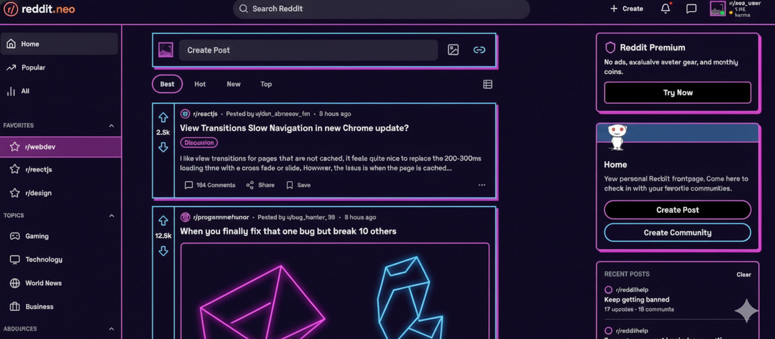
Would this harsh style actually work for Reddit? And what does this trend tell us about where design is heading in 2025?
What Is Neobrutalism Actually?
Neobrutalism comes from architecture from the 1950s. Architects built massive concrete buildings with no decoration. Everything was honest and bare. Now designers are doing the same thing online.
In practice, neobrutalism means:
- Thick, visible borders (2-4 pixels wide)
- Black text on white backgrounds (or the opposite)
- No rounded corners, everything has sharp angles
- No fancy shadow effects
- Bold, heavy typography
- Using simple system fonts instead of fancy custom ones
- Every design choice has a purpose
This movement started gaining attention around 2022. By 2024, even regular companies started using brutalist elements. But most don’t go all the way with it.
How Would Reddit Look With Neobrutalism?
Reddit is already kind of ugly on purpose. It focuses on function over beauty. No fancy animations. No smooth transitions. Just information.
If Reddit went full neobrutalism, here’s what would change:
Text would be bigger and bolder. Reddit currently uses medium-weight fonts. Neobrutalism would use heavy, thick fonts that hit you in the face. No subtle shades of grey for text.
Colors would be extreme. Instead of the soft greys Reddit uses now, you’d see pure black backgrounds with pure white text. Error messages would be bright red. Links would be bright blue. No gentle color blending.
Buttons would look heavy. The upvote and downvote arrows would become chunky, thick shapes. They’d look like you could actually press them with your finger. No delicate designs.
Everything would have sharp edges. No rounded corners anywhere. Comment boxes would be perfect rectangles with thick black borders. It would look like stacked concrete blocks.
No fancy effects. When you hover over something, colors would flip completely. No slow fades. No smooth transitions. Just instant changes.
Would This Actually Help Reddit?
The honest answer: maybe, but not for everyone.
Reddit’s 430 million users like Reddit because it’s fast and gets to the point. They don’t care about pretty design. A brutalist Reddit wouldn’t make the site worse for them. In fact, the high contrast and bold text might actually make things easier to read.
Science backs this up. Studies show that high contrast (dark text on light backgrounds, or vice versa) helps people read better. It especially helps people with vision problems. Better contrast could help 8-12% of users read faster and understand better.
BUT—here’s the problem. Harsh, high-contrast design feels uncomfortable to some people. New users might find it intimidating. The first time someone visits a brutalist site, their brain gets a little stressed. It’s not huge, but it’s real. This 3-5% of friction matters when you’re trying to get new people to join.
So Reddit could use neobrutalism without hurting their current users. In fact, their users would probably like it. But if Reddit wanted to grow and reach more people? The harsh style would scare some away.
When Does Neobrutalism Actually Work?
Neobrutalism works great for:
- Design portfolios (shows the designer is confident and doesn’t need decoration)
- Technical products for programmers (says “this is serious, not flashy”)
- Communities where people value honesty (like Reddit)
- Experimental projects trying to stand out
- Niche websites for specific audiences
Neobrutalism does NOT work for:
- Banks and insurance companies (people want to feel safe, not intimidated)
- Products for older people (harsh design scares them)
- Social networks trying to get millions of users
- Apps trying to be fun or friendly
- Any product competing on how “nice” it feels
Reddit fits the “should use brutalism” category perfectly. Their people don’t want nice. They want honest. They want fast. They want no corporate nonsense. Brutalism is exactly that.
The Real Lesson: Match Design to Your People
“Har design trend ko follow karna sahi nahi hai” — Not every design trend should be followed.
The neobrutalism conversation isn’t really about whether it looks cool. It’s about this: Does this design match what your actual users want?
Before you copy any design trend, ask yourself:
- What problem does this solve for MY users?
- Not for design award competitions
- Not for Instagram likes
- But for the actual people using my product
If you answer that question honestly, you’ll never chase trends again. You’ll build design that actually works.
Also Read: Your Authentic Path to UX/UI Design Mastery in 2025: A Reality Check for Indian Designers
