RPS // Blogs // Apple’s Cross-Device UX: How Continuity & Handoff Drive 800M+ Active Users
Apple's Cross-Device UX: How Continuity & Handoff Drive 800M+ Active Users

Explore Apple’s ecosystem UX design: Handoff, Continuity, and iCloud sync. Learn how seamless device integration increases user lifetime value.

The smartphone era promised liberation—complete access to your digital life, anywhere, anytime. Yet by 2012, a new problem emerged. People didn’t use just one device anymore. They used phones, tablets, laptops, and watches. The friction wasn’t in using individual devices; it was in moving between them. Start composing an email on your iPhone during a commute. Arrive at your desk. Want to finish on your Mac? You’d either send it to yourself, manually copy-paste the text, or restart completely. This fragmentation frustrated power users and demonstrated a critical insight: the future wasn’t about individual devices—it was about seamless experiences across multiple devices.

Apple recognized this wasn’t just a usability problem; it was a competitive opportunity. Samsung offered individual devices. Google distributed them across Android. But Apple owned both hardware and software, meaning they could engineer experiences impossible for competitors. If Apple could make switching between devices feel native and invisible, users would stay locked into the ecosystem not through artificial restrictions, but through genuine convenience. This became the foundation for Apple’s Continuity features—a suite of integrated experiences that transformed the ecosystem from a collection of products into a unified system.

How to Set Up Continuity & Handoff Between Your Mac & iPhone

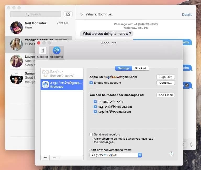
The core innovation was Handoff, introduced with iOS 8 and OS X Yosemite in 2014. The feature allows users to start a task on one device and seamlessly continue on another. Begin drafting a document on your iPad during a meeting. Return to your Mac. Your exact location in that document appears in the Dock—just click it and you’re back where you left off, with full context restored. This sounds simple, but the engineering is profound. Apple had to synchronize app state across devices in real-time, handle network interruptions gracefully, ensure security across device transitions, and design UI that made the feature discoverable without cluttering the interface. Most companies couldn’t coordinate this across their own organization, let alone across multiple platforms.

The magic was in the execution details. Handoff appears as a subtle icon in the Dock on Mac, or in the app switcher on iOS—visible but not intrusive. The transition between devices feels instantaneous because Apple uses Bluetooth Low Energy and iCloud to keep devices in constant lightweight communication. When you tap the Handoff icon, the app launches on your current device with your exact previous state restored. There’s no data loss, no context switching, no friction. Psychologically, this removes the perception that you’re using separate devices—you’re simply continuing work on whichever device is most convenient.

How to use Continuity on your iPhone, Mac, Watch and iPad
How to use Continuity on your iPhone, Mac, Watch and iPad 

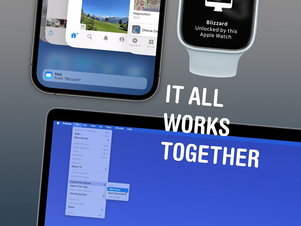
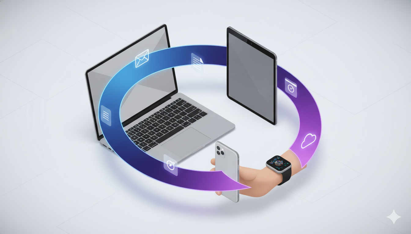
The broader Continuity ecosystem expanded on this principle. Instant Hotspot allows your Mac to automatically connect to your iPhone’s cellular data without manual pairing. Universal Clipboard lets you copy text or images on your iPhone and paste them on your Mac—seamlessly. Handoff calls and messages work across devices, so you can start a call on your Apple Watch and continue on your iPhone without hanging up and redialing. AirDrop enables instant file sharing between any nearby Apple devices using encrypted wireless protocols. Each feature addressed a specific friction point—but together, they created a narrative that choosing Apple meant never thinking about device boundaries again.

The business impact proved substantial. Apple’s ecosystem approach created powerful retention mechanics. Users invested in multiple Apple devices earned increasing returns—each new device added value to the existing devices. This compounding value makes switching to competitors expensive. Microsoft users can move their email and documents to Google Workspace and lose nothing; Apple users face a genuine loss if they switch. This isn’t achieved through forced lock-in, but through genuine experience superiority that emerges from ecosystem integration.

The user research behind Continuity revealed something crucial: people don’t think about devices—they think about tasks. A user preparing a presentation doesn’t want a “Mac experience” and an “iPad experience”; they want a single, coherent presentation experience that happens to leverage multiple devices. Traditional device manufacturers optimized for individual devices; Apple optimized for the task spanning devices. This task-centric thinking guided every design decision. Notifications sync across devices—you don’t get duplicate alerts. Your default apps remain consistent across devices. Your iCloud data stays synchronized automatically, creating a unified information experience.

How to use Continuity on your iPhone, Mac, Watch and iPad

The Continuity handoff concept inspired competing products like Google’s cross-device computing features and Microsoft’s universal clipboard, validating that Apple had identified a genuine user need. But because Apple controlled the full stack—hardware, OS, and apps—they executed with consistency competitors couldn’t match. A third-party developer building for both iOS and macOS has to manage different code bases, different design guidelines, and different OS capabilities. Apple’s first-party apps (Mail, Notes, Safari, Maps) work identically across all platforms because they share underlying code and design principles.

The security and privacy architecture deserves mention because it’s invisible but critical. Handoff data transmits encrypted between devices. iCloud synchronization uses end-to-end encryption for sensitive data. When you hand off a task containing private information, Apple’s infrastructure ensures that data never exists on unencrypted servers where Apple itself can read it. This technical foundation builds trust—users can hand off anything, from financial records to health data to private messages, knowing the system protects privacy by design.

By 2024, the Apple ecosystem had grown to over 800 million active devices. Continuity features account for a portion of this growth because they make the ecosystem objectively more functional than alternatives. Samsung users with an iPhone cannot access Handoff. Google ecosystem users switching to Apple gain these capabilities. The competitive advantage compounds—each new user who experiences seamless handoff becomes a stronger advocate within their social network.

The UX principle here transcends Apple: Seamless experience across touchpoints reduces friction, but unified design philosophy ensures consistency. Continuity succeeded not because Apple created magical technology (the underlying wireless protocols existed for years), but because they designed comprehensive, coherent features that addressed real user pain points. They treated the multi-device world not as a fragmentation problem but as an opportunity to create differentiation through integration. That’s how a feature that seems invisible—because it works so smoothly you never think about it—becomes one of the most powerful retention mechanics in the tech industry.

Also Read: Amazon One-Click Checkout: The UX Case Study That Revolutionized E-Commerce

RPS // Blogs // Amazon One-Click Checkout: The UX Case Study That Revolutionized E-Commerce
Amazon One-Click Checkout: The UX Case Study That Revolutionized E-Commerce

Learn how Amazon’s 1-click checkout increased conversions by 300% and reduced cart abandonment. The UX design principles behind $738B in e-commerce.

In 1999, Amazon filed a patent for something that sounds impossibly simple: letting customers buy something with a single click. Today, “One-Click Checkout” sits alongside the iPhone and Post-it Notes as one of those inventions so intuitive we forget what shopping was like before it existed. Yet when Amazon introduced this feature, it was genuinely revolutionary. The average e-commerce checkout required customers to navigate through 4–5 separate steps: cart review, account login, address entry, payment details, and order confirmation. Each step was a decision point. Each decision point was an opportunity for buyers to reconsider, procrastinate, or abandon altogether.

The problem wasn’t complexity—it was friction. Even highly motivated customers faced friction from decision fatigue. Enter a shipping address. Enter a billing address (sometimes different). Enter credit card details. Verify everything. Confirm the order. By the time checkout completed, the psychological momentum that drove the initial purchase had dissipated. Mobile shopping made this even worse. Typing a 16-digit credit card number on a three-inch screen felt so cumbersome that many shoppers simply abandoned their carts rather than complete the transaction.

Amazon Checkout UX Design Case Study — EMILY PAK

Amazon’s data revealed something striking: checkout cart abandonment rates hovered around 70% across the e-commerce industry. Worse, roughly 18% of shoppers abandoned carts specifically because the checkout process felt too complicated or time-consuming. This represented catastrophic revenue leakage. Industry analysis suggested that e-commerce stores could recover an estimated $260 billion in lost orders simply by optimizing the checkout experience. The mathematical incentive was undeniable, but the design challenge was equally clear: how do you remove friction without compromising security or data collection?

One-Click Checkout solved this through a progressive disclosure strategy. Instead of asking for all information upfront, Amazon securely stored customer payment and shipping details. On subsequent visits, users could complete a purchase with literally one click. The cognitive load dropped from “fill five forms” to “confirm one decision.” This wasn’t about removing information requirements—it was about removing the moment of friction at the point of impulse buying. When users decided they wanted something, they could act on that decision instantly, before motivation faded or distractions intervened.

The results were staggering. Amazon’s conversion rates jumped from approximately 2.5% to over 10%—a 300% relative increase. Cart abandonment rates plummeted by 40–45%, meaning 40% more people who started the checkout process actually completed it. Average order value increased by 5.3%, and behavioral data showed that One-Click customers visited 7% more frequently and spent 7.8% more time browsing per session over 15-month periods. More pages per session—9.3% more, to be precise—suggested that removing checkout friction freed customers to explore more products rather than rush through the purchase experience.

Competing research corroborated Amazon’s findings. Studies by the Baymard Institute indicated that optimizing checkout alone could boost conversion rates by up to 35%. Later implementations like Apple Pay demonstrated similar patterns: when HotelTonight integrated one-click payment, they saw a 26% immediate increase in orders. Shop Pay, Shopify’s one-click solution, reported 70% faster checkout times and conversion rates 1.72 times higher than traditional multi-step flows. These weren’t isolated success stories—they were consistent validation of a principle: friction correlates directly to abandonment.

What made Amazon’s approach sophisticated wasn’t the technology—it was the psychological insight. Friction isn’t just a feature problem; it’s a behavior problem. Humans experience decision fatigue. Each form field, each validation step, each page load depletes mental resources. By the time customers reach payment, they’re mentally exhausted and vulnerable to second thoughts. One-Click didn’t just save time; it preserved the psychological state that motivated the initial purchase. The customer remained in a state of desire and action, uninterrupted by procedural complexity.

The design also understood security perception. Many users worried that storing payment information online was risky. Amazon addressed this through explicit security messaging, encryption transparency, and brand reputation. The UX communicated that their security was strong enough that you could trust instant payments. This was crucial because removing friction can only succeed if users feel safe. Security concerns still matter—they’re just addressed through design communication, not by adding more form fields.

Mobile optimization became critical as shopping shifted to phones. One-Click’s convenience became exponentially more valuable on mobile devices where typing and navigation felt clunky. Rather than design a separate “mobile checkout,” Amazon recognized that the frictionless principle applied universally. Whether desktop or phone, the goal remained identical: minimize steps between desire and transaction completion. This consistency across devices reinforced One-Click’s value proposition and built user habit.

The business impact extended beyond immediate revenue. One-Click created switching costs that benefited Amazon for decades. Customers stored payment information on Amazon, making it easier to buy from Amazon again than from competitors who required re-entering all information. This small UX advantage compounded over time into massive competitive moat. New competitors couldn’t instantly match Amazon’s frictionless experience because customers had already invested in the convenience of One-Click.

The core takeaway isn’t that you should copy One-Click—it’s that you should map your checkout for friction. Where do users hesitate? Where do they reconsider? Where do form fields outnumber motivation? Those are your design opportunities. Amazon proved that removing even tiny friction points accumulates into massive business impact. The difference between a 2.5% and 10% conversion rate isn’t the result of flashy design; it’s the product of systematic friction reduction at every touchpoint. That’s how a simple checkout feature became one of the most valuable innovations in e-commerce history.

Also Read: Airbnb UX Design Case Study: Building Trust in Peer-to-Peer Travel

RPS // Blogs // Airbnb UX Design Case Study: Building Trust in Peer-to-Peer Travel
Airbnb UX Design Case Study: Building Trust in Peer-to-Peer Travel

Discover how Airbnb’s user-centered design solved trust barriers and scaled to 4M+ hosts. Learn the UX principles behind their $100B+ valuation.

When Airbnb launched in 2008, they faced an almost impossible challenge: convincing millions of people to stay in strangers’ homes. The psychological barrier wasn’t just about logistics—it was about overcoming deep-rooted fear and skepticism. The peer-to-peer accommodation concept seemed risky, even unsafe. Hosts questioned whether guests would respect their spaces, while travelers worried about scams, safety, and whether photos matched reality. Airbnb didn’t win the market through aggressive marketing or competitive pricing alone. They won it through intentional, human-centered design that systematically dismantled every friction point in the user journey.

The core problem Airbnb identified was this: trust doesn’t exist in a vacuum—it must be designed into the product. Both hosts and guests needed tangible proof of legitimacy before committing. Hosts needed visibility and professional presentation tools, while travelers needed reassurance that their money and safety were protected. Rather than building features in isolation, Airbnb mapped the emotional journey of both user groups and designed interfaces that spoke directly to their fears.

Airbnb Travel App UI Design by Alomgir Hossen on Dribbble

The breakthrough came through a deceptively simple mechanism: two-way reviews and verified profiles. But the genius wasn’t in the concept—it was in the execution. Airbnb didn’t just add a review button; they embedded trust signals throughout the entire interface, making reputation visible at every decision-making moment. Ratings appeared above the fold on listing pages, filterable and sortable to ease choice anxiety. Review counts carried visual weight equivalent to pricing information, signaling that community feedback was as important as cost. Microinteractions—like highlighting keywords such as “clean,” “friendly host,” and “responsive“—reduced cognitive load and subconsciously reinforced safety during the critical booking moment. This wasn’t decoration; it was strategic psychology embedded in UI.

Booking's vs. Airbnb's Mobile Homepage UI | GoodUI Blog
Booking’s vs. Airbnb’s Mobile Homepage UI | GoodUI Blog

To address the visual trust barrier, Airbnb invested heavily in professional photography. They recognized that most hosts lacked professional equipment or skills to showcase their spaces effectively. Instead of assuming hosts would solve this problem themselves, Airbnb launched a free professional photography service. High-quality images didn’t just look better—they fundamentally changed how guests perceived value and reduced booking hesitation. This hands-on approach demonstrated Airbnb’s understanding that not all UX problems can be solved with code. Sometimes the most impactful design decisions happen offline, in real homes, with real people.

The search and filtering experience was engineered for cognitive ease. Rather than overwhelming users with hundreds of parameters, Airbnb grouped filters contextually: location, price range, amenities, and experience type. They added an interactive map feature that allowed users to think geographically rather than scrolling through endless lists. Each listing card prioritized information hierarchy—stunning photos, transparent pricing, review highlights, and instant booking availability. Users could scan a grid of results and instantly identify matches. This wasn’t beautiful design for beauty’s sake; it was friction-reduction through clarity.

Airbnb A/B Tests More Filters On Their Listing Screens With

The booking flow itself became a masterclass in reducing abandonment. Airbnb introduced Instant Book, eliminating the approval step that created uncertainty and delayed gratification. Pricing transparency went further than competitors: Airbnb displayed total costs upfront, including service fees and taxes, removing the shock factor that triggers checkout abandonment. In-app messaging enabled direct communication between hosts and guests, reducing the risk of miscommunication and building rapport before arrival. Each touchpoint was designed to reinforce the narrative that you’re not dealing with a faceless corporation—you’re connecting with a real person in a real home.

The impact speaks for itself. By 2023, Airbnb scaled to over 4 million hosts and 1.4 billion guest arrivals, achieving a valuation exceeding $100 billion. More importantly, the company maintained a 4.3-star app rating across more than 138,000 reviews, a testament to consistent, thoughtful experience design. This wasn’t achieved through a single feature launch but through systematic, user-centered iteration that treated trust-building as a design problem, not a marketing challenge.

The UX lesson here is fundamental: When your product requires users to overcome psychological barriers, design must address emotion before function. Airbnb didn’t just create a platform to list homes; they created a system of reciprocal accountability, transparency, and human connection. They understood that reviews weren’t social proof—they were psychological scaffolding that made the leap from “I’d never trust a stranger” to “I’m excited to meet this person.” That’s the difference between a good product and a transformational one.

Also Read: How to Implement AI as a Design Collaborator in 2026: A Practical Guide for UX/UI Teams