
Let’s be honest. When was the last time you got excited about a “Settings” page?
Exactly. Never.
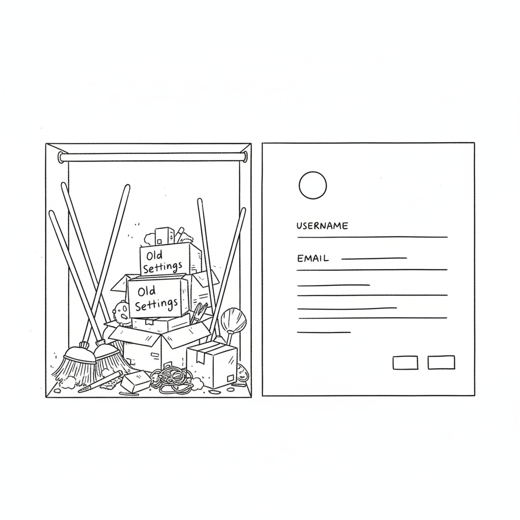
In the design world, the profile or settings page is the digital equivalent of the utility closet. It’s where we shove the brooms, the mismatched Tupperware, and the holiday decorations. As long as the door closes and the clutter is hidden, we’re happy. We prioritize the landing page, the dashboard, and the analytics graphs. We treat the profile page like a tax form, a necessary evil.
Your profile page is a retention killer.
We spend months agonizing over landing page hero images and CTA button colors. But the moment a user signs up, where do they go to set up their account? The profile page. If that experience is cluttered, confusing, or ugly, you’ve just poured gasoline on your churn rate.
You can have the sexiest onboarding flow in the world, but if the user feels lost the second they try to upload an avatar or change their password, they’re gone. The “First Time User Experience” doesn’t end at the signup screen; it ends when the user successfully customizes their space.
Why “Boring” Pages Matter (The Psychology of Ownership)
A profile page isn’t just a data dump; it’s a user’s personal space within your product. It’s the only part of the app that truly belongs to them. In a sea of charts, graphs, and other people’s data, the profile page is the only mirror.
If you treat it like an afterthought—hiding it behind a vague gear icon or making it look like a 1990s database form—you are subtly telling the user that they are an afterthought. You are telling them that their personal comfort is secondary to the system’s efficiency.
This creates a disconnect. In SaaS, specifically, trust is currency. If a user feels they don’t have control over their own identity (can they change their name? can they delete their credit card?), they subconsciously stop trusting the platform with their work.
According to insights from top agencies like Eleken, a well-structured profile page isn’t about looking cool; it’s about information hierarchy. You need to separate the “critical” (email, password, billing) from the “nice-to-have” (newsletter preferences, dark mode toggle, social links). This distinction reduces cognitive load. A user shouldn’t have to scan 50 options just to figure out how to log out.
How to Stop the Clutter
The biggest mistake in profile page UI is trying to show everything at once. We’ve seen massive enterprise tools where the settings page is a literal wall of text—300 form fields with no visual break. That is not a page; that is a resignation letter.

Here is how to fix it:
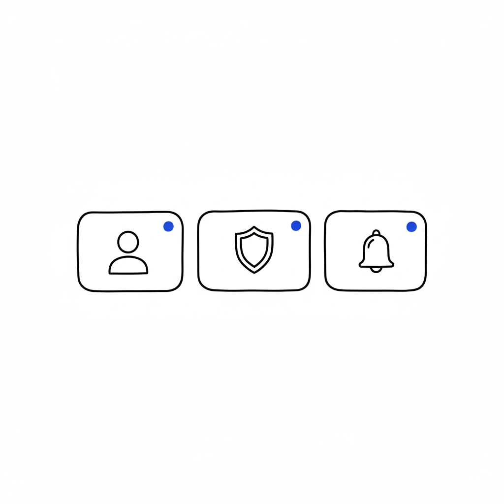
1. Group the Logic (Don’t Mix “Danger” with “Delight”)
Don’t put “Delete Account” next to “Change Profile Picture.” That’s anxiety-inducing. Group things by intent: Identity (photo, name, bio), Security (password, 2FA), and Notifications. Keep the destructive actions (Delete Account, Downgrade Plan) in a separate, clearly marked “Danger Zone” or bottom of the page. This gives the user psychological safety while navigating.
2. Visual Hierarchy is King
The user’s name and photo should be the stars of the show. Give them real estate. The billing info should be visible but not screaming for attention. Use whitespace aggressively. If a section looks dense, users assume it will be difficult to use.
3. Empty States are Marketing
If a user hasn’t filled out their bio yet, don’t just show empty lines or a gray placeholder. That’s a wasted opportunity. Use that space to teach them the value of the feature. instead of a blank box, try: “Add a bio so teammates know who you are” or “Upload a logo to appear on your invoices.”
“The page that belongs to users… Most profile pages don’t make headlines… But open any app you’ve used, and chances are you’ll find your fingerprints all over that little corner.” — Iryna Parashchenko, Eleken
4. Don’t Forget Mobile
This is where most profile pages die. A layout that looks clean on a 27-inch monitor becomes a thumb-twisting nightmare on an iPhone. On mobile, complex forms should be broken into bite-sized steps or collapsible accordions. If you are forcing a user to pinch-and-zoom just to update their phone number, you have failed mobile UX 101.
The “Invisible” Design Goal
The best profile pages are the ones you don’t notice. They feel obvious. They feel like the app was built specifically for that one user. When the design is “invisible,” the user feels a sense of agency and competence. They feel smart because they didn’t have to hunt for anything. And when a user feels smart, they stay.
FAQs
Q: Can I put a link to my design portfolio in the user’s profile for them?
A: You can try, but they will likely change it to a link to their cat’s Instagram. Prioritize their content, not yours.
Q: Is dark mode mandatory for settings?
A: Only if you want users to like you. Yes, it’s mandatory. Blinding white settings at 2 AM is a crime against eyes.
Q: How many tabs is too many tabs?
A: If you need a compass to navigate your settings page, you have failed. Stick to three or four max. Group the rest under “Advanced.”
Q: Should I hide the “Delete Account” button to reduce churn?
A: Never. Hiding it makes you look shady and desperate. Make it accessible, but ask for confirmation. If they really want to leave, a hidden button won’t stop them, just make them angrier.
Also Read: Apple’s Cross-Device UX: How Continuity & Handoff Drive 800M+ Active Users
