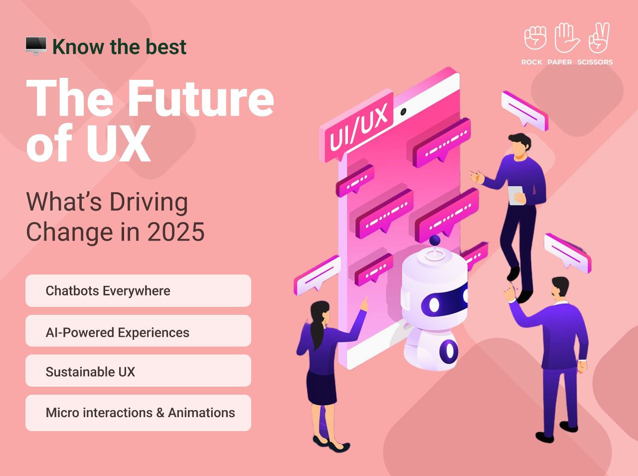
As technology evolves and user expectations rise, UX design is entering a new era. In 2025, the focus is on creating smarter, more intuitive, and sustainable experiences. From AI-driven personalization to eco-conscious design, here’s how UX is being redefined.
Chatbots Everywhere: The Future of Seamless UX Chatbots are transforming user interactions, now handling over 85% of customer engagements. They provide instant, 24/7 support, enhancing convenience and satisfaction. As AI makes them smarter and more intuitive, chatbots will continue to be a key element of seamless digital experiences.
AI-Powered Experiences: Personalization at Its Best Artificial Intelligence is revolutionizing UX by tailoring content, recommendations, and interactions based on user behaviour. AI not only enhances engagement but also streamlines tasks and boosts efficiency, making digital experiences more intuitive and rewarding.
Sustainable UX: Designing for a Greener Tomorrow With growing environmental consciousness, sustainable UX is gaining momentum. By reducing digital waste, optimizing resources, and promoting eco-friendly practices, UX designers are shaping experiences that benefit both users and the planet.
Micro interactions & Animations: Elevating Engagement Small yet impactful, micro interactions and animations make interfaces more engaging and user-friendly. These subtle elements guide users smoothly through their journey while adding a touch of charm. Animations enhance emotional connections, fostering stronger relationships between users and digital platforms. When executed thoughtfully, they transform mundane interactions into delightful experiences.
Looking Ahead The UX landscape in 2025 is driven by intelligence, sustainability, and engagement. As technology advances, designers play a crucial role in crafting experiences that are not just efficient and seamless but also meaningful and responsible. The future of UX is about connecting users, technology, and the world in more thoughtful ways.
RPS//
Blogs
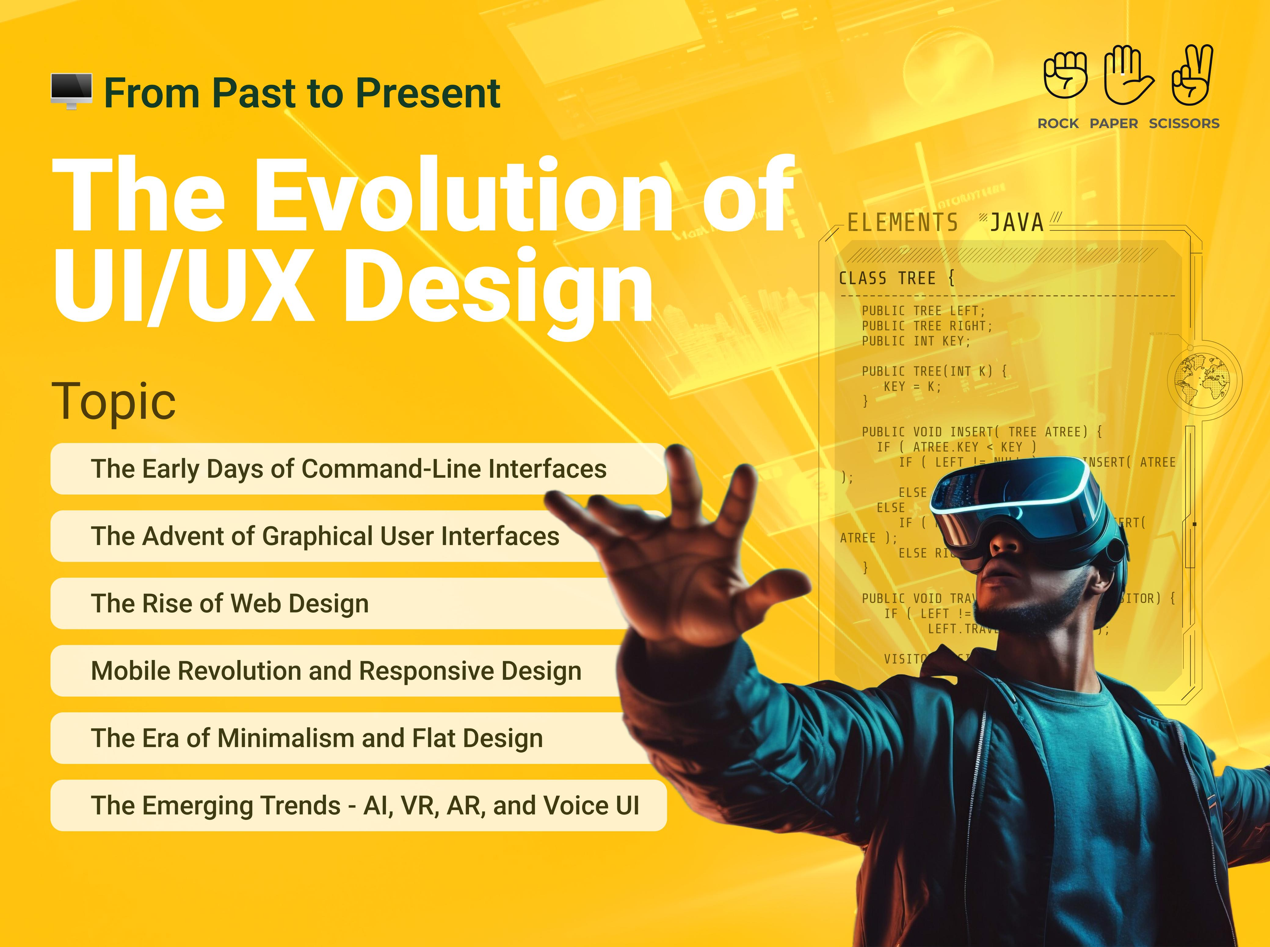
//From Past to Present: The Evolution of UI/UX Design
From Past to Present: The Evolution of UI/UX Design
Over the past few decades, User Interface (UI) and User Experience (UX) design have undergone a significant transformation. From the early days of command-line interfaces to the highly intuitive and user-friendly designs of today, UI/UX has continually evolved to enhance human-computer interactions. Technological advancements and user expectations are shaping UI/UX development and require designers to remain updated with emerging trends to create seamless and meaningful user experiences.
The Early Days of Command-Line Interfaces
In the early days of computing around the 1960s, interaction with machines was limited to command-line interfaces (CLI). Users needed to memorise complex commands to navigate systems. Though efficient for experts, CLI was inaccessible to the general public due to its steep learning curve.
The Advent of Graphical User Interfaces
The introduction of Graphical User Interfaces (GUIs) in the 1980s revolutionised user interactions. Companies like Xerox, Apple, and Microsoft played pivotal roles in this transition. Apple’s Macintosh and Microsoft Windows popularised GUI, making computers more accessible through visual elements like Windows, Icons, Menus, and Pointers (WIMP).
The Rise of Web Design
With the advent of the internet, web design became a crucial aspect of UI/UX. Early websites were text-heavy and lacked interactivity. However, advancements in HTML, CSS, and JavaScript enabled designers to create visually appealing and interactive web pages. The late 1990s and early 2000s saw the rise of Flash-based websites, allowing for rich animations and multimedia content. Since flash was easy to use and compress well, it became ideal for dial-up internet connections.
Mobile Revolution and Responsive Design
The introduction of smartphones and tablets brought new challenges and opportunities for UI/UX designers. This period also saw the rise of responsive design, ensuring seamless experiences across different screen sizes and devices. Responsive design which is a web design approach and easily adaptive to device layout and navigation, revolutionized how people worked, communicated, and brought the concept of e-commerce into existence.
The Era of Minimalism and Flat Design
In response to cluttered and skeuomorphic designs, the 2010s saw a shift towards minimalism and flat design. Companies like Google and Apple adopted material design and flat UI principles, emphasizing simplicity, clarity, and usability. The focus shifted towards user-centric design, emphasizing accessibility, consistency, and efficiency.
The Emerging Trends – AI, VR, AR, and Voice UI
Today, UI/UX design is evolving with the integration of artificial intelligence (AI), virtual reality (VR), and voice interfaces. AI-driven chatbots and recommendation engines personalise user experiences, while VR and Augmented Reality (AR) create immersive interactions. Voice assistants like Siri, Alexa, Gemini and Google Assistant are redefining how users interact with technology. The evolution of UI/UX design reflects the continuous efforts to make technology more intuitive, accessible, and engaging. As technology advances, UI/UX will continue to adapt, shaping the future of human-computer interactions.
RPS//
Blogs
//How to Enhance Your SaaS UX Design with These Top Best Practices
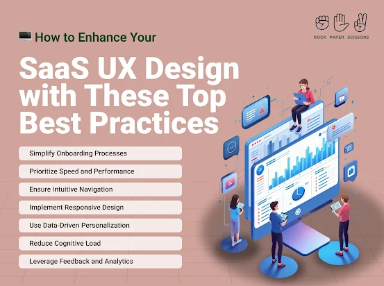
How to Enhance Your SaaS UX Design with These Top Best Practices
User experience (UX) plays a crucial role in the success of Software-as-a-Service (SaaS) products. A well-designed UX not only boosts customer satisfaction but also improves retention rates and revenue. Research indicates that 88% of users are less likely to return to a website after a bad experience, while companies that prioritize UX design see conversion rates increase by up to 400%.
Simplify Onboarding Processes
A streamlined onboarding experience helps users quickly understand and engage with your SaaS product. More than 60% of customers today consider onboarding a key factor in their purchase decision. Therefore, implementing interactive tutorials, tooltips, and personalized onboarding flows can ensure a frictionless start.
Prioritize Speed and Performance
A slow application can drive users away. According to Google reports, a one-second delay in page load time can reduce conversions by 7%. Hence, using content delivery networks (CDNs), optimizing code, and compressing images to enhance speed can improve performance while monitoring tools can help identify bottlenecks.
Ensure Intuitive Navigation
Users should find what they need with minimal effort. Poor navigation leads to frustration and abandonment. Various studies indicate that 76% of consumers find ease of use the most important characteristic of a website. Hence, using clear menus, logical information hierarchy, and a search function can improve usability.
Implement Responsive Design
With mobile SaaS usage increasing, a responsive design is essential. Statistics reveal that 57% of users won’t recommend a business with a poorly designed mobile site. Adopting a mobile-first approach while ensuring layouts, buttons, and fonts are optimized for different screen sizes can lead to a win-win.
Use Data-Driven Personalization
Personalization enhances user engagement. Research indicates that 80% of consumers are more likely to do business with a company that offers personalized experiences. Utilize AI-driven recommendations, customized dashboards, and tailored notifications to enhance user satisfaction.
Reduce Cognitive Load
Overloading users with information or choices can be overwhelming. Simplified interfaces, minimalistic elements, and progressive disclosures can present information gradually, providing users space to absorb information and improve their website experience.
Leverage Feedback and Analytics
Continuous improvement is key to UX success. Studies show that businesses that actively collect user feedback and make data-driven changes see a 25% boost in customer satisfaction. A/B testing and user surveys can identify pain points and refine the UX.
Enhance Accessibility Compliance
Making SaaS platforms accessible improves inclusivity and market reach. The Web Accessibility Initiative (WAI) reports that 15% of the world’s population experiences some form of disability. Use readable fonts, provide alt text for images, and ensure keyboard navigation for a more accessible experience.
Key Takeaways
Investing in UX design for your SaaS product can significantly impact user engagement, retention, and overall success. By simplifying onboarding, optimizing speed, ensuring intuitive navigation, and embracing personalization, businesses can enhance user satisfaction and drive growth. As research suggests, companies with a strong UX focus outperform their competitors, making UX design a non-negotiable aspect of SaaS development.
RPS//
Blogs
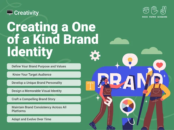
//Creating a One-of-a-Kind Brand Identity: 7 Steps You Need to Follow
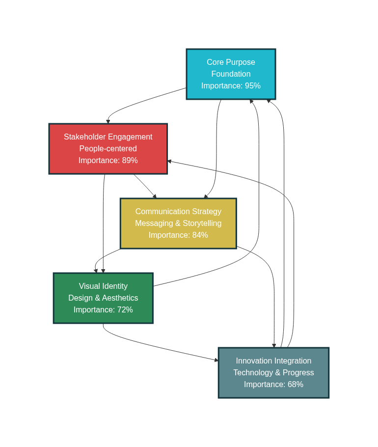
A strong brand identity is crucial in today’s competitive market. It sets your business apart, builds trust, and creates a lasting impression.
Here’s a seven-step guide to craft a unique brand identity that resonates with your audience.
1. Define Your Brand Purpose and Values
Your brand purpose is the reason your business exists beyond making a profit. Ask yourself:
What problem does my brand solve?
What values drive my business?
How do I want my brand to impact the world? Having a clear purpose and values will help shape your brand’s voice and identity.
2. Know Your Target Audience
Understanding your audience is essential for creating a brand that connects. Research your ideal customers:
Demographics (age, gender, location, etc.)
Psychographics (interests, lifestyle, values)
Pain points and needs (By aligning your brand identity with your audience’s preferences, you create a stronger emotional connection.)
3. Develop a Unique Brand Personality
Your brand personality is the human-like characteristics associated with your business. Is your brand:
Playful or professional?
Luxurious or budget-friendly?
Traditional or innovative? This personality should be reflected in your messaging, tone, and visual elements.
4. Design a Memorable Visual Identity
Your visual identity includes your logo, colour palette, typography, and imagery. Consider:
A logo that is simple yet distinctive
Colours that evoke the right emotions (e.g., blue for trust, red for excitement)
Fonts that align with your brand personality (consistency in visual branding ensures instant recognition and credibility).
5. Craft a Compelling Brand Story
A compelling brand story helps customers connect with your business on a deeper level. Your story should include:
The inspiration behind your brand
Challenges you’ve overcome
Your mission and vision
Make it relatable and authentic to build customer loyalty.
6. Maintain Brand Consistency Across All Platforms
Brand consistency strengthens recognition and trust. Ensure uniformity in:
Website design and content
Social media presence
Marketing materials and packaging
Customer service interactions
A brand style guide can help maintain consistency in tone, messaging, and visuals.
7. Adapt and Evolve Over Time
A great brand identity is dynamic, not static. Monitor trends, customer feedback, and market changes to stay relevant. While your core values should remain intact, be open to:
Refining your logo or visual identity
Adjusting your messaging strategy
Expanding your brand’s offerings Continuous improvement ensures your brand remains fresh and competitive.
Creating a distinctive brand identity takes time, effort, and consistency. By following these seven steps, you can establish a strong, authentic brand that leaves a lasting impression on your audience. Invest in your brand’s identity today to build trust, recognition, and long-term success.
RPS//
Blogs
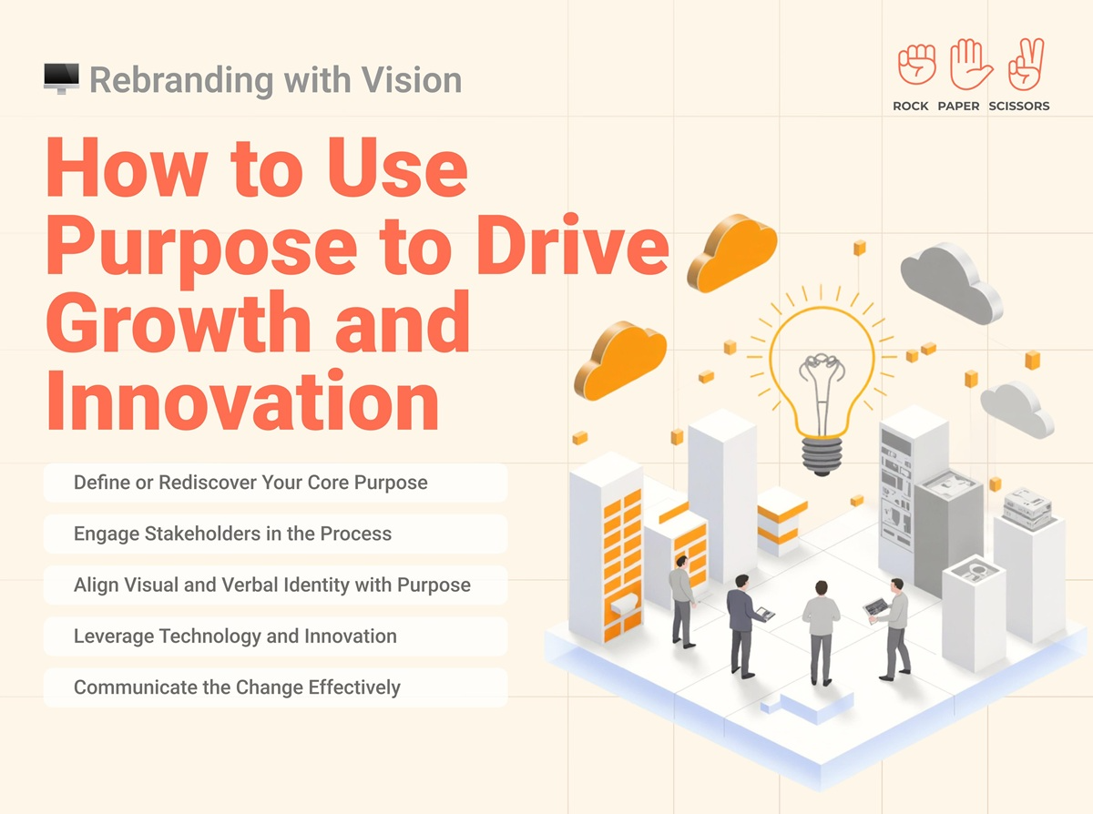
//7 Purpose-Driven Rebranding Strategies That Actually Drive Growth in 2025
Look, I’ve seen so many companies mess up their rebranding that it’s honestly painful. You know what I mean? You’re scrolling through LinkedIn and see another “exciting rebrand announcement” with a slightly different logo and the same empty corporate speak. Then six months later, you hear they laid off 30% of their team.
And honestly, it’s making me question if most business leaders even understand what purpose-driven rebranding actually means. Everyone keeps throwing around buzzwords like “authentic transformation” without doing the actual work. Even seasoned executives who’ve been in business for decades treat rebranding like it’s just a fancy design project.
But here’s what nobody talks about – purpose-driven rebranding isn’t about making your logo prettier. It’s about fundamentally changing how your business operates and grows.
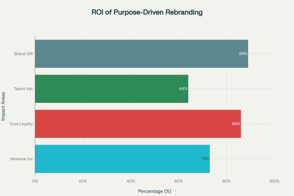
Purpose-Driven Rebranding ROI Statistics 2024-2025
Why Most Rebranding Efforts Fail Spectacularly
You want to know the brutal truth? 73% of rebranding efforts fail within the first 18 months. Not because the logos were ugly or the colors were wrong. They fail because companies focus on surface-level changes instead of purpose-driven rebranding strategies that actually matter.
Here’s what typically happens. CEO gets excited about a competitor’s new look. Calls a meeting. “We need to refresh our brand!” Three months and $200k later, they have new business cards and a website that looks like every other company in their industry.
Meanwhile, their actual problems – confused customers, disengaged employees, unclear market positioning – remain exactly the same.
I watched this happen to a fintech startup in Mumbai. They spent ₹15 lakh on a complete visual rebrand. New logo, new colors, new everything. But they never addressed their core issue: customers didn’t understand what they actually did. Six months later, their customer acquisition cost was still 340% higher than industry average.
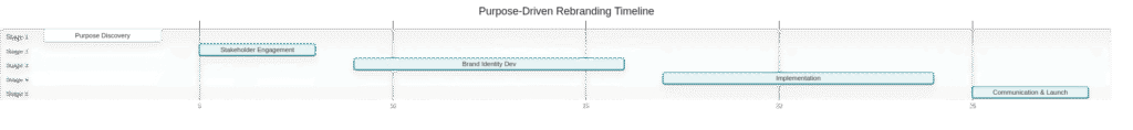
Purpose-Driven Rebranding Timeline and Process Stages
The 7 Elements That Make Purpose-Driven Rebranding Actually Work
Real purpose-driven rebranding starts from the inside out. You can’t fake authenticity, and customers spot superficial changes from miles away.
1. Define Your Actual Purpose (Not Your Marketing Purpose)
Stop writing mission statements that sound like they came from a corporate buzzword generator. Your purpose should answer one simple question: “Why should anyone care that your company exists?”
Nike didn’t rebrand around “athletic footwear excellence.” They built their entire identity around “Just Do It” – a philosophy that resonates far beyond shoes. That’s purpose-driven rebranding that creates emotional connection.
Here’s how you find your real purpose:
Ask your customers why they choose you over competitors
Survey your employees about what makes them proud to work there
Identify the specific problem you solve better than anyone else
2. Engage Every Stakeholder (Especially The Ones You’re Ignoring)
Most companies ask their executive team what they think the brand should be. That’s like asking a fish what water tastes like.
Your frontline employees know what customers actually complain about. Your customers know what promises you’re not keeping. Your partners know where you’re falling short.
Unilever’s sustainability rebrand didn’t happen in a boardroom. They talked to suppliers, employees, environmental groups, and consumers across 50+ countries. That stakeholder input shaped their entire “Sustainable Living” strategy, which now drives 70% of their growth.
3. Align Every Touchpoint With Your Purpose
This is where most companies completely fall apart. They create beautiful brand guidelines then implement them terribly.
Your customer service scripts, your hiring process, your product development, your office design – everything needs to reflect your purpose. If your purpose is “making financial services accessible,” but your loan application takes 47 steps, you’re not doing purpose-driven rebranding. You’re doing purpose-driven lying.
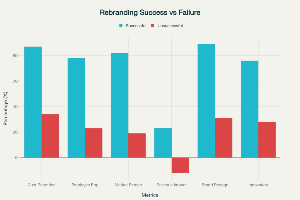
Successful vs Unsuccessful Rebranding Outcomes Comparison
4. Leverage Technology To Deliver On Your Promise
Purpose without capability is just pretty words. If your purpose involves innovation, customer service, or accessibility, you need the tech stack to deliver.
Microsoft’s transformation from software company to cloud-first, AI-powered platform wasn’t just about messaging. They rebuilt their entire technology infrastructure to support their new purpose of “empowering every person and organization to achieve more.”
5. Create Authentic Communication (Not Marketing Fluff)
Your rebranding story needs to be honest about where you came from and where you’re going. Customers connect with transformation stories that acknowledge struggles and mistakes.
Domino’s “Our Pizza Sucked” campaign is still the gold standard for authentic rebranding communication. They didn’t pretend their pizza was always great. They admitted it was terrible, showed exactly how they fixed it, and invited customers to judge the results.
6. Measure What Actually Matters
Forget vanity metrics like “brand awareness” and “social engagement.” Purpose-driven rebranding success shows up in business results:
Customer acquisition cost decreases
Employee retention improves
Customer lifetime value increases
Innovation pipeline accelerates
7. Commit To Long-Term Consistency
This isn’t a six-month project. Purpose-driven rebranding requires years of consistent execution. Every decision, every hire, every product launch needs to reinforce your purpose.
Patagonia has been building their environmental purpose for over 30 years. They’ve turned away profitable opportunities that didn’t align with their values. That consistency built a $1 billion brand with fanatically loyal customers.
Five Key Elements of Purpose-Driven Rebranding Framework
The Companies Getting Purpose-Driven Rebranding Right
Unilever focused their entire business around sustainability. Not just their marketing – their supply chain, product development, and corporate strategy. Result: sustainable brands grow 69% faster than the rest of their portfolio.
Microsoft transformed from a software company to an empowerment platform. They rebuilt their culture, technology, and go-to-market strategy around this purpose. Market cap grew from $230 billion to $2.8 trillion.
Nike continuously evolves while staying true to their “Just Do It” purpose. Whether it’s Colin Kaepernick or women’s athletics or sustainability, every major decision reinforces their commitment to empowering athletes.
The Real Cost of Superficial Rebranding
According to 2024 research by Prophet Brand Strategy, companies that approach rebranding as a cosmetic exercise face predictable consequences:
34% see decreased customer loyalty within 12 months
67% report employee confusion about company direction
89% fail to differentiate from competitors
Average revenue impact: -12% in year following rebrand
As branding expert Marty Neumeier puts it: “A brand is not what you say it is. It’s what they say it is.” If your purpose-driven rebranding doesn’t change how stakeholders actually experience your company, it’s just expensive decoration.
Your Purpose-Driven Rebranding Action Plan
Week 1-4: Purpose Discovery
Survey customers about why they choose you
Interview employees about what makes them proud
Analyze competitors’ positioning gaps
Define your authentic purpose statement
Week 5-8: Stakeholder Alignment
Conduct focus groups with key customer segments
Workshop sessions with all employee levels
Partner and supplier feedback collection
Board and investor alignment sessions
Week 9-16: Identity Development
Create visual identity that reflects purpose
Develop messaging framework for all touchpoints
Design customer experience that delivers on promise
Build internal systems to support new direction
Week 17-24: Implementation
Roll out new identity across all channels
Train employees on purpose and behaviors
Update all customer-facing materials
Implement new processes and systems
Week 25-28: Launch and Communication
Create authentic launch narrative
Execute multi-channel communication strategy
Monitor stakeholder reactions and feedback
Adjust based on initial market response
Frequently Asked Questions About Purpose-Driven Rebranding
Q: How long does purpose-driven rebranding take? A: Real purpose-driven rebranding takes 6-12 months for initial implementation, but building authentic purpose into your culture and operations is a 2-3 year process. Companies that rush it typically fail.
Q: How much should we budget for purpose-driven rebranding? A: Budget varies widely, but expect 3-5% of annual revenue for comprehensive transformation. This includes research, design, implementation, technology updates, and change management. Cheap rebranding usually means superficial rebranding.
Q: Can small businesses do purpose-driven rebranding effectively? A: Small businesses often have advantages in purpose-driven rebranding because they’re closer to customers and can move faster. Focus on authenticity over big budgets. Your purpose needs to be real, not expensive.
Q: What’s the biggest mistake companies make in rebranding? A: Treating it as a marketing project instead of a business transformation. Purpose-driven rebranding requires changes to operations, culture, and strategy – not just logos and websites.
Q: How do we measure purpose-driven rebranding success? A: Track business metrics that matter: customer acquisition cost, employee retention, customer lifetime value, and innovation pipeline. Brand awareness is nice, but revenue impact proves success.
Q: Should we hire an agency or do purpose-driven rebranding internally? A: Depends on your internal capabilities. Strategy and purpose definition often work better with external perspective, but implementation requires deep internal commitment. Many successful companies use hybrid approaches.
The bottom line? Purpose-driven rebranding works when you commit to actually changing how your business operates, not just how it looks. Stop thinking about rebranding as a design project. Start thinking about it as business transformation that happens to include new visuals.
Most companies won’t do this work because it’s hard and requires admitting your current approach isn’t working. But that’s exactly why purpose-driven rebranding creates such powerful competitive advantages for companies willing to do it right.
RPS//
Blogs
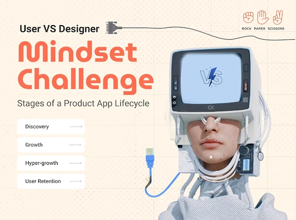
//Mindset Challenge – Stages of a Product App Lifecycle for UI/UX designers
In the ever-evolving digital landscape, designing a successful product app requires a deep understanding of user behaviour and expectations. The journey of an app—from initial discovery to long-term retention—is shaped by the mindset of both users and UI/UX designers. Users seek intuitive, efficient, and engaging experiences, while designers must balance innovation with practicality to sustain engagement. This article explores the key stages of a product app’s lifecycle, analyzing them from both the user’s and the designer’s perspectives.
Discovery
From the User’s Perspective:
Users face a dilemma about whether they need a new product app.
They are open to trying new options and providing feedback but expect an immediate solution to their challenges.
Key pain points include navigation, cart interface, and payment gateways.
From UI/UX Designer’s Perspective:
The need to simplify complexity and accommodate diverse user needs.
Conducting research, usability testing, and applying insights to refine the user experience.
Focus on intuitive design and seamless onboarding to encourage adoption.
Growth
From the User’s Perspective:
Increasing comfort level with the app but quick to spot flaws.
Active in providing feedback and expecting timely updates.
Product value is assessed based on ease of use and continuous improvements.
From UI/UX Designer’s Perspective:
Incorporating user feedback to sustain engagement and improve retention.
Refining interface elements to enhance usability and ensure a seamless experience.
Optimizing user flows to ensure convenience and efficiency.
Hyper-growth
From the User’s Perspective:
Ready to fully embrace the app, looking for enhanced experiences.
Expectations for new features, personalized recommendations, and overall improvements.
Seeking an emotional connection with the brand through user-friendly interactions.
From UI/UX Designer’s Perspective:
Balancing rapid growth with real value creation.
Developing micro-interactions that enrich user engagement.
Ensuring scalability while maintaining a consistent and delightful user experience.
User Retention
From the User’s Perspective:
Evaluating whether to continue using the app or uninstall it.
The decision depends on the ongoing value provided and the overall experience.
Looking for continuous engagement, updates, and incentives to stay.
From UI/UX Designer’s Perspective:
Keeping engagement high by generating incremental value.
Ensuring the product evolves with user needs and market trends.
Acknowledging that launching a product is easy, but retention requires constant innovation in design and experience.
A successful product app lifecycle hinges on aligning user expectations with intuitive and evolving UI/UX design. By consistently refining user experience, addressing pain points, and providing meaningful updates, brands can sustain long-term user engagement and loyalty.
RPS//
Blogs
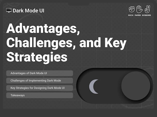
//Dark Mode UI: Advantages, Challenges, and Key Strategies
In recent times, dark mode has become an increasingly popular UI trend – offering users an alternative to the traditional light mode. With major platforms like iOS, Android, Windows, and macOS supporting system-wide dark themes, designers and developers must understand the benefits, challenges, and best practices of implementing dark mode in user interfaces. For more information on designing effective user interfaces, visit https://rockpaperscissors.studio
Advantages of Dark Mode UI
1. Easy on Eyes
Dark mode reduces the overall brightness of the screen, making it easier on the eyes, especially in low-light environments. This can be particularly beneficial for users who spend extended hours looking at screens.
2. Energy Efficiency
Dark mode can significantly conserve battery life. Since these screens turn off individual pixels when displaying true black, less power is consumed compared to light mode.
3. Enhanced Aesthetic Appeal
Dark mode offers a sleek and modern look, which many users find visually appealing. It provides a more immersive experience, especially in media-heavy applications such as streaming services, gaming platforms, and design tools.
4. Improved Focus and Readability
Dark backgrounds with high-contrast text can help reduce distractions and enhance readability. This is especially useful for developers, writers, and professionals working with large blocks of text.
Challenges of Implementing Dark Mode
1. Contrast and Readability Issues
One of the biggest challenges in designing dark mode UI is ensuring proper contrast between text and background. Poor contrast can lead to readability issues, making content difficult to follow.
2. Colour Inconsistencies
Not all colours work well in dark mode. Bright and saturated colours may appear harsh, while low-contrast colours might become unreadable. Designers must carefully choose colours that maintain clarity and accessibility.
3. Increased Development Complexity
Supporting dark mode requires additional development effort. Designers need to create separate styles for both light and dark themes, and developers must ensure smooth transitions between them.
Key Strategies for Designing Dark Mode UI
1. Use True Blacks and Dark Grays
2. Maintain Sufficient Contrast
3. Provide Theme Switching Options
4. Adjust Colours and Shadows Thoughtfully
5. Test in Different Lighting Conditions
Takeaways
Dark mode is more than just a visual preference; it offers tangible benefits like reduced eye strain, battery efficiency, and improved aesthetics. However, its implementation requires careful planning to overcome readability, colour, and performance challenges. By following best practices such as optimising contrast, providing user control, and testing under different conditions, designers can create a seamless and effective dark mode experience.
As users demand for dark mode continues to grow, businesses and developers must integrate it thoughtfully into their designs to enhance user experience and accessibility.
RPS//
Blogs
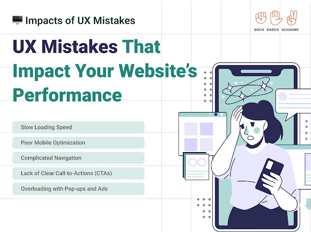
//UX Mistakes That Impact Your Website’s Performance
User experience (UX) plays a crucial role in determining the success of a website. A well-designed website keeps visitors engaged, improves conversions, and enhances brand credibility. However, many websites suffer due to common UX mistakes that drive users away. Some of the UX mistakes that could be hurting your website’s performance are;
Slow Loading Speed
Poor Mobile Optimization
Complicated Navigation
Lack of Clear Call-to-Actions (CTAs)
Overloading with Pop-ups and Ads
How to Fix these UX mistakes?
Optimise images and compress large files
Implement a responsive web design
Ensure buttons and links are easy to tap
Optimise fonts and images for mobile screens
Simplify your navigation menu with clear categories
Include a search bar for easy access to content
Ensure links and CTA buttons are prominent and functional
Use action-driven words like “Get Started,” “Sign Up Now,” or “Learn More”
Limit the use of pop-ups and ensure they don’t cover important content
Avoid autoplay videos and disruptive ads
Key Thoughts
Avoiding these UX mistakes can dramatically improve your website’s performance, user engagement, and conversion rates. Regularly test and refine your site’s UX design based on user behaviour and feedback. A seamless, fast, and intuitive website will keep visitors coming back, helping you achieve your business goals. To check out our UX works, visit our website https://rockpaperscissors.studio
RPS//
Blogs
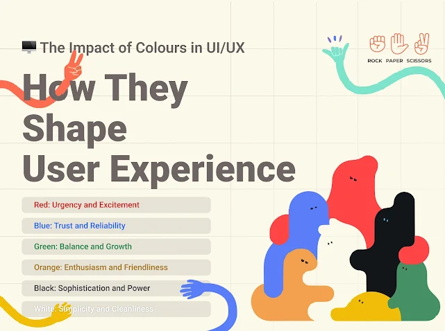
//The Impact of Colours in UI/UX: How They Shape User Experience
Colours evoke emotions and psychological responses, making them powerful tools in user interface (UI) and user experience (UX) design. Each colour carries a specific psychological meaning that can affect how users perceive a product, website, or application. Understanding the psychology of colours helps designers create intuitive, engaging, and effective digital experiences.
Red: Urgency and Excitement
Stimulates energy, passion, and action.
Often used for call-to-action (CTA) buttons, warnings, and alerts.
Example: Netflix’s red branding creates a sense of urgency and excitement.
Blue: Trust and Reliability
Evokes feelings of security, calmness, and professionalism.
Frequently used by financial, healthcare, and technology companies.
Example: Facebook and LinkedIn use blue to convey trust and credibility.
Green: Balance and Growth
Represents nature, harmony, and prosperity.
Commonly used in eco-friendly brands, finance, and wellness apps.
Example: WhatsApp’s green promotes connectivity and positivity.
Orange: Enthusiasm and Friendliness
Combines the excitement of red and the happiness of yellow.
Used in entertainment, food, and e-commerce platforms.
Example: Amazon’s orange elements enhance friendliness and approachability.
Black: Sophistication and Power
Represents elegance, luxury, and authority.
Used in high-end brands and minimalist UI designs.
Example: Apple’s black-and-white aesthetic emphasizes simplicity and sophistication.
White: Simplicity and Cleanliness
Symbolizes purity, clarity, and modernity.
Often used in minimalistic design and healthcare applications.
Example: Google’s white background enhances readability and focus.
How to Use Colours Effectively in UI/UX Design
1. Consider the Target Audience
2. Maintain Brand Consistency
3. Ensure Readability and Accessibility
4. Use Colour to Guide User Actions
Key Thoughts
Colours in UI/UX design are not just about aesthetic choices – they are psychological triggers that influence user perception and interaction. By understanding colour psychology and strategically implementing it in design, businesses can enhance user engagement, improve conversion rates, and create a memorable digital experience. Whether designing a website, an app, or an interface, the right colour choices can make all the difference.
Are you using the right colours in your design? Experiment, analyse, and optimise to create an impactful UI/UX experience! For more details connect with us www.rockpaperscissors.studio
RPS//
Blogs
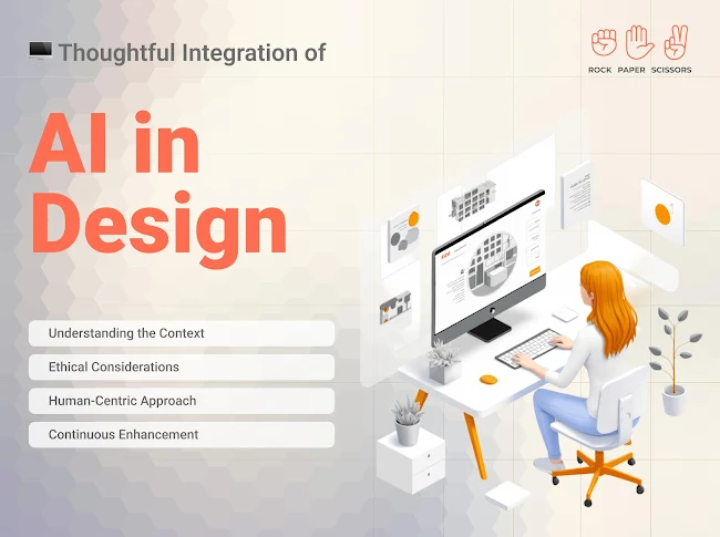
//Thoughtful Integration of AI in Design
Artificial Intelligence (AI) in design, enhancing creativity, efficiency, and user experience. However, for AI to be truly effective, it must be integrated thoughtfully, with careful consideration of ethical, human-centric, and iterative improvement principles.
Understanding the Context
The first step in AI-driven design is to understand the context in which it will be applied. AI solutions should not be implemented simply for the sake of innovation. They should address real user needs and solve specific problems.
Designers and developers must analyse user behaviour, pain points, and expectations to ensure that AI enhances usability rather than complicating it. By aligning AI capabilities with real-world applications, designers can create solutions that are not only functional but also meaningful.
Ethical Considerations
As AI continues to evolve, ethical concerns must be at the forefront of its integration. Addressing issues such as bias, privacy, and transparency is crucial in building trust with users.
Mitigating Bias: AI models should be trained on diverse datasets to avoid biased outcomes that could impact certain user groups.
Ensuring Privacy and Data Security: With AI-driven design often relying on user data, stringent privacy measures must be in place. Encryption, data anonymisation, and user consent mechanisms are essential to protect sensitive information.
Promoting Transparency: AI systems should be explainable, meaning users should have a clear understanding of how and why AI makes certain decisions.
Human-Centric Approach
The AI models should enhance and not replace human creativity and decision-making. A human-centric approach ensures that AI tools are intuitive and responsive to user needs.
Enhancing User Experience: AI should simplify interactions rather than complicate them.
Balancing Automation with Human Oversight: While AI can automate repetitive tasks, human intervention remains crucial for tasks requiring critical thinking and empathy. Hybrid models, where AI assists rather than dictates, create a more effective and user-friendly experience.
Continuous Enhancement
The integration of AI in design is not a one-time effort; it requires continuous iteration and improvements.
Iterative Testing and Refinement: AI models should be regularly tested against real-world scenarios, with adjustments made based on performance metrics and user feedback.
Adapting AI Models: AI must be flexible and adaptable to changing user needs. Regular updates, retraining of models, and algorithm enhancements ensure that AI remains relevant and effective over time.
In the End
A thoughtful approach to AI integration in design is essential for creating solutions that are ethical, user-friendly, and continuously evolving. By understanding the context, addressing ethical concerns, prioritising a human-centric approach, and committing to ongoing refinement, AI can truly enhance the design landscape, making it more intuitive and impactful. The future of AI in design lies in striking a right balance between automation and human creativity, ensuring technology serves users in the best possible way. Some of the popular AI tools include Relume.io, Octopus.do, Adobe Firefly, Lovable.dev, Ulzard.io, Wix Studio, and Lummiai, among others. For more details connect with us www.rockpaperscissors.studio