Nuvama Wealth Management Platform
Nuvama Wealth Management is a leading Indian financial services platform offering integrated wealth advisory, asset management, and capital market solutions for HNIs, retail investors, and institutions.
Overview
Nuvama Wealth Management Platform
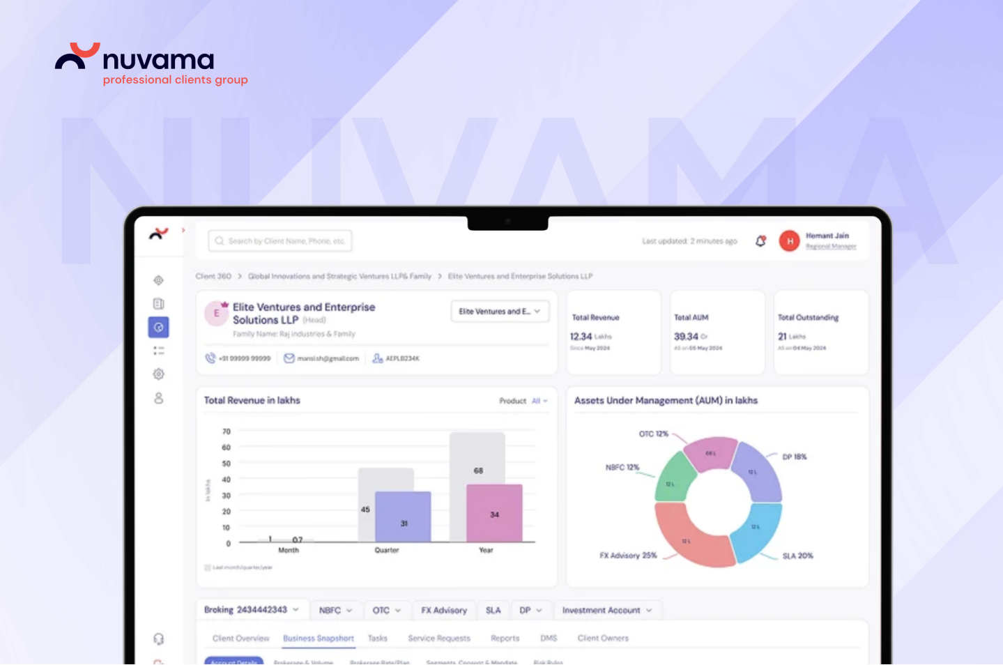
Nuvama's platform supports Relationship Managers working across HNI wealth journeys. The earlier experience was functional, but it was built around tasks and modules before it was built around the people using them every day.
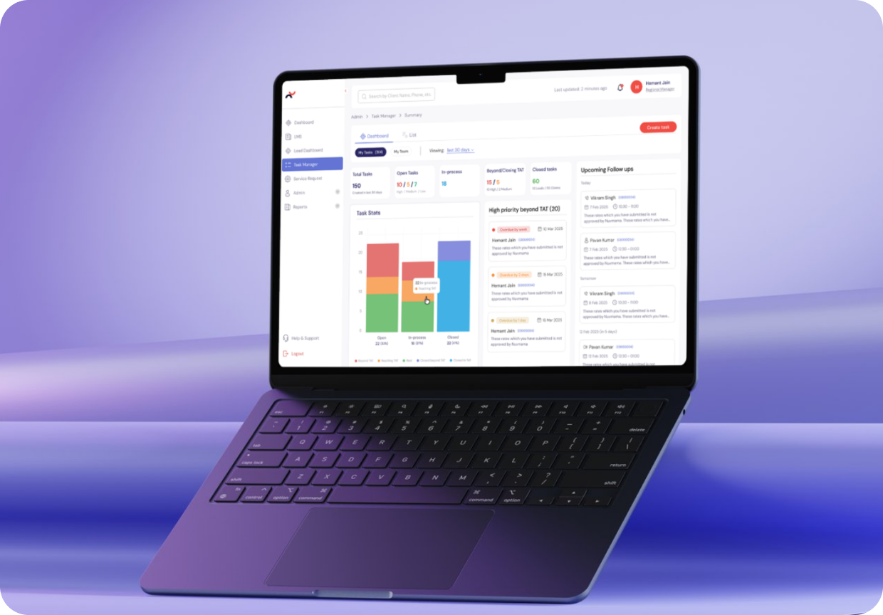
Rock Paper Scissors Studio was engaged to transform the dashboard into a clearer web app experience for Relationship Managers, partners, and clients. The work covered lead management, admin workflows, task management, dashboard views, search, follow-ups, approval states, and reusable interface patterns.
The goal was to move the platform from function-first to user-first: easier to understand, easier to navigate, and strong enough to support complex wealth-management workflows with less training and more confidence.
Role
Turning Operational Complexity Into Daily Clarity
Our role was to redesign the platform experience so that core workflows felt connected instead of scattered. The system needed to support internal users who manage large volumes of leads, client information, meetings, approvals, and follow-ups, while also creating a more coherent experience for partners and clients.
The design challenge was not only visual refinement. It was about translating a dense internal platform into a structured digital product where users could see what needed attention, move between views, and act without relearning the interface at every step.

Key Challenges
Function-First Workflows Meet User-First Clarity
Challenges
- The experience served the workflow, but not always the user.
- RMs, partners, and clients needed a more unified experience.
- Navigation and information architecture were difficult to scan.Users needed to move between dashboard, list, calendar, board, reports, search, and lead creation without losing context.
- Inconsistent patterns increased the learning curve.The old interface required more training because users had to interpret different controls, layouts, and status behaviours across the platform.
- Dense data needed stronger visual hierarchy. Lead counts, TAT status, approval states, follow-ups, conversion views, meetings, and client details all competed for attention.
Solutions
- We redesigned the experience around clearer user journeys, helping Relationship Managers move through leads, tasks, approvals, and client context with less friction.
- We created a unified UX direction that brought navigation, dashboard structure, and interaction patterns into one shared product language.
- We simplified navigation and IA so high-frequency actions could be found faster and repeated workflows felt more predictable.
- We introduced standardized patterns based on familiar interaction models, reducing cognitive load and making the interface easier to adopt.
- We refined spacing, white space, card structure, and hierarchy so the dashboard could guide attention instead of overwhelming the user.
RPS Approach
Built Around Workflow Clarity
Our approach followed the same core principle used in complex enterprise redesigns: understand the operations deeply before designing the interface.
1
Mapping the platform around real user movement
We began by understanding how Relationship Managers move through the platform: reviewing leads, checking client context, creating follow-ups, tracking approval states, and managing upcoming meetings.

2
Designing repeatable patterns for scale
3
Refining the UI through collaboration and iteration
User Insight & Persona
The Relationship Manager Under Daily Pressure
The primary user was the Relationship Manager, a role that depends on speed, visibility, and context. RMs need to track leads, identify urgent follow-ups, understand approval status, prepare for meetings, and keep client movement visible across different stages.
Key User Problems
The old platform placed a lot of responsibility on the user to interpret the interface. The redesign shifted more of that work into the product itself: clearer dashboards, stronger status cues, predictable actions, and views that help users understand what is pending, what is urgent, and what can move forward.
Partners and clients were also part of the larger experience. The redesign therefore needed to support internal operational accuracy while making the wider wealth-management journey feel more structured and connected.
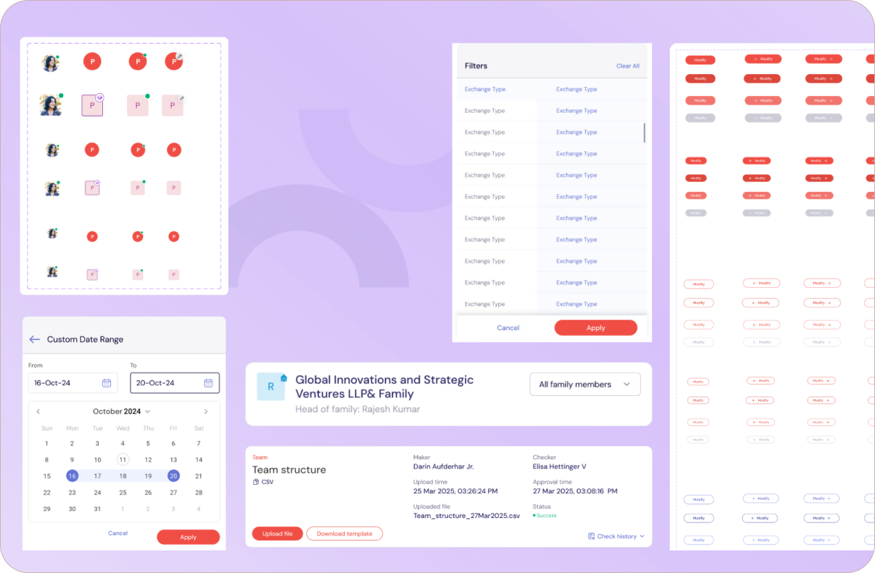
Components
Design System
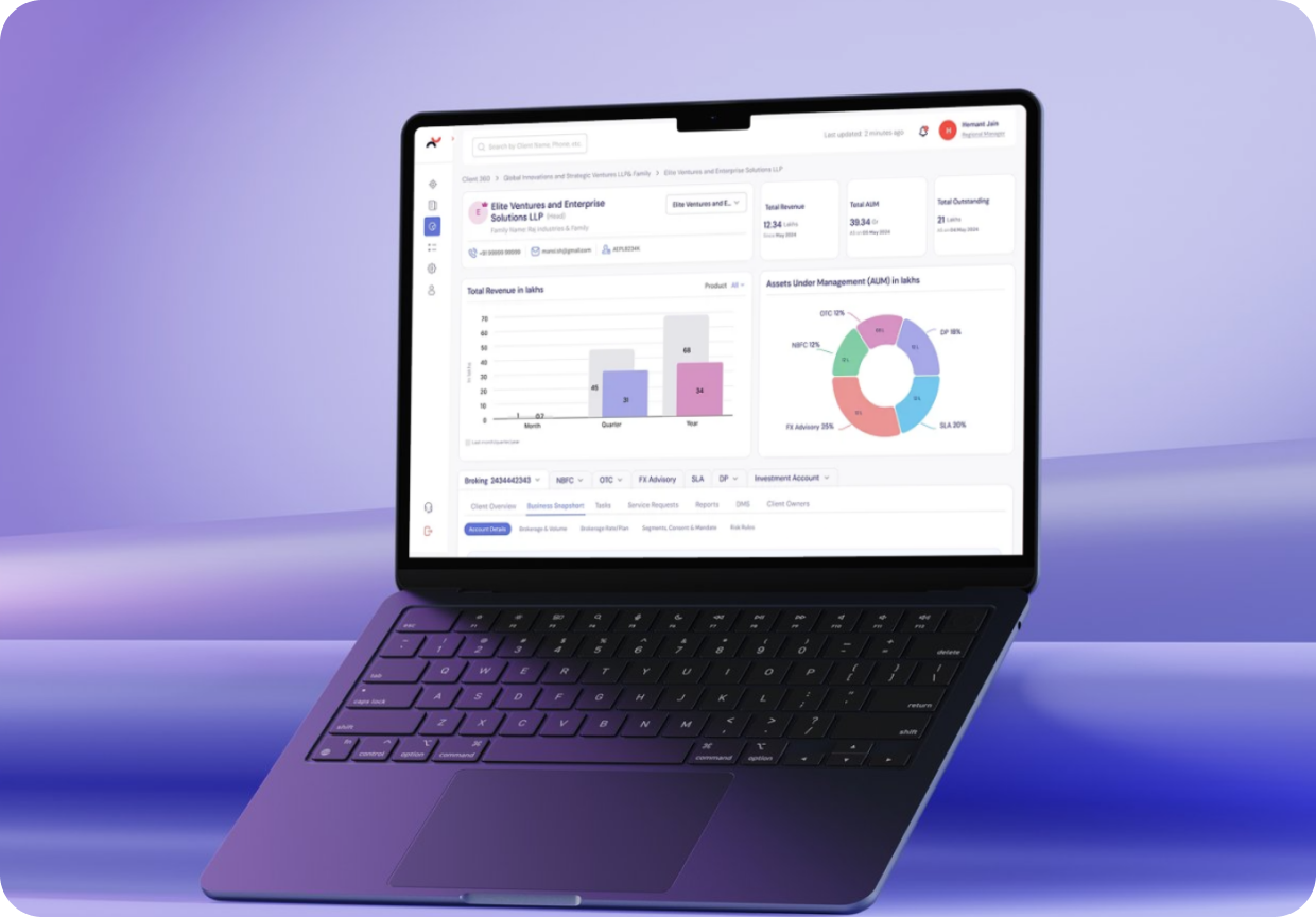
A modular design approach focused on flexibility and performance. Enables faster interactions and a cohesive user interface.
Key Improvements
From Dense Dashboard To Structured Workspace
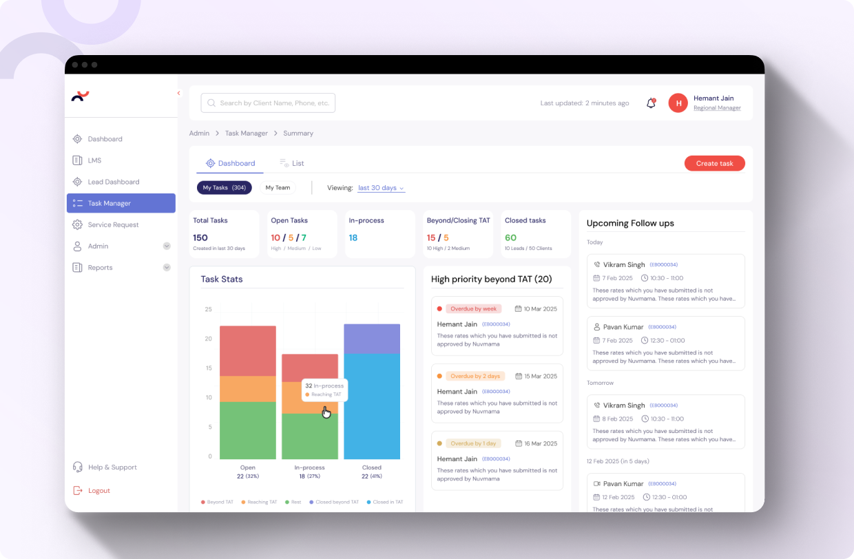
Unified lead management
The redesigned workspace brought lead counts, follow-ups, converted leads, meetings, and approval activity into a clearer operating view for Relationship Managers.
Improved visual hierarchy
Spacing, card design, and content grouping helped users scan important information faster, especially in data-heavy areas of the platform.
Simplified navigation and IA
Dashboard, list, calendar, board, reports, search, and lead creation were organized into a cleaner structure so users could move between tasks with less effort.
Clearer status and approval visibility
TAT states, approval status, lead temperature, and follow-up cues were treated as priority information, helping users focus on what needed action.
Standardized interaction patterns
Familiar components and consistent states helped reduce the learning curve and made repeated actions easier to understand
Scalable system thinking
The design direction supported multiple product contexts, creating a foundation that could extend across lead management, admin systems, and task management.
Refinement
Details That Build Trust
Details That Make Operations Faster and Safer
White Space And Hierarchy
The interface was refined to give dense information more breathing room. This helped users identify the most important data without losing access to supporting details
Familiar Behaviour Patterns
Reusable components and Jacob's Law-based interaction patterns helped make the product feel easier to learn. Users did not need to decode a new behaviour on every screen.
Action-Oriented Status Design
Follow-up, approval, TAT, and lead-status cues were designed to support decision-making. The interface made it easier to understand where attention was required and what could move next
Impact
A Platform Designed For Faster Adoption
The redesigned experience gave Nuvama a clearer product foundation for internal wealth-management workflows.

Wrap-up
Engineered for Nuvama
The Nuvama redesign was more than a dashboard refresh. It was a shift from a functional internal tool to a structured wealth-management platform that helps users understand, prioritize, and act with greater clarity.
By bringing navigation, hierarchy, reusable components, and workflow thinking into one system, RPS helped create a product experience that supports Relationship Managers in their daily work while giving Nuvama a stronger foundation for future scale.