Turtlemint
Turtlemint is an online insurance platform and licensed broker that helps customers compare, buy, renew, and manage insurance policies through digital tools.
Overview
Turtlemint Consumer App
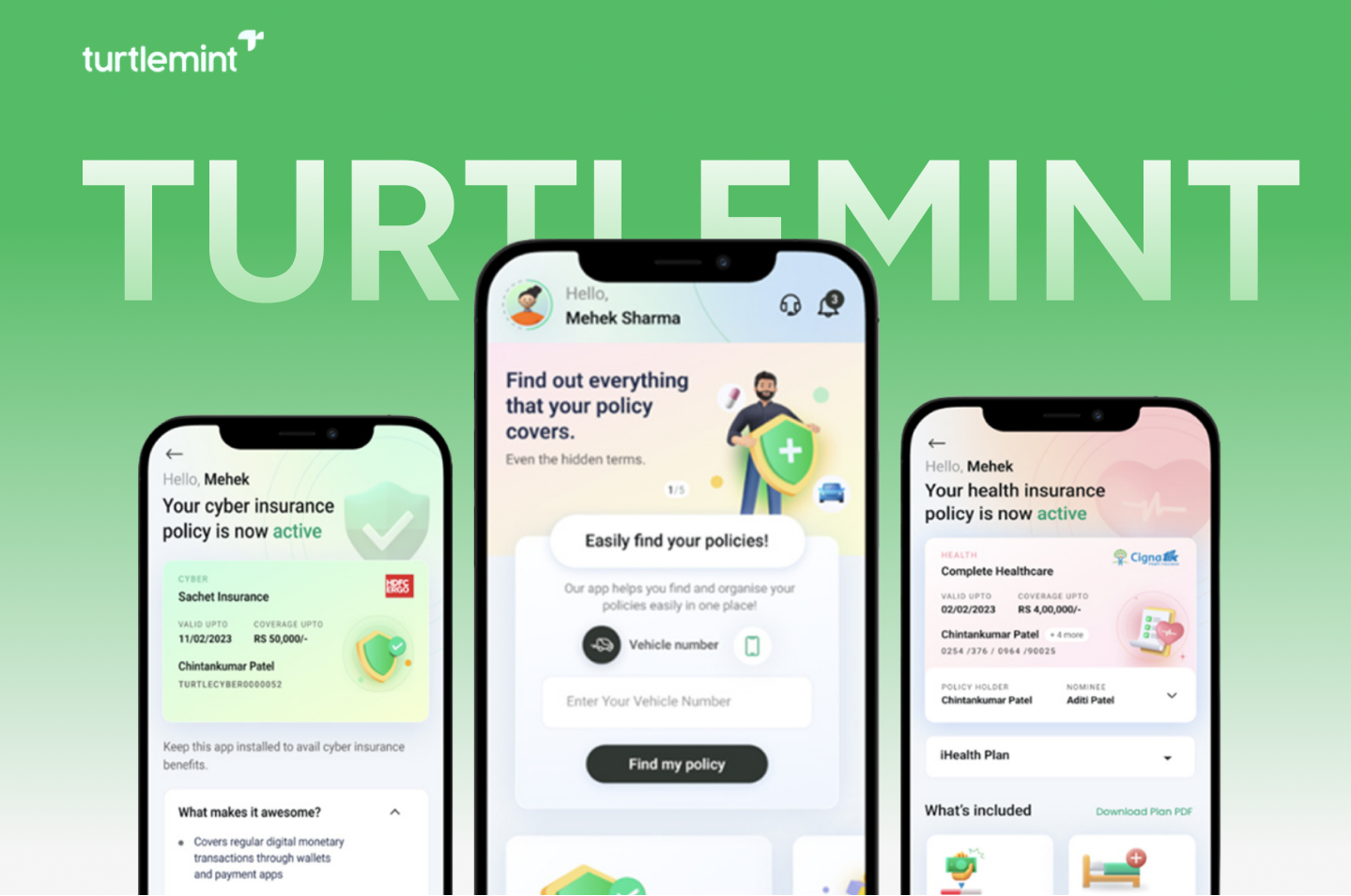
Turtlemint is an online insurance marketplace and licensed broker that enables users to compare, buy, and renew policies, while providing digital tools to insurance advisors. The redesign by Rock Paper Scissors (RPS) Studio aimed to modernize the functional interface into a clearer, visually confident, and more user-friendly product experience for both customers and advisors.
Key Challenges
Complex insurance decisions meet everyday app behavior
Challenges
- Lacked Refinement: The previous UI was purely utilitarian
- Complex Comparison & Completion: Users struggled to navigate buying, renewing, discovering policies, and claims.
- Dual User Base Needs: Customers needed self-serve functionality, while advisors required detailed tool access.
- Low CTA Visibility: Important actions were easy to miss.
Solutions
- We refreshed visual language, cleaner layouts, improved spacing, and modern mobile hierarchy.
- We reorganized key flows and highlighted high-value actions.
- We kept customer tasks simple while preserving workflow depth for advisors.
- We positioned prominent CTAs upfront for clear task completion.
RPS Approach
Grounded in real-world workflows, driven by structured visual benchmarking.
Our approach followed the same core principle used in complex enterprise redesigns: understand the operations deeply before designing the interface.
1
Business & Product Understanding:
Aligned redesign decisions around real user needs through in-depth discussions with business teams

2
Benchmarking:
Analyzed similar insurance apps to establish UX patterns,
3
Visual Direction:
Applied mood boards & clear CTAs, and selective 3D icons
User Insight & Persona
Empowering self-serve customers without compromising advisor workflows
The primary user was the everyday customer looking to easily compare, purchase, renew policies, and track claims independently without friction, while the secondary user was the insurance advisor who needed deep workflow tools and quick access to client data to guide and manage policies effectively without dealing with an overloaded interface.
Customers: Focused on reducing uncertainty through structured onboarding, policy discovery, organized claims, and visible CTAs
Advisors: Integrated advisor tools into the overall flow without cluttering the core customer interface.
Components
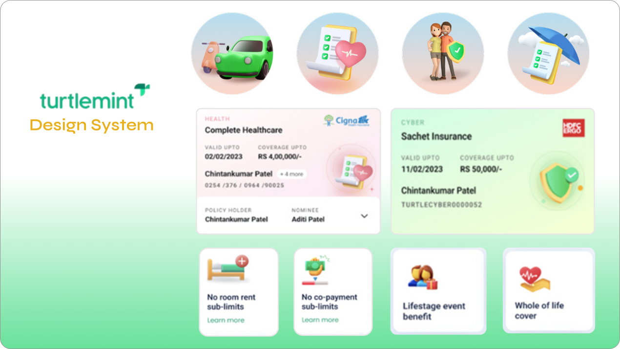
Modular card architecture meets purposeful visual depth
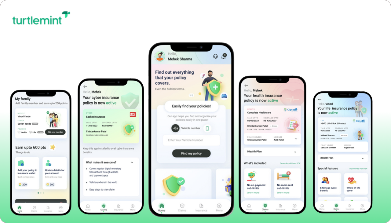
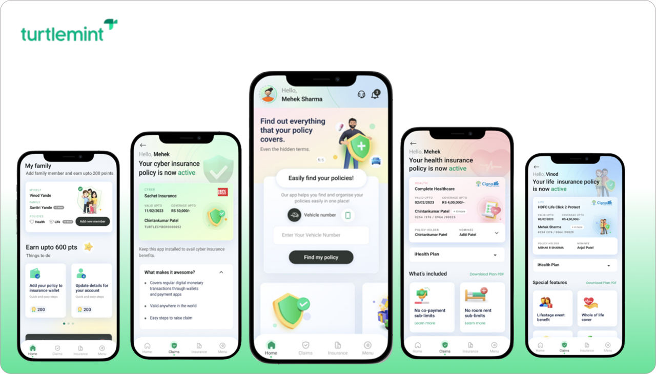
Modern card layouts, upfront CTAs, onboarding patterns, purchase/renewal flows, claims screens, family view/policy finder layouts, rewards, profile surfaces, and custom 3D icons.
Key Improvements
From fragmented utility to an intuitive, guided product experience

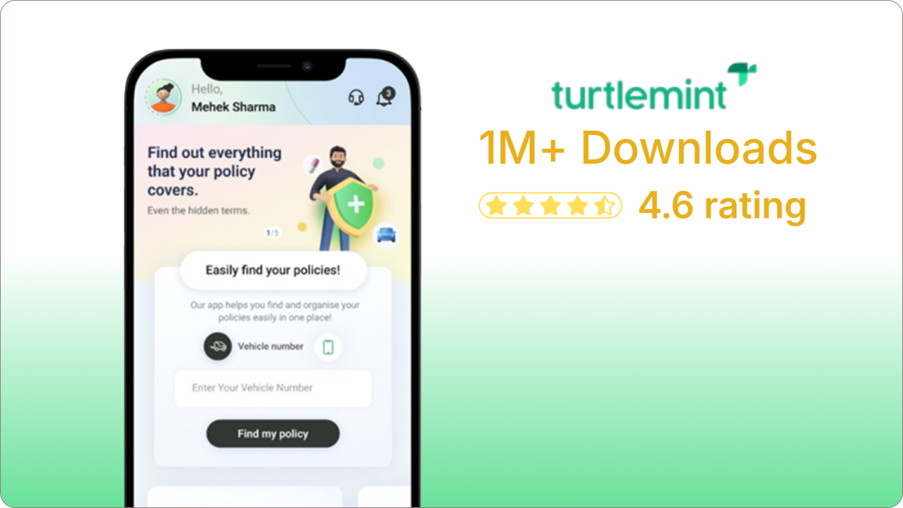
Streamlined onboarding experience.
Structured flows for insurance purchases, renewals, and claims.
Stronger CTA priority and cleaner content hierarchy using cards.
Balanced experience for both self-serve customers and advisor-guided assistance.
Impact
A seamless, confident mobile app experience for a large-scale insurance marketplace.

Wrap-up
More than a visual refresh , a strategic leap in user-centric financial mobility.
The redesign elevated Turtlemint from a purely utility-driven platform into a structured, intuitive mobile experience for both customers and advisors. By pairing card-based modular layouts and clear CTAs with strategic flow optimizations, the new product makes navigating complex insurance decisions feel effortless and confidence-inspiring.