Your product still works. Technically, everything functions fine. Your engineers built it well. But something’s off.
Users are switching to competitors. Support tickets are increasing for “how do I…” questions. Your newest onboarding cohort has a 45% bounce rate instead of 15%. Nobody’s complaining directly, but they’re leaving quietly.
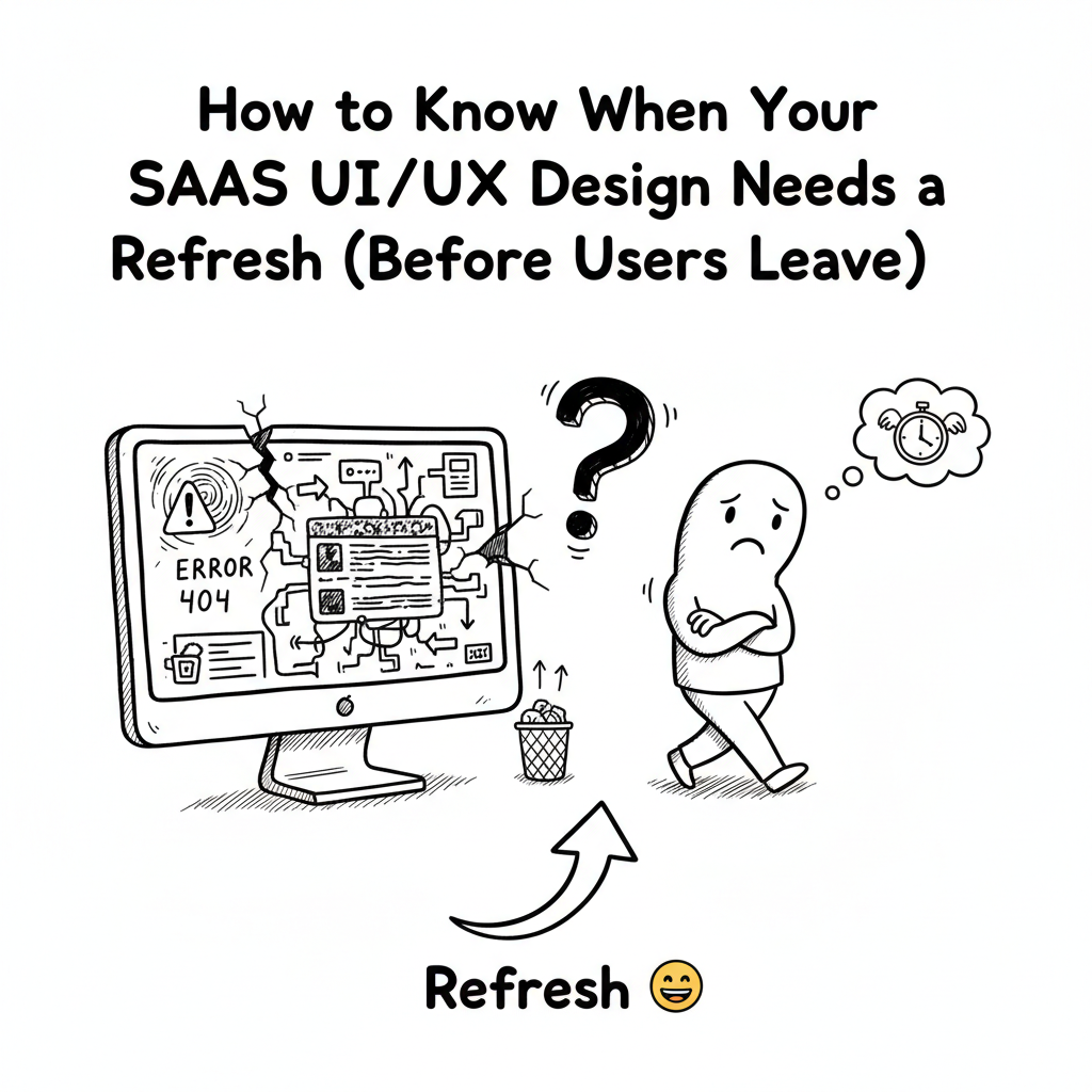
This is what happens when your UI/UX design gets old.
Not old like “from 2015” old. Old like “designed without understanding actual user behavior” old. Old like “designed by committee” old. Old like “designed once and never touched again” old.
Most founders don’t want to hear this. They think, “If it’s not broken, don’t fix it.” But user interfaces are always slowly breaking. They’re always getting less effective. They’re always losing users to products that adapted to how people actually behave.
Here’s how to spot when your SaaS design needs refreshing:
Red Flag 1: Your onboarding is a gauntlet
If it takes more than 5 minutes to get started, you’re losing people. If users have to fill out 15 fields before they see any value, they’re gone. If they can’t accomplish something meaningful in their first session, they won’t come back.
Test this yourself. Create a new account. How long until you do something useful? If it’s more than 5 minutes, your UI UX design needs work.
Red Flag 2: Power users love it. Normal users are confused.
If your most engaged users praise the product but your average users struggle, your design is too complex. Good design works for everyone, not just people who’ve spent 100 hours in your product.
Red Flag 3: Support tickets are about basic functionality
When your support team is answering “How do I…” questions about core features, your UI/UX design failed. Good design answers those questions without needing support.
Red Flag 4: Users switch to competitors after trying yours
People don’t switch because competitors have better features. They switch because the experience is faster, simpler, or more intuitive. Your UI/UX design is losing users to experience.
Red Flag 5: Your analytics show high bounce rates on key pages
If 40%+ of users hit your dashboard and immediately leave, something’s broken. If signup pages have 60%+ abandonment, your design is confusing. Track where users get stuck and you’ll find your biggest design problems.
Red Flag 6: You haven’t changed your design in 18+ months
Industries move fast. User expectations evolve. Design trends shift. If your product looks the same as it did 2 years ago, it’s showing its age. And users notice.
Red Flag 7: Mobile users hate your product
If your desktop experience is good but mobile is a disaster, your UI/UX design isn’t responsive. 60%+ of users are on mobile. If they’re not happy, you’re failing half your market.
These patterns show up everywhere. And they’re always fixable.
Here’s your audit process:
Step 1: Watch real users try your product for the first time. Don’t help them. Don’t explain features. Watch where they get stuck.
Step 2: Map your support tickets. What questions do people ask most? Those are your design problems.
Step 3: Check your analytics. Where do users abandon most? Those are your friction points.
Step 4: Interview 5 customers who didn’t renew. Ask why. Usually it’s UX-related.
Step 5: Test your product on mobile. Right now. If it’s painful, that’s your biggest problem.
One SaaS company did this audit. They discovered their onboarding was the killer. Users were completing it, but slowly. They were frustrated. They weren’t coming back.
The company redesigned just the onboarding. Better copy. Fewer fields. Faster value demonstration. Onboarding time dropped 67%. Activation rate improved 89%.
That’s what happens when you audit before you panic-redesign. You find the actual problem. You fix the actual problem. Everything else improves naturally.
Your UI/UX design probably needs a refresh. Not a complete overhaul. But something needs updating. Find out what by watching your users struggle. Then fix that specific thing.
That’s how you keep users from switching to competitors.
Also Read: Fintech UX for Indian Startups: Why Trust Beats Features
