Every app looks identical. Design systems created this problem. Learn why sameness is expensive and how intentional divergence builds real brand differentiation.
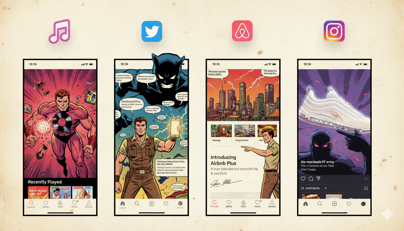
Open Apple Music. Open Twitter. Open Airbnb. Open Instagram. Different companies. Different audiences. Different business models. Same feeling. Same layouts. Same gestures. Same visual language. This isn’t an accident. It’s the logical outcome of modern design systems. And while systems solved the chaos of early web design, they’ve created a new problem that’s harder to see: invisibility.
The Safety Trap: Why Designers Choose Sameness
Design today is built from shared components—same UI kits, same frameworks, same inspiration sources, same Figma community files downloaded a thousand times. Designers aren’t copying each other maliciously. They’re optimizing for safety. And safety produces sameness. You can’t fail if you follow the pattern. You can’t be wrong if you use the framework everyone else uses. So the pattern spreads until it becomes invisible—not because it’s so good, but because it’s so familiar.
The visual grammar is predictable: card-based layouts, bottom navigation, rounded rectangles, spacing rhythms that feel balanced because we’ve seen them a hundred times. Everything feels usable. Nothing feels distinctive. We’ve created a world where recognition beats identity. Users don’t remember the product. They remember it felt expected.
Three Forces Driving the Copy-Paste Era
Pattern worship is the first force. Design systems reward consistency—that’s genuinely good. But consistency has become dogma. Once a pattern “works,” no one questions it again. The fact that everyone uses the same navigation patterns isn’t because alternative patterns wouldn’t work; it’s because proven patterns feel safer. Fear of breaking mental models is the second force. Designers are told: “Don’t surprise users.” So we stop surprising them at all. The result? Interfaces that are technically easy to use and psychologically impossible to remember.
Third is platform gravity. iOS, Android, and web conventions pull everything toward the same center. Deviation feels risky. Risk feels expensive. So brands conform. The system self-reinforces: safe design gets funded, risky design gets questioned, sameness spreads.
The Real Cost of Invisibility
When everything looks the same, something critical happens: brand becomes interchangeable. If Apple Music and Spotify have the same interaction patterns, the same layout logic, the same visual rhythm, what’s stopping users from switching? Usability is table stakes now. It’s not a differentiator anymore. Price becomes the differentiator. That’s bad design economics. You’ve made your product easier to leave.
At Rock Paper Scissors, we worked with a fintech client facing exactly this problem. Their app worked perfectly. Users couldn’t remember it. Why? Because it looked like every other fintech app—sleek, minimal, standardized. We didn’t reinvent navigation. We didn’t break usability principles. We changed emphasis: different information hierarchy, bolder type decisions, intentional friction in key moments where it builds confidence instead of preventing action. Engagement increased. So did recall. Sameness wasn’t helping them. It was hiding them.
The Irony: Designers Created This Prison
Designers built design systems, libraries, and best practices to scale quality and solve chaos. That was the right move. But now those systems are creating uniformity. We’ve optimized away personality in the name of consistency. We solved the problem of inconsistency by removing the possibility of distinction. The system works. The system is also making everything invisible.
Breaking Out: Intentional Divergence
The solution isn’t “be different for the sake of it.” Arbitrary differentiation is as bad as no differentiation. The answer is intentional divergence. Where can you safely break expectations? Where does your brand deserve emphasis? What should users feel, not just do? Memorable products take small, consistent risks. Not risks in usability—risks in personality, emphasis, and the micro-moments where brand becomes tangible.
Think about why you remember certain products. It’s usually not the navigation. It’s the feeling. The emphasis. The moment something surprised you (in a good way) because the designer chose to be slightly different instead of perfectly safe.
The Next Generation
In 2025, everything looks the same because we designed it that way. The next generation of great products won’t reject usability. They’ll reject invisibility. And that will require designers brave enough to stop copy-pasting—and start deciding again. Not deciding against best practices. Deciding how to bend them toward something that actually feels like a brand.
Also Read: AI Won’t Replace Designers It’ll Replace Bad Design Execution
