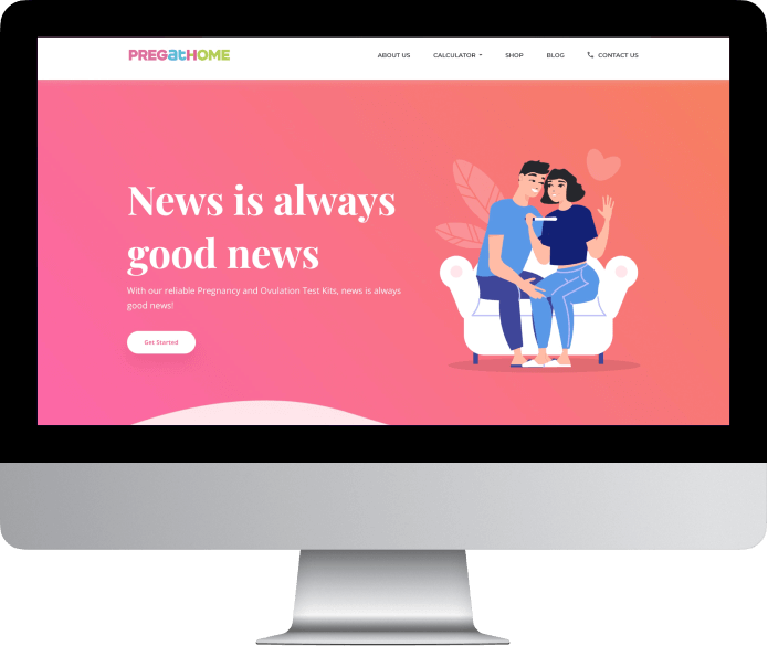
Project name: PregatHome
Duration: 3 months
Launch Project: July, 2022
PregatHome - News is always good news
Challenge
To create a niche for PregatHome in the already crowded pregnancy test kit market.
Insight
Many players with similar products are available in the market. These players have been focusing on pregnancy and women centric packaging, when the need of the hour has been of extending knowledge on ovulation cycle and afresh view over product placement.
Goal
To break the stereotype and have a more colourful packaging than the mundane celebrity star holding the testing kit. Spread awareness about ovulation cycle and ovulation kit. Position PregatHome as a convenient and easy to use self test, making every decision a proud moment.
TYPOGRAPHY
Aa
Playfair Display
A B C D E F G H I J K L M N O P Q R S T U V W X Y Z
a b c d e f g h i j k l m n o p q r s t u v w x y z
1 2 3 4 5 6 7 8 9 0
Aa
Open Sans
A B C D E F G H I J K L M N O P Q R S T U V W X Y Z
a b c d e f g h i j k l m n o p q r s t u v w x y z
1 2 3 4 5 6 7 8 9 0
cOLOR SCHEME
Primary
#F0679E
#00BFD9
#ABD037
#212121
#FFFFFF
Secondary
#EE3D8A
#00B1C5
#72BF44
Tertiary
#F6ADC6
#A1DBE0
#D6E59B
Visual Language
The logo evolved to encompass the value of the brand in the form of symbols for each.
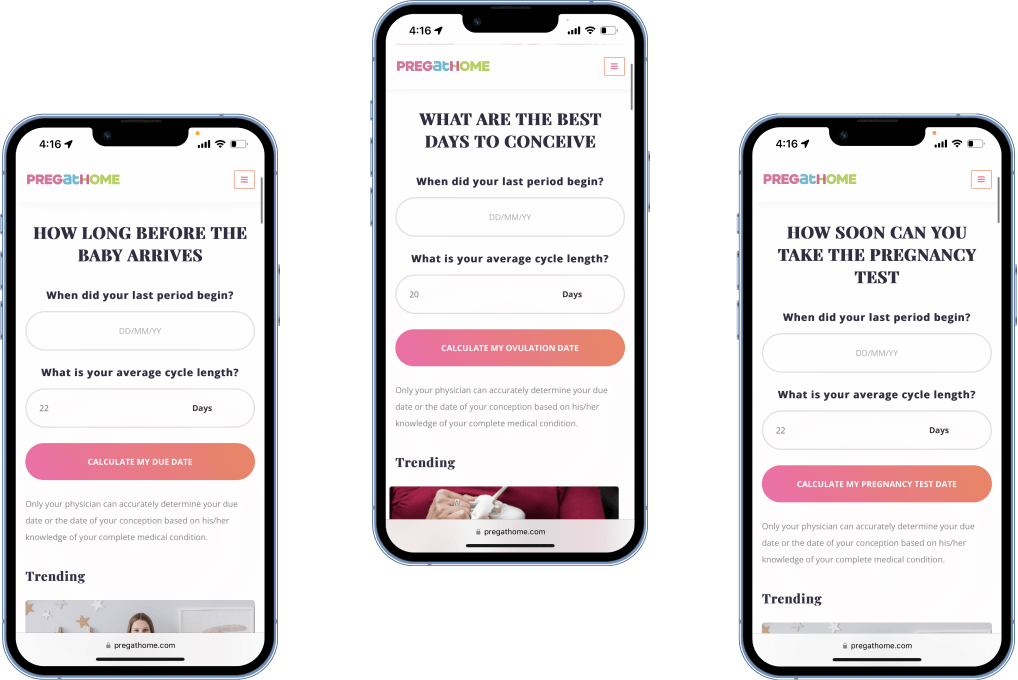
Futher, this slowly translated to every brand material including the stationery, the posters, flyers, forms and, most importantly, the website.
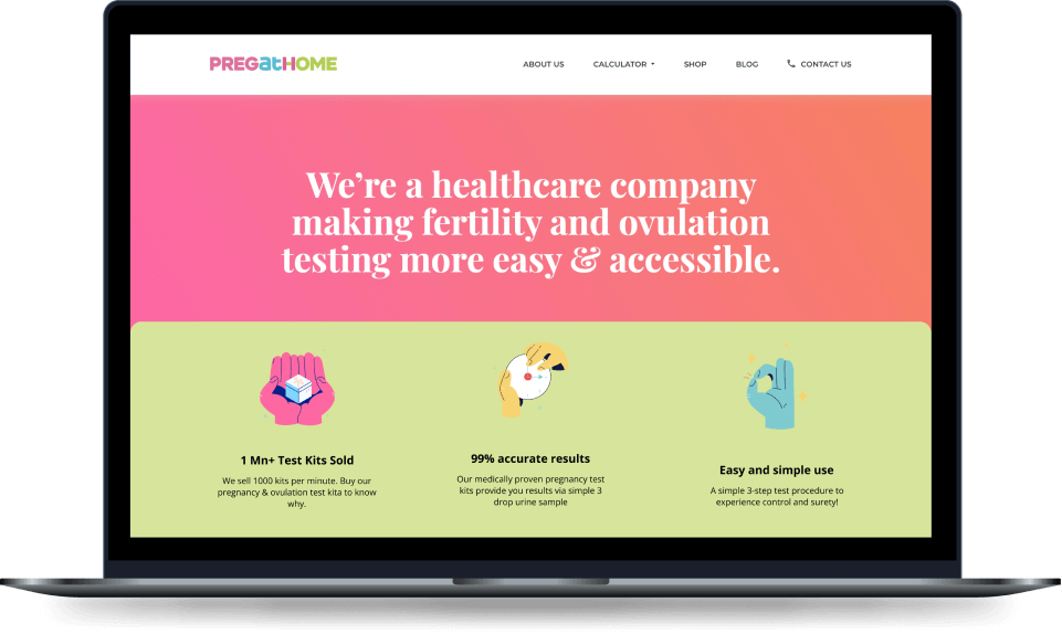
The website
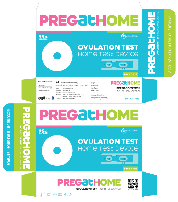
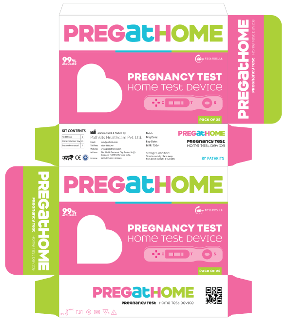
Final product packaging
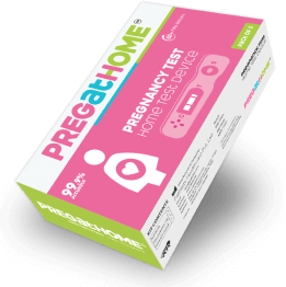
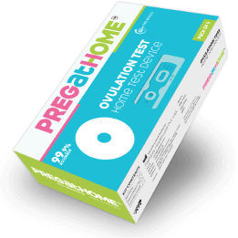
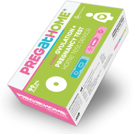
The entire branding of PregatHome has been conceptualised and created keeping the woman and their requirements in mind, including the smallest details such as over the counter buy at retail stores with confidence.


