Your 25-year-old cousin sends you money via her fintech app. The transaction completes instantly. No bank forms. No waiting in queues. No frustration. But before she trusted this app with her money, she had one question: “Will they actually give it back?”
That question defines fintech UX in India.
Indian fintech startups face a problem that Silicon Valley startups don’t: they’re asking users to trust digital payment with their hard-earned money while competing against banks that users already trust (even if those banks have terrible apps).
Building Trust Through Design
Trust isn’t designed through logos or marketing. It’s built through interface clarity. When users see your fintech app, they judge trustworthiness in milliseconds. Is the interface clean? Do they understand how to send money? Can they see where their money goes?
Razorpay‘s payment gateway became category-defining because developers trust it. PhonePe‘s wallet got 100 million users because regular people trust it. CRED built a unicorn because it makes feeling secure feel effortless.
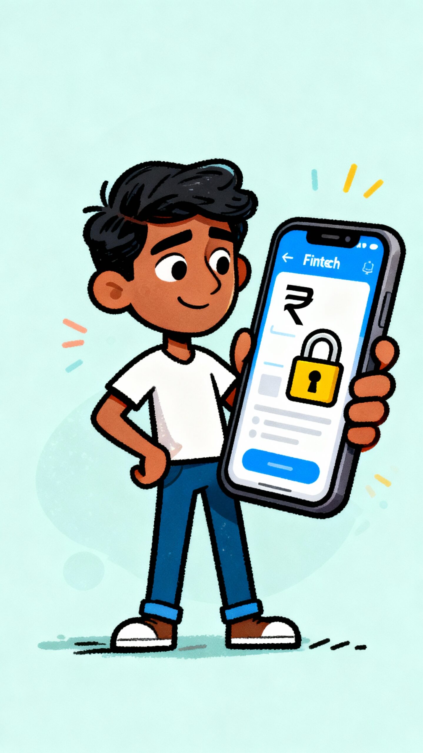
Here’s what these winners do: they show security visually. SSL certificates aren’t invisible. Encryption badges matter. Two-factor authentication isn’t hidden in settings. It’s prominent. Users see you take security seriously.
Simplicity Over Features
Indian fintech startups launch with too many features. Send money. Request money. Pay bills. Buy insurance. Invest in stocks. All in one app.
This kills conversion. Users overwhelmed by options choose nothing.
Startups that win focus obsessively. PhonePe started with payments only. Cash transfers. That’s it. Users mastered one thing before discovering others. Now they offer dozens of services. But onboarding still feels simple.
Design this simplicity ruthlessly. Hide advanced features behind progressive disclosure. New users see core functionality. Power users find advanced options when needed.
Handling Failure Gracefully
Payments fail. Networks drop. Bank servers crash. When failure happens, your interface determines whether users retry or abandon.
Bad error messages: “Transaction failed. Error code: 502.”
Good error messages: “Bank connection dropped. Your money is safe. Retry in 30 seconds or contact support.”
Indian users give you one retry. Make your error messages count. Explain what happened. Explain what users should do. Show them the path forward.
The Business Impact
Design directly influences fintech metrics. Better onboarding increases user acquisition. Clearer payment flows increase conversion. Reduced friction increases transaction volume.
A ui/ux design company in India working with fintech startups isn’t adding pretty colors. They’re building systems that increase trust, reduce abandonment, and drive revenue.
Fintech UX isn’t optional. It’s the difference between a startup that survives Series A and one that doesn’t.
