
Learn how Amazon’s 1-click checkout increased conversions by 300% and reduced cart abandonment. The UX design principles behind $738B in e-commerce.
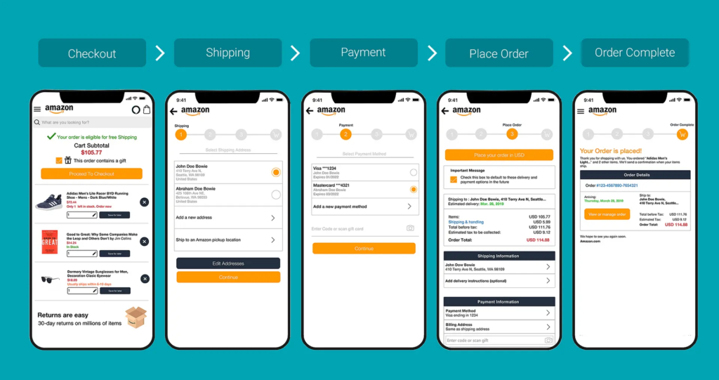
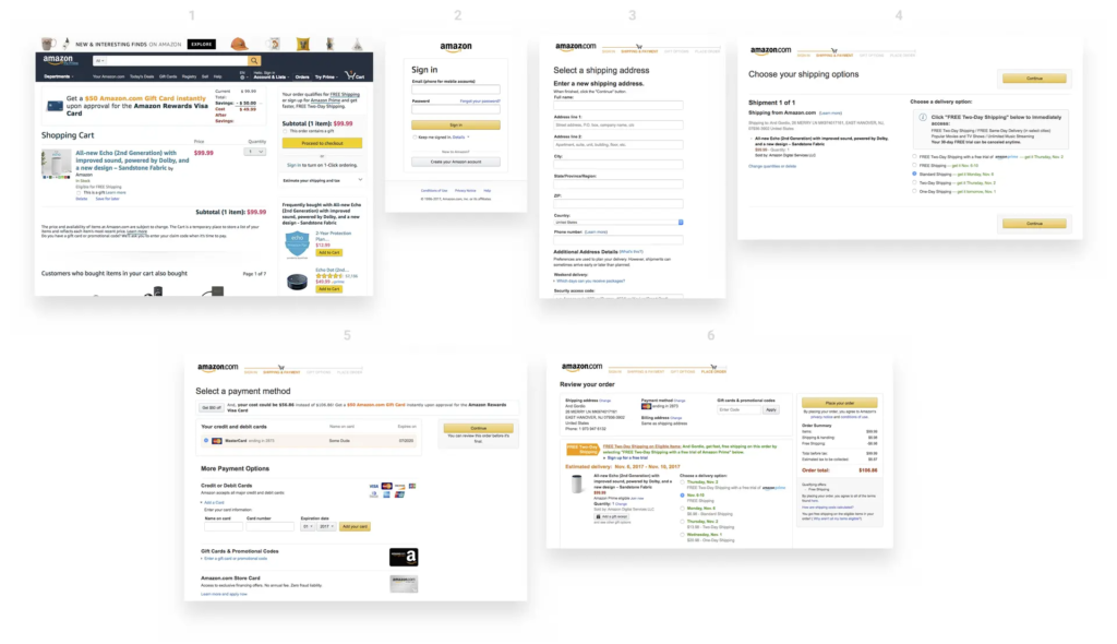
In 1999, Amazon filed a patent for something that sounds impossibly simple: letting customers buy something with a single click. Today, “One-Click Checkout” sits alongside the iPhone and Post-it Notes as one of those inventions so intuitive we forget what shopping was like before it existed. Yet when Amazon introduced this feature, it was genuinely revolutionary. The average e-commerce checkout required customers to navigate through 4–5 separate steps: cart review, account login, address entry, payment details, and order confirmation. Each step was a decision point. Each decision point was an opportunity for buyers to reconsider, procrastinate, or abandon altogether.
The problem wasn’t complexity—it was friction. Even highly motivated customers faced friction from decision fatigue. Enter a shipping address. Enter a billing address (sometimes different). Enter credit card details. Verify everything. Confirm the order. By the time checkout completed, the psychological momentum that drove the initial purchase had dissipated. Mobile shopping made this even worse. Typing a 16-digit credit card number on a three-inch screen felt so cumbersome that many shoppers simply abandoned their carts rather than complete the transaction.
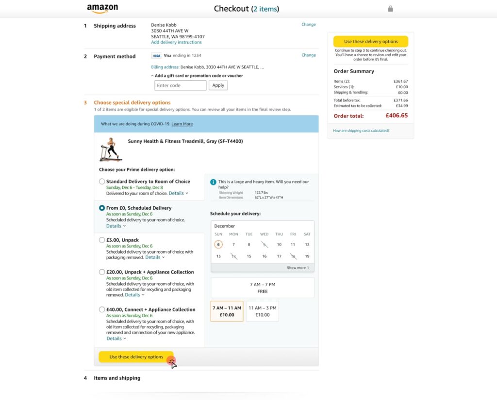
Amazon’s data revealed something striking: checkout cart abandonment rates hovered around 70% across the e-commerce industry. Worse, roughly 18% of shoppers abandoned carts specifically because the checkout process felt too complicated or time-consuming. This represented catastrophic revenue leakage. Industry analysis suggested that e-commerce stores could recover an estimated $260 billion in lost orders simply by optimizing the checkout experience. The mathematical incentive was undeniable, but the design challenge was equally clear: how do you remove friction without compromising security or data collection?
One-Click Checkout solved this through a progressive disclosure strategy. Instead of asking for all information upfront, Amazon securely stored customer payment and shipping details. On subsequent visits, users could complete a purchase with literally one click. The cognitive load dropped from “fill five forms” to “confirm one decision.” This wasn’t about removing information requirements—it was about removing the moment of friction at the point of impulse buying. When users decided they wanted something, they could act on that decision instantly, before motivation faded or distractions intervened.
The results were staggering. Amazon’s conversion rates jumped from approximately 2.5% to over 10%—a 300% relative increase. Cart abandonment rates plummeted by 40–45%, meaning 40% more people who started the checkout process actually completed it. Average order value increased by 5.3%, and behavioral data showed that One-Click customers visited 7% more frequently and spent 7.8% more time browsing per session over 15-month periods. More pages per session—9.3% more, to be precise—suggested that removing checkout friction freed customers to explore more products rather than rush through the purchase experience.
Competing research corroborated Amazon’s findings. Studies by the Baymard Institute indicated that optimizing checkout alone could boost conversion rates by up to 35%. Later implementations like Apple Pay demonstrated similar patterns: when HotelTonight integrated one-click payment, they saw a 26% immediate increase in orders. Shop Pay, Shopify’s one-click solution, reported 70% faster checkout times and conversion rates 1.72 times higher than traditional multi-step flows. These weren’t isolated success stories—they were consistent validation of a principle: friction correlates directly to abandonment.
What made Amazon’s approach sophisticated wasn’t the technology—it was the psychological insight. Friction isn’t just a feature problem; it’s a behavior problem. Humans experience decision fatigue. Each form field, each validation step, each page load depletes mental resources. By the time customers reach payment, they’re mentally exhausted and vulnerable to second thoughts. One-Click didn’t just save time; it preserved the psychological state that motivated the initial purchase. The customer remained in a state of desire and action, uninterrupted by procedural complexity.
The design also understood security perception. Many users worried that storing payment information online was risky. Amazon addressed this through explicit security messaging, encryption transparency, and brand reputation. The UX communicated that their security was strong enough that you could trust instant payments. This was crucial because removing friction can only succeed if users feel safe. Security concerns still matter—they’re just addressed through design communication, not by adding more form fields.
Mobile optimization became critical as shopping shifted to phones. One-Click’s convenience became exponentially more valuable on mobile devices where typing and navigation felt clunky. Rather than design a separate “mobile checkout,” Amazon recognized that the frictionless principle applied universally. Whether desktop or phone, the goal remained identical: minimize steps between desire and transaction completion. This consistency across devices reinforced One-Click’s value proposition and built user habit.
The business impact extended beyond immediate revenue. One-Click created switching costs that benefited Amazon for decades. Customers stored payment information on Amazon, making it easier to buy from Amazon again than from competitors who required re-entering all information. This small UX advantage compounded over time into massive competitive moat. New competitors couldn’t instantly match Amazon’s frictionless experience because customers had already invested in the convenience of One-Click.
The core takeaway isn’t that you should copy One-Click—it’s that you should map your checkout for friction. Where do users hesitate? Where do they reconsider? Where do form fields outnumber motivation? Those are your design opportunities. Amazon proved that removing even tiny friction points accumulates into massive business impact. The difference between a 2.5% and 10% conversion rate isn’t the result of flashy design; it’s the product of systematic friction reduction at every touchpoint. That’s how a simple checkout feature became one of the most valuable innovations in e-commerce history.
Also Read: Airbnb UX Design Case Study: Building Trust in Peer-to-Peer Travel
