Discover how Airbnb’s user-centered design solved trust barriers and scaled to 4M+ hosts. Learn the UX principles behind their $100B+ valuation.
When Airbnb launched in 2008, they faced an almost impossible challenge: convincing millions of people to stay in strangers’ homes. The psychological barrier wasn’t just about logistics—it was about overcoming deep-rooted fear and skepticism. The peer-to-peer accommodation concept seemed risky, even unsafe. Hosts questioned whether guests would respect their spaces, while travelers worried about scams, safety, and whether photos matched reality. Airbnb didn’t win the market through aggressive marketing or competitive pricing alone. They won it through intentional, human-centered design that systematically dismantled every friction point in the user journey.
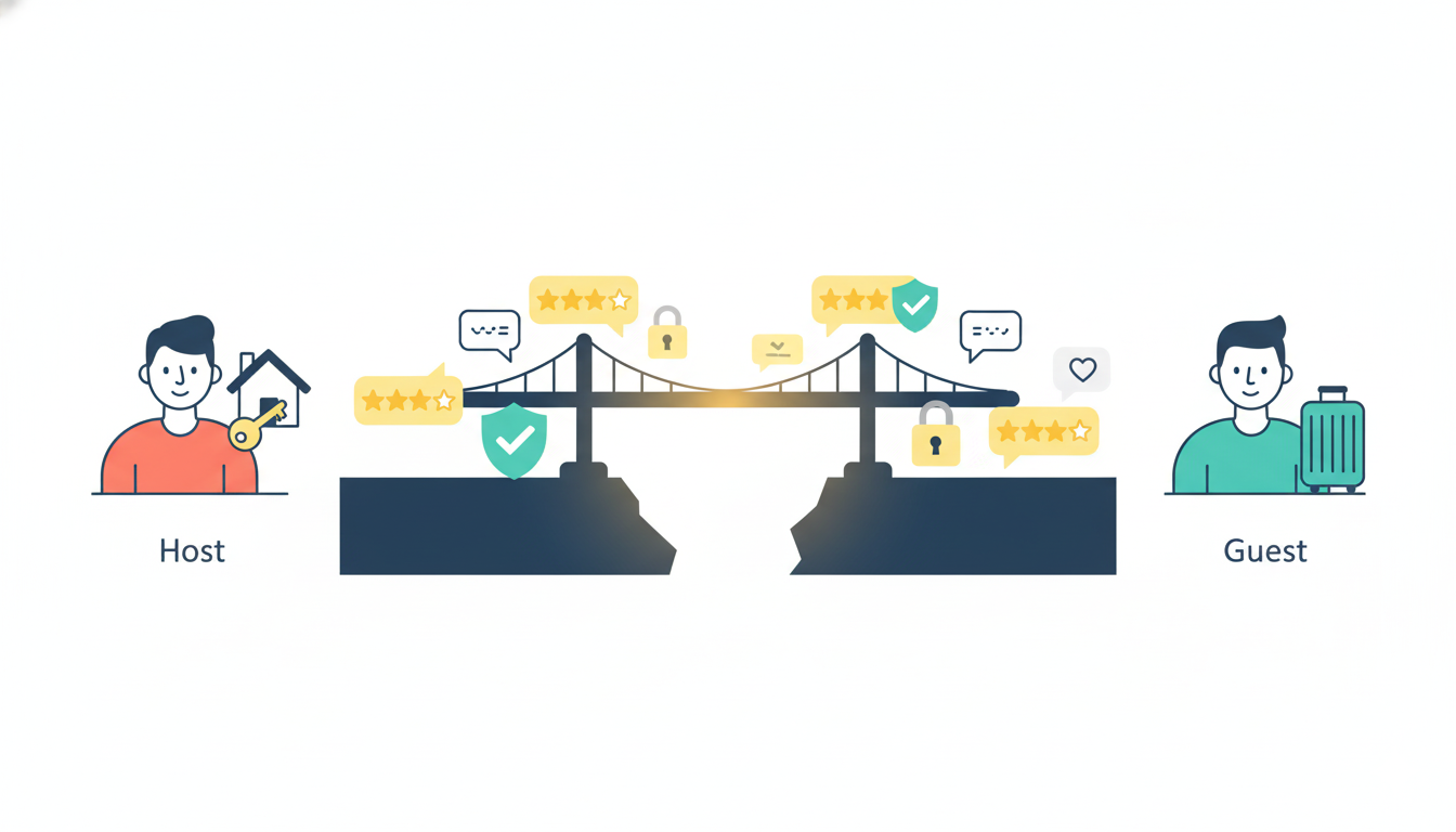
The core problem Airbnb identified was this: trust doesn’t exist in a vacuum—it must be designed into the product. Both hosts and guests needed tangible proof of legitimacy before committing. Hosts needed visibility and professional presentation tools, while travelers needed reassurance that their money and safety were protected. Rather than building features in isolation, Airbnb mapped the emotional journey of both user groups and designed interfaces that spoke directly to their fears.
The breakthrough came through a deceptively simple mechanism: two-way reviews and verified profiles. But the genius wasn’t in the concept—it was in the execution. Airbnb didn’t just add a review button; they embedded trust signals throughout the entire interface, making reputation visible at every decision-making moment. Ratings appeared above the fold on listing pages, filterable and sortable to ease choice anxiety. Review counts carried visual weight equivalent to pricing information, signaling that community feedback was as important as cost. Microinteractions—like highlighting keywords such as “clean,” “friendly host,” and “responsive“—reduced cognitive load and subconsciously reinforced safety during the critical booking moment. This wasn’t decoration; it was strategic psychology embedded in UI.
To address the visual trust barrier, Airbnb invested heavily in professional photography. They recognized that most hosts lacked professional equipment or skills to showcase their spaces effectively. Instead of assuming hosts would solve this problem themselves, Airbnb launched a free professional photography service. High-quality images didn’t just look better—they fundamentally changed how guests perceived value and reduced booking hesitation. This hands-on approach demonstrated Airbnb’s understanding that not all UX problems can be solved with code. Sometimes the most impactful design decisions happen offline, in real homes, with real people.
The search and filtering experience was engineered for cognitive ease. Rather than overwhelming users with hundreds of parameters, Airbnb grouped filters contextually: location, price range, amenities, and experience type. They added an interactive map feature that allowed users to think geographically rather than scrolling through endless lists. Each listing card prioritized information hierarchy—stunning photos, transparent pricing, review highlights, and instant booking availability. Users could scan a grid of results and instantly identify matches. This wasn’t beautiful design for beauty’s sake; it was friction-reduction through clarity.

The booking flow itself became a masterclass in reducing abandonment. Airbnb introduced Instant Book, eliminating the approval step that created uncertainty and delayed gratification. Pricing transparency went further than competitors: Airbnb displayed total costs upfront, including service fees and taxes, removing the shock factor that triggers checkout abandonment. In-app messaging enabled direct communication between hosts and guests, reducing the risk of miscommunication and building rapport before arrival. Each touchpoint was designed to reinforce the narrative that you’re not dealing with a faceless corporation—you’re connecting with a real person in a real home.
The impact speaks for itself. By 2023, Airbnb scaled to over 4 million hosts and 1.4 billion guest arrivals, achieving a valuation exceeding $100 billion. More importantly, the company maintained a 4.3-star app rating across more than 138,000 reviews, a testament to consistent, thoughtful experience design. This wasn’t achieved through a single feature launch but through systematic, user-centered iteration that treated trust-building as a design problem, not a marketing challenge.
The UX lesson here is fundamental: When your product requires users to overcome psychological barriers, design must address emotion before function. Airbnb didn’t just create a platform to list homes; they created a system of reciprocal accountability, transparency, and human connection. They understood that reviews weren’t social proof—they were psychological scaffolding that made the leap from “I’d never trust a stranger” to “I’m excited to meet this person.” That’s the difference between a good product and a transformational one.
Also Read: How to Implement AI as a Design Collaborator in 2026: A Practical Guide for UX/UI Teams
